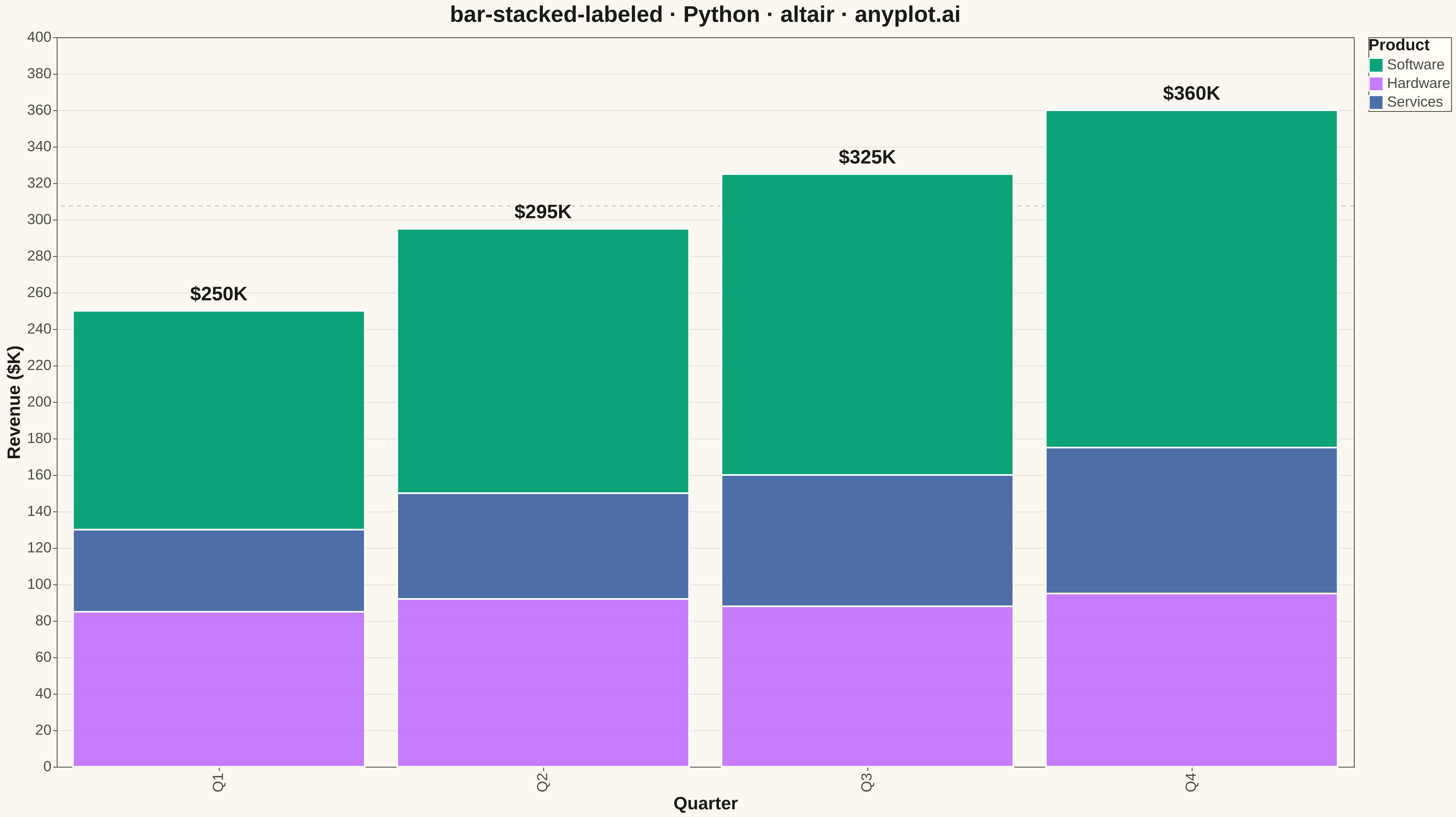
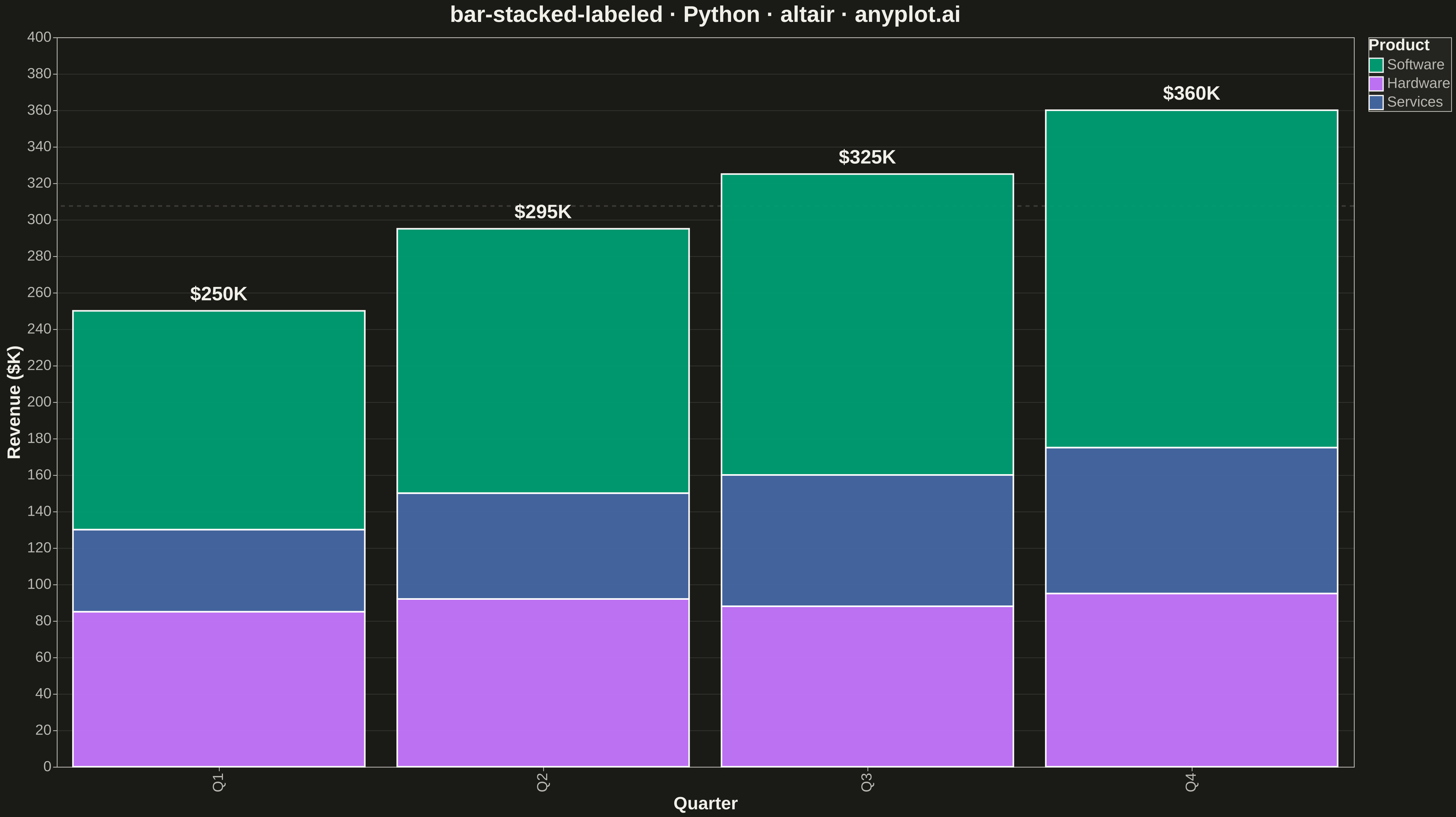
A stacked bar chart that displays multiple data series stacked on top of each other with total value labels prominently shown above each bar stack. This variant combines part-to-whole visualization with explicit numerical annotations, making it easy to read both individual segment contributions and cumulative totals at a glance. The total labels eliminate the need for mental arithmetic when comparing overall values across categories.
""" anyplot.ai
bar-stacked-labeled: Stacked Bar Chart with Total Labels
Library: altair 6.1.0 | Python 3.13.13
Quality: 89/100 | Updated: 2026-05-18
"""

import os
import sys


# Remove current directory from path to avoid shadowing altair library
sys.path = [p for p in sys.path if not p.endswith("/python")]

import altair as alt
import pandas as pd


# Theme tokens
THEME = os.getenv("ANYPLOT_THEME", "light")
PAGE_BG = "#FAF8F1" if THEME == "light" else "#1A1A17"
ELEVATED_BG = "#FFFDF6" if THEME == "light" else "#242420"
INK = "#1A1A17" if THEME == "light" else "#F0EFE8"
INK_SOFT = "#4A4A44" if THEME == "light" else "#B8B7B0"

# Okabe-Ito palette
IMPRINT = ["#009E73", "#C475FD", "#4467A3"]

# Data - Quarterly revenue by product category
data = pd.DataFrame(
    {
        "quarter": ["Q1", "Q1", "Q1", "Q2", "Q2", "Q2", "Q3", "Q3", "Q3", "Q4", "Q4", "Q4"],
        "product": ["Software", "Hardware", "Services"] * 4,
        "revenue": [120, 85, 45, 145, 92, 58, 165, 88, 72, 185, 95, 80],
    }
)

# Calculate totals for labels
totals = data.groupby("quarter")["revenue"].sum().reset_index()
totals.columns = ["quarter", "total"]
totals["label"] = totals["total"].apply(lambda x: f"${x}K")

# Create stacked bar chart with enhanced styling
bars = (
    alt.Chart(data)
    .mark_bar(strokeWidth=2, stroke="white", opacity=0.95)
    .encode(
        x=alt.X("quarter:N", title="Quarter", axis=alt.Axis(labelFontSize=18, titleFontSize=22)),
        y=alt.Y("revenue:Q", title="Revenue ($K)", axis=alt.Axis(labelFontSize=18, titleFontSize=22)),
        color=alt.Color(
            "product:N",
            title="Product",
            scale=alt.Scale(domain=["Software", "Hardware", "Services"], range=IMPRINT),
            legend=alt.Legend(titleFontSize=20, labelFontSize=18, symbolSize=300),
        ),
        order=alt.Order("product:N", sort="ascending"),
        tooltip=["quarter:N", "product:N", "revenue:Q"],
    )
)

# Total labels with improved styling for emphasis
labels = (
    alt.Chart(totals)
    .mark_text(fontSize=24, fontWeight="bold", dy=-20, color=INK, align="center")
    .encode(x=alt.X("quarter:N"), y=alt.Y("total:Q"), text="label:N")
)

# Add visual hierarchy with a subtle reference line at average total
avg_total = totals["total"].mean()
reference_line = (
    alt.Chart(pd.DataFrame({"avg": [avg_total]}))
    .mark_rule(color=INK_SOFT, opacity=0.2, strokeWidth=2, strokeDash=[5, 5])
    .encode(y=alt.Y("avg:Q"))
)

# Combine and configure
chart = (
    (reference_line + bars + labels)
    .properties(
        width=1600,
        height=900,
        background=PAGE_BG,
        title=alt.Title("bar-stacked-labeled · Python · altair · anyplot.ai", fontSize=28, anchor="middle", color=INK),
    )
    .configure_view(fill=PAGE_BG, stroke=INK_SOFT, strokeWidth=1)
    .configure_axis(
        domainColor=INK_SOFT, tickColor=INK_SOFT, gridColor=INK, gridOpacity=0.10, labelColor=INK_SOFT, titleColor=INK
    )
    .configure_title(color=INK)
    .configure_legend(fillColor=ELEVATED_BG, strokeColor=INK_SOFT, labelColor=INK_SOFT, titleColor=INK)
)

# Save outputs
script_dir = os.path.dirname(os.path.abspath(__file__))
chart.save(os.path.join(script_dir, f"plot-{THEME}.png"), scale_factor=3.0)
chart.save(os.path.join(script_dir, f"plot-{THEME}.html"))
Runnable source as JSON, for any HTTP client: https://api.anyplot.ai/specs/bar-stacked-labeled/altair/code. Any spec id and library id listed in llms-full.txt fit the same URL shape; every URL below is complete and callable.
{
  "spec_id": "bar-stacked-labeled",
  "language": "python",
  "library": "altair",
  "page": "https://anyplot.ai/bar-stacked-labeled/python/altair",
  "hub": "https://anyplot.ai/bar-stacked-labeled",
  "code_json": "https://api.anyplot.ai/specs/bar-stacked-labeled/altair/code",
  "spec_json": "https://api.anyplot.ai/specs/bar-stacked-labeled",
  "render_light_png": "https://storage.googleapis.com/anyplot-images/plots/bar-stacked-labeled/python/altair/plot-light.png",
  "render_dark_png": "https://storage.googleapis.com/anyplot-images/plots/bar-stacked-labeled/python/altair/plot-dark.png",
  "interactive_light_html": "https://storage.googleapis.com/anyplot-images/plots/bar-stacked-labeled/python/altair/plot-light.html",
  "interactive_dark_html": "https://storage.googleapis.com/anyplot-images/plots/bar-stacked-labeled/python/altair/plot-dark.html",
  "quality_score": 89.0,
  "license": "MIT",
  "guide": "https://anyplot.ai/llms.txt"
}
Part of Stacked Bar Chart with Total Labels on anyplot.ai.