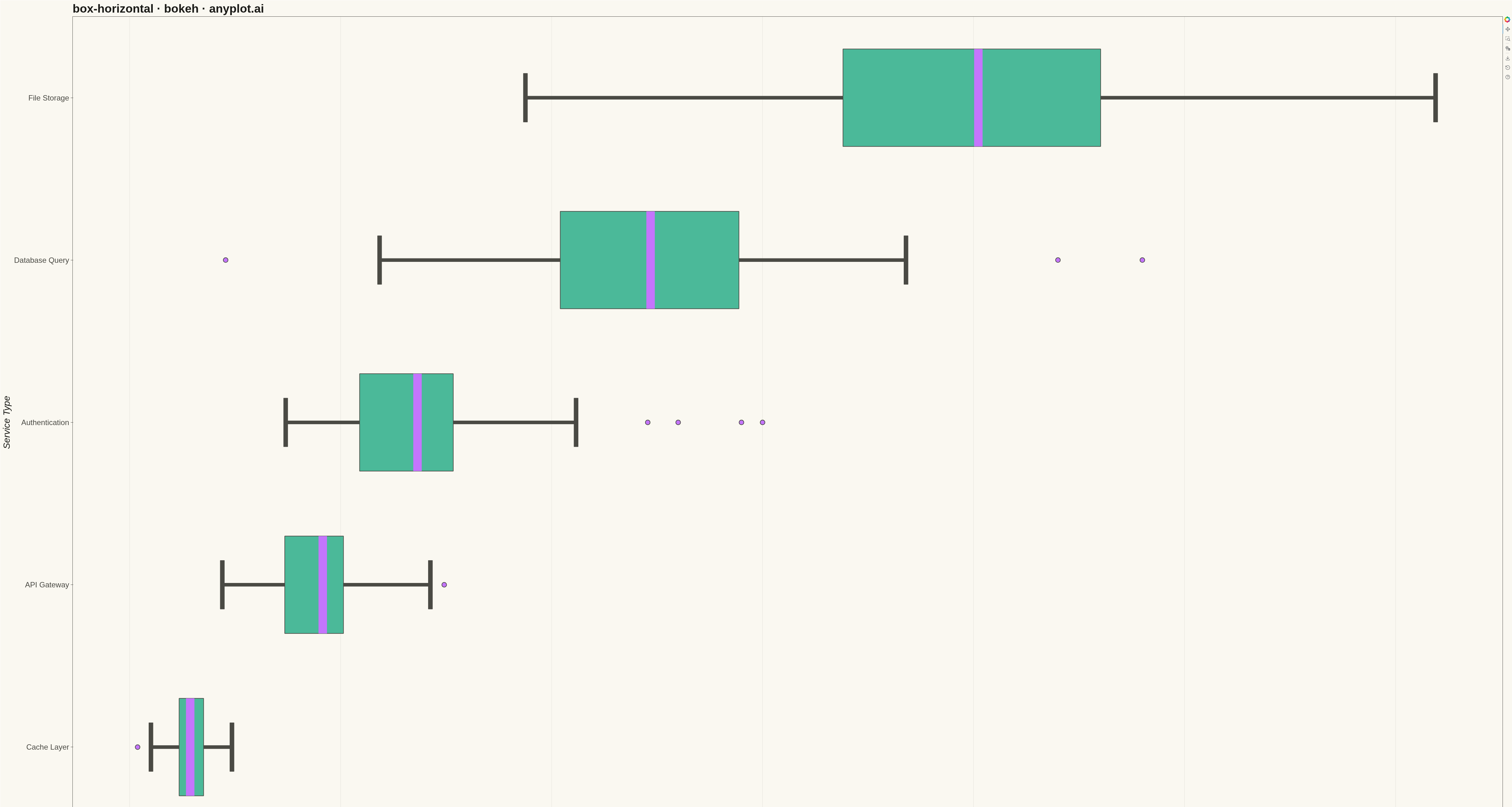
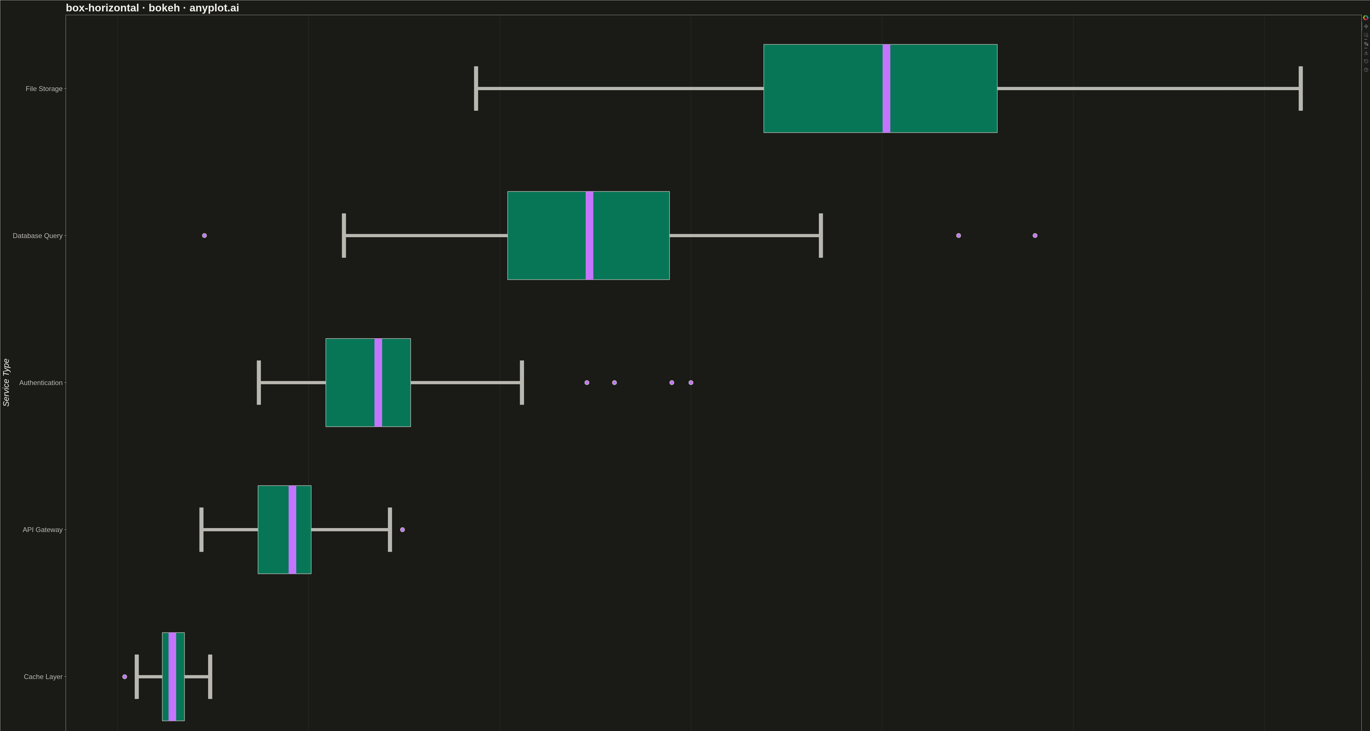
A horizontal box plot displays the distribution of numerical data through quartiles with the boxes oriented horizontally. This orientation is particularly useful when category labels are long or when comparing many groups, as it allows for easier reading of labels on the y-axis.
""" anyplot.ai
box-horizontal: Horizontal Box Plot
Library: bokeh 3.9.0 | Python 3.13.13
Quality: 91/100 | Updated: 2026-05-12
"""

import sys
from pathlib import Path


# Remove script directory from sys.path to avoid circular import of bokeh
_script_dir = str(Path(__file__).parent)
sys.path[:] = [p for p in sys.path if p != _script_dir and p != ""]

import os
import time

import bokeh.io
import bokeh.models
import bokeh.plotting
import numpy as np
from selenium import webdriver
from selenium.webdriver.chrome.options import Options


output_file = bokeh.io.output_file
save = bokeh.io.save
FactorRange = bokeh.models.FactorRange
figure = bokeh.plotting.figure

# Change to script directory for output files
os.chdir(Path(__file__).parent)

# Theme tokens
THEME = os.getenv("ANYPLOT_THEME", "light")
PAGE_BG = "#FAF8F1" if THEME == "light" else "#1A1A17"
ELEVATED_BG = "#FFFDF6" if THEME == "light" else "#242420"
INK = "#1A1A17" if THEME == "light" else "#F0EFE8"
INK_SOFT = "#4A4A44" if THEME == "light" else "#B8B7B0"

# Okabe-Ito palette
BRAND = "#009E73"
ALT_COLOR = "#C475FD"

# Data - Response times (ms) by service type
np.random.seed(42)

categories = ["Cache Layer", "API Gateway", "Authentication", "Database Query", "File Storage"]

# Generate different distributions for each service (sorted by median)
data = {
    "Cache Layer": np.random.normal(15, 5, 80),
    "API Gateway": np.random.normal(45, 12, 80),
    "Authentication": np.concatenate([np.random.normal(65, 15, 75), [130, 145, 150]]),
    "Database Query": np.concatenate([np.random.normal(120, 30, 80), [220, 240]]),
    "File Storage": np.random.normal(200, 50, 80),
}

# Calculate box plot statistics for each category
stats = {}
outliers_x = []
outliers_y = []

for cat in categories:
    values = data[cat]
    q1 = np.percentile(values, 25)
    q2 = np.percentile(values, 50)
    q3 = np.percentile(values, 75)
    iqr = q3 - q1
    upper_fence = q3 + 1.5 * iqr
    lower_fence = q1 - 1.5 * iqr

    # Whiskers extend to furthest data point within fence
    mask = (values >= lower_fence) & (values <= upper_fence)
    upper = values[mask].max() if mask.any() else q3
    lower = values[mask].min() if mask.any() else q1

    # Find outliers
    outlier_mask = (values < lower_fence) | (values > upper_fence)
    for o in values[outlier_mask]:
        outliers_x.append(o)
        outliers_y.append(cat)

    stats[cat] = {"q1": q1, "q2": q2, "q3": q3, "upper": upper, "lower": lower}

# Plot
p = figure(
    width=4800,
    height=2700,
    y_range=FactorRange(*categories),
    x_axis_label="Response Time (ms)",
    y_axis_label="Service Type",
    title="box-horizontal · bokeh · anyplot.ai",
)

# Box and whisker dimensions
box_height = 0.6
cap_height = 0.3

for cat in categories:
    s = stats[cat]

    # Draw box (IQR)
    p.hbar(
        y=[cat],
        left=[s["q1"]],
        right=[s["q3"]],
        height=box_height,
        fill_color=BRAND,
        fill_alpha=0.7,
        line_color=INK_SOFT,
        line_width=2,
    )

    # Draw median line
    p.hbar(
        y=[cat],
        left=[s["q2"] - 1],
        right=[s["q2"] + 1],
        height=box_height,
        fill_color=ALT_COLOR,
        line_color=ALT_COLOR,
        line_width=0,
    )

    # Draw whiskers (horizontal lines from box to whisker ends)
    p.hbar(y=[cat], left=[s["lower"]], right=[s["q1"]], height=0.02, fill_color=INK_SOFT, line_color=INK_SOFT)
    p.hbar(y=[cat], left=[s["q3"]], right=[s["upper"]], height=0.02, fill_color=INK_SOFT, line_color=INK_SOFT)

    # Draw whisker caps (vertical lines at whisker ends)
    p.hbar(
        y=[cat],
        left=[s["lower"] - 0.5],
        right=[s["lower"] + 0.5],
        height=cap_height,
        fill_color=INK_SOFT,
        line_color=INK_SOFT,
    )
    p.hbar(
        y=[cat],
        left=[s["upper"] - 0.5],
        right=[s["upper"] + 0.5],
        height=cap_height,
        fill_color=INK_SOFT,
        line_color=INK_SOFT,
    )

# Draw outliers
if outliers_x:
    p.scatter(
        x=outliers_x, y=outliers_y, size=15, fill_color=ALT_COLOR, line_color=INK_SOFT, line_width=2, marker="circle"
    )

# Style
p.title.text_font_size = "28pt"
p.title.text_color = INK

p.xaxis.axis_label_text_font_size = "22pt"
p.yaxis.axis_label_text_font_size = "22pt"
p.xaxis.axis_label_text_color = INK
p.yaxis.axis_label_text_color = INK

p.xaxis.major_label_text_font_size = "18pt"
p.yaxis.major_label_text_font_size = "18pt"
p.xaxis.major_label_text_color = INK_SOFT
p.yaxis.major_label_text_color = INK_SOFT

# Grid styling
p.xgrid.grid_line_alpha = 0.10
p.xgrid.grid_line_color = INK
p.ygrid.grid_line_alpha = 0.0

# Background and borders
p.background_fill_color = PAGE_BG
p.border_fill_color = PAGE_BG
p.outline_line_color = INK_SOFT

# Axis styling
p.xaxis.axis_line_color = INK_SOFT
p.yaxis.axis_line_color = INK_SOFT
p.xaxis.major_tick_line_color = INK_SOFT
p.yaxis.major_tick_line_color = INK_SOFT

# Save HTML
output_file(f"plot-{THEME}.html")
save(p)

# Screenshot with headless Chrome
W, H = 4800, 2700
opts = Options()
for arg in (
    "--headless=new",
    "--no-sandbox",
    "--disable-dev-shm-usage",
    "--disable-gpu",
    f"--window-size={W},{H}",
    "--hide-scrollbars",
):
    opts.add_argument(arg)
driver = webdriver.Chrome(options=opts)
driver.set_window_size(W, H)
driver.get(f"file://{Path(f'plot-{THEME}.html').resolve()}")
time.sleep(3)
driver.save_screenshot(f"plot-{THEME}.png")
driver.quit()
Runnable source as JSON, for any HTTP client: https://api.anyplot.ai/specs/box-horizontal/bokeh/code. Any spec id and library id listed in llms-full.txt fit the same URL shape; every URL below is complete and callable.
{
  "spec_id": "box-horizontal",
  "language": "python",
  "library": "bokeh",
  "page": "https://anyplot.ai/box-horizontal/python/bokeh",
  "hub": "https://anyplot.ai/box-horizontal",
  "code_json": "https://api.anyplot.ai/specs/box-horizontal/bokeh/code",
  "spec_json": "https://api.anyplot.ai/specs/box-horizontal",
  "render_light_png": "https://storage.googleapis.com/anyplot-images/plots/box-horizontal/python/bokeh/plot-light.png",
  "render_dark_png": "https://storage.googleapis.com/anyplot-images/plots/box-horizontal/python/bokeh/plot-dark.png",
  "interactive_light_html": "https://storage.googleapis.com/anyplot-images/plots/box-horizontal/python/bokeh/plot-light.html",
  "interactive_dark_html": "https://storage.googleapis.com/anyplot-images/plots/box-horizontal/python/bokeh/plot-dark.html",
  "quality_score": 91.0,
  "license": "MIT",
  "guide": "https://anyplot.ai/llms.txt"
}
Part of Horizontal Box Plot on anyplot.ai.