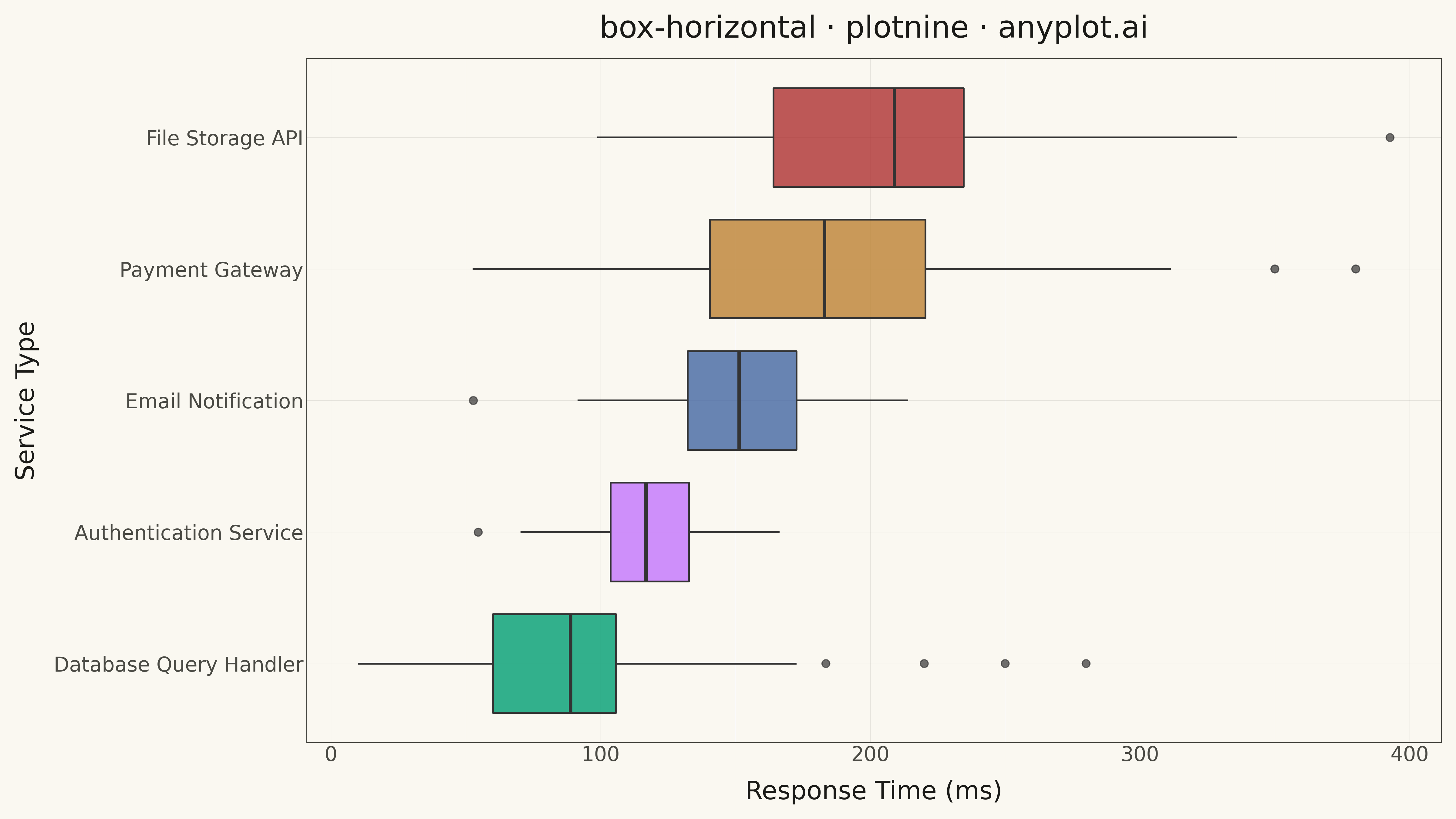
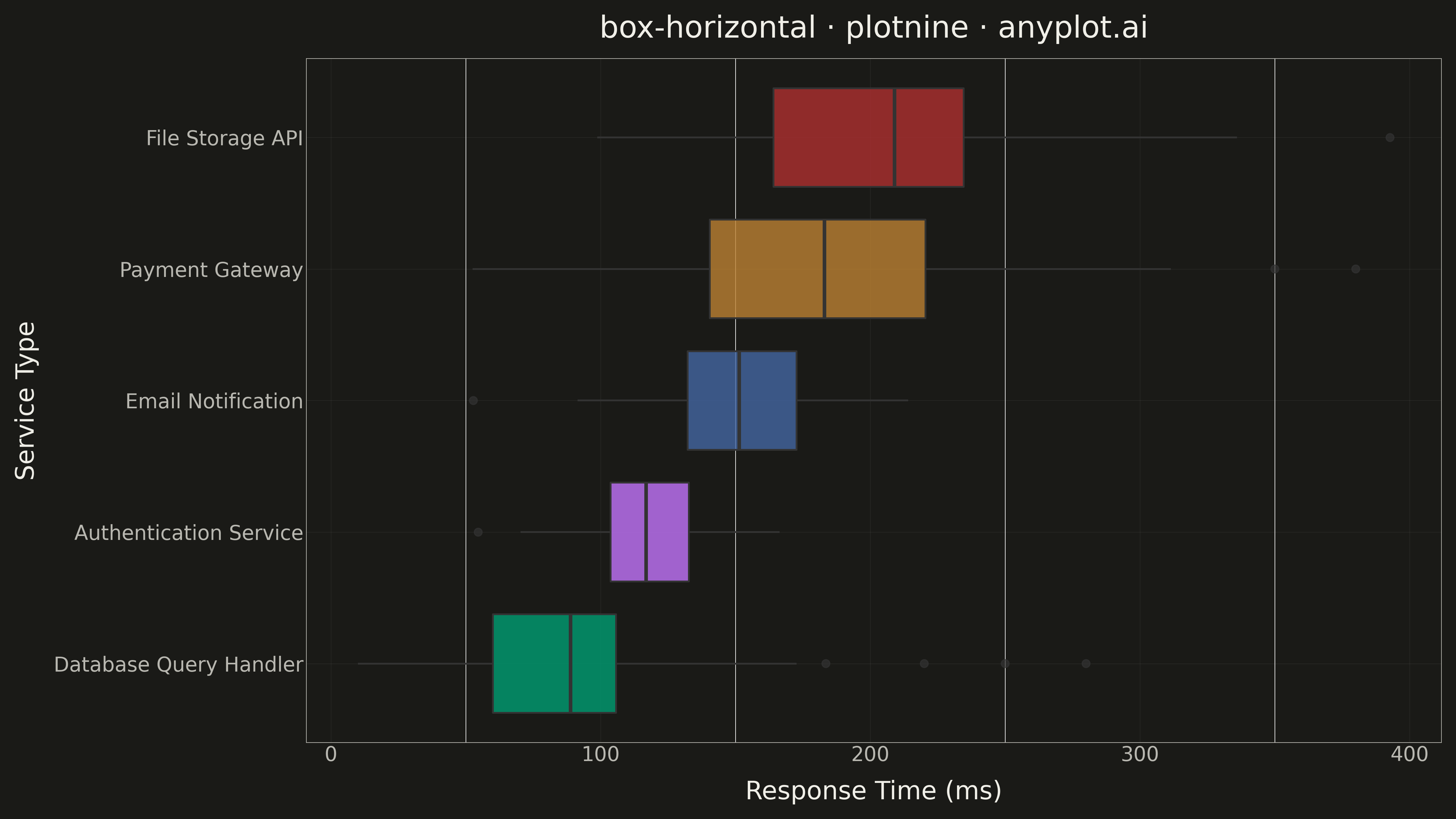
A horizontal box plot displays the distribution of numerical data through quartiles with the boxes oriented horizontally. This orientation is particularly useful when category labels are long or when comparing many groups, as it allows for easier reading of labels on the y-axis.
""" anyplot.ai
box-horizontal: Horizontal Box Plot
Library: plotnine 0.15.4 | Python 3.13.13
Quality: 91/100 | Updated: 2026-05-12
"""

import os

import numpy as np
import pandas as pd
from plotnine import (
    aes,
    coord_flip,
    element_line,
    element_rect,
    element_text,
    geom_boxplot,
    ggplot,
    labs,
    scale_fill_manual,
    theme,
    theme_minimal,
)


# Theme tokens
THEME = os.getenv("ANYPLOT_THEME", "light")
PAGE_BG = "#FAF8F1" if THEME == "light" else "#1A1A17"
ELEVATED_BG = "#FFFDF6" if THEME == "light" else "#242420"
INK = "#1A1A17" if THEME == "light" else "#F0EFE8"
INK_SOFT = "#4A4A44" if THEME == "light" else "#B8B7B0"

# Okabe-Ito palette - first series is always #009E73
IMPRINT = ["#009E73", "#C475FD", "#4467A3", "#BD8233", "#AE3030", "#2ABCCD", "#954477"]

# Data - Response times (ms) by service type
np.random.seed(42)

services = [
    "Authentication Service",
    "Database Query Handler",
    "File Storage API",
    "Email Notification",
    "Payment Gateway",
]

data = []
for service in services:
    if service == "Authentication Service":
        values = np.random.normal(120, 25, 80)
    elif service == "Database Query Handler":
        values = np.random.normal(85, 40, 80)
        values = np.append(values, [220, 250, 280])
    elif service == "File Storage API":
        values = np.random.normal(200, 50, 80)
    elif service == "Email Notification":
        values = np.random.normal(150, 30, 80)
    else:
        values = np.random.normal(180, 60, 80)
        values = np.append(values, [350, 380])

    for v in values:
        data.append({"Service": service, "Response Time": max(10, v)})

df = pd.DataFrame(data)

# Sort by median response time for easier comparison
medians = df.groupby("Service")["Response Time"].median().sort_values()
df["Service"] = pd.Categorical(df["Service"], categories=medians.index, ordered=True)

# Create horizontal box plot
anyplot_theme = theme(
    figure_size=(16, 9),
    plot_background=element_rect(fill=PAGE_BG, color=PAGE_BG),
    panel_background=element_rect(fill=PAGE_BG, color=PAGE_BG),
    panel_grid_major_y=element_line(color=INK, size=0.3, alpha=0.10),
    panel_grid_major_x=element_line(color=INK, size=0.3, alpha=0.10),
    panel_border=element_rect(color=INK_SOFT, fill=None, size=0.5),
    axis_title=element_text(size=20, color=INK),
    axis_text=element_text(size=16, color=INK_SOFT),
    axis_line=element_line(color=INK_SOFT, size=0.5),
    plot_title=element_text(size=24, color=INK),
    legend_background=element_rect(fill=ELEVATED_BG, color=INK_SOFT),
    legend_text=element_text(size=16, color=INK_SOFT),
    legend_position="none",
)

plot = (
    ggplot(df, aes(x="Service", y="Response Time", fill="Service"))
    + geom_boxplot(alpha=0.8, size=0.8, outlier_size=3, outlier_alpha=0.7)
    + coord_flip()
    + scale_fill_manual(values=IMPRINT[: len(services)])
    + labs(title="box-horizontal · plotnine · anyplot.ai", x="Service Type", y="Response Time (ms)")
    + theme_minimal()
    + anyplot_theme
)

# Save
plot.save(f"plot-{THEME}.png", dpi=300, verbose=False)
Runnable source as JSON, for any HTTP client: https://api.anyplot.ai/specs/box-horizontal/plotnine/code. Any spec id and library id listed in llms-full.txt fit the same URL shape; every URL below is complete and callable.
{
  "spec_id": "box-horizontal",
  "language": "python",
  "library": "plotnine",
  "page": "https://anyplot.ai/box-horizontal/python/plotnine",
  "hub": "https://anyplot.ai/box-horizontal",
  "code_json": "https://api.anyplot.ai/specs/box-horizontal/plotnine/code",
  "spec_json": "https://api.anyplot.ai/specs/box-horizontal",
  "render_light_png": "https://storage.googleapis.com/anyplot-images/plots/box-horizontal/python/plotnine/plot-light.png",
  "render_dark_png": "https://storage.googleapis.com/anyplot-images/plots/box-horizontal/python/plotnine/plot-dark.png",
  "quality_score": 91.0,
  "license": "MIT",
  "guide": "https://anyplot.ai/llms.txt"
}
Part of Horizontal Box Plot on anyplot.ai.