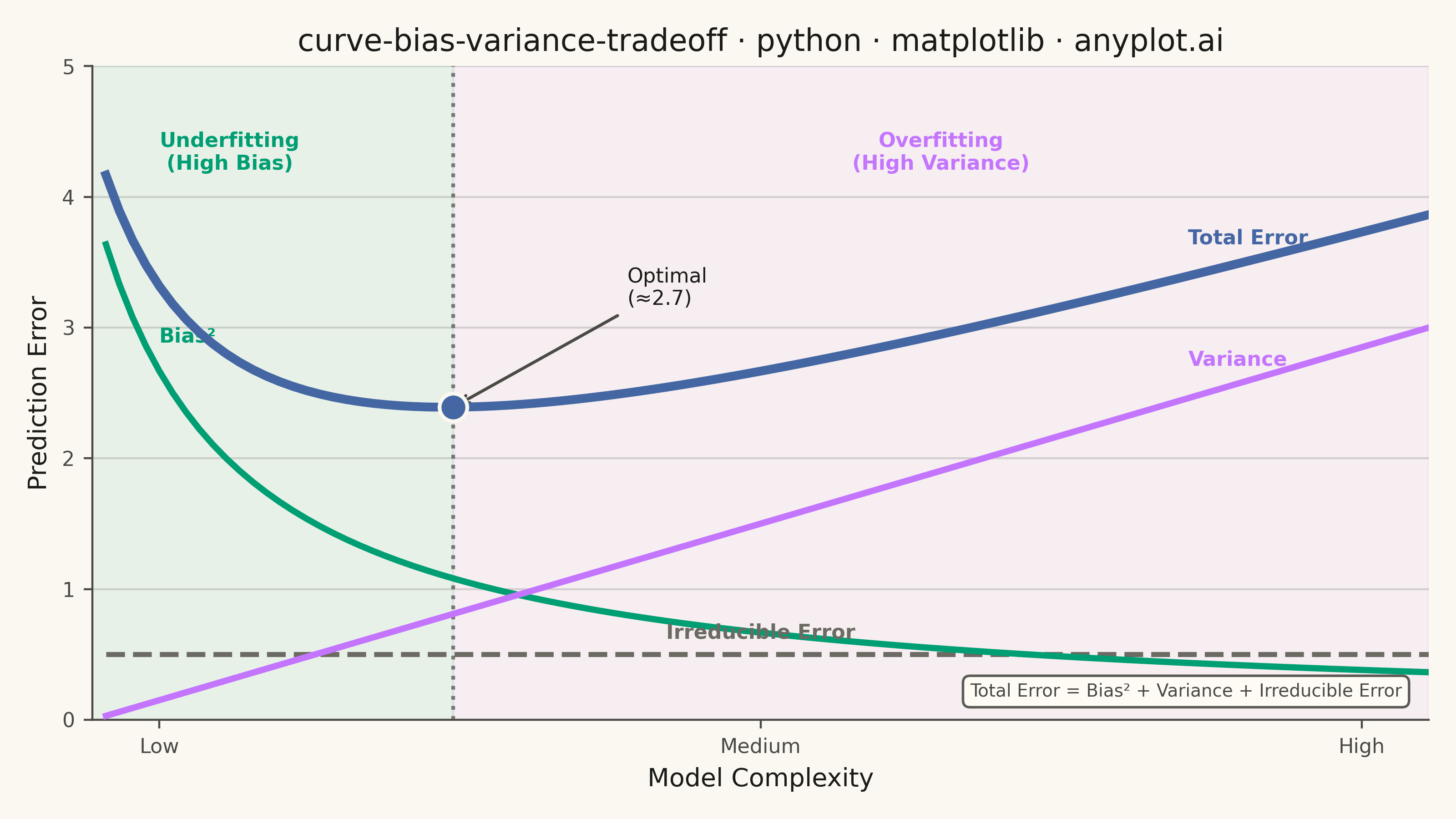
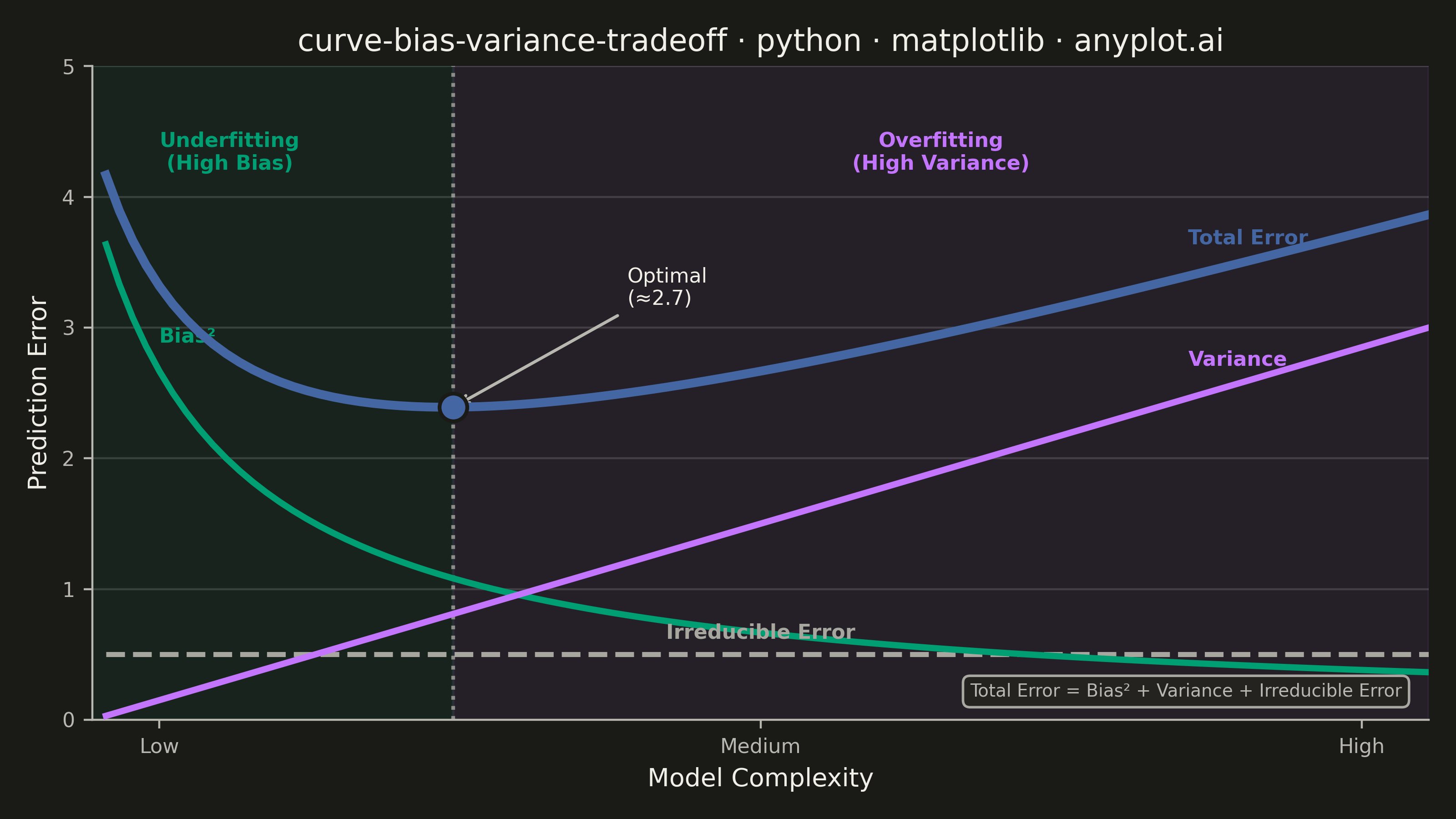
A theoretical visualization of the bias-variance tradeoff showing how total prediction error decomposes into bias squared, variance, and irreducible noise as a function of model complexity. The plot displays multiple curves: bias squared (decreasing with complexity), variance (increasing with complexity), irreducible error (constant), and total error (U-shaped). This is one of the most fundamental conceptual plots in machine learning for understanding model selection, overfitting, and underfitting.
""" anyplot.ai
curve-bias-variance-tradeoff: Bias-Variance Tradeoff Curve
Library: matplotlib 3.10.9 | Python 3.13.13
Quality: 91/100 | Updated: 2026-05-28
"""

import os

import matplotlib.pyplot as plt
import numpy as np


# Theme tokens
THEME = os.getenv("ANYPLOT_THEME", "light")
PAGE_BG = "#FAF8F1" if THEME == "light" else "#1A1A17"
ELEVATED_BG = "#FFFDF6" if THEME == "light" else "#242420"
INK = "#1A1A17" if THEME == "light" else "#F0EFE8"
INK_SOFT = "#4A4A44" if THEME == "light" else "#B8B7B0"
INK_MUTED = "#6B6A63" if THEME == "light" else "#A8A79F"

# Imprint palette — positions 1→3 for the three active curves; muted for the reference baseline
C_BIAS = "#009E73"  # position 1 — green   (Bias²)
C_VARIANCE = "#C475FD"  # position 2 — lavender (Variance)
C_TOTAL = "#4467A3"  # position 3 — blue     (Total Error, the primary curve)
C_IRREDUCIBLE = INK_MUTED  # theme-adaptive muted — constant noise floor reference

# Data: theoretical bias-variance tradeoff curves
complexity = np.linspace(0.1, 10, 100)
bias_squared = 4 / (1 + complexity)
variance = 0.3 * complexity
irreducible_error = np.ones_like(complexity) * 0.5
total_error = bias_squared + variance + irreducible_error

optimal_idx = np.argmin(total_error)
optimal_complexity = complexity[optimal_idx]
optimal_error = total_error[optimal_idx]

# Plot
fig, ax = plt.subplots(figsize=(8, 4.5), dpi=400, facecolor=PAGE_BG)
ax.set_facecolor(PAGE_BG)

# Shaded zones (draw first so curves appear on top)
ax.axvspan(0, optimal_complexity, alpha=0.07, color=C_BIAS)
ax.axvspan(optimal_complexity, 10, alpha=0.07, color=C_VARIANCE)

# Curves
ax.plot(complexity, bias_squared, color=C_BIAS, linewidth=2.5, linestyle="-", zorder=3)
ax.plot(complexity, variance, color=C_VARIANCE, linewidth=2.5, linestyle="-", zorder=3)
ax.plot(complexity, irreducible_error, color=C_IRREDUCIBLE, linewidth=2.0, linestyle="--", zorder=2)
ax.plot(complexity, total_error, color=C_TOTAL, linewidth=3.5, linestyle="-", zorder=4)

# Optimal complexity marker
ax.axvline(x=optimal_complexity, color=INK_SOFT, linewidth=1.5, linestyle=":", alpha=0.7)
ax.scatter([optimal_complexity], [optimal_error], color=C_TOTAL, s=120, zorder=5, edgecolors=PAGE_BG, linewidths=1.5)
ax.annotate(
    f"Optimal\n(≈{optimal_complexity:.1f})",
    xy=(optimal_complexity, optimal_error),
    xytext=(optimal_complexity + 1.3, optimal_error + 0.75),
    fontsize=8,
    color=INK,
    ha="left",
    va="bottom",
    arrowprops={"arrowstyle": "->", "color": INK_SOFT, "lw": 1.2},
)

# Zone labels (placed near the top of each shaded region)
ax.text(
    optimal_complexity * 0.38,
    4.5,
    "Underfitting\n(High Bias)",
    fontsize=8,
    ha="center",
    va="top",
    color=C_BIAS,
    fontweight="bold",
)
ax.text(
    (optimal_complexity + 10) * 0.5,
    4.5,
    "Overfitting\n(High Variance)",
    fontsize=8,
    ha="center",
    va="top",
    color=C_VARIANCE,
    fontweight="bold",
)

# Direct curve labels (no legend needed — labels are placed on the curves)
ax.text(0.5, bias_squared[4] + 0.22, "Bias²", fontsize=8, color=C_BIAS, fontweight="bold")
ax.text(8.2, variance[82] + 0.22, "Variance", fontsize=8, color=C_VARIANCE, fontweight="bold")
ax.text(8.2, total_error[82] + 0.22, "Total Error", fontsize=8, color=C_TOTAL, fontweight="bold")
ax.text(5.0, 0.62, "Irreducible Error", fontsize=8, ha="center", color=C_IRREDUCIBLE, fontweight="bold")

# Formula annotation box (bottom right in axes coordinates)
ax.text(
    0.98,
    0.03,
    "Total Error = Bias² + Variance + Irreducible Error",
    transform=ax.transAxes,
    fontsize=7,
    ha="right",
    va="bottom",
    color=INK_SOFT,
    bbox={"boxstyle": "round,pad=0.4", "facecolor": ELEVATED_BG, "edgecolor": INK_SOFT, "alpha": 0.9},
)

# Axes range and custom x-tick labels
ax.set_xlim(0, 10)
ax.set_ylim(0, 5)
ax.set_xticks([0.5, 5, 9.5])
ax.set_xticklabels(["Low", "Medium", "High"])

# Style
title = "curve-bias-variance-tradeoff · python · matplotlib · anyplot.ai"
title_fontsize = max(8, round(12 * 67 / len(title))) if len(title) > 67 else 12

ax.set_xlabel("Model Complexity", fontsize=10, color=INK)
ax.set_ylabel("Prediction Error", fontsize=10, color=INK)
ax.set_title(title, fontsize=title_fontsize, fontweight="medium", color=INK)
ax.tick_params(axis="both", labelsize=8, colors=INK_SOFT, labelcolor=INK_SOFT)

ax.spines["top"].set_visible(False)
ax.spines["right"].set_visible(False)
for s in ("left", "bottom"):
    ax.spines[s].set_color(INK_SOFT)

ax.yaxis.grid(True, alpha=0.15, linewidth=0.8, color=INK)

# Save
plt.tight_layout()
plt.savefig(f"plot-{THEME}.png", dpi=400, facecolor=PAGE_BG)
Runnable source as JSON, for any HTTP client: https://api.anyplot.ai/specs/curve-bias-variance-tradeoff/matplotlib/code. Any spec id and library id listed in llms-full.txt fit the same URL shape; every URL below is complete and callable.
{
  "spec_id": "curve-bias-variance-tradeoff",
  "language": "python",
  "library": "matplotlib",
  "page": "https://anyplot.ai/curve-bias-variance-tradeoff/python/matplotlib",
  "hub": "https://anyplot.ai/curve-bias-variance-tradeoff",
  "code_json": "https://api.anyplot.ai/specs/curve-bias-variance-tradeoff/matplotlib/code",
  "spec_json": "https://api.anyplot.ai/specs/curve-bias-variance-tradeoff",
  "render_light_png": "https://storage.googleapis.com/anyplot-images/plots/curve-bias-variance-tradeoff/python/matplotlib/plot-light.png",
  "render_dark_png": "https://storage.googleapis.com/anyplot-images/plots/curve-bias-variance-tradeoff/python/matplotlib/plot-dark.png",
  "quality_score": 91.0,
  "license": "MIT",
  "guide": "https://anyplot.ai/llms.txt"
}
Part of Bias-Variance Tradeoff Curve on anyplot.ai.