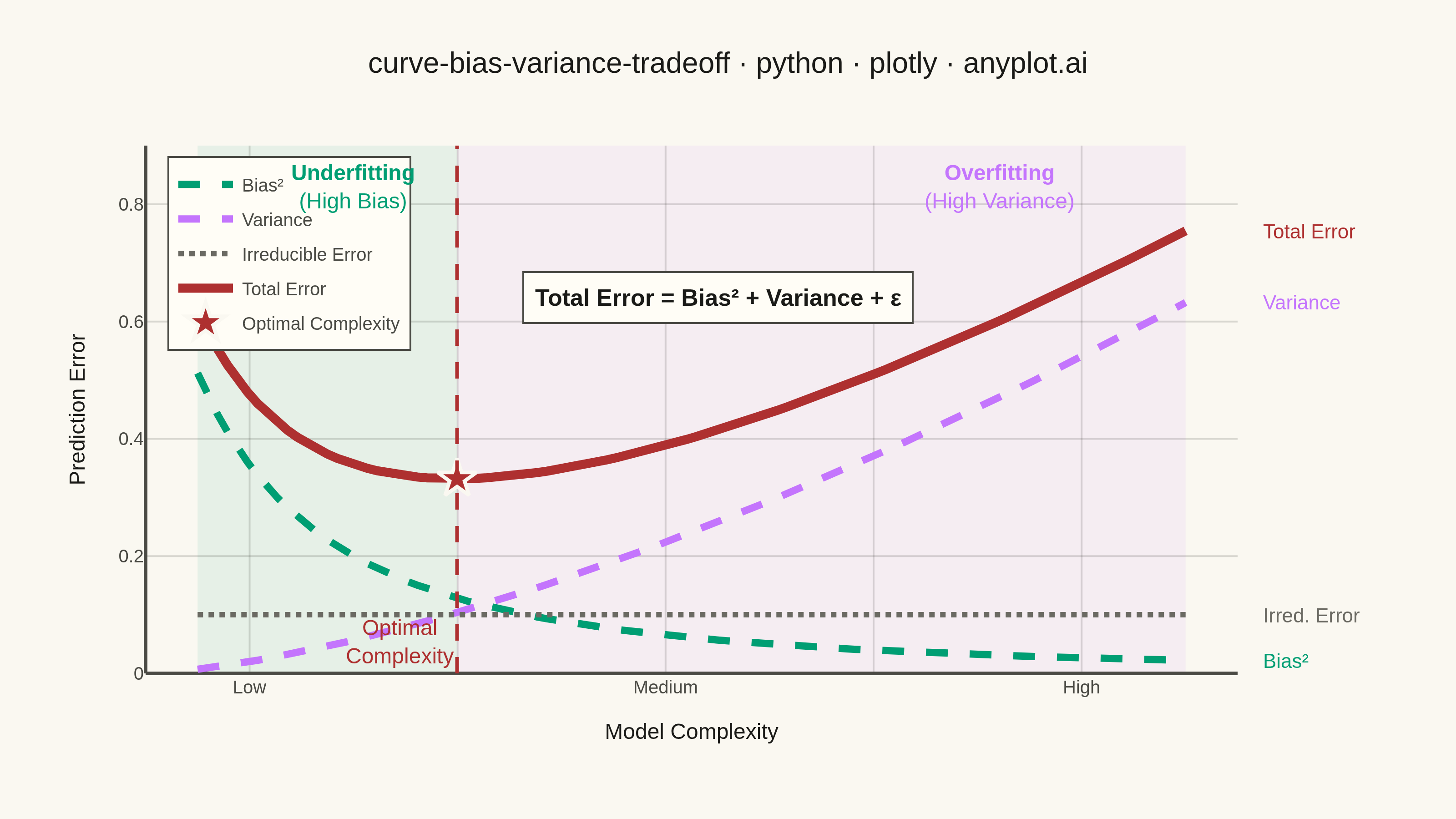
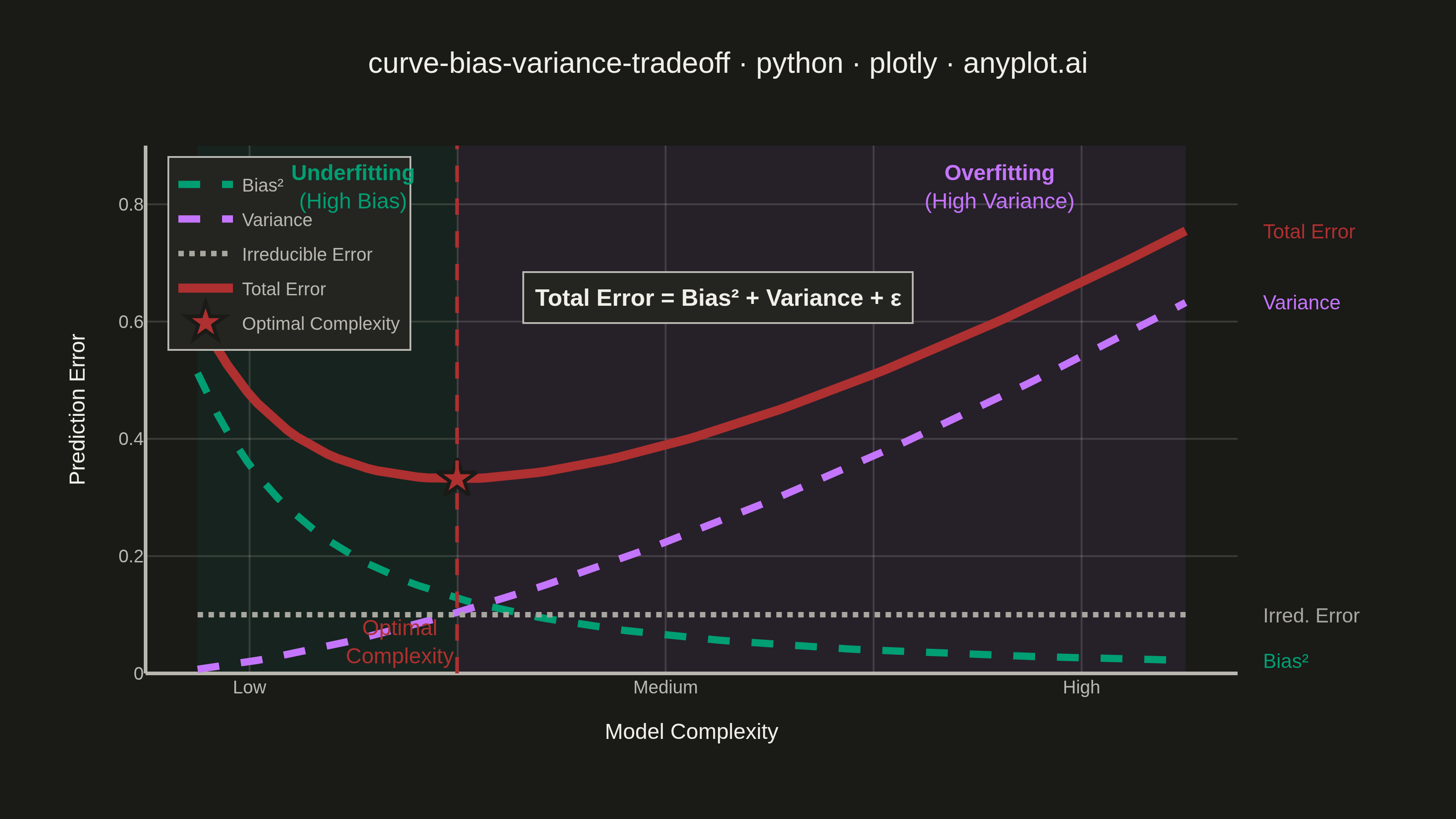
A theoretical visualization of the bias-variance tradeoff showing how total prediction error decomposes into bias squared, variance, and irreducible noise as a function of model complexity. The plot displays multiple curves: bias squared (decreasing with complexity), variance (increasing with complexity), irreducible error (constant), and total error (U-shaped). This is one of the most fundamental conceptual plots in machine learning for understanding model selection, overfitting, and underfitting.
""" anyplot.ai
curve-bias-variance-tradeoff: Bias-Variance Tradeoff Curve
Library: plotly 6.7.0 | Python 3.13.13
Quality: 91/100 | Updated: 2026-05-28
"""

import os

import numpy as np
import plotly.graph_objects as go


# Theme
THEME = os.getenv("ANYPLOT_THEME", "light")
PAGE_BG = "#FAF8F1" if THEME == "light" else "#1A1A17"
ELEVATED_BG = "#FFFDF6" if THEME == "light" else "#242420"
INK = "#1A1A17" if THEME == "light" else "#F0EFE8"
INK_SOFT = "#4A4A44" if THEME == "light" else "#B8B7B0"
INK_MUTED = "#6B6A63" if THEME == "light" else "#A8A79F"
GRID = "rgba(26,26,23,0.15)" if THEME == "light" else "rgba(240,239,232,0.15)"

# Imprint palette assignments
BIAS_COLOR = "#009E73"  # position 1 — first series (brand green)
VARIANCE_COLOR = "#C475FD"  # position 2 — lavender
IRRED_COLOR = INK_MUTED  # semantic muted — baseline noise floor
TOTAL_COLOR = "#AE3030"  # semantic red — total error (bad/loss)

# Data — theoretical bias-variance decomposition
complexity = np.linspace(0.5, 10, 100)
bias_squared = 0.8 / (1 + 0.5 * complexity) ** 2
variance = 0.02 * complexity**1.5
irreducible_error = np.full_like(complexity, 0.1)
total_error = bias_squared + variance + irreducible_error

optimal_idx = np.argmin(total_error)
optimal_complexity = complexity[optimal_idx]
optimal_error = total_error[optimal_idx]

# Figure
fig = go.Figure()

# Shaded underfitting / overfitting zones
fig.add_vrect(x0=0.5, x1=optimal_complexity, fillcolor="rgba(0,158,115,0.08)", layer="below", line_width=0)
fig.add_vrect(x0=optimal_complexity, x1=10, fillcolor="rgba(196,117,253,0.08)", layer="below", line_width=0)

# Curves
fig.add_trace(
    go.Scatter(
        x=complexity, y=bias_squared, mode="lines", name="Bias²", line=dict(color=BIAS_COLOR, width=4, dash="dash")
    )
)
fig.add_trace(
    go.Scatter(
        x=complexity, y=variance, mode="lines", name="Variance", line=dict(color=VARIANCE_COLOR, width=4, dash="dash")
    )
)
fig.add_trace(
    go.Scatter(
        x=complexity,
        y=irreducible_error,
        mode="lines",
        name="Irreducible Error",
        line=dict(color=IRRED_COLOR, width=3, dash="dot"),
    )
)
fig.add_trace(
    go.Scatter(x=complexity, y=total_error, mode="lines", name="Total Error", line=dict(color=TOTAL_COLOR, width=5))
)

# Optimal complexity marker
fig.add_trace(
    go.Scatter(
        x=[optimal_complexity],
        y=[optimal_error],
        mode="markers",
        name="Optimal Complexity",
        marker=dict(color=TOTAL_COLOR, size=16, symbol="star", line=dict(color=PAGE_BG, width=2)),
    )
)

# Vertical line at optimal point
fig.add_vline(
    x=optimal_complexity,
    line=dict(color=TOTAL_COLOR, width=2, dash="dash"),
    annotation_text="Optimal<br>Complexity",
    annotation_position="bottom left",
    annotation_font=dict(size=12, color=TOTAL_COLOR),
)

# Zone labels — separated horizontally from the top-left legend
fig.add_annotation(
    x=2.0, y=0.83, text="<b>Underfitting</b><br>(High Bias)", showarrow=False, font=dict(size=12, color=BIAS_COLOR)
)
fig.add_annotation(
    x=8.2,
    y=0.83,
    text="<b>Overfitting</b><br>(High Variance)",
    showarrow=False,
    font=dict(size=12, color=VARIANCE_COLOR),
)

# Formula annotation — centered below zone labels in a clear area
fig.add_annotation(
    x=5.5,
    y=0.64,
    text="<b>Total Error = Bias² + Variance + ε</b>",
    showarrow=False,
    font=dict(size=13, color=INK),
    bgcolor=ELEVATED_BG,
    bordercolor=INK_SOFT,
    borderwidth=1,
    borderpad=6,
)

# Direct curve labels at the right edge of each curve
_y_bias = float(bias_squared[-1])
_y_var = float(variance[-1])
_y_irred = float(irreducible_error[-1])
_y_total = float(total_error[-1])

fig.add_annotation(
    x=1.02,
    xref="paper",
    y=_y_total,
    yref="y",
    text="Total Error",
    showarrow=False,
    xanchor="left",
    font=dict(size=11, color=TOTAL_COLOR),
)
fig.add_annotation(
    x=1.02,
    xref="paper",
    y=_y_var,
    yref="y",
    text="Variance",
    showarrow=False,
    xanchor="left",
    font=dict(size=11, color=VARIANCE_COLOR),
)
fig.add_annotation(
    x=1.02,
    xref="paper",
    y=_y_irred,
    yref="y",
    text="Irred. Error",
    showarrow=False,
    xanchor="left",
    font=dict(size=11, color=IRRED_COLOR),
)
fig.add_annotation(
    x=1.02,
    xref="paper",
    y=_y_bias,
    yref="y",
    text="Bias²",
    showarrow=False,
    xanchor="left",
    font=dict(size=11, color=BIAS_COLOR),
)

title = "curve-bias-variance-tradeoff · python · plotly · anyplot.ai"

fig.update_layout(
    autosize=False,
    paper_bgcolor=PAGE_BG,
    plot_bgcolor=PAGE_BG,
    font=dict(color=INK),
    title=dict(text=title, font=dict(size=16, color=INK), x=0.5, xanchor="center"),
    xaxis=dict(
        title=dict(text="Model Complexity", font=dict(size=12, color=INK)),
        tickfont=dict(size=10, color=INK_SOFT),
        tickvals=[1, 3, 5, 7, 9],
        ticktext=["Low", "", "Medium", "", "High"],
        range=[0, 10.5],
        showgrid=True,
        gridcolor=GRID,
        gridwidth=1,
        linecolor=INK_SOFT,
        zerolinecolor=INK_SOFT,
        showline=False,
        mirror=False,
    ),
    yaxis=dict(
        title=dict(text="Prediction Error", font=dict(size=12, color=INK)),
        tickfont=dict(size=10, color=INK_SOFT),
        range=[0, 0.9],
        showgrid=True,
        gridcolor=GRID,
        gridwidth=1,
        linecolor=INK_SOFT,
        zerolinecolor=INK_SOFT,
        showline=False,
        mirror=False,
    ),
    legend=dict(
        x=0.02,
        y=0.98,
        xanchor="left",
        yanchor="top",
        font=dict(size=10, color=INK_SOFT),
        bgcolor=ELEVATED_BG,
        bordercolor=INK_SOFT,
        borderwidth=1,
    ),
    margin=dict(l=80, r=120, t=80, b=80),
)

fig.write_image(f"plot-{THEME}.png", width=800, height=450, scale=4)
fig.write_html(f"plot-{THEME}.html", include_plotlyjs="cdn")
Runnable source as JSON, for any HTTP client: https://api.anyplot.ai/specs/curve-bias-variance-tradeoff/plotly/code. Any spec id and library id listed in llms-full.txt fit the same URL shape; every URL below is complete and callable.
{
  "spec_id": "curve-bias-variance-tradeoff",
  "language": "python",
  "library": "plotly",
  "page": "https://anyplot.ai/curve-bias-variance-tradeoff/python/plotly",
  "hub": "https://anyplot.ai/curve-bias-variance-tradeoff",
  "code_json": "https://api.anyplot.ai/specs/curve-bias-variance-tradeoff/plotly/code",
  "spec_json": "https://api.anyplot.ai/specs/curve-bias-variance-tradeoff",
  "render_light_png": "https://storage.googleapis.com/anyplot-images/plots/curve-bias-variance-tradeoff/python/plotly/plot-light.png",
  "render_dark_png": "https://storage.googleapis.com/anyplot-images/plots/curve-bias-variance-tradeoff/python/plotly/plot-dark.png",
  "interactive_light_html": "https://storage.googleapis.com/anyplot-images/plots/curve-bias-variance-tradeoff/python/plotly/plot-light.html",
  "interactive_dark_html": "https://storage.googleapis.com/anyplot-images/plots/curve-bias-variance-tradeoff/python/plotly/plot-dark.html",
  "quality_score": 91.0,
  "license": "MIT",
  "guide": "https://anyplot.ai/llms.txt"
}
Part of Bias-Variance Tradeoff Curve on anyplot.ai.