The same plot in 14 other libraries — Python: Altair, Bokeh, lets-plot, Matplotlib, Plotly, Pygal, Seaborn; R: ggplot2; Julia: Makie.jl; JavaScript: Chart.js, D3.js, Apache ECharts, Highcharts, MUI X Charts. Compare all 15 side by side: Bias-Variance Tradeoff Curve in Python, R, Julia and JavaScript.
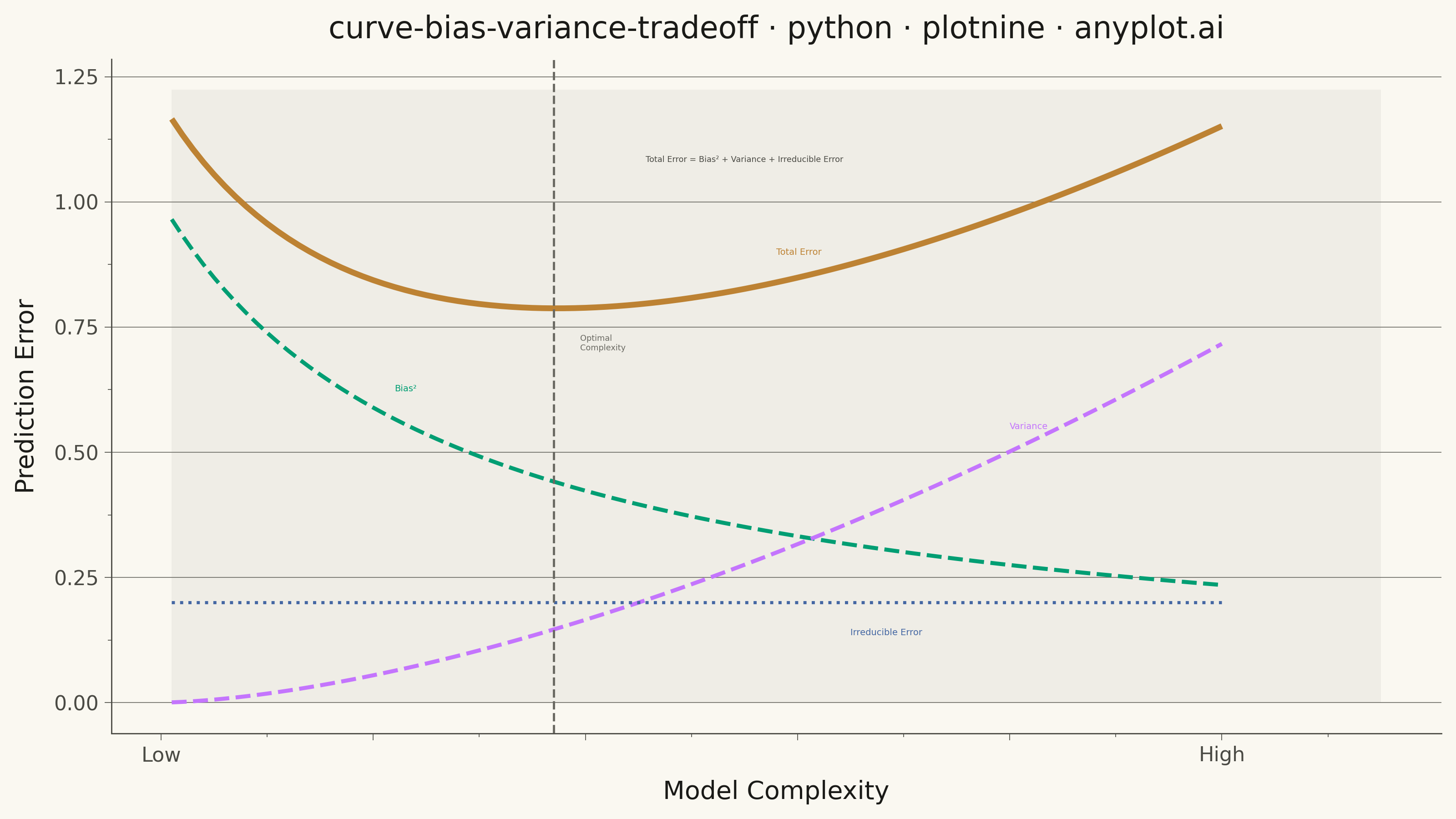
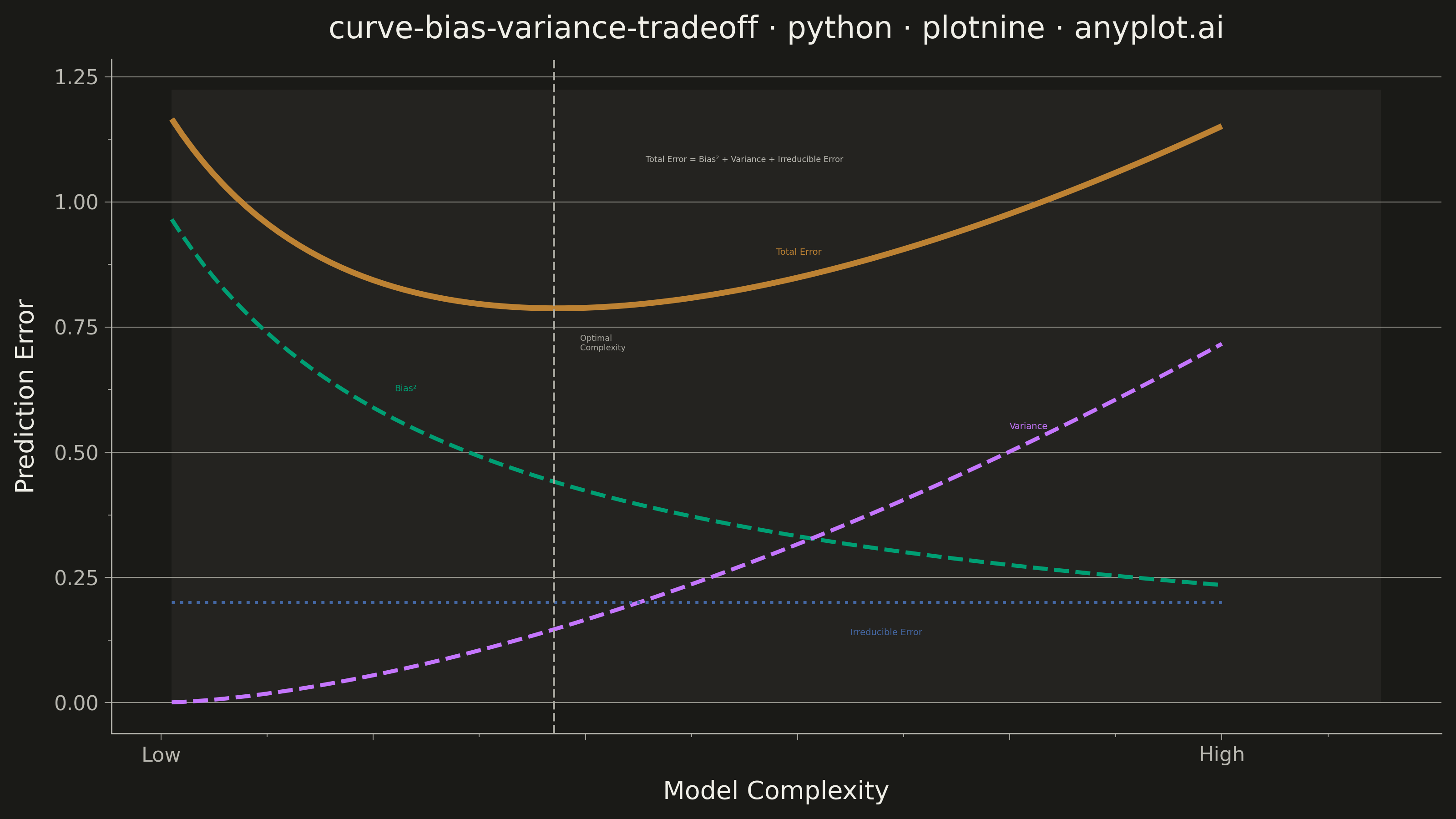
A theoretical visualization of the bias-variance tradeoff showing how total prediction error decomposes into bias squared, variance, and irreducible noise as a function of model complexity. The plot displays multiple curves: bias squared (decreasing with complexity), variance (increasing with complexity), irreducible error (constant), and total error (U-shaped). This is one of the most fundamental conceptual plots in machine learning for understanding model selection, overfitting, and underfitting.
""" anyplot.ai
curve-bias-variance-tradeoff: Bias-Variance Tradeoff Curve
Library: plotnine 0.15.4 | Python 3.13.13
Quality: 88/100 | Created: 2026-05-28
"""

import os

import numpy as np
import pandas as pd
from plotnine import (
    aes,
    element_blank,
    element_line,
    element_rect,
    element_text,
    geom_line,
    geom_rect,
    geom_text,
    geom_vline,
    ggplot,
    labs,
    scale_color_manual,
    scale_linetype_manual,
    scale_size_manual,
    scale_x_continuous,
    scale_y_continuous,
    theme,
)


THEME = os.getenv("ANYPLOT_THEME", "light")
PAGE_BG = "#FAF8F1" if THEME == "light" else "#1A1A17"
ELEVATED_BG = "#FFFDF6" if THEME == "light" else "#242420"
INK = "#1A1A17" if THEME == "light" else "#F0EFE8"
INK_SOFT = "#4A4A44" if THEME == "light" else "#B8B7B0"
INK_MUTED = "#6B6A63" if THEME == "light" else "#A8A79F"

IMPRINT_PALETTE = ["#009E73", "#C475FD", "#4467A3", "#BD8233"]

# Data
complexity = np.linspace(0.1, 10, 100)
n = len(complexity)
irreducible = 0.20
bias_sq = 1.0 / (1.0 + complexity * 0.4) ** 0.9
variance = 0.018 * complexity**1.6
total_error = bias_sq + variance + irreducible

opt_idx = int(np.argmin(total_error))
opt_x = float(complexity[opt_idx])
opt_y = float(total_error[opt_idx])
y_max = float(np.max(total_error))

series_order = ["Bias²", "Variance", "Irreducible Error", "Total Error"]

df = pd.DataFrame(
    {
        "complexity": np.tile(complexity, 4),
        "error": np.concatenate([bias_sq, variance, np.full(n, irreducible), total_error]),
        "component": pd.Categorical(
            ["Bias²"] * n + ["Variance"] * n + ["Irreducible Error"] * n + ["Total Error"] * n, categories=series_order
        ),
    }
)

colors = dict(zip(series_order, IMPRINT_PALETTE, strict=False))
linetypes = {"Bias²": "dashed", "Variance": "dashed", "Irreducible Error": "dotted", "Total Error": "solid"}
line_sizes = {"Bias²": 0.9, "Variance": 0.9, "Irreducible Error": 0.7, "Total Error": 1.3}


def y_at(arr, x_val):
    idx = min(int(np.searchsorted(complexity, x_val)), n - 1)
    return float(arr[idx])


# Shaded underfitting (left) / overfitting (right) zones
zone_df = pd.DataFrame(
    {"xmin": [0.1, opt_x], "xmax": [opt_x, 11.5], "ymin": [0.0, 0.0], "ymax": [y_max * 1.05, y_max * 1.05]}
)

# Direct curve labels at well-separated positions
curve_label_df = pd.DataFrame(
    {
        "x": [2.2, 8.0, 6.5, 5.8],
        "y": [y_at(bias_sq, 2.2) + 0.06, y_at(variance, 8.0) + 0.05, irreducible - 0.06, y_at(total_error, 5.8) + 0.06],
        "label": ["Bias²", "Variance", "Irreducible Error", "Total Error"],
        "component": pd.Categorical(["Bias²", "Variance", "Irreducible Error", "Total Error"], categories=series_order),
    }
)

opt_label_df = pd.DataFrame({"x": [opt_x + 0.25], "y": [opt_y - 0.07], "label": ["Optimal\nComplexity"]})

formula_df = pd.DataFrame(
    {"x": [5.5], "y": [y_max * 0.93], "label": ["Total Error = Bias² + Variance + Irreducible Error"]}
)

title = "curve-bias-variance-tradeoff · python · plotnine · anyplot.ai"

anyplot_theme = theme(
    figure_size=(8, 4.5),
    plot_background=element_rect(fill=PAGE_BG, color=PAGE_BG),
    panel_background=element_rect(fill=PAGE_BG),
    panel_grid_major_y=element_line(color=INK_MUTED, size=0.3),
    panel_grid_major_x=element_blank(),
    panel_grid_minor=element_blank(),
    panel_border=element_blank(),
    axis_line=element_line(color=INK_SOFT, size=0.5),
    axis_ticks=element_line(color=INK_SOFT, size=0.3),
    axis_title=element_text(color=INK, size=10),
    axis_text=element_text(color=INK_SOFT, size=8),
    plot_title=element_text(color=INK, size=12),
    legend_position="none",
)

# Plot
plot = (
    ggplot(df, aes(x="complexity", y="error", color="component", linetype="component", size="component"))
    + geom_rect(
        data=zone_df,
        mapping=aes(xmin="xmin", xmax="xmax", ymin="ymin", ymax="ymax"),
        fill=INK_MUTED,
        alpha=0.07,
        inherit_aes=False,
    )
    + geom_line()
    + geom_vline(xintercept=opt_x, color=INK_MUTED, linetype="dashed", size=0.5, inherit_aes=False)
    + geom_text(
        data=curve_label_df,
        mapping=aes(x="x", y="y", label="label", color="component"),
        size=3.5,
        ha="left",
        inherit_aes=False,
    )
    + geom_text(
        data=opt_label_df,
        mapping=aes(x="x", y="y", label="label"),
        color=INK_MUTED,
        size=3.2,
        ha="left",
        inherit_aes=False,
    )
    + geom_text(
        data=formula_df,
        mapping=aes(x="x", y="y", label="label"),
        color=INK_SOFT,
        size=3.2,
        ha="center",
        inherit_aes=False,
    )
    + scale_color_manual(values=colors)
    + scale_linetype_manual(values=linetypes)
    + scale_size_manual(values=line_sizes)
    + scale_x_continuous(
        name="Model Complexity", breaks=[0, 2, 4, 6, 8, 10], labels=["Low", "", "", "", "", "High"], limits=(0.1, 11.5)
    )
    + scale_y_continuous(name="Prediction Error", limits=(0.0, y_max * 1.05))
    + labs(title=title)
    + anyplot_theme
)

# Save
plot.save(f"plot-{THEME}.png", dpi=400, width=8, height=4.5, units="in")
Runnable source as JSON, for any HTTP client: https://api.anyplot.ai/specs/curve-bias-variance-tradeoff/plotnine/code. Any spec id and library id listed in llms-full.txt fit the same URL shape; every URL below is complete and callable.
{
  "spec_id": "curve-bias-variance-tradeoff",
  "language": "python",
  "library": "plotnine",
  "page": "https://anyplot.ai/curve-bias-variance-tradeoff/python/plotnine",
  "hub": "https://anyplot.ai/curve-bias-variance-tradeoff",
  "code_json": "https://api.anyplot.ai/specs/curve-bias-variance-tradeoff/plotnine/code",
  "spec_json": "https://api.anyplot.ai/specs/curve-bias-variance-tradeoff",
  "render_light_png": "https://storage.googleapis.com/anyplot-images/plots/curve-bias-variance-tradeoff/python/plotnine/plot-light.png",
  "render_dark_png": "https://storage.googleapis.com/anyplot-images/plots/curve-bias-variance-tradeoff/python/plotnine/plot-dark.png",
  "quality_score": 88.0,
  "license": "MIT",
  "guide": "https://anyplot.ai/llms.txt"
}
Part of Bias-Variance Tradeoff Curve on anyplot.ai.