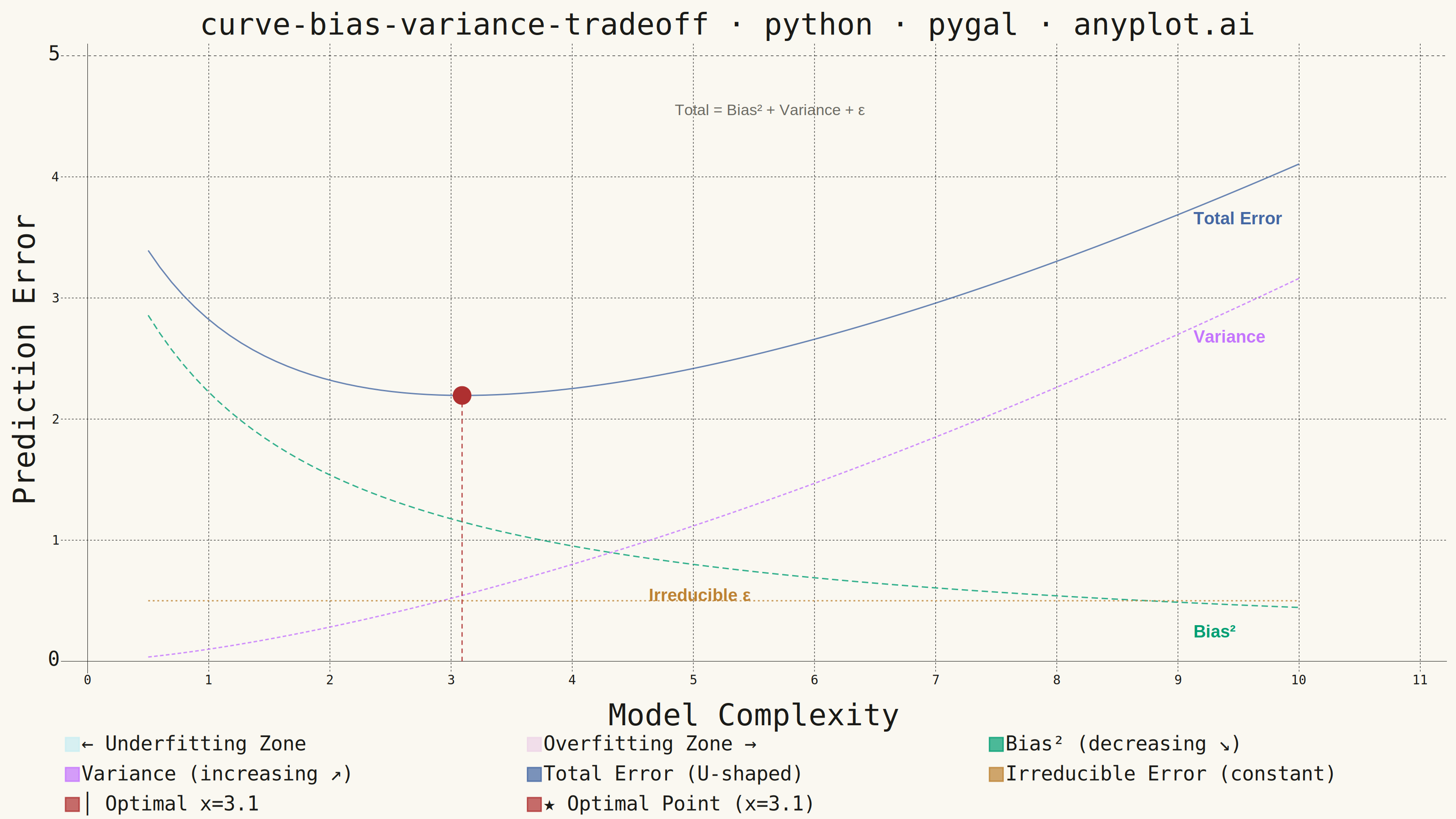
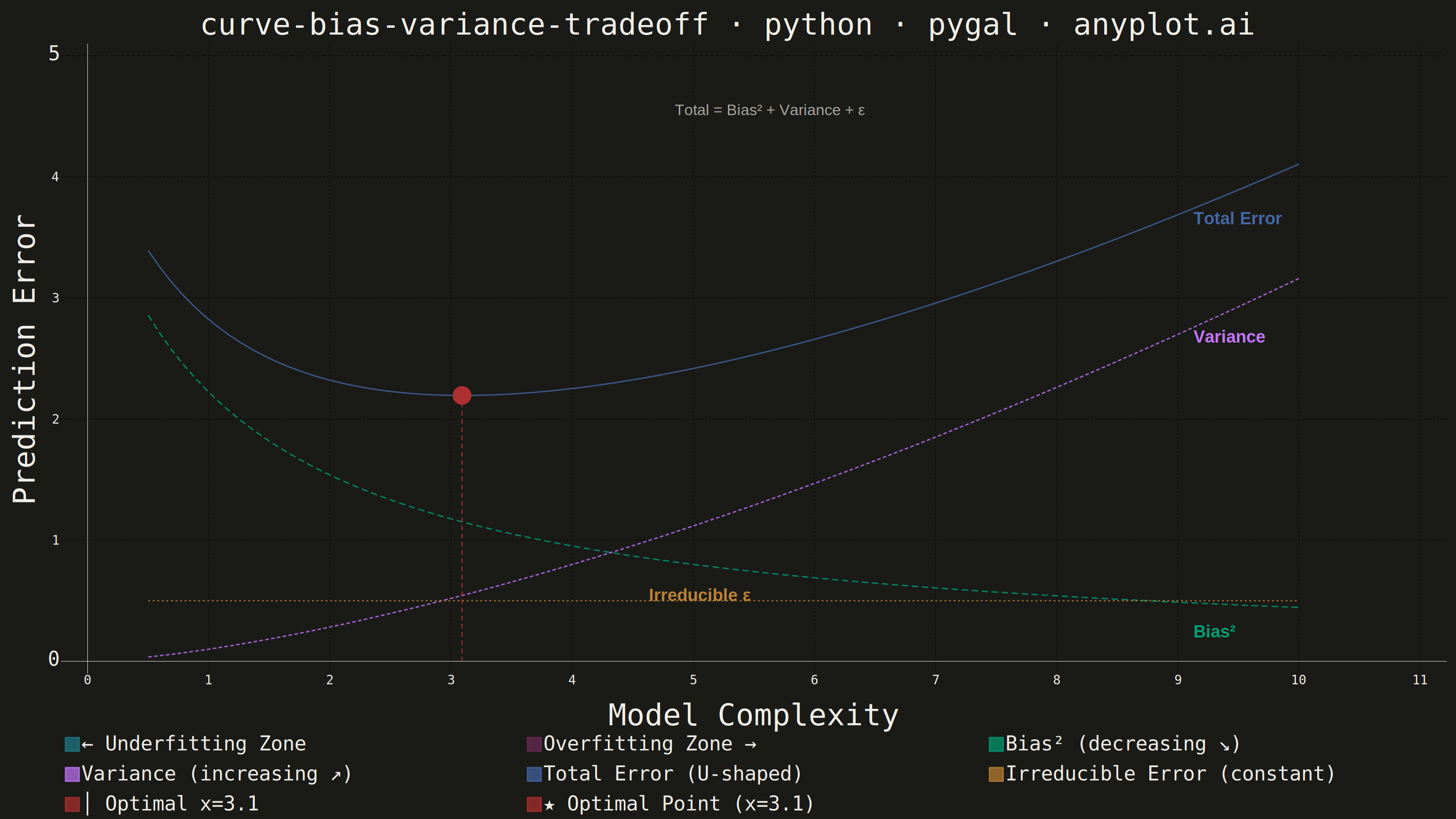
A theoretical visualization of the bias-variance tradeoff showing how total prediction error decomposes into bias squared, variance, and irreducible noise as a function of model complexity. The plot displays multiple curves: bias squared (decreasing with complexity), variance (increasing with complexity), irreducible error (constant), and total error (U-shaped). This is one of the most fundamental conceptual plots in machine learning for understanding model selection, overfitting, and underfitting.
""" anyplot.ai
curve-bias-variance-tradeoff: Bias-Variance Tradeoff Curve
Library: pygal 3.1.0 | Python 3.13.13
Quality: 83/100 | Updated: 2026-05-28
"""

import os

import cairosvg
import numpy as np
import pygal
from pygal.style import Style


THEME = os.getenv("ANYPLOT_THEME", "light")
PAGE_BG = "#FAF8F1" if THEME == "light" else "#1A1A17"
INK = "#1A1A17" if THEME == "light" else "#F0EFE8"
INK_MUTED = "#6B6A63" if THEME == "light" else "#A8A79F"

# Theme-adaptive zone colors: pastel tints in light mode, vivid mid-tones in dark mode
ZONE_LEFT = "#C8EDF2" if THEME == "light" else "#1E7D8A"  # cyan underfitting zone
ZONE_RIGHT = "#EDD4E7" if THEME == "light" else "#6B2A56"  # rose overfitting zone

# Data
np.random.seed(42)
complexity = np.linspace(0.5, 10, 100)
bias_squared = 4.0 / (1 + 0.8 * complexity)
variance = 0.1 * complexity**1.5
irreducible_error = np.full_like(complexity, 0.5)
total_error = bias_squared + variance + irreducible_error

optimal_idx = int(np.argmin(total_error))
optimal_complexity = float(complexity[optimal_idx])
optimal_error = float(total_error[optimal_idx])

title = "curve-bias-variance-tradeoff · python · pygal · anyplot.ai"

# Series order: zones (0,1) → Bias² (2=green) → Variance (3) → Total (4) → Irred (5) → vert line (6=red) → point (7=red)
custom_style = Style(
    background=PAGE_BG,
    plot_background=PAGE_BG,
    foreground=INK,
    foreground_strong=INK,
    foreground_subtle=INK_MUTED,
    colors=(ZONE_LEFT, ZONE_RIGHT, "#009E73", "#C475FD", "#4467A3", "#BD8233", "#AE3030", "#AE3030"),
    title_font_size=66,
    label_font_size=28,  # Reduced from 44 to prevent y_title overflow at current canvas size
    major_label_font_size=44,
    legend_font_size=44,
    value_font_size=36,
    stroke_width=3,
)

chart = pygal.XY(
    width=3200,
    height=1800,
    style=custom_style,
    title=title,
    x_title="Model Complexity",
    y_title="Prediction Error",
    show_dots=False,
    show_x_guides=True,
    show_y_guides=True,
    legend_at_bottom=True,
    legend_box_size=30,
    truncate_legend=-1,
    range=(0, 5.0),
    xrange=(0, 11),
    print_values=False,
)

# Zone fills — flat lines at y=5 with fill=True create shaded background rectangles
underfitting_fill = [(0.0, 5.0)] + [(float(x), 5.0) for x in complexity[: optimal_idx + 1]]
overfitting_fill = [(float(x), 5.0) for x in complexity[optimal_idx:]] + [(11.0, 5.0)]
chart.add("← Underfitting Zone", underfitting_fill, fill=True, stroke=False, show_dots=False)
chart.add("Overfitting Zone →", overfitting_fill, fill=True, stroke=False, show_dots=False)

# Main curves (palette positions 2–5: green, lavender, blue, ochre)
bias_data = [(float(x), float(y)) for x, y in zip(complexity, bias_squared, strict=True)]
variance_data = [(float(x), float(y)) for x, y in zip(complexity, variance, strict=True)]
total_data = [(float(x), float(y)) for x, y in zip(complexity, total_error, strict=True)]
irreducible_data = [(float(x), float(y)) for x, y in zip(complexity, irreducible_error, strict=True)]

chart.add("Bias² (decreasing ↘)", bias_data, stroke_style={"width": 7, "dasharray": "14, 8"}, show_dots=False)
chart.add("Variance (increasing ↗)", variance_data, stroke_style={"width": 7, "dasharray": "8, 5"}, show_dots=False)
chart.add("Total Error (U-shaped)", total_data, stroke_style={"width": 9}, show_dots=False)
chart.add(
    "Irreducible Error (constant)", irreducible_data, stroke_style={"width": 6, "dasharray": "4, 6"}, show_dots=False
)

# Vertical dashed line from y=0 to optimal error at the optimal complexity point
vertical_line = [(optimal_complexity, 0.0), (optimal_complexity, optimal_error)]
chart.add(
    f"│ Optimal x={optimal_complexity:.1f}",
    vertical_line,
    stroke_style={"width": 4, "dasharray": "10, 8"},
    show_dots=False,
)

# Optimal point marker (palette position 7: #AE3030 semantic red)
optimal_point = [
    {
        "value": (optimal_complexity, optimal_error),
        "label": f"Optimal: x={optimal_complexity:.1f}, err={optimal_error:.2f}",
    }
]
chart.add(f"★ Optimal Point (x={optimal_complexity:.1f})", optimal_point, show_dots=True, dots_size=20, stroke=False)

# Get SVG output for annotation post-processing
svg_bytes = chart.render()

# Add direct curve annotations via SVG text elements.
# Coordinate mapping for pygal 3200×1800 with legend_at_bottom:
#   chart left ≈230px (y-title + tick labels), right ≈3155px, top ≈175px, bottom ≈1490px
CHART_LEFT, CHART_RIGHT = 230, 3155
CHART_TOP, CHART_BOTTOM = 175, 1490
CHART_W = CHART_RIGHT - CHART_LEFT
CHART_H = CHART_BOTTOM - CHART_TOP
X_MIN, X_MAX = 0.0, 11.0
Y_MIN, Y_MAX = 0.0, 5.0


def to_px(x_d: float, y_d: float) -> tuple[int, int]:
    xp = int(CHART_LEFT + (x_d - X_MIN) / (X_MAX - X_MIN) * CHART_W)
    yp = int(CHART_BOTTOM - (y_d - Y_MIN) / (Y_MAX - Y_MIN) * CHART_H)
    return xp, yp


# Compute annotation positions at x=9.0 (near right end of curves)
x_ann = 9.0
b_y = 4.0 / (1 + 0.8 * x_ann)  # ~0.465
v_y = 0.1 * x_ann**1.5  # ~2.927
t_y = b_y + v_y + 0.5  # ~3.892

ann_font = 38
ann_style = f"font-family: Arial, sans-serif; font-size: {ann_font}px; font-weight: bold;"

svg_str = svg_bytes.decode("utf-8")
text_elements = []

# Formula annotation at top of chart area (spec requirement: show Total = Bias² + Variance + ε)
formula_style = f"font-family: Arial, sans-serif; font-size: 34px; fill: {INK_MUTED};"
fx, fy = to_px(5.5, 4.70)
text_elements.append(
    f'<text x="{fx}" y="{fy}" text-anchor="middle" style="{formula_style}">Total = Bias² + Variance + ε</text>'
)

# Total Error — above the highest curve at x=9
tx, ty = to_px(x_ann, t_y + 0.10)
text_elements.append(f'<text x="{tx}" y="{ty}" style="{ann_style} fill: #4467A3;">Total Error</text>')
# Variance label — above the variance curve
tx, ty = to_px(x_ann, v_y + 0.10)
text_elements.append(f'<text x="{tx}" y="{ty}" style="{ann_style} fill: #C475FD;">Variance</text>')
# Bias² label — below the bias curve at x=9 (near bottom right)
tx, ty = to_px(x_ann, b_y - 0.15)
text_elements.append(f'<text x="{tx}" y="{ty}" style="{ann_style} fill: #009E73;">Bias²</text>')
# Irreducible Error label — placed at x=4.5 to avoid overlap with bias annotation at x=9
tx, ty = to_px(4.5, 0.5 + 0.14)
text_elements.append(f'<text x="{tx}" y="{ty}" style="{ann_style} fill: #BD8233;">Irreducible ε</text>')

svg_str = svg_str.replace("</svg>", "\n".join(text_elements) + "\n</svg>")

# Render modified SVG to PNG with curve annotation text visible in both themes
cairosvg.svg2png(bytestring=svg_str.encode("utf-8"), write_to=f"plot-{THEME}.png")

# Save interactive HTML (unmodified SVG — tooltips serve as annotations in browser)
with open(f"plot-{THEME}.html", "wb") as f:
    f.write(svg_bytes)
Runnable source as JSON, for any HTTP client: https://api.anyplot.ai/specs/curve-bias-variance-tradeoff/pygal/code. Any spec id and library id listed in llms-full.txt fit the same URL shape; every URL below is complete and callable.
{
  "spec_id": "curve-bias-variance-tradeoff",
  "language": "python",
  "library": "pygal",
  "page": "https://anyplot.ai/curve-bias-variance-tradeoff/python/pygal",
  "hub": "https://anyplot.ai/curve-bias-variance-tradeoff",
  "code_json": "https://api.anyplot.ai/specs/curve-bias-variance-tradeoff/pygal/code",
  "spec_json": "https://api.anyplot.ai/specs/curve-bias-variance-tradeoff",
  "render_light_png": "https://storage.googleapis.com/anyplot-images/plots/curve-bias-variance-tradeoff/python/pygal/plot-light.png",
  "render_dark_png": "https://storage.googleapis.com/anyplot-images/plots/curve-bias-variance-tradeoff/python/pygal/plot-dark.png",
  "interactive_light_html": "https://storage.googleapis.com/anyplot-images/plots/curve-bias-variance-tradeoff/python/pygal/plot-light.html",
  "interactive_dark_html": "https://storage.googleapis.com/anyplot-images/plots/curve-bias-variance-tradeoff/python/pygal/plot-dark.html",
  "quality_score": 83.0,
  "license": "MIT",
  "guide": "https://anyplot.ai/llms.txt"
}
Part of Bias-Variance Tradeoff Curve on anyplot.ai.