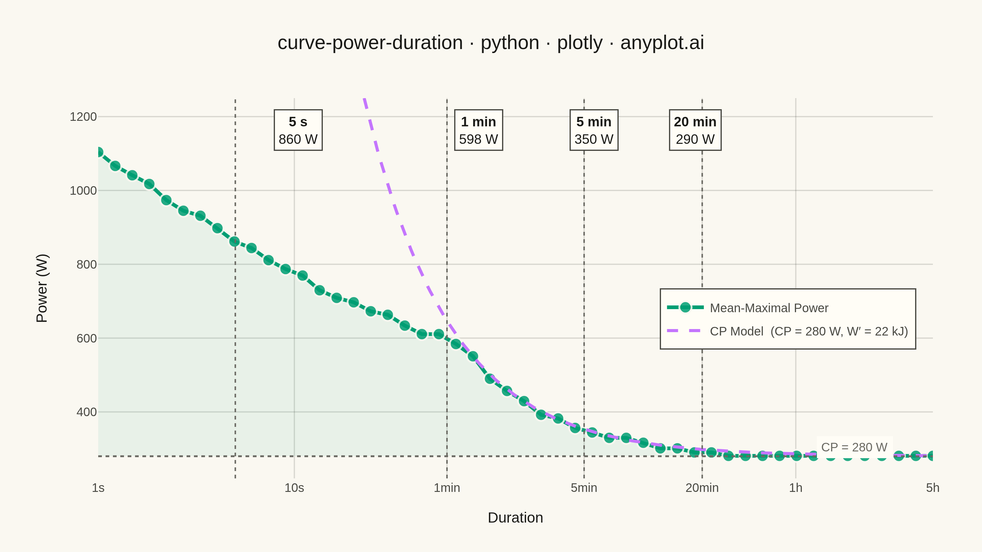
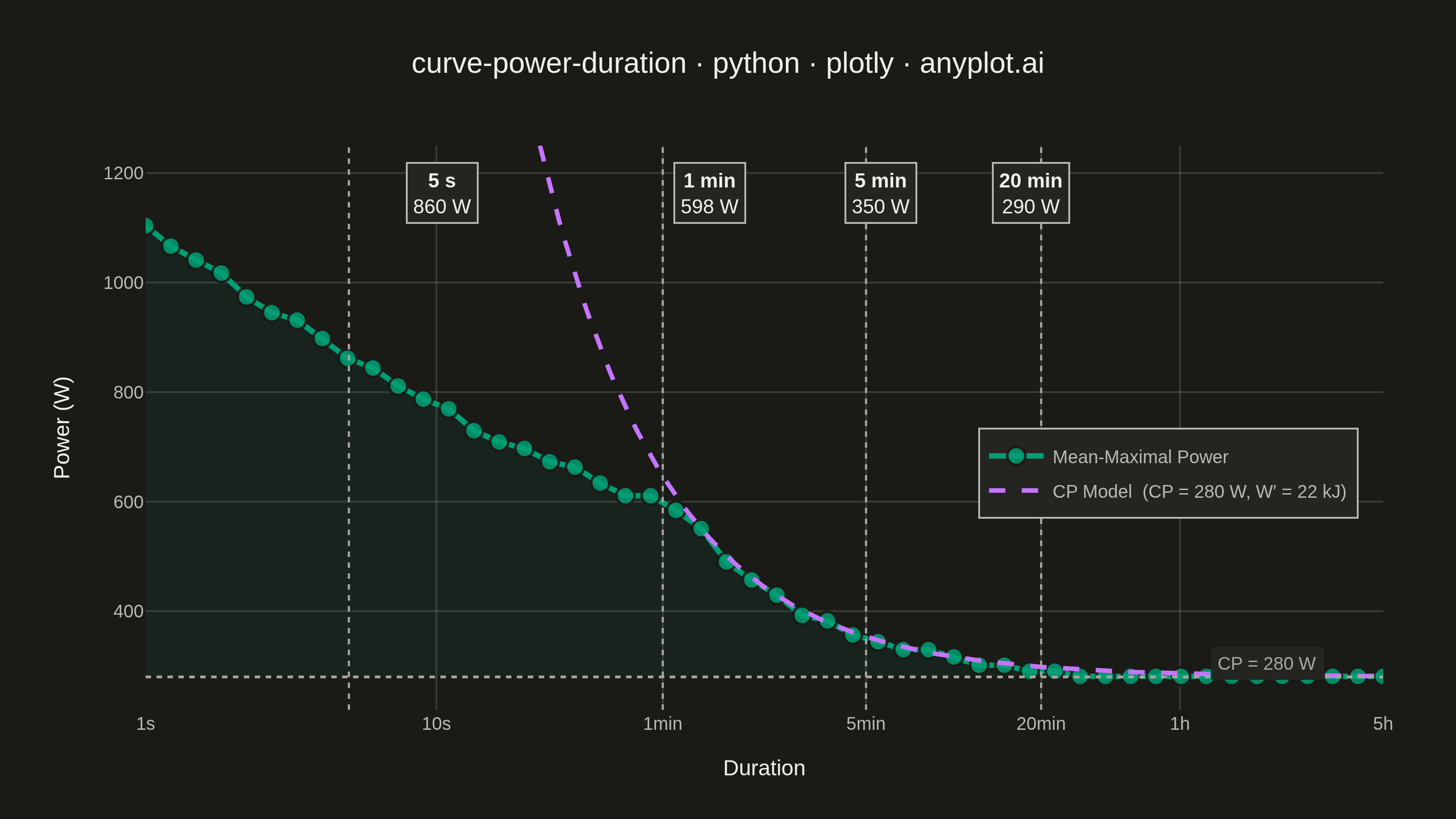
A power duration curve plots an athlete's best mean-maximal power output (watts) against effort duration on a logarithmic time axis spanning roughly 1 second to several hours. Each point answers "what is the highest average power this rider could sustain for exactly this long?", producing a characteristic monotonically decreasing decay curve. A critical power (CP) model is fitted and overlaid, decomposing performance into an aerobic asymptote (CP) and a finite anaerobic work capacity (W′). The chart is a cornerstone of cycling and endurance sports analytics for profiling rider strengths, tracking fitness, and setting training zones.
""" anyplot.ai
curve-power-duration: Mean-Maximal Power Duration Curve
Library: plotly 6.8.0 | Python 3.13.13
Quality: 89/100 | Created: 2026-06-13
"""

import os

import numpy as np
import plotly.graph_objects as go


# Theme tokens
THEME = os.getenv("ANYPLOT_THEME", "light")
PAGE_BG = "#FAF8F1" if THEME == "light" else "#1A1A17"
ELEVATED_BG = "#FFFDF6" if THEME == "light" else "#242420"
INK = "#1A1A17" if THEME == "light" else "#F0EFE8"
INK_SOFT = "#4A4A44" if THEME == "light" else "#B8B7B0"
INK_MUTED = "#6B6A63" if THEME == "light" else "#A8A79F"
GRID = "rgba(26,26,23,0.15)" if THEME == "light" else "rgba(240,239,232,0.15)"

# Imprint palette — first series always #009E73
IMPRINT_PALETTE = ["#009E73", "#C475FD", "#4467A3", "#BD8233", "#AE3030", "#2ABCCD", "#954477", "#99B314"]

# Data — synthetic well-trained cyclist
np.random.seed(42)

CP = 280  # Critical Power in watts (aerobic asymptote)
W_PRIME = 22000  # Anaerobic work capacity in joules
P_1SEC = 1100  # Neuromuscular peak power at 1 s

# Log-spaced test durations: 1 s to 5 hours (50 points)
durations = np.logspace(0, np.log10(18000), 50)

# CP model: P(t) = CP + W′/t  (valid mainly for 2–60 min)
model_power = CP + W_PRIME / durations

# Empirical curve bounded by neuromuscular capacity at short durations
neuro_cap = P_1SEC * (durations**-0.15)
empirical_raw = np.minimum(model_power, neuro_cap)
empirical_raw += np.random.normal(0, 8, len(durations))
# Enforce monotonically non-increasing; keep power above CP floor
empirical_power = np.minimum.accumulate(np.maximum(empirical_raw, CP + 1))

# Smooth model display line
model_t = np.logspace(0, np.log10(18000), 300)
model_display = CP + W_PRIME / model_t

# Reference durations: data values for interpolated empirical power
references = {"5 s": 5, "1 min": 60, "5 min": 300, "20 min": 1200}

# Log10 range for the x-axis (1 s → 18000 s)
LOG_MIN = 0.0
LOG_MAX = float(np.log10(18000))  # ≈ 4.255

# Paper x-coordinate constants (accounts for l=80, r=40 margins on width=800)
_LEFT_FRAC = 80 / 800
_DATA_FRAC = 1.0 - _LEFT_FRAC - 40 / 800

# Title — 49 chars < 67-char baseline, no scaling needed
title = "curve-power-duration · python · plotly · anyplot.ai"
title_fontsize = round(16 * min(1.0, 67 / len(title)))

# X-axis ticks: 7 well-spaced values, no overlap
tick_vals = [1, 10, 60, 300, 1200, 3600, 18000]
tick_text = ["1s", "10s", "1min", "5min", "20min", "1h", "5h"]

# Plot
fig = go.Figure()

# Subtle aerobic zone fill: area between the empirical curve and the CP floor
fig.add_trace(
    go.Scatter(
        x=np.concatenate([durations, durations[::-1]]),
        y=np.concatenate([empirical_power, np.full(len(durations), CP)]),
        fill="toself",
        fillcolor="rgba(0,158,115,0.07)",
        line={"width": 0},
        showlegend=False,
        hoverinfo="skip",
    )
)

# Empirical mean-maximal power curve (primary series — Imprint position 1)
fig.add_trace(
    go.Scatter(
        x=durations,
        y=empirical_power,
        mode="lines+markers",
        name="Mean-Maximal Power",
        line={"color": IMPRINT_PALETTE[0], "width": 3},
        marker={"size": 10, "color": IMPRINT_PALETTE[0], "opacity": 0.85, "line": {"color": PAGE_BG, "width": 1.5}},
    )
)

# CP model fit — dashed (Imprint position 2)
fig.add_trace(
    go.Scatter(
        x=model_t,
        y=model_display,
        mode="lines",
        name=f"CP Model  (CP = {CP} W, W′ = {W_PRIME // 1000} kJ)",
        line={"color": IMPRINT_PALETTE[1], "width": 2.5, "dash": "dash"},
    )
)

# CP asymptote horizontal dotted line
fig.add_hline(y=CP, line={"color": INK_MUTED, "width": 1.5, "dash": "dot"})

# CP label near the right where the curve flattens (paper coords for robustness)
fig.add_annotation(
    x=0.86,
    y=CP + 25,
    xref="paper",
    yref="y",
    text=f"CP = {CP} W",
    showarrow=False,
    font={"size": 10, "color": INK_MUTED},
    bgcolor=ELEVATED_BG,
    borderpad=3,
    xanchor="left",
)

# Reference vertical dotted lines
for dur in references.values():
    fig.add_vline(x=dur, line={"color": INK_MUTED, "width": 1.2, "dash": "dot"})

# Reference annotations using paper x-coordinates to avoid log-axis positioning issues
for label, dur in references.items():
    ref_power = int(np.interp(dur, durations, empirical_power))
    x_paper = _LEFT_FRAC + (np.log10(dur) - LOG_MIN) / (LOG_MAX - LOG_MIN) * _DATA_FRAC
    fig.add_annotation(
        x=x_paper,
        y=0.97,
        xref="paper",
        yref="paper",
        text=f"<b>{label}</b><br>{ref_power} W",
        showarrow=False,
        font={"size": 11, "color": INK},
        bgcolor=ELEVATED_BG,
        bordercolor=INK_SOFT,
        borderwidth=1,
        borderpad=3,
        xanchor="center",
        yanchor="top",
    )

# Layout
fig.update_layout(
    autosize=False,
    paper_bgcolor=PAGE_BG,
    plot_bgcolor=PAGE_BG,
    title={"text": title, "font": {"size": title_fontsize, "color": INK}, "x": 0.5, "xanchor": "center"},
    xaxis={
        "type": "log",
        "range": [LOG_MIN, LOG_MAX],
        "title": {"text": "Duration", "font": {"size": 12, "color": INK}},
        "tickvals": tick_vals,
        "ticktext": tick_text,
        "tickfont": {"size": 10, "color": INK_SOFT},
        "tickangle": 0,
        "gridcolor": GRID,
        "showgrid": True,
        "showline": False,
        "zeroline": False,
    },
    yaxis={
        "range": [220, 1250],
        "title": {"text": "Power (W)", "font": {"size": 12, "color": INK}},
        "tickfont": {"size": 10, "color": INK_SOFT},
        "gridcolor": GRID,
        "showgrid": True,
        "showline": False,
        "zeroline": False,
    },
    legend={
        "bgcolor": ELEVATED_BG,
        "bordercolor": INK_SOFT,
        "borderwidth": 1,
        "font": {"size": 10, "color": INK_SOFT},
        "x": 0.98,
        "xanchor": "right",
        "y": 0.50,
        "yanchor": "top",
    },
    margin={"l": 80, "r": 40, "t": 80, "b": 60},
)

# Save — landscape 3200 × 1800 (width=800, height=450, scale=4)
fig.write_image(f"plot-{THEME}.png", width=800, height=450, scale=4)
fig.write_html(f"plot-{THEME}.html", include_plotlyjs="cdn")
Runnable source as JSON, for any HTTP client: https://api.anyplot.ai/specs/curve-power-duration/plotly/code. Any spec id and library id listed in llms-full.txt fit the same URL shape; every URL below is complete and callable.
{
  "spec_id": "curve-power-duration",
  "language": "python",
  "library": "plotly",
  "page": "https://anyplot.ai/curve-power-duration/python/plotly",
  "hub": "https://anyplot.ai/curve-power-duration",
  "code_json": "https://api.anyplot.ai/specs/curve-power-duration/plotly/code",
  "spec_json": "https://api.anyplot.ai/specs/curve-power-duration",
  "render_light_png": "https://storage.googleapis.com/anyplot-images/plots/curve-power-duration/python/plotly/plot-light.png",
  "render_dark_png": "https://storage.googleapis.com/anyplot-images/plots/curve-power-duration/python/plotly/plot-dark.png",
  "interactive_light_html": "https://storage.googleapis.com/anyplot-images/plots/curve-power-duration/python/plotly/plot-light.html",
  "interactive_dark_html": "https://storage.googleapis.com/anyplot-images/plots/curve-power-duration/python/plotly/plot-dark.html",
  "quality_score": 89.0,
  "license": "MIT",
  "guide": "https://anyplot.ai/llms.txt"
}
Part of Mean-Maximal Power Duration Curve on anyplot.ai.