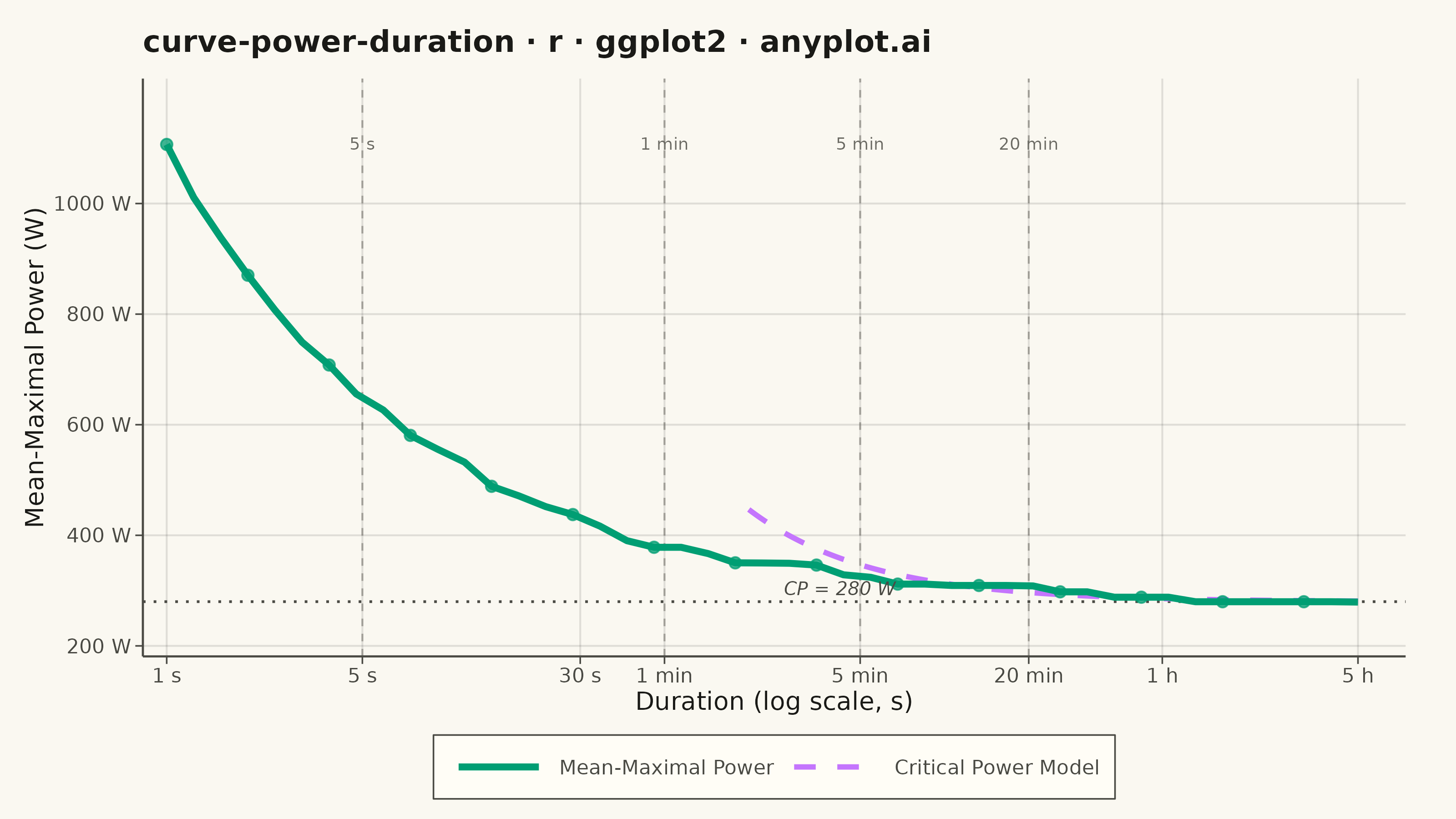
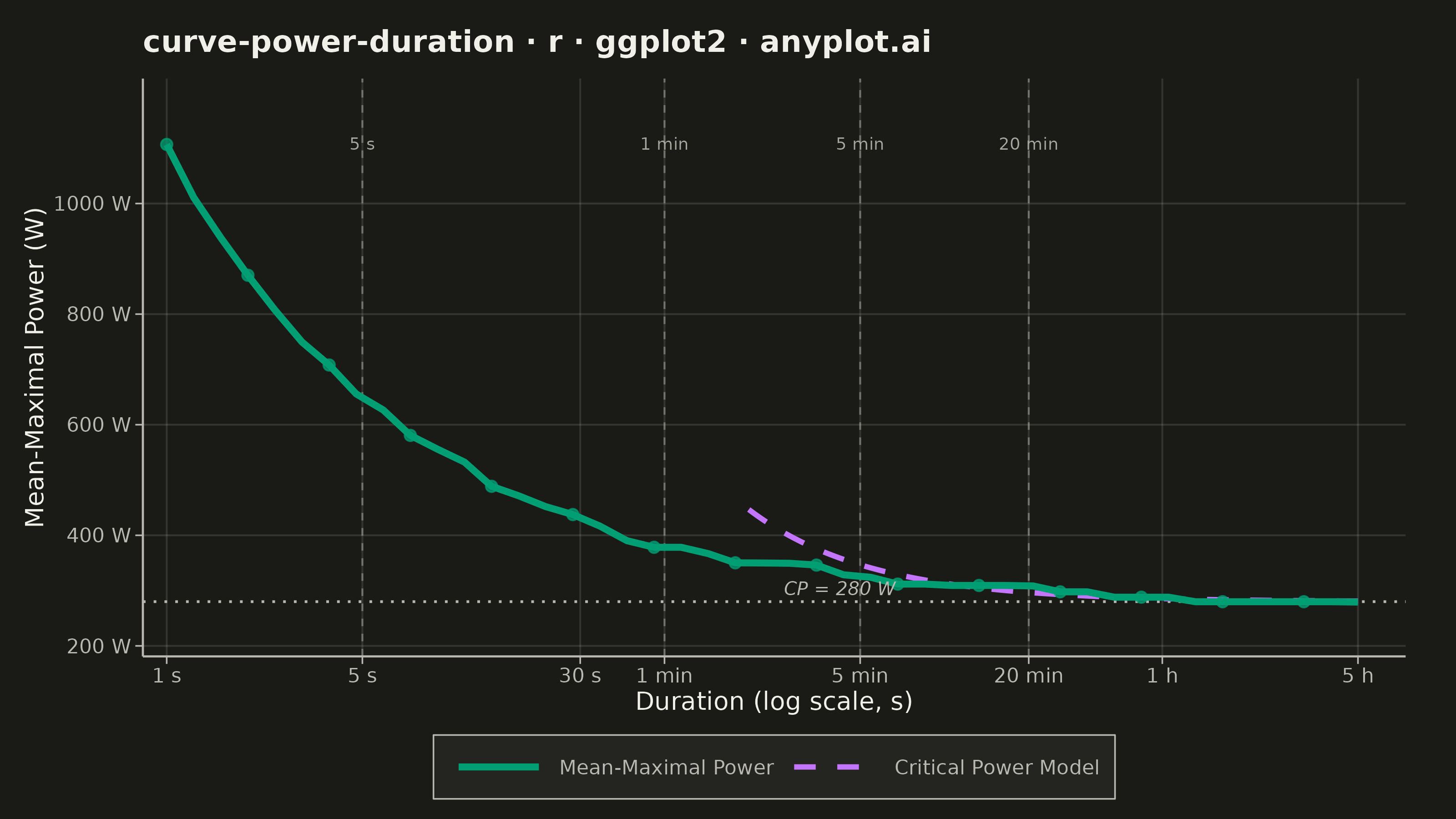
A power duration curve plots an athlete's best mean-maximal power output (watts) against effort duration on a logarithmic time axis spanning roughly 1 second to several hours. Each point answers "what is the highest average power this rider could sustain for exactly this long?", producing a characteristic monotonically decreasing decay curve. A critical power (CP) model is fitted and overlaid, decomposing performance into an aerobic asymptote (CP) and a finite anaerobic work capacity (W′). The chart is a cornerstone of cycling and endurance sports analytics for profiling rider strengths, tracking fitness, and setting training zones.
#' anyplot.ai
#' curve-power-duration: Mean-Maximal Power Duration Curve
#' Library: ggplot2 3.5.1 | R 4.4.1
#' Quality: 88/100 | Created: 2026-06-13

library(ggplot2)
library(ragg)

set.seed(42)

# Theme tokens (Imprint palette — see prompts/default-style-guide.md)
THEME       <- Sys.getenv("ANYPLOT_THEME", "light")
PAGE_BG     <- if (THEME == "light") "#FAF8F1" else "#1A1A17"
ELEVATED_BG <- if (THEME == "light") "#FFFDF6" else "#242420"
INK         <- if (THEME == "light") "#1A1A17" else "#F0EFE8"
INK_SOFT    <- if (THEME == "light") "#4A4A44" else "#B8B7B0"
INK_MUTED   <- if (THEME == "light") "#6B6A63" else "#A8A79F"

IMPRINT_PALETTE <- c(
    "#009E73",  # 1 - brand green  (empirical MMP curve)
    "#C475FD",  # 2 - lavender     (CP model overlay)
    "#4467A3",  # 3 - blue
    "#BD8233",  # 4 - ochre
    "#AE3030",  # 5 - matte red
    "#2ABCCD",  # 6 - cyan
    "#954477",  # 7 - rose
    "#99B314"   # 8 - lime
)

# Grid color: INK with alpha embedded for subtlety (ggplot2 has no alpha on element_line)
GRID_COLOR <- grDevices::adjustcolor(INK, alpha.f = 0.12)

# --- Data -------------------------------------------------------------------

# Well-trained cyclist parameters
CP   <- 280    # Critical Power (watts) — aerobic asymptote
Wp   <- 20000  # W' anaerobic work capacity (joules)
Pmax <- 1100   # Neuromuscular peak power at 1 s (watts)

# Empirical mean-maximal power: 45 log-spaced durations from 1 s to 5 h
n_emp   <- 45
dur_emp <- exp(seq(log(1), log(18000), length.out = n_emp))

# Power-law decay: P(t) = CP + (Pmax - CP) / sqrt(t)
# Gives realistic MMP shape: 1100 W at 1 s, converging to ~286 W at 5 h
W_eff     <- Pmax - CP   # 820 W effective surplus above CP at t = 1 s
emp_power <- CP + W_eff / sqrt(dur_emp)

# Add ~2% noise and enforce monotonicity (MMP is always non-increasing)
noise      <- rnorm(n_emp, 0, sd = 5)
emp_final  <- cummin(emp_power + noise)

df_emp <- data.frame(
    duration_s = dur_emp,
    power_w    = emp_final,
    series     = "Mean-Maximal Power"
)

# CP model P(t) = CP + W'/t — shown from 2 min onward where it is physically valid
# (at < 2 min the model overestimates vs. neuromuscular-bounded empirical efforts)
dur_mod   <- exp(seq(log(120), log(18000), length.out = 200))
mod_power <- CP + Wp / dur_mod

df_mod <- data.frame(
    duration_s = dur_mod,
    power_w    = mod_power,
    series     = "Critical Power Model"
)

# Reference durations for vertical annotation guides
ref_dur    <- c(5, 60, 300, 1200)
ref_labels <- c("5 s", "1 min", "5 min", "20 min")

# Title (46 chars < 67 baseline — no fontsize scaling needed)
plot_title <- "curve-power-duration · r · ggplot2 · anyplot.ai"

# --- Plot -------------------------------------------------------------------

p <- ggplot() +
    # CP asymptote — horizontal guide at CP = 280 W
    geom_hline(
        yintercept = CP,
        color      = INK_SOFT,
        linewidth  = 0.5,
        linetype   = "dotted"
    ) +
    # Reference duration vertical guides (5 s sprint, 1 min, 5 min, 20 min FTP)
    geom_vline(
        xintercept = ref_dur,
        color      = INK_MUTED,
        linewidth  = 0.35,
        linetype   = "dashed",
        alpha      = 0.55
    ) +
    # CP model — dashed lavender line (from 2 min to 5 h)
    geom_line(
        data      = df_mod,
        aes(x = duration_s, y = power_w, color = series, linetype = series),
        linewidth = 1.0
    ) +
    # Empirical MMP — solid green line
    geom_line(
        data      = df_emp,
        aes(x = duration_s, y = power_w, color = series, linetype = series),
        linewidth = 1.3
    ) +
    # Empirical data points (every 3rd for clarity at this density)
    geom_point(
        data        = df_emp[seq(1, n_emp, by = 3), ],
        aes(x = duration_s, y = power_w),
        color       = IMPRINT_PALETTE[1],
        size        = 1.8,
        alpha       = 0.75,
        show.legend = FALSE
    ) +
    # Reference duration labels at top of chart
    annotate(
        "text",
        x         = ref_dur,
        y         = 1120,
        label     = ref_labels,
        color     = INK_MUTED,
        size      = 2.4,
        hjust     = 0.5,
        vjust     = 1,
        fontface  = "plain"
    ) +
    # CP label next to the asymptote line
    annotate(
        "text",
        x        = 160,
        y        = CP + 24,
        label    = "CP = 280 W",
        color    = INK_SOFT,
        size     = 2.6,
        hjust    = 0,
        fontface = "italic"
    ) +
    # Color scale — Imprint positions 1 (green) and 2 (lavender), canonical order
    # limits forces legend order: MMP first (primary), CP Model second
    scale_color_manual(
        values = c(
            "Mean-Maximal Power"   = IMPRINT_PALETTE[1],
            "Critical Power Model" = IMPRINT_PALETTE[2]
        ),
        limits = c("Mean-Maximal Power", "Critical Power Model"),
        name   = NULL
    ) +
    # Linetype scale — suppress redundant guide, handled via override in color guide
    scale_linetype_manual(
        values = c(
            "Mean-Maximal Power"   = "solid",
            "Critical Power Model" = "dashed"
        ),
        limits = c("Mean-Maximal Power", "Critical Power Model"),
        name   = NULL,
        guide  = "none"
    ) +
    # Legend icons match actual styles: MMP = solid green, CP Model = dashed lavender
    guides(color = guide_legend(
        override.aes = list(
            linetype  = c("solid", "dashed"),
            linewidth = c(1.3, 1.0)
        )
    )) +
    # Log-scale x axis: 1 s to 5 h with human-readable labels
    scale_x_log10(
        limits = c(1, 18000),
        breaks = c(1, 5, 30, 60, 300, 1200, 3600, 18000),
        labels = c("1 s", "5 s", "30 s", "1 min", "5 min", "20 min", "1 h", "5 h"),
        expand = expansion(mult = c(0.02, 0.04))
    ) +
    # Y axis: power in watts, 200–1150 W shows full curve and CP asymptote
    scale_y_continuous(
        limits = c(200, 1150),
        breaks = c(200, 400, 600, 800, 1000),
        labels = function(x) paste0(x, " W"),
        expand = expansion(mult = c(0.02, 0.08))
    ) +
    labs(
        title = plot_title,
        x     = "Duration (log scale, s)",
        y     = "Mean-Maximal Power (W)"
    ) +
    theme_minimal(base_size = 8) +
    theme(
        plot.background   = element_rect(fill = PAGE_BG, color = PAGE_BG),
        panel.background  = element_rect(fill = PAGE_BG, color = NA),
        panel.grid.major  = element_line(color = GRID_COLOR, linewidth = 0.35),
        panel.grid.minor  = element_blank(),
        panel.border      = element_blank(),
        axis.line         = element_line(color = INK_SOFT, linewidth = 0.4),
        axis.ticks        = element_line(color = INK_SOFT, linewidth = 0.3),
        axis.ticks.length = unit(3, "pt"),
        axis.title        = element_text(color = INK,      size = 10),
        axis.text         = element_text(color = INK_SOFT, size = 8),
        plot.title        = element_text(color = INK,      size = 12, face = "bold",
                                         margin = margin(b = 8)),
        legend.background = element_rect(fill = ELEVATED_BG, color = INK_SOFT,
                                         linewidth = 0.3),
        legend.text       = element_text(color = INK_SOFT, size = 8),
        legend.key.width  = unit(1.4, "cm"),
        legend.position   = "bottom",
        legend.margin     = margin(t = 4, b = 4, l = 6, r = 6),
        plot.margin       = margin(t = 12, r = 20, b = 8, l = 10)
    )

# --- Save -------------------------------------------------------------------

ggsave(
    filename = sprintf("plot-%s.png", THEME),
    plot     = p,
    device   = ragg::agg_png,
    width    = 8,
    height   = 4.5,
    units    = "in",
    dpi      = 400
)
Runnable source as JSON, for any HTTP client: https://api.anyplot.ai/specs/curve-power-duration/ggplot2/code. Any spec id and library id listed in llms-full.txt fit the same URL shape; every URL below is complete and callable.
{
  "spec_id": "curve-power-duration",
  "language": "r",
  "library": "ggplot2",
  "page": "https://anyplot.ai/curve-power-duration/r/ggplot2",
  "hub": "https://anyplot.ai/curve-power-duration",
  "code_json": "https://api.anyplot.ai/specs/curve-power-duration/ggplot2/code",
  "spec_json": "https://api.anyplot.ai/specs/curve-power-duration",
  "render_light_png": "https://storage.googleapis.com/anyplot-images/plots/curve-power-duration/r/ggplot2/plot-light.png",
  "render_dark_png": "https://storage.googleapis.com/anyplot-images/plots/curve-power-duration/r/ggplot2/plot-dark.png",
  "quality_score": 88.0,
  "license": "MIT",
  "guide": "https://anyplot.ai/llms.txt"
}
Part of Mean-Maximal Power Duration Curve on anyplot.ai.