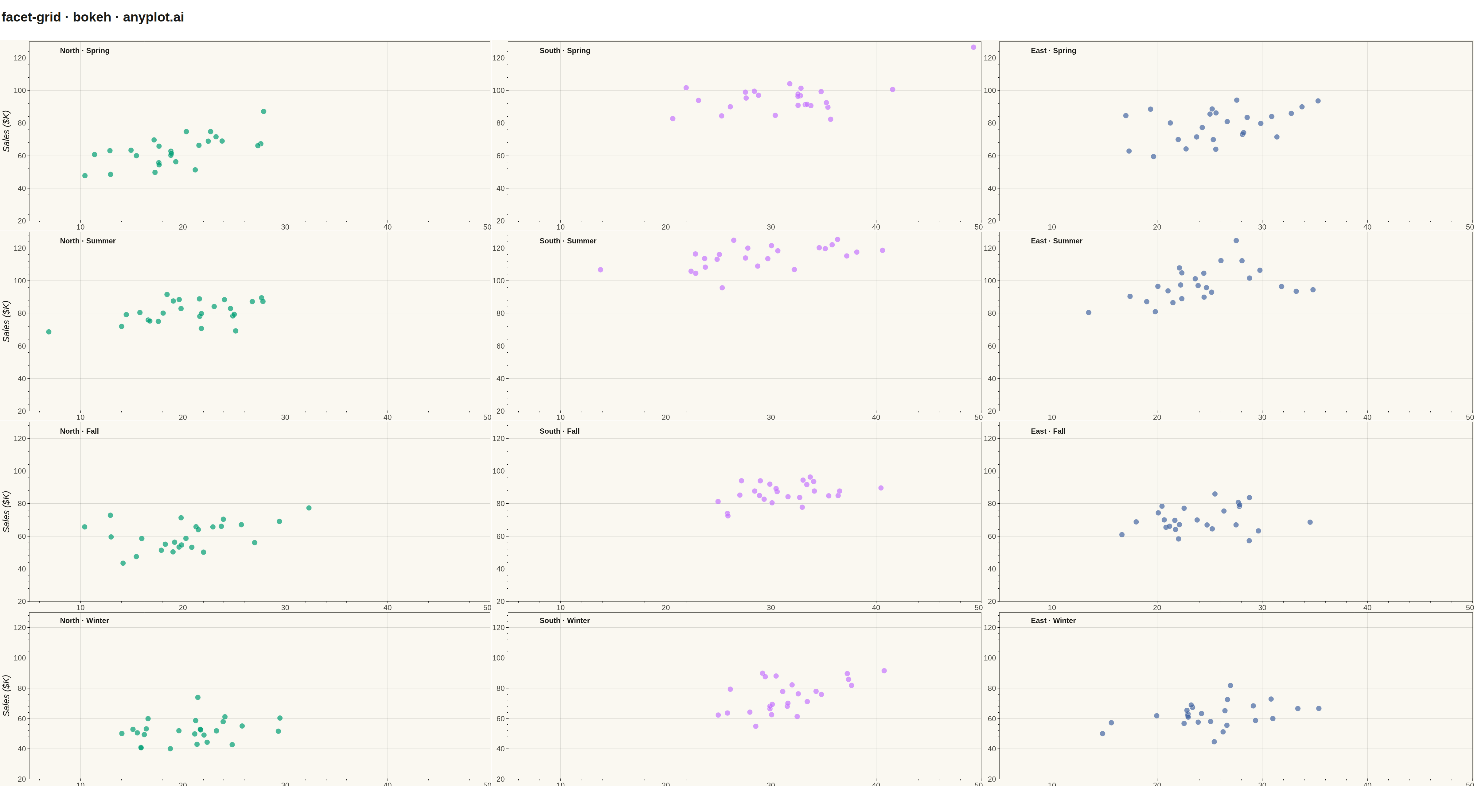
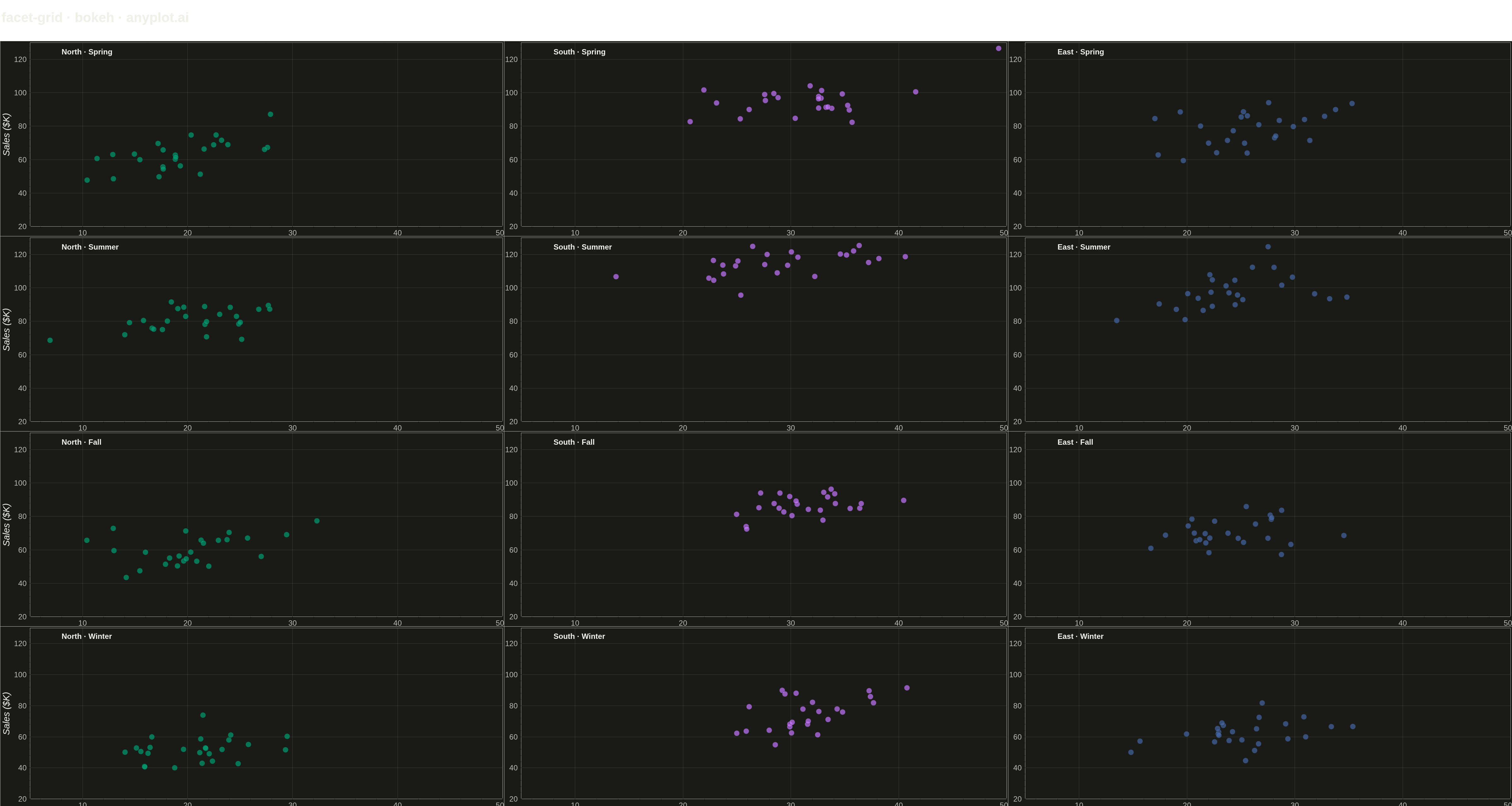
A grid of subplots where each cell shows the same type of plot for a different subset of data, split by one or two categorical variables. Enables systematic comparison across multiple dimensions.
""" anyplot.ai
facet-grid: Faceted Grid Plot
Library: bokeh 3.9.0 | Python 3.13.13
Quality: 87/100 | Updated: 2026-05-13
"""

import os
import time
from pathlib import Path

import numpy as np
import pandas as pd
from bokeh.io import output_file, save
from bokeh.layouts import column, gridplot
from bokeh.models import ColumnDataSource, Div, HoverTool
from bokeh.plotting import figure
from selenium import webdriver
from selenium.webdriver.chrome.options import Options


# Theme tokens
THEME = os.getenv("ANYPLOT_THEME", "light")
PAGE_BG = "#FAF8F1" if THEME == "light" else "#1A1A17"
ELEVATED_BG = "#FFFDF6" if THEME == "light" else "#242420"
INK = "#1A1A17" if THEME == "light" else "#F0EFE8"
INK_SOFT = "#4A4A44" if THEME == "light" else "#B8B7B0"

# Okabe-Ito palette
IMPRINT = [
    "#009E73",  # bluish green (brand)
    "#C475FD",  # vermillion
    "#4467A3",  # blue
]

# Data - Product performance across regions and seasons
np.random.seed(42)

regions = ["North", "South", "East"]
seasons = ["Spring", "Summer", "Fall", "Winter"]

data = []
for region in regions:
    for season in seasons:
        n_points = 25
        # Base values vary by region
        base_x = {"North": 20, "South": 30, "East": 25}[region]
        base_y = {"North": 50, "South": 70, "East": 60}[region]

        # Seasonal adjustments
        season_adj = {"Spring": 1.0, "Summer": 1.3, "Fall": 0.9, "Winter": 0.7}[season]

        x = np.random.normal(base_x, 5, n_points)
        y = base_y * season_adj + x * 0.8 + np.random.normal(0, 8, n_points)

        for xi, yi in zip(x, y, strict=True):
            data.append({"marketing_spend": xi, "sales": yi, "region": region, "season": season})

df = pd.DataFrame(data)

# Map regions to colors
color_map = {"North": IMPRINT[0], "South": IMPRINT[1], "East": IMPRINT[2]}

# Create grid of plots (rows=seasons, cols=regions)
plots = []

for season in seasons:
    row_plots = []
    for region in regions:
        subset = df[(df["region"] == region) & (df["season"] == season)]
        source = ColumnDataSource(
            data={"x": subset["marketing_spend"], "y": subset["sales"], "region": [region] * len(subset)}
        )

        # Create figure for each cell
        p = figure(
            width=1600, height=620, x_range=(5, 50), y_range=(20, 130), tools="", title="", toolbar_location=None
        )

        # Add scatter points
        scatter = p.scatter(
            x="x", y="y", source=source, size=18, color=color_map[region], alpha=0.7, line_color=PAGE_BG, line_width=1
        )

        # Add hover tooltip
        hover = HoverTool(
            renderers=[scatter], tooltips=[("Region", "@region"), ("Spend", "@x{0.0}"), ("Sales", "@y{0.0}")]
        )
        p.add_tools(hover)

        # Add facet label in top-left corner
        p.text(
            x=[8], y=[122], text=[f"{region} · {season}"], text_font_size="18pt", text_color=INK, text_font_style="bold"
        )

        # Style axes - only show labels on edges
        p.xaxis.axis_label = "Marketing Spend ($K)" if season == seasons[-1] else ""
        p.yaxis.axis_label = "Sales ($K)" if region == regions[0] else ""
        p.xaxis.axis_label_text_font_size = "22pt"
        p.yaxis.axis_label_text_font_size = "22pt"
        p.xaxis.major_label_text_font_size = "18pt"
        p.yaxis.major_label_text_font_size = "18pt"

        # Theme-adaptive styling
        p.background_fill_color = PAGE_BG
        p.border_fill_color = PAGE_BG
        p.outline_line_color = INK_SOFT
        p.title.text_color = INK
        p.xaxis.axis_label_text_color = INK
        p.yaxis.axis_label_text_color = INK
        p.xaxis.major_label_text_color = INK_SOFT
        p.yaxis.major_label_text_color = INK_SOFT
        p.xaxis.axis_line_color = INK_SOFT
        p.yaxis.axis_line_color = INK_SOFT

        # Grid styling
        p.xgrid.grid_line_color = INK
        p.ygrid.grid_line_color = INK
        p.xgrid.grid_line_alpha = 0.15
        p.ygrid.grid_line_alpha = 0.15

        row_plots.append(p)
    plots.append(row_plots)

# Create gridplot layout
grid = gridplot(plots, toolbar_location=None, merge_tools=False)

# Add overall title using Div
title_div = Div(
    text=f"<h1 style='text-align: center; color: {INK}; font-size: 32pt; margin: 20px 0;'>"
    f"facet-grid · bokeh · anyplot.ai</h1>",
    width=4800,
    height=120,
)

# Create legend using Div for region-color mapping
legend_html = (
    f"<div style='text-align: center; font-size: 18pt; padding: 20px 0; color: {INK};'>"
    f"<span style='font-weight: bold; margin-right: 30px;'>Region:</span>"
)
for region in regions:
    color = color_map[region]
    legend_html += (
        f"<span style='margin-right: 40px;'>"
        f"<span style='display: inline-block; width: 20px; height: 20px; "
        f"background-color: {color}; border: 1px solid {INK_SOFT}; border-radius: 50%; "
        f"vertical-align: middle; margin-right: 8px;'></span>"
        f"<span style='color: {INK_SOFT};'>{region}</span></span>"
    )
legend_html += "</div>"

legend_div = Div(text=legend_html, width=4800, height=100)

# Combine title, grid, and legend using column layout
final_layout = column(title_div, grid, legend_div)

# Save HTML
output_file(f"plot-{THEME}.html")
save(final_layout)

# Screenshot with headless Chrome
W, H = 4800, 2700
opts = Options()
for arg in (
    "--headless=new",
    "--no-sandbox",
    "--disable-dev-shm-usage",
    "--disable-gpu",
    f"--window-size={W},{H}",
    "--hide-scrollbars",
):
    opts.add_argument(arg)
driver = webdriver.Chrome(options=opts)
driver.set_window_size(W, H)
driver.get(f"file://{Path(f'plot-{THEME}.html').resolve()}")
time.sleep(3)
driver.save_screenshot(f"plot-{THEME}.png")
driver.quit()
Runnable source as JSON, for any HTTP client: https://api.anyplot.ai/specs/facet-grid/bokeh/code. Any spec id and library id listed in llms-full.txt fit the same URL shape; every URL below is complete and callable.
{
  "spec_id": "facet-grid",
  "language": "python",
  "library": "bokeh",
  "page": "https://anyplot.ai/facet-grid/python/bokeh",
  "hub": "https://anyplot.ai/facet-grid",
  "code_json": "https://api.anyplot.ai/specs/facet-grid/bokeh/code",
  "spec_json": "https://api.anyplot.ai/specs/facet-grid",
  "render_light_png": "https://storage.googleapis.com/anyplot-images/plots/facet-grid/python/bokeh/plot-light.png",
  "render_dark_png": "https://storage.googleapis.com/anyplot-images/plots/facet-grid/python/bokeh/plot-dark.png",
  "interactive_light_html": "https://storage.googleapis.com/anyplot-images/plots/facet-grid/python/bokeh/plot-light.html",
  "interactive_dark_html": "https://storage.googleapis.com/anyplot-images/plots/facet-grid/python/bokeh/plot-dark.html",
  "quality_score": 87.0,
  "license": "MIT",
  "guide": "https://anyplot.ai/llms.txt"
}
Part of Faceted Grid Plot on anyplot.ai.