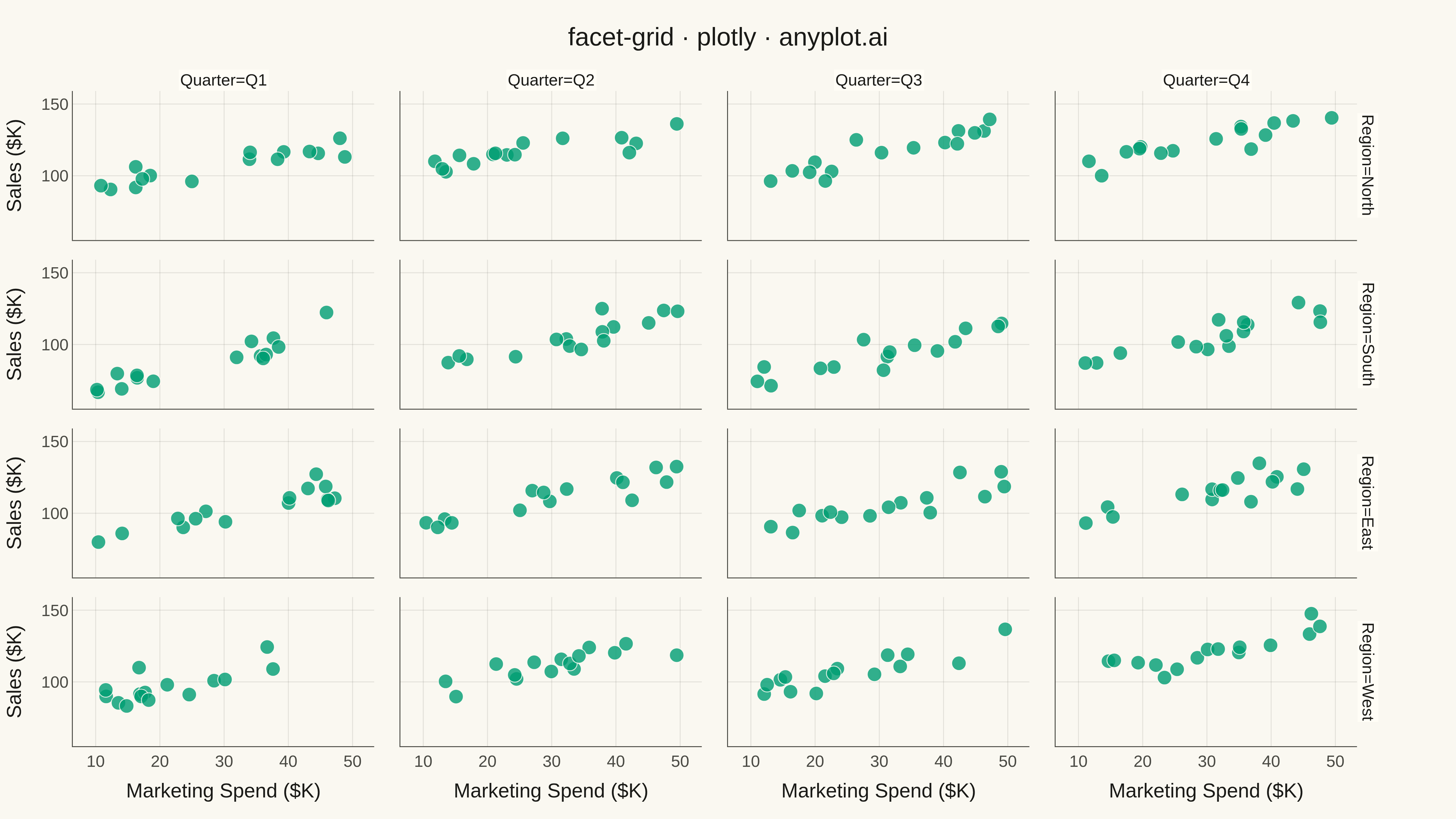
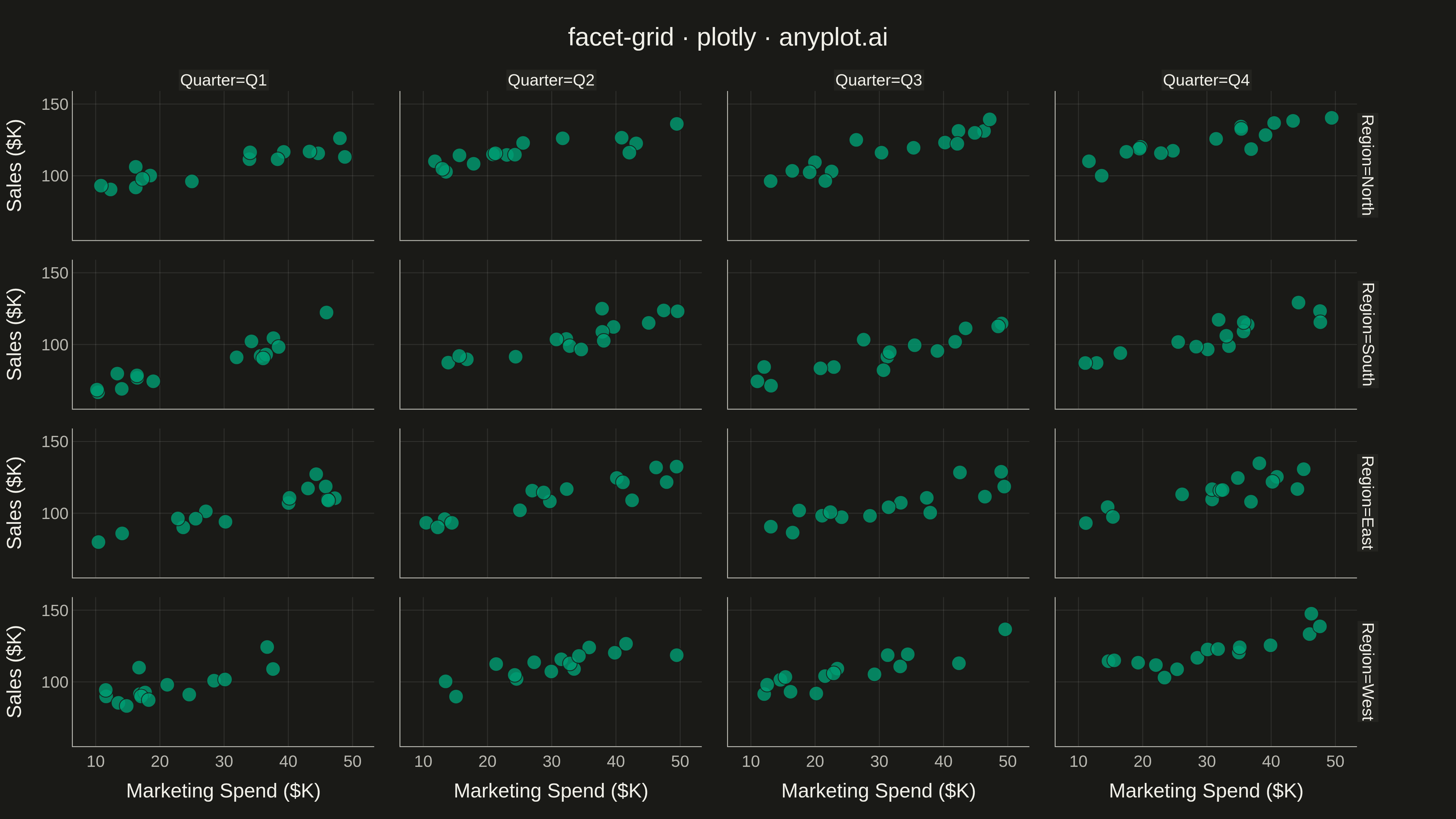
A grid of subplots where each cell shows the same type of plot for a different subset of data, split by one or two categorical variables. Enables systematic comparison across multiple dimensions.
""" anyplot.ai
facet-grid: Faceted Grid Plot
Library: plotly 6.7.0 | Python 3.13.13
Quality: 92/100 | Updated: 2026-05-13
"""

import os

import numpy as np
import pandas as pd
import plotly.express as px


THEME = os.getenv("ANYPLOT_THEME", "light")
PAGE_BG = "#FAF8F1" if THEME == "light" else "#1A1A17"
ELEVATED_BG = "#FFFDF6" if THEME == "light" else "#242420"
INK = "#1A1A17" if THEME == "light" else "#F0EFE8"
INK_SOFT = "#4A4A44" if THEME == "light" else "#B8B7B0"
GRID = "rgba(26,26,23,0.10)" if THEME == "light" else "rgba(240,239,232,0.10)"
BRAND = "#009E73"

# Data
np.random.seed(42)

regions = ["North", "South", "East", "West"]
quarters = ["Q1", "Q2", "Q3", "Q4"]

data = []
for region in regions:
    for quarter in quarters:
        n = 15
        base_sales = {"North": 80, "South": 60, "East": 70, "West": 75}
        quarter_effect = {"Q1": 0, "Q2": 10, "Q3": 5, "Q4": 15}

        marketing_spend = np.random.uniform(10, 50, n)
        sales = (
            base_sales[region]
            + quarter_effect[quarter]
            + marketing_spend * (0.8 + np.random.uniform(0, 0.4, n))
            + np.random.normal(0, 5, n)
        )

        for i in range(n):
            data.append(
                {
                    "Marketing Spend ($K)": marketing_spend[i],
                    "Sales ($K)": sales[i],
                    "Region": region,
                    "Quarter": quarter,
                }
            )

df = pd.DataFrame(data)

# Plot
fig = px.scatter(df, x="Marketing Spend ($K)", y="Sales ($K)", facet_row="Region", facet_col="Quarter")

# Style
fig.update_layout(
    title={"text": "facet-grid · plotly · anyplot.ai", "font": {"size": 28, "color": INK}, "x": 0.5, "xanchor": "center"},
    paper_bgcolor=PAGE_BG,
    plot_bgcolor=PAGE_BG,
    font={"color": INK},
    showlegend=False,
    margin={"l": 80, "r": 80, "t": 100, "b": 80},
)

fig.update_xaxes(
    title_font={"size": 22, "color": INK}, tickfont={"size": 18, "color": INK_SOFT}, gridcolor=GRID, linecolor=INK_SOFT
)

fig.update_yaxes(
    title_font={"size": 22, "color": INK}, tickfont={"size": 18, "color": INK_SOFT}, gridcolor=GRID, linecolor=INK_SOFT
)

fig.for_each_annotation(lambda a: a.update(font={"size": 18, "color": INK}))

fig.update_traces(marker={"size": 16, "opacity": 0.8, "color": BRAND, "line": {"width": 1, "color": PAGE_BG}})

# Save
fig.write_image(f"plot-{THEME}.png", width=1600, height=900, scale=3)
fig.write_html(f"plot-{THEME}.html", include_plotlyjs="cdn")
Runnable source as JSON, for any HTTP client: https://api.anyplot.ai/specs/facet-grid/plotly/code. Any spec id and library id listed in llms-full.txt fit the same URL shape; every URL below is complete and callable.
{
  "spec_id": "facet-grid",
  "language": "python",
  "library": "plotly",
  "page": "https://anyplot.ai/facet-grid/python/plotly",
  "hub": "https://anyplot.ai/facet-grid",
  "code_json": "https://api.anyplot.ai/specs/facet-grid/plotly/code",
  "spec_json": "https://api.anyplot.ai/specs/facet-grid",
  "render_light_png": "https://storage.googleapis.com/anyplot-images/plots/facet-grid/python/plotly/plot-light.png",
  "render_dark_png": "https://storage.googleapis.com/anyplot-images/plots/facet-grid/python/plotly/plot-dark.png",
  "interactive_light_html": "https://storage.googleapis.com/anyplot-images/plots/facet-grid/python/plotly/plot-light.html",
  "interactive_dark_html": "https://storage.googleapis.com/anyplot-images/plots/facet-grid/python/plotly/plot-dark.html",
  "quality_score": 92.0,
  "license": "MIT",
  "guide": "https://anyplot.ai/llms.txt"
}
Part of Faceted Grid Plot on anyplot.ai.