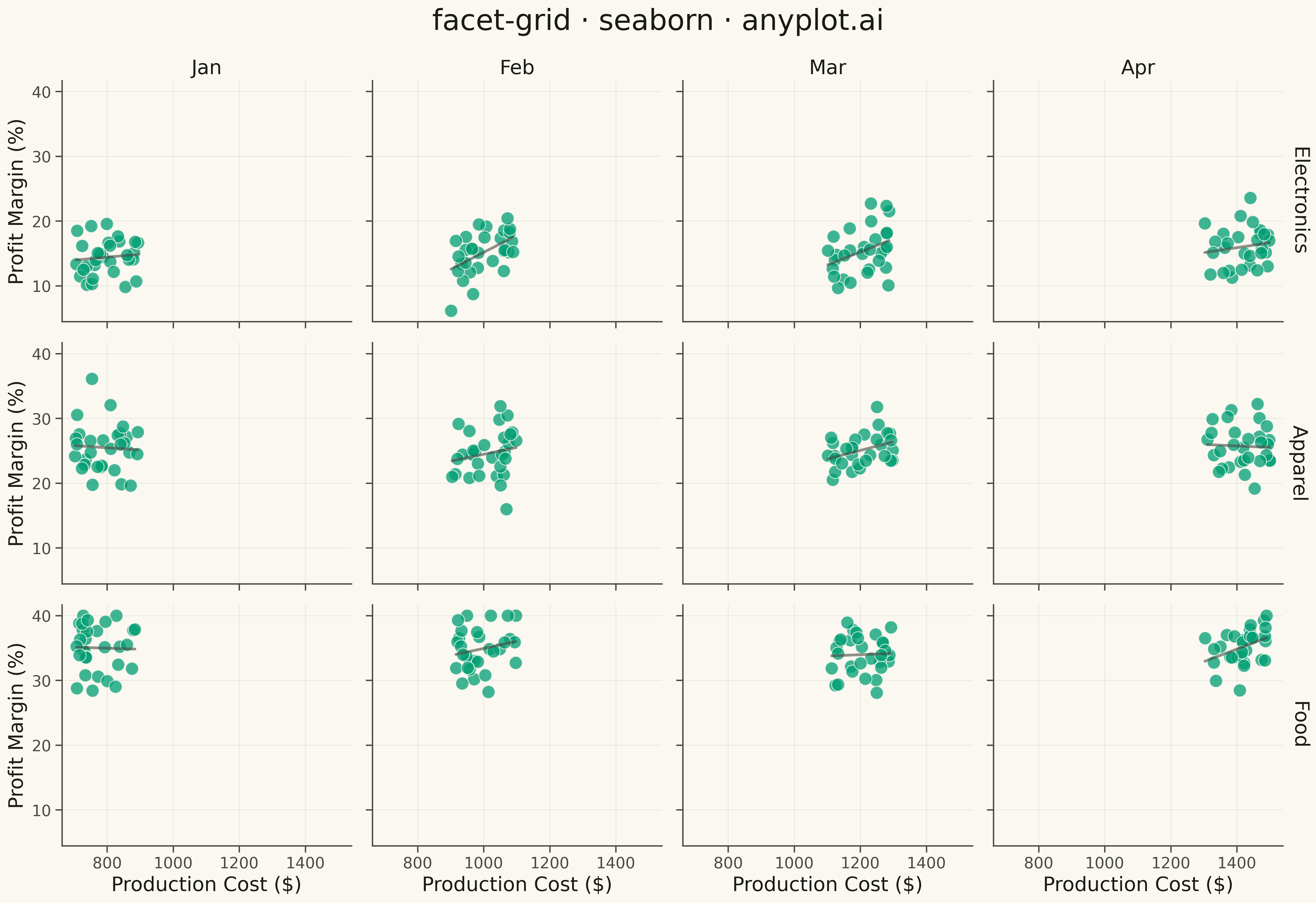
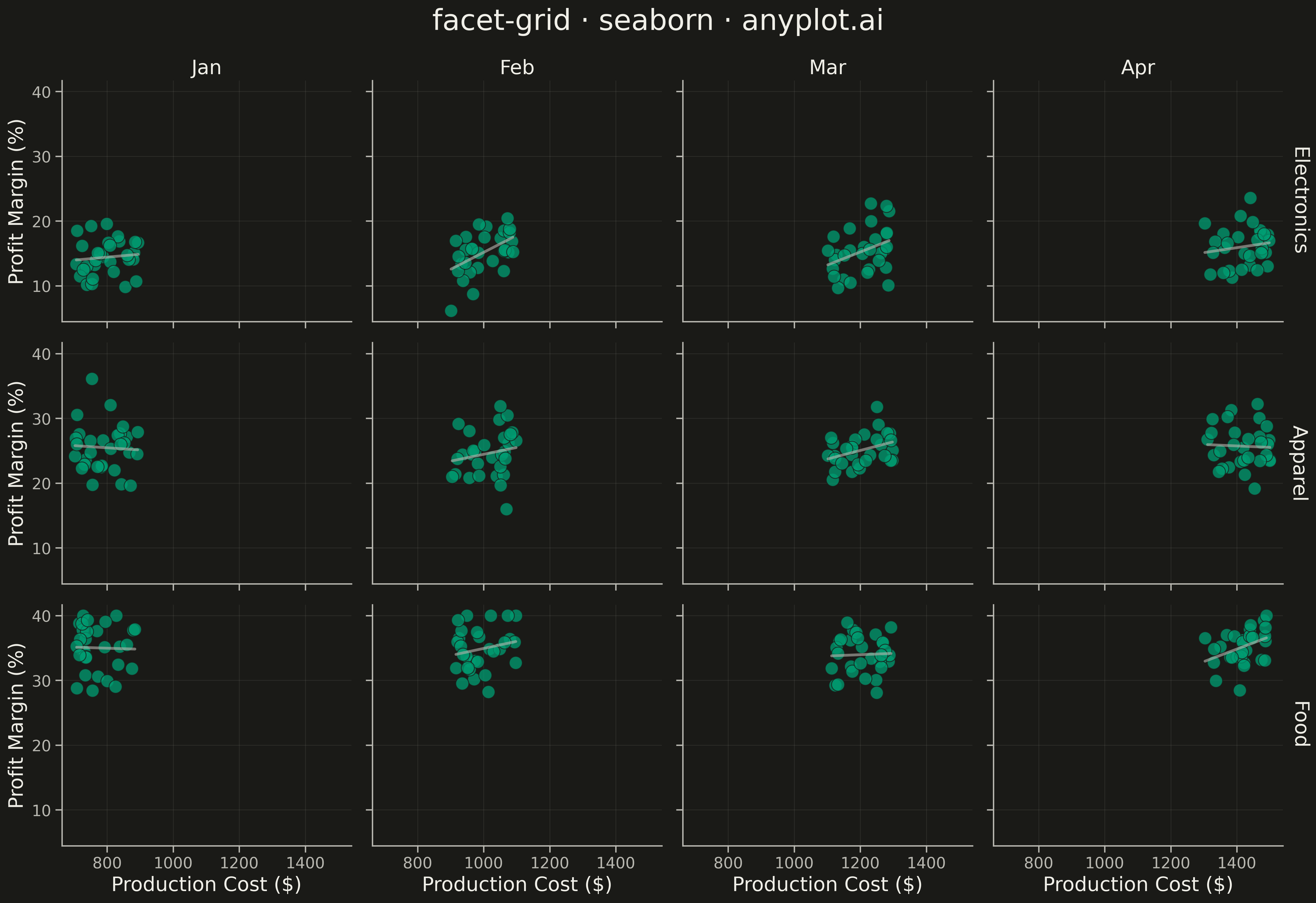
A grid of subplots where each cell shows the same type of plot for a different subset of data, split by one or two categorical variables. Enables systematic comparison across multiple dimensions.
""" anyplot.ai
facet-grid: Faceted Grid Plot
Library: seaborn 0.13.2 | Python 3.13.13
Quality: 90/100 | Updated: 2026-05-13
"""

import os

import matplotlib.pyplot as plt
import numpy as np
import pandas as pd
import seaborn as sns


# Theme tokens
THEME = os.getenv("ANYPLOT_THEME", "light")
PAGE_BG = "#FAF8F1" if THEME == "light" else "#1A1A17"
ELEVATED_BG = "#FFFDF6" if THEME == "light" else "#242420"
INK = "#1A1A17" if THEME == "light" else "#F0EFE8"
INK_SOFT = "#4A4A44" if THEME == "light" else "#B8B7B0"
INK_MUTED = "#6B6A63" if THEME == "light" else "#A8A79F"
BRAND = "#009E73"

# Data - Differentiated scenario: Production Cost vs Profit Margin by Product Line and Month
np.random.seed(42)

product_lines = ["Electronics", "Apparel", "Food"]
months = ["Jan", "Feb", "Mar", "Apr"]

data = []
for product_idx, product in enumerate(product_lines):
    for month_idx, month in enumerate(months):
        n_points = 30
        # Vary profit margin by product line (Electronics: high margin but higher cost,
        # Apparel: moderate, Food: low margin, high volume)
        base_margin = 15 + 10 * product_idx
        margin_noise = np.random.normal(0, 3, n_points)

        # Cost varies by month (seasonality)
        base_cost = 800 + 200 * month_idx
        cost_var = np.random.uniform(-100, 100, n_points)

        # Profit margin increases with cost for some products
        cost = base_cost + cost_var
        profit_margin = base_margin + 0.01 * (cost - base_cost) + margin_noise
        profit_margin = np.clip(profit_margin, 5, 40)

        for i in range(n_points):
            data.append(
                {
                    "Production Cost ($)": cost[i],
                    "Profit Margin (%)": profit_margin[i],
                    "Product Line": product,
                    "Month": month,
                }
            )

df = pd.DataFrame(data)

# Setup theme
sns.set_theme(
    style="ticks",
    rc={
        "figure.facecolor": PAGE_BG,
        "axes.facecolor": PAGE_BG,
        "axes.edgecolor": INK_SOFT,
        "axes.labelcolor": INK,
        "text.color": INK,
        "xtick.color": INK_SOFT,
        "ytick.color": INK_SOFT,
        "grid.color": INK_MUTED,
        "grid.alpha": 0.10,
        "legend.facecolor": ELEVATED_BG,
        "legend.edgecolor": INK_SOFT,
    },
)

# Plot
g = sns.FacetGrid(df, row="Product Line", col="Month", height=3.8, aspect=1.1, margin_titles=True)

# Map scatterplot with regression line
g.map_dataframe(
    sns.regplot,
    x="Production Cost ($)",
    y="Profit Margin (%)",
    scatter_kws={"color": BRAND, "s": 140, "alpha": 0.75, "edgecolor": PAGE_BG, "linewidths": 0.8},
    line_kws={"color": INK_SOFT, "linewidth": 2.5, "alpha": 0.6},
    ci=None,
)

# Styling
g.set_titles(row_template="{row_name}", col_template="{col_name}", size=18, fontweight="medium")

# Remove y-axis label repetition: only show on leftmost column
for i, ax in enumerate(g.axes.flat):
    ax.tick_params(axis="both", labelsize=14)
    ax.grid(True, alpha=0.12, linestyle="-", linewidth=0.7)

    # Only leftmost column keeps y-axis label
    if i % 4 != 0:
        ax.set_ylabel("")

# Set labels once globally
g.set_axis_labels("Production Cost ($)", "Profit Margin (%)", fontsize=18)

# Add main title
g.figure.suptitle("facet-grid · seaborn · anyplot.ai", fontsize=26, fontweight="medium", y=0.995, color=INK)

g.tight_layout()

# Save
plt.savefig(f"plot-{THEME}.png", dpi=300, bbox_inches="tight", facecolor=PAGE_BG)
Runnable source as JSON, for any HTTP client: https://api.anyplot.ai/specs/facet-grid/seaborn/code. Any spec id and library id listed in llms-full.txt fit the same URL shape; every URL below is complete and callable.
{
  "spec_id": "facet-grid",
  "language": "python",
  "library": "seaborn",
  "page": "https://anyplot.ai/facet-grid/python/seaborn",
  "hub": "https://anyplot.ai/facet-grid",
  "code_json": "https://api.anyplot.ai/specs/facet-grid/seaborn/code",
  "spec_json": "https://api.anyplot.ai/specs/facet-grid",
  "render_light_png": "https://storage.googleapis.com/anyplot-images/plots/facet-grid/python/seaborn/plot-light.png",
  "render_dark_png": "https://storage.googleapis.com/anyplot-images/plots/facet-grid/python/seaborn/plot-dark.png",
  "quality_score": 90.0,
  "license": "MIT",
  "guide": "https://anyplot.ai/llms.txt"
}
Part of Faceted Grid Plot on anyplot.ai.