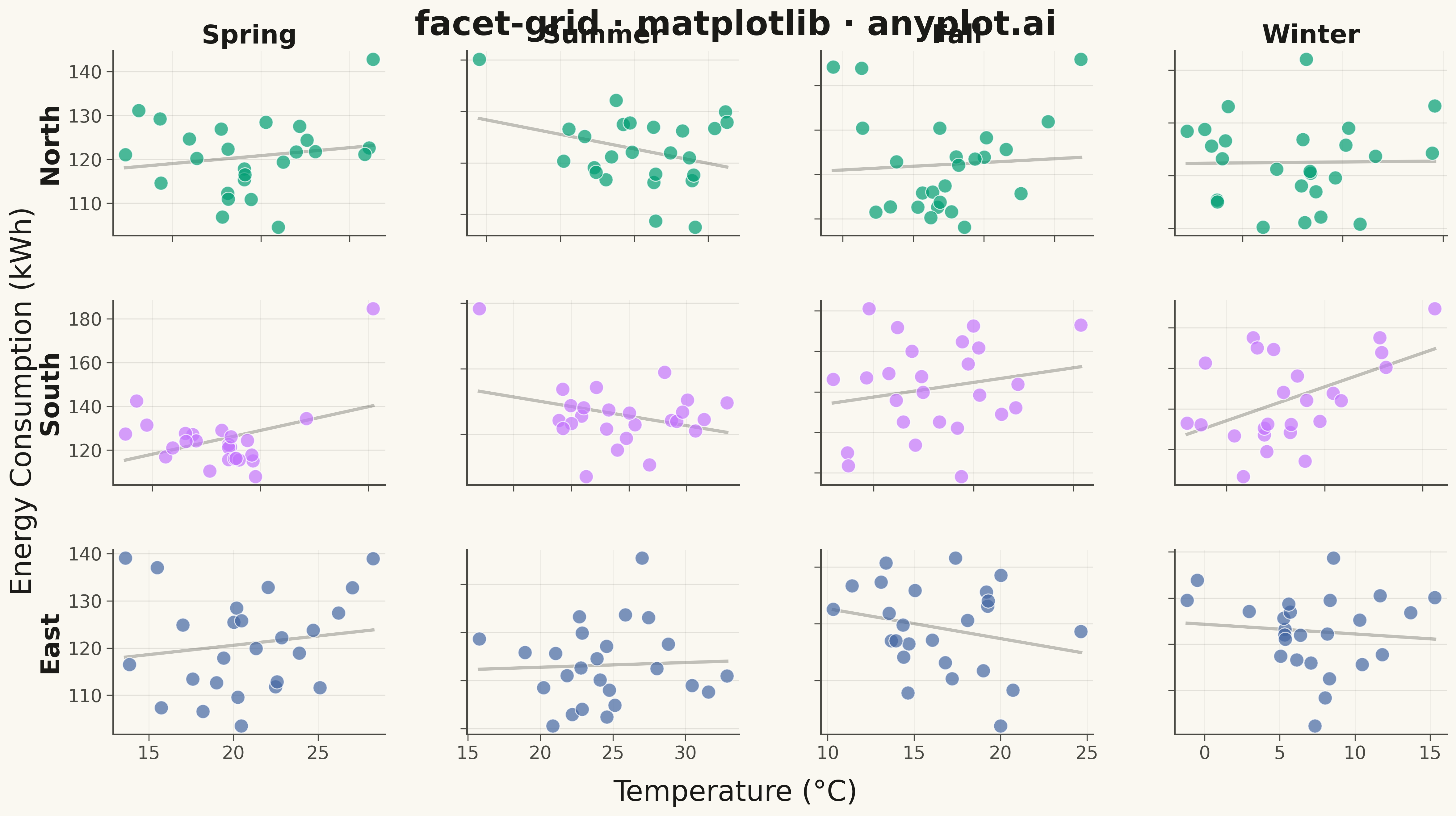
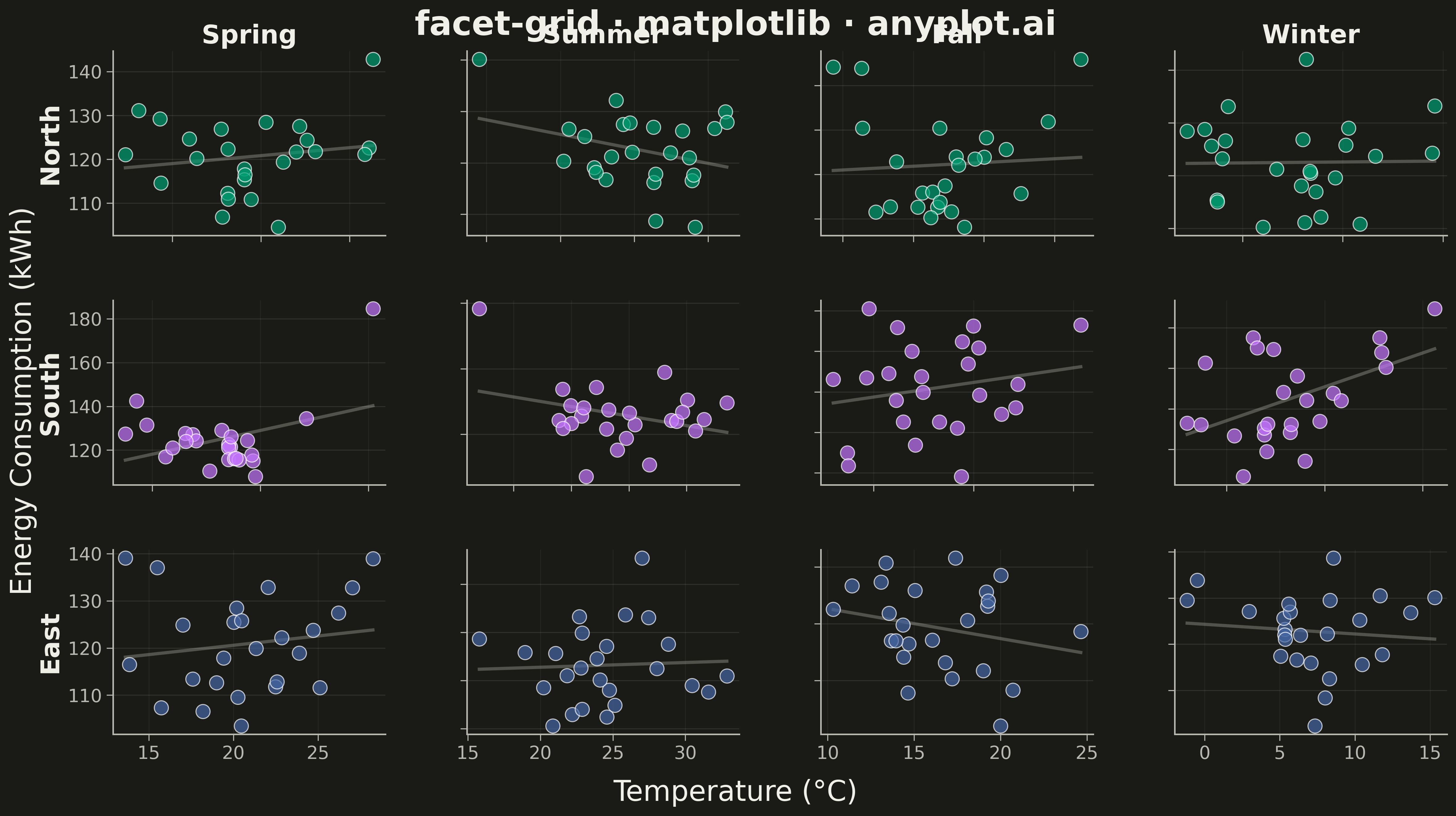
A grid of subplots where each cell shows the same type of plot for a different subset of data, split by one or two categorical variables. Enables systematic comparison across multiple dimensions.
""" anyplot.ai
facet-grid: Faceted Grid Plot
Library: matplotlib 3.10.9 | Python 3.13.13
Quality: 96/100 | Updated: 2026-05-13
"""

import os
import sys


# Remove the script's directory from sys.path to avoid shadowing matplotlib package
script_dir = os.path.dirname(os.path.abspath(__file__))
if script_dir in sys.path:
    sys.path.remove(script_dir)

import matplotlib.pyplot as plt
import numpy as np
import pandas as pd
from matplotlib import gridspec
from scipy.stats import linregress


# Theme tokens
THEME = os.getenv("ANYPLOT_THEME", "light")
PAGE_BG = "#FAF8F1" if THEME == "light" else "#1A1A17"
ELEVATED_BG = "#FFFDF6" if THEME == "light" else "#242420"
INK = "#1A1A17" if THEME == "light" else "#F0EFE8"
INK_SOFT = "#4A4A44" if THEME == "light" else "#B8B7B0"
INK_MUTED = "#6B6A63" if THEME == "light" else "#A8A79F"

# Okabe-Ito palette - first series is always #009E73
IMPRINT = [
    "#009E73",  # brand green
    "#C475FD",  # vermillion
    "#4467A3",  # blue
    "#BD8233",  # reddish purple
]

# Data
np.random.seed(42)

regions = ["North", "South", "East"]
seasons = ["Spring", "Summer", "Fall", "Winter"]

data = []
for region in regions:
    for season in seasons:
        n_points = 25
        # Base temperature varies by region and season
        base_temps = {"North": 5, "South": 20, "East": 15}
        season_offsets = {"Spring": 5, "Summer": 10, "Fall": 2, "Winter": -8}

        base_temp = base_temps[region] + season_offsets[season]
        temp = np.random.normal(base_temp, 4, n_points)

        # Energy consumption: U-shaped relationship with temperature
        energy = 120 + (temp - base_temp) ** 2 * 0.2 + np.random.normal(0, 8, n_points)

        for t, e in zip(temp, energy, strict=True):
            data.append({"Temperature": t, "Energy": e, "Region": region, "Season": season})

df = pd.DataFrame(data)

# Create figure with GridSpec for sophisticated layout control
fig = plt.figure(figsize=(16, 9), facecolor=PAGE_BG)
gs = gridspec.GridSpec(
    len(regions), len(seasons), figure=fig, hspace=0.35, wspace=0.3, left=0.08, right=0.98, top=0.92, bottom=0.10
)

# Color map: regions to Okabe-Ito palette
region_colors = {region: IMPRINT[i] for i, region in enumerate(regions)}

# Create scatter plots in each facet with trend lines
for i, region in enumerate(regions):
    for j, season in enumerate(seasons):
        ax = fig.add_subplot(gs[i, j])
        ax.set_facecolor(PAGE_BG)

        subset = df[(df["Region"] == region) & (df["Season"] == season)]

        # Scatter plot
        ax.scatter(
            subset["Temperature"],
            subset["Energy"],
            s=120,
            alpha=0.7,
            color=region_colors[region],
            edgecolors="white",
            linewidth=0.8,
            zorder=3,
        )

        # Trend line for visual emphasis and pattern highlighting
        if len(subset) > 1:
            x_sorted = np.sort(subset["Temperature"].values)
            slope, intercept, _, _, _ = linregress(subset["Temperature"].values, subset["Energy"].values)
            y_trend = slope * x_sorted + intercept
            ax.plot(x_sorted, y_trend, color=INK_MUTED, linewidth=2.5, alpha=0.4, linestyle="-", zorder=1)

        # Subtle grid
        ax.yaxis.grid(True, alpha=0.10, linewidth=0.8, color=INK)
        ax.xaxis.grid(True, alpha=0.08, linewidth=0.6, color=INK_SOFT)

        # Column headers (top row only)
        if i == 0:
            ax.set_title(season, fontsize=20, color=INK, fontweight="semibold")

        # Row labels (left side)
        if j == 0:
            ax.set_ylabel(region, fontsize=20, color=INK, fontweight="semibold")

        # Only show labels on outer edges
        if i < len(regions) - 1:
            ax.set_xticklabels([])
        if j > 0:
            ax.set_yticklabels([])

        # Tick styling
        ax.tick_params(axis="both", labelsize=14, colors=INK_SOFT, labelcolor=INK_SOFT, length=5, width=0.8)

        # Spine styling
        for spine in ("top", "right"):
            ax.spines[spine].set_visible(False)
        for spine in ("left", "bottom"):
            ax.spines[spine].set_color(INK_SOFT)
            ax.spines[spine].set_linewidth(1.2)

# Shared axis labels
fig.text(0.5, 0.02, "Temperature (°C)", ha="center", fontsize=22, color=INK, fontweight="medium")
fig.text(
    0.01, 0.5, "Energy Consumption (kWh)", va="center", rotation="vertical", fontsize=22, color=INK, fontweight="medium"
)

# Main title with enhanced typography
fig.suptitle("facet-grid · matplotlib · anyplot.ai", fontsize=26, fontweight="semibold", color=INK, y=0.97)

plt.savefig(f"plot-{THEME}.png", dpi=300, bbox_inches="tight", facecolor=PAGE_BG)
Runnable source as JSON, for any HTTP client: https://api.anyplot.ai/specs/facet-grid/matplotlib/code. Any spec id and library id listed in llms-full.txt fit the same URL shape; every URL below is complete and callable.
{
  "spec_id": "facet-grid",
  "language": "python",
  "library": "matplotlib",
  "page": "https://anyplot.ai/facet-grid/python/matplotlib",
  "hub": "https://anyplot.ai/facet-grid",
  "code_json": "https://api.anyplot.ai/specs/facet-grid/matplotlib/code",
  "spec_json": "https://api.anyplot.ai/specs/facet-grid",
  "render_light_png": "https://storage.googleapis.com/anyplot-images/plots/facet-grid/python/matplotlib/plot-light.png",
  "render_dark_png": "https://storage.googleapis.com/anyplot-images/plots/facet-grid/python/matplotlib/plot-dark.png",
  "quality_score": 96.0,
  "license": "MIT",
  "guide": "https://anyplot.ai/llms.txt"
}
Part of Faceted Grid Plot on anyplot.ai.