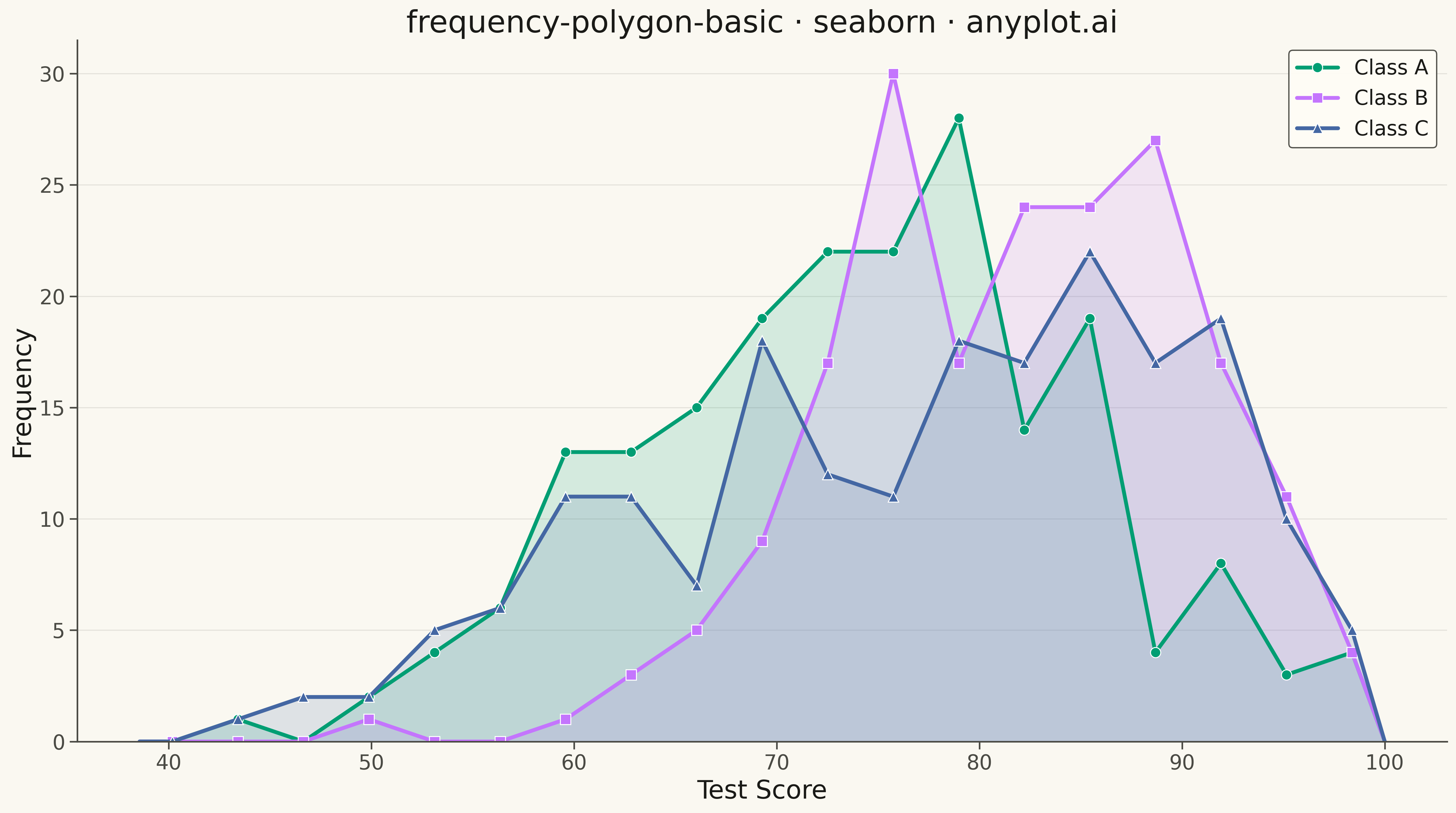
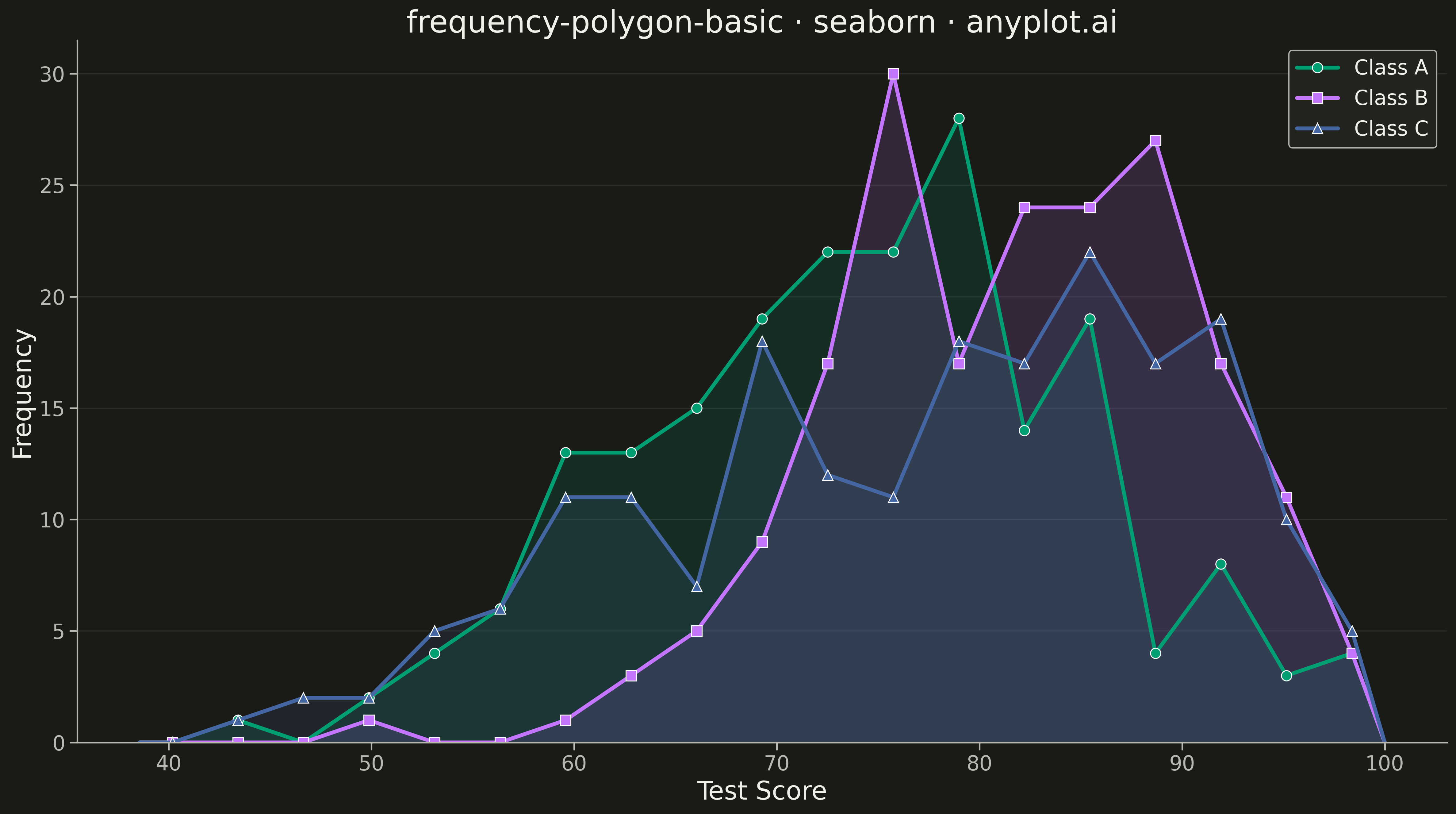
A frequency polygon connects the midpoints of histogram bins with straight line segments, creating a smooth outline of the distribution shape. This visualization excels at comparing multiple distributions simultaneously since lines overlap without obscuring each other, unlike stacked or overlapping histogram bars. Frequency polygons reveal differences in central tendency, spread, skewness, and modality across groups with minimal visual clutter.
Preview render from the Seaborn implementation.