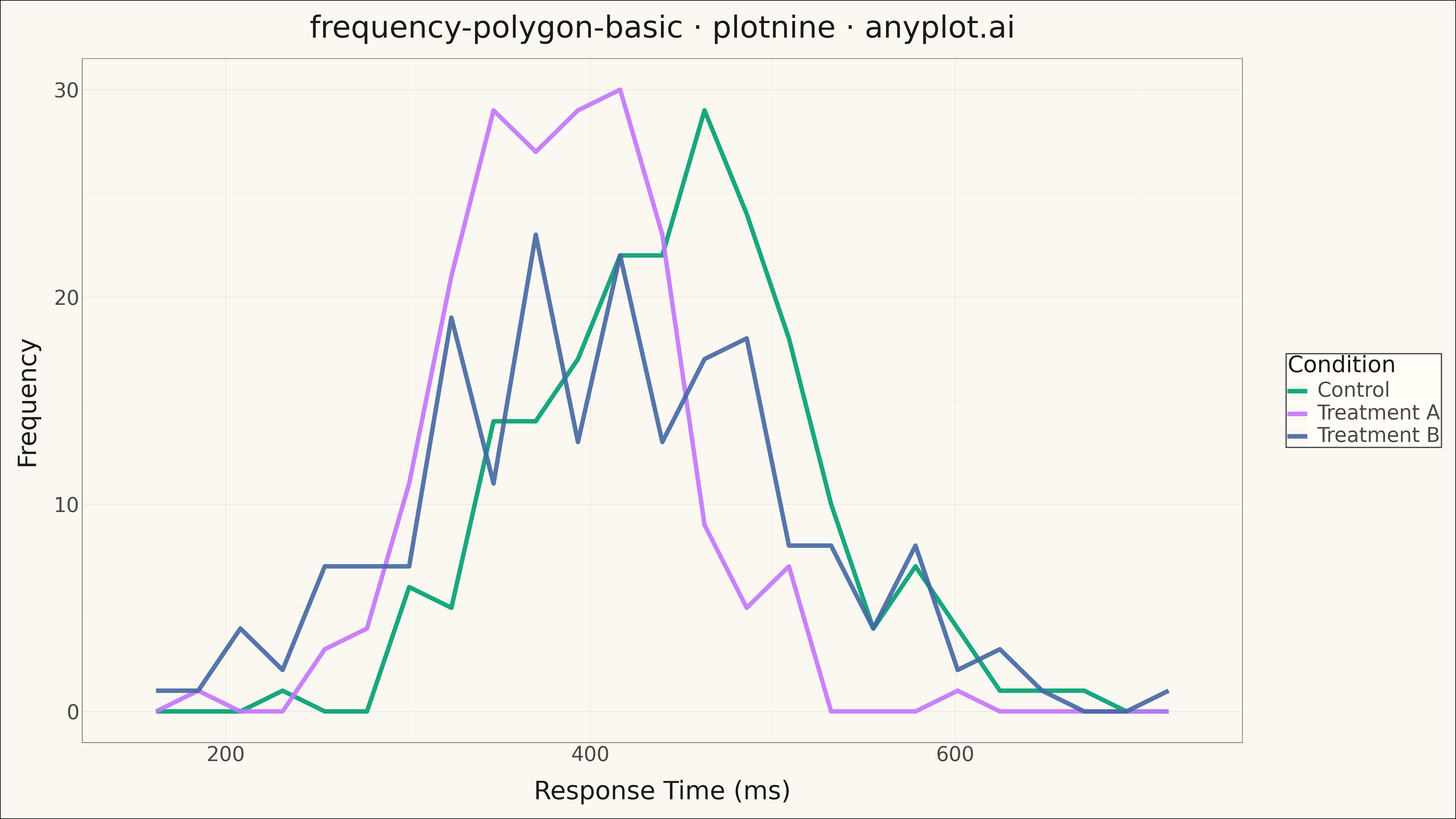
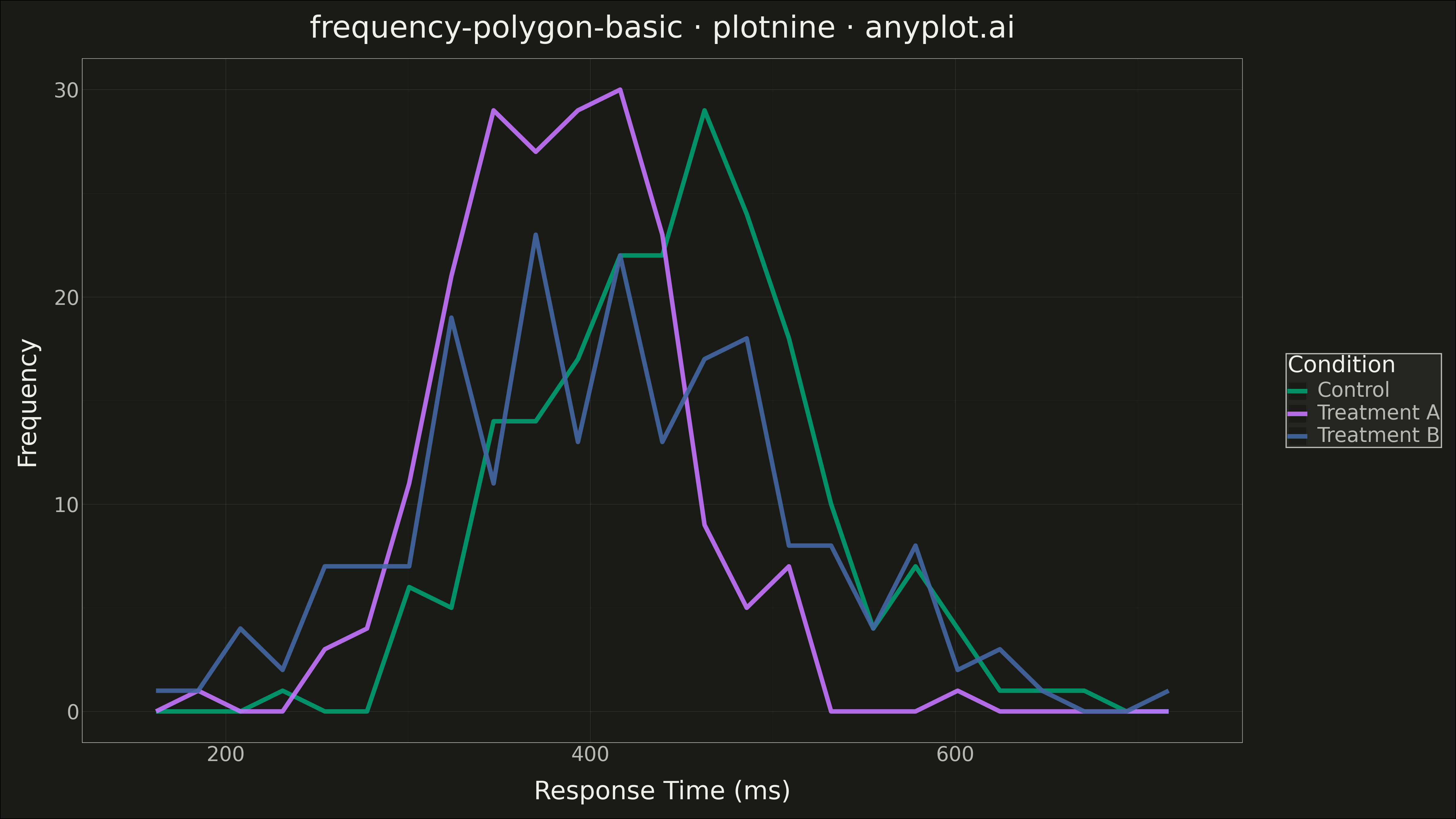
A frequency polygon connects the midpoints of histogram bins with straight line segments, creating a smooth outline of the distribution shape. This visualization excels at comparing multiple distributions simultaneously since lines overlap without obscuring each other, unlike stacked or overlapping histogram bars. Frequency polygons reveal differences in central tendency, spread, skewness, and modality across groups with minimal visual clutter.
""" anyplot.ai
frequency-polygon-basic: Frequency Polygon for Distribution Comparison
Library: plotnine 0.15.4 | Python 3.13.13
Quality: 87/100 | Updated: 2026-05-17
"""

import os

import numpy as np
import pandas as pd
from plotnine import (
    aes,
    element_line,
    element_rect,
    element_text,
    geom_freqpoly,
    ggplot,
    labs,
    scale_color_manual,
    theme,
    theme_minimal,
)


# Theme tokens
THEME = os.getenv("ANYPLOT_THEME", "light")
PAGE_BG = "#FAF8F1" if THEME == "light" else "#1A1A17"
ELEVATED_BG = "#FFFDF6" if THEME == "light" else "#242420"
INK = "#1A1A17" if THEME == "light" else "#F0EFE8"
INK_SOFT = "#4A4A44" if THEME == "light" else "#B8B7B0"

# Okabe-Ito palette
IMPRINT = ["#009E73", "#C475FD", "#4467A3"]

# Data - Response times by experimental condition
np.random.seed(42)

# Three experimental conditions with different distributions
control = np.random.normal(loc=450, scale=80, size=200)
treatment_a = np.random.normal(loc=380, scale=60, size=200)
treatment_b = np.random.normal(loc=420, scale=100, size=200)

# Combine into DataFrame
df = pd.DataFrame(
    {
        "response_time": np.concatenate([control, treatment_a, treatment_b]),
        "condition": ["Control"] * 200 + ["Treatment A"] * 200 + ["Treatment B"] * 200,
    }
)

# Custom theme with theme-adaptive chrome
anyplot_theme = theme(
    figure_size=(16, 9),
    text=element_text(size=14),
    axis_title=element_text(size=20, color=INK),
    axis_text=element_text(size=16, color=INK_SOFT),
    plot_title=element_text(size=24, color=INK),
    plot_background=element_rect(fill=PAGE_BG, color=None),
    panel_background=element_rect(fill=PAGE_BG, color=None),
    panel_grid_major=element_line(color=INK, size=0.3, alpha=0.15),
    panel_grid_minor=element_line(color=INK, size=0.2, alpha=0.05),
    panel_border=element_rect(color=INK_SOFT, fill=None, size=0.4),
    axis_line=element_line(color=INK_SOFT, size=0.3),
    legend_background=element_rect(fill=ELEVATED_BG, color=INK_SOFT),
    legend_text=element_text(size=16, color=INK_SOFT),
    legend_title=element_text(size=18, color=INK),
    legend_position="right",
)

# Plot - Frequency polygon comparing distributions
plot = (
    ggplot(df, aes(x="response_time", color="condition"))
    + geom_freqpoly(size=2, bins=25, alpha=0.9)
    + scale_color_manual(values=IMPRINT)
    + labs(
        x="Response Time (ms)",
        y="Frequency",
        title="frequency-polygon-basic · plotnine · anyplot.ai",
        color="Condition",
    )
    + theme_minimal()
    + anyplot_theme
)

# Save
plot.save(f"plot-{THEME}.png", dpi=300, verbose=False)
Runnable source as JSON, for any HTTP client: https://api.anyplot.ai/specs/frequency-polygon-basic/plotnine/code. Any spec id and library id listed in llms-full.txt fit the same URL shape; every URL below is complete and callable.
{
  "spec_id": "frequency-polygon-basic",
  "language": "python",
  "library": "plotnine",
  "page": "https://anyplot.ai/frequency-polygon-basic/python/plotnine",
  "hub": "https://anyplot.ai/frequency-polygon-basic",
  "code_json": "https://api.anyplot.ai/specs/frequency-polygon-basic/plotnine/code",
  "spec_json": "https://api.anyplot.ai/specs/frequency-polygon-basic",
  "render_light_png": "https://storage.googleapis.com/anyplot-images/plots/frequency-polygon-basic/python/plotnine/plot-light.png",
  "render_dark_png": "https://storage.googleapis.com/anyplot-images/plots/frequency-polygon-basic/python/plotnine/plot-dark.png",
  "quality_score": 87.0,
  "license": "MIT",
  "guide": "https://anyplot.ai/llms.txt"
}
Part of Frequency Polygon for Distribution Comparison on anyplot.ai.