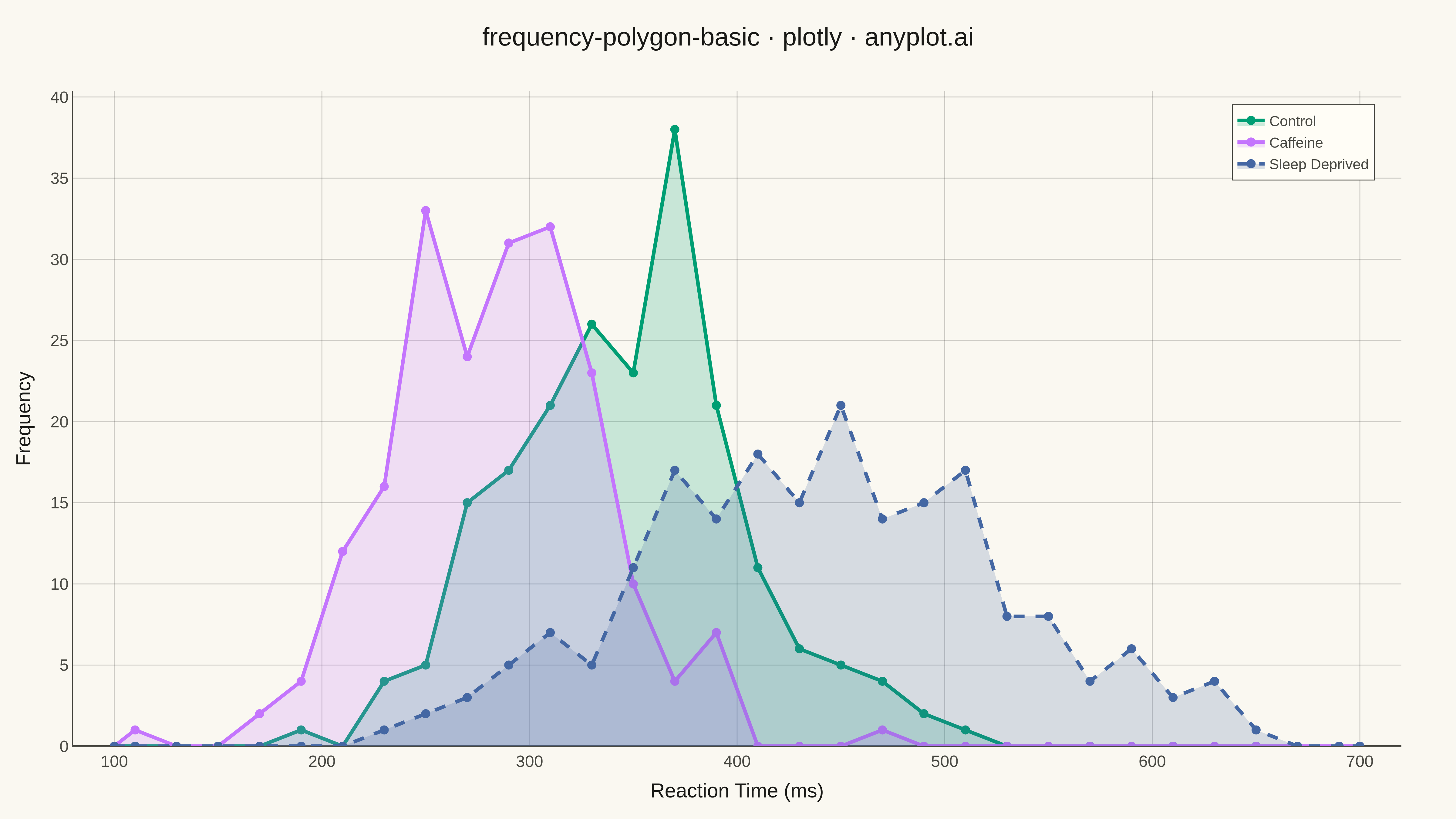
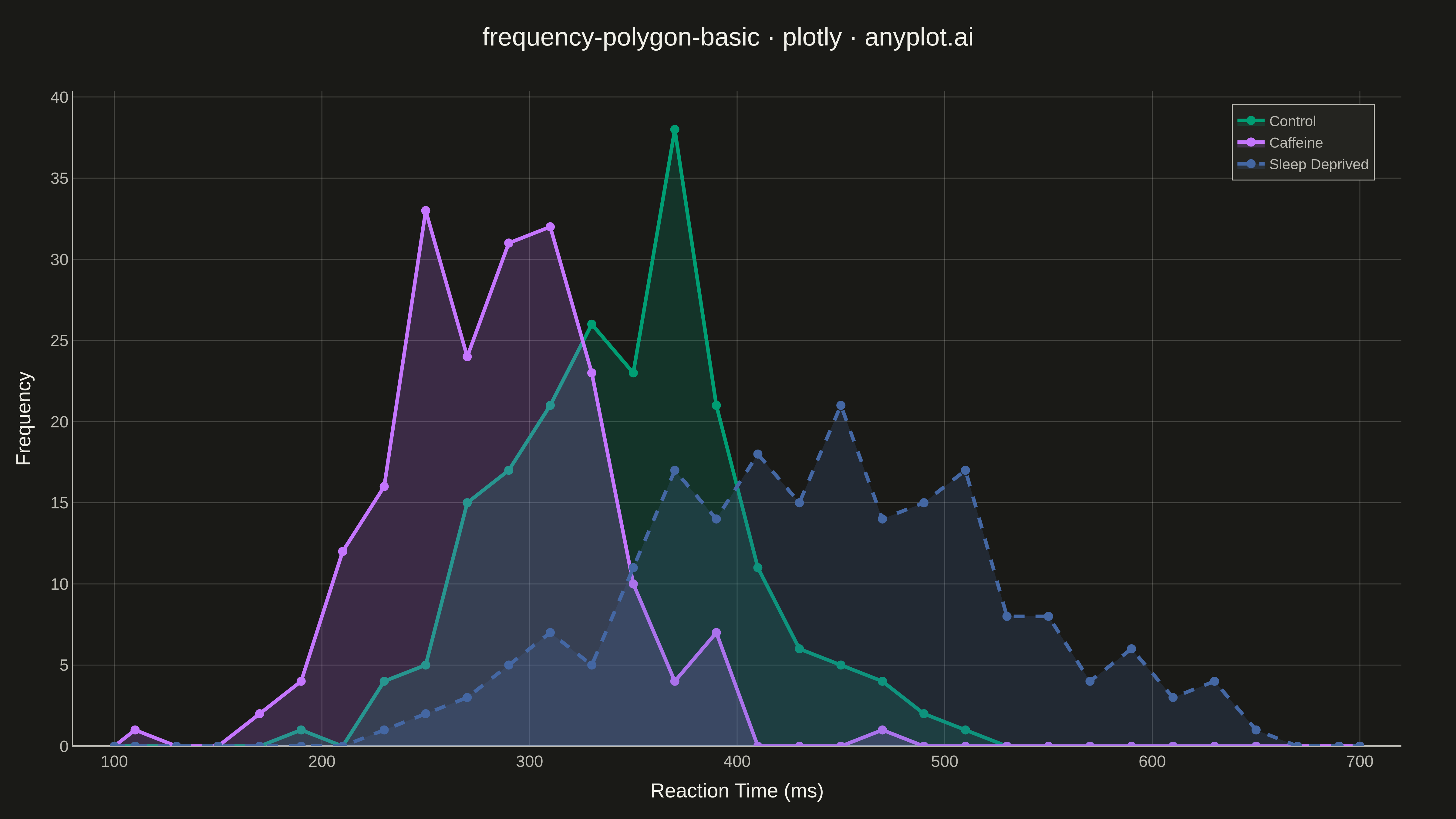
A frequency polygon connects the midpoints of histogram bins with straight line segments, creating a smooth outline of the distribution shape. This visualization excels at comparing multiple distributions simultaneously since lines overlap without obscuring each other, unlike stacked or overlapping histogram bars. Frequency polygons reveal differences in central tendency, spread, skewness, and modality across groups with minimal visual clutter.
""" anyplot.ai
frequency-polygon-basic: Frequency Polygon for Distribution Comparison
Library: plotly 6.7.0 | Python 3.13.13
Quality: 91/100 | Updated: 2026-05-17
"""

import os

import numpy as np
import plotly.graph_objects as go


# Theme tokens (see prompts/default-style-guide.md "Background" + "Theme-adaptive Chrome")
THEME = os.getenv("ANYPLOT_THEME", "light")
PAGE_BG = "#FAF8F1" if THEME == "light" else "#1A1A17"
ELEVATED_BG = "#FFFDF6" if THEME == "light" else "#242420"
INK = "#1A1A17" if THEME == "light" else "#F0EFE8"
INK_SOFT = "#4A4A44" if THEME == "light" else "#B8B7B0"
GRID = "rgba(26, 26, 23, 0.2)" if THEME == "light" else "rgba(240, 239, 232, 0.2)"

# Okabe-Ito palette
BRAND = "#009E73"  # Okabe-Ito position 1 — ALWAYS first series
OKABE_VERMILLION = "#C475FD"  # Okabe-Ito position 2
OKABE_BLUE = "#4467A3"  # Okabe-Ito position 3

# Data - Reaction times (ms) for three experimental conditions
np.random.seed(42)

# Control group - normal distribution centered around 350ms
control = np.random.normal(loc=350, scale=60, size=200)

# Caffeine group - faster reactions, centered around 280ms
caffeine = np.random.normal(loc=280, scale=50, size=200)

# Sleep deprived group - slower and more variable reactions
sleep_deprived = np.random.normal(loc=450, scale=90, size=200)

# Define consistent bins for all groups
bin_edges = np.linspace(100, 700, 31)
bin_centers = (bin_edges[:-1] + bin_edges[1:]) / 2

# Calculate frequency for each group
control_freq, _ = np.histogram(control, bins=bin_edges)
caffeine_freq, _ = np.histogram(caffeine, bins=bin_edges)
sleep_deprived_freq, _ = np.histogram(sleep_deprived, bins=bin_edges)

# Extend to zero at both ends to close polygon
extended_centers = np.concatenate([[bin_edges[0]], bin_centers, [bin_edges[-1]]])
control_extended = np.concatenate([[0], control_freq, [0]])
caffeine_extended = np.concatenate([[0], caffeine_freq, [0]])
sleep_deprived_extended = np.concatenate([[0], sleep_deprived_freq, [0]])

# Create figure
fig = go.Figure()

# Add frequency polygons with semi-transparent fill
fig.add_trace(
    go.Scatter(
        x=extended_centers,
        y=control_extended,
        mode="lines+markers",
        name="Control",
        line={"color": BRAND, "width": 4},
        marker={"size": 10, "color": BRAND},
        fill="tozeroy",
        fillcolor="rgba(0, 158, 115, 0.2)",
    )
)

fig.add_trace(
    go.Scatter(
        x=extended_centers,
        y=caffeine_extended,
        mode="lines+markers",
        name="Caffeine",
        line={"color": OKABE_VERMILLION, "width": 4},
        marker={"size": 10, "color": OKABE_VERMILLION},
        fill="tozeroy",
        fillcolor="rgba(196, 117, 253, 0.2)",
    )
)

fig.add_trace(
    go.Scatter(
        x=extended_centers,
        y=sleep_deprived_extended,
        mode="lines+markers",
        name="Sleep Deprived",
        line={"color": OKABE_BLUE, "width": 4, "dash": "dash"},
        marker={"size": 10, "color": OKABE_BLUE},
        fill="tozeroy",
        fillcolor="rgba(68, 103, 163, 0.2)",
    )
)

# Update layout with theme-adaptive colors
fig.update_layout(
    title={
        "text": "frequency-polygon-basic · plotly · anyplot.ai",
        "font": {"size": 28, "color": INK},
        "x": 0.5,
        "xanchor": "center",
    },
    xaxis={
        "title": {"text": "Reaction Time (ms)", "font": {"size": 22, "color": INK}},
        "tickfont": {"size": 18, "color": INK_SOFT},
        "showgrid": True,
        "gridcolor": GRID,
        "gridwidth": 1,
        "linecolor": INK_SOFT,
        "zerolinecolor": INK_SOFT,
        "range": [80, 720],
    },
    yaxis={
        "title": {"text": "Frequency", "font": {"size": 22, "color": INK}},
        "tickfont": {"size": 18, "color": INK_SOFT},
        "showgrid": True,
        "gridcolor": GRID,
        "gridwidth": 1,
        "linecolor": INK_SOFT,
        "zerolinecolor": INK_SOFT,
    },
    legend={
        "font": {"size": 16, "color": INK_SOFT},
        "x": 0.98,
        "y": 0.98,
        "xanchor": "right",
        "yanchor": "top",
        "bgcolor": ELEVATED_BG,
        "bordercolor": INK_SOFT,
        "borderwidth": 1,
    },
    paper_bgcolor=PAGE_BG,
    plot_bgcolor=PAGE_BG,
    margin={"l": 80, "r": 60, "t": 100, "b": 80},
)

# Save as PNG and HTML with theme suffix
fig.write_image(f"plot-{THEME}.png", width=1600, height=900, scale=3)
fig.write_html(f"plot-{THEME}.html", include_plotlyjs="cdn")
Runnable source as JSON, for any HTTP client: https://api.anyplot.ai/specs/frequency-polygon-basic/plotly/code. Any spec id and library id listed in llms-full.txt fit the same URL shape; every URL below is complete and callable.
{
  "spec_id": "frequency-polygon-basic",
  "language": "python",
  "library": "plotly",
  "page": "https://anyplot.ai/frequency-polygon-basic/python/plotly",
  "hub": "https://anyplot.ai/frequency-polygon-basic",
  "code_json": "https://api.anyplot.ai/specs/frequency-polygon-basic/plotly/code",
  "spec_json": "https://api.anyplot.ai/specs/frequency-polygon-basic",
  "render_light_png": "https://storage.googleapis.com/anyplot-images/plots/frequency-polygon-basic/python/plotly/plot-light.png",
  "render_dark_png": "https://storage.googleapis.com/anyplot-images/plots/frequency-polygon-basic/python/plotly/plot-dark.png",
  "interactive_light_html": "https://storage.googleapis.com/anyplot-images/plots/frequency-polygon-basic/python/plotly/plot-light.html",
  "interactive_dark_html": "https://storage.googleapis.com/anyplot-images/plots/frequency-polygon-basic/python/plotly/plot-dark.html",
  "quality_score": 91.0,
  "license": "MIT",
  "guide": "https://anyplot.ai/llms.txt"
}
Part of Frequency Polygon for Distribution Comparison on anyplot.ai.