The same plot in 14 other libraries — JavaScript: Chart.js, D3.js, Highcharts, MUI X Charts; Python: Altair, Bokeh, lets-plot, Matplotlib, Plotly, plotnine, Pygal, Seaborn; R: ggplot2; Julia: Makie.jl. Compare all 15 side by side: Gini Impurity vs Entropy Comparison in Python, R, Julia and JavaScript.
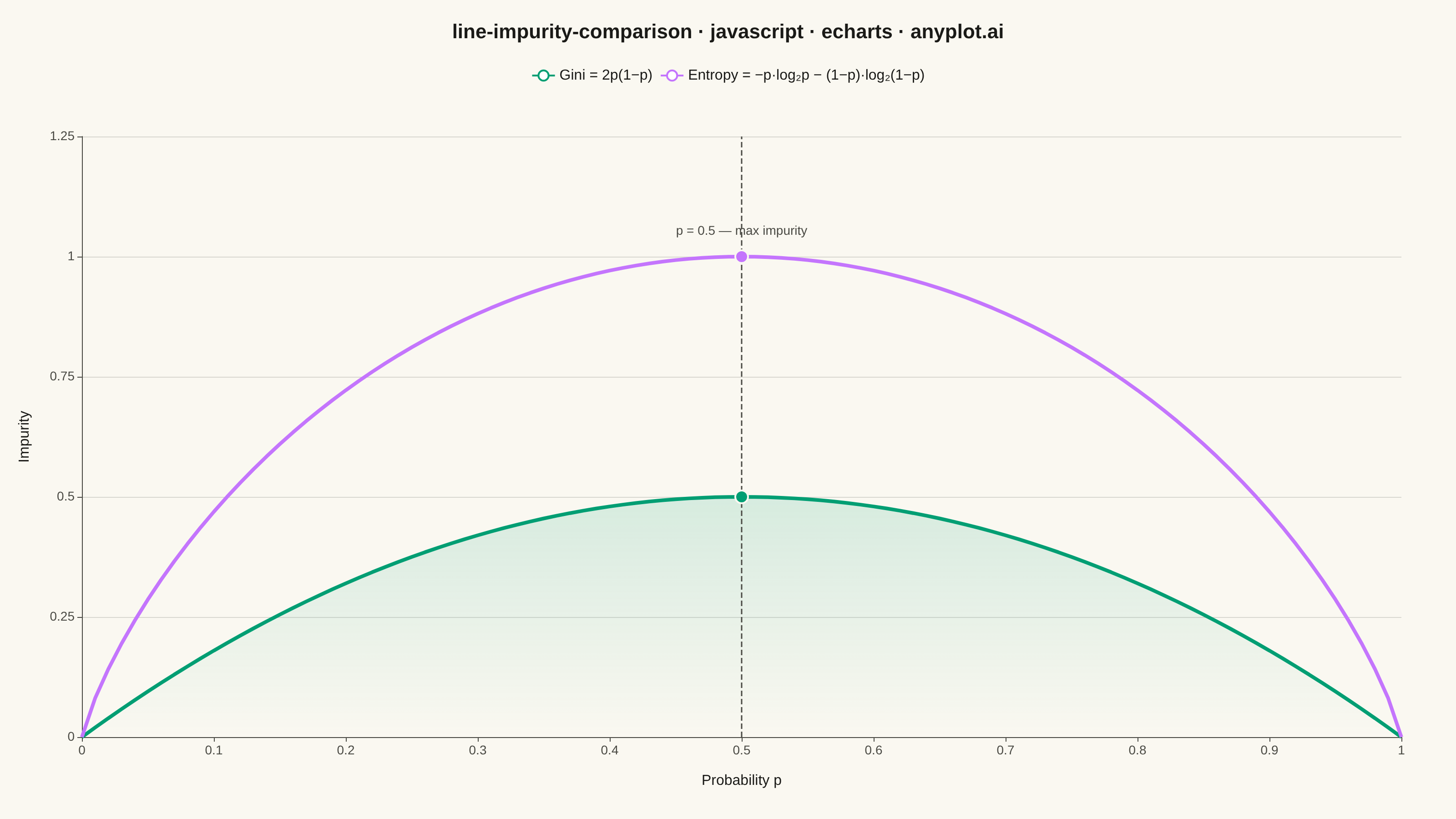
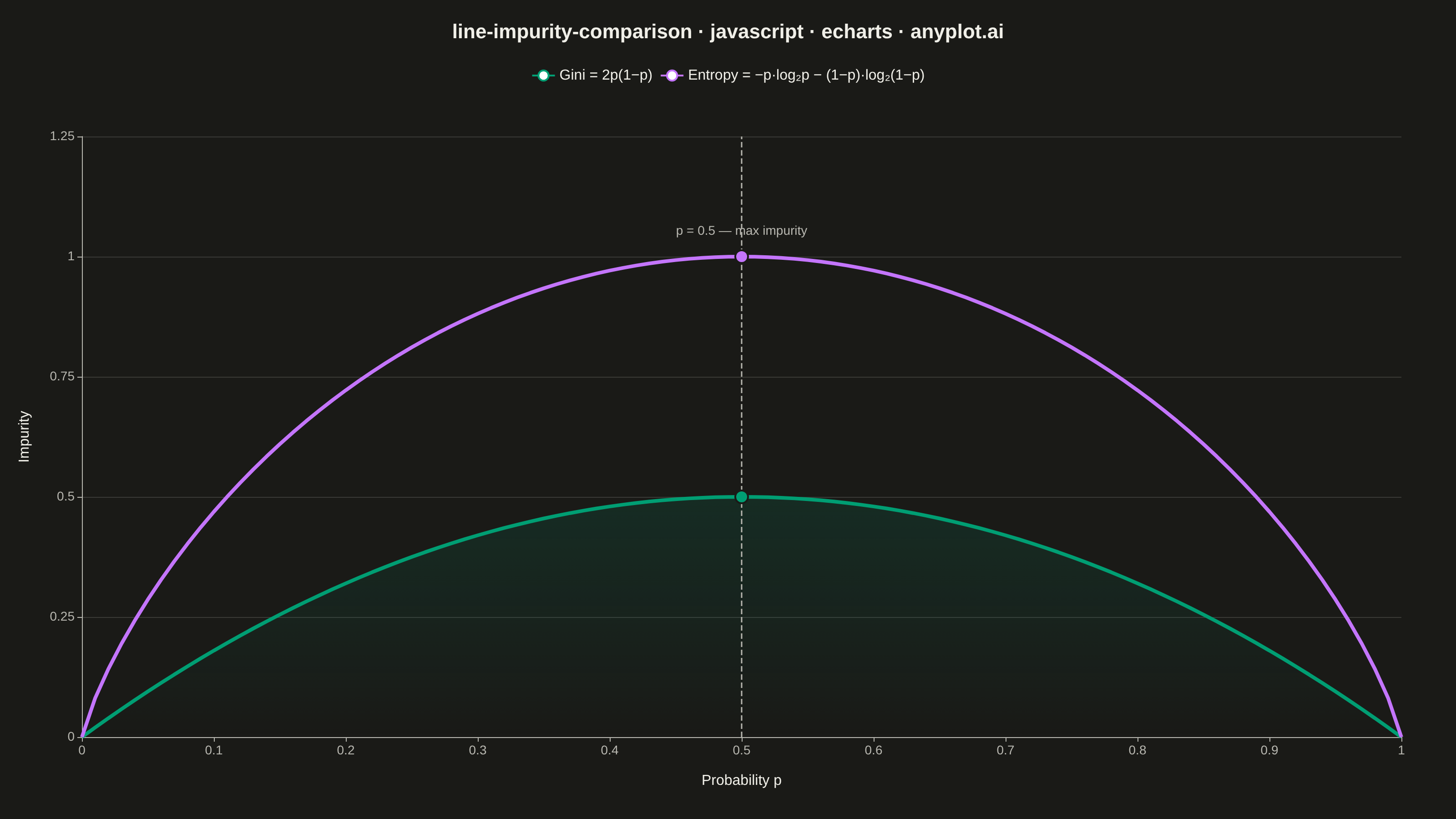
A theoretical comparison plot showing Gini impurity and entropy (information gain) as splitting criteria for decision trees across the probability range [0, 1]. Both curves are displayed on the same axes to illustrate their similar behavior and slight differences. This educational visualization helps understand the mathematical foundation of tree-based algorithms and why both criteria lead to similar tree structures in practice.
// anyplot.ai
// line-impurity-comparison: Gini Impurity vs Entropy Comparison
// Library: echarts 6.1.0 | JavaScript 22.23.2
// Quality: 92/100 | Created: 2026-08-26

const t = window.ANYPLOT_TOKENS;

// --- Data (in-memory, deterministic) ----------------------------------------
// Splitting-criterion curves across the full probability range, 101 points for
// a smooth curve including both endpoints.
const POINT_COUNT = 101;
const probabilities = Array.from(
  { length: POINT_COUNT },
  (_, i) => i / (POINT_COUNT - 1),
);

const giniImpurity = probabilities.map((p) => 2 * p * (1 - p));
const entropy = probabilities.map((p) => {
  // Binary entropy in bits; the p*log2(p) term is defined as 0 at p=0 and p=1
  // (the standard 0*log(0) := 0 convention), so both endpoints render cleanly.
  const term = (x) => (x === 0 ? 0 : -x * Math.log2(x));
  return term(p) + term(1 - p);
});

// --- Init --------------------------------------------------------------------
const chart = echarts.init(document.getElementById("container"));

// --- Option --------------------------------------------------------------------
chart.setOption({
  animation: false,
  color: [t.palette[0], t.palette[1]],
  backgroundColor: "transparent",
  title: {
    text: "line-impurity-comparison · javascript · echarts · anyplot.ai",
    left: "center",
    top: 20,
    textStyle: { color: t.ink, fontSize: 22 },
  },
  legend: {
    top: 70,
    textStyle: { color: t.ink, fontSize: 16 },
    data: ["Gini = 2p(1−p)", "Entropy = −p·log₂p − (1−p)·log₂(1−p)"],
  },
  grid: { left: 90, right: 60, top: 150, bottom: 90 },
  xAxis: {
    type: "value",
    name: "Probability p",
    nameLocation: "middle",
    nameGap: 40,
    nameTextStyle: { color: t.ink, fontSize: 16 },
    min: 0,
    max: 1,
    interval: 0.1,
    axisLabel: { color: t.inkSoft, fontSize: 14 },
    axisLine: { lineStyle: { color: t.inkSoft } },
    splitLine: { show: false },
  },
  yAxis: {
    type: "value",
    name: "Impurity",
    nameLocation: "middle",
    nameGap: 55,
    nameTextStyle: { color: t.ink, fontSize: 16 },
    min: 0,
    max: 1.25,
    interval: 0.25,
    axisLabel: { color: t.inkSoft, fontSize: 14 },
    axisLine: { lineStyle: { color: t.inkSoft } },
    splitLine: { lineStyle: { color: t.grid } },
  },
  series: [
    {
      name: "Gini = 2p(1−p)",
      type: "line",
      data: probabilities.map((p, i) => [p, giniImpurity[i]]),
      showSymbol: false,
      lineStyle: { width: 4, color: t.palette[0] },
      areaStyle: {
        color: new echarts.graphic.LinearGradient(0, 0, 0, 1, [
          { offset: 0, color: t.palette[0] + "33" },
          { offset: 1, color: t.palette[0] + "00" },
        ]),
      },
      markLine: {
        symbol: "none",
        silent: true,
        animation: false,
        lineStyle: { color: t.inkSoft, type: "dashed", width: 1.5 },
        label: { show: false },
        data: [{ xAxis: 0.5 }],
      },
      markPoint: {
        symbol: "circle",
        symbolSize: 14,
        animation: false,
        itemStyle: {
          color: t.palette[0],
          borderColor: t.pageBg,
          borderWidth: 2,
        },
        label: { show: false },
        data: [{ coord: [0.5, 0.5] }],
      },
    },
    {
      name: "Entropy = −p·log₂p − (1−p)·log₂(1−p)",
      type: "line",
      data: probabilities.map((p, i) => [p, entropy[i]]),
      showSymbol: false,
      lineStyle: { width: 4, color: t.palette[1] },
      markPoint: {
        symbol: "circle",
        symbolSize: 14,
        animation: false,
        itemStyle: {
          color: t.palette[1],
          borderColor: t.pageBg,
          borderWidth: 2,
        },
        label: {
          show: true,
          formatter: "p = 0.5 — max impurity",
          position: "top",
          align: "center",
          offset: [0, -8],
          color: t.inkSoft,
          fontSize: 14,
        },
        data: [{ coord: [0.5, 1] }],
      },
    },
  ],
});
Runnable source as JSON, for any HTTP client: https://api.anyplot.ai/specs/line-impurity-comparison/echarts/code. Any spec id and library id listed in llms-full.txt fit the same URL shape; every URL below is complete and callable.
{
  "spec_id": "line-impurity-comparison",
  "language": "javascript",
  "library": "echarts",
  "page": "https://anyplot.ai/line-impurity-comparison/javascript/echarts",
  "hub": "https://anyplot.ai/line-impurity-comparison",
  "code_json": "https://api.anyplot.ai/specs/line-impurity-comparison/echarts/code",
  "spec_json": "https://api.anyplot.ai/specs/line-impurity-comparison",
  "render_light_png": "https://storage.googleapis.com/anyplot-images/plots/line-impurity-comparison/javascript/echarts/plot-light.png",
  "render_dark_png": "https://storage.googleapis.com/anyplot-images/plots/line-impurity-comparison/javascript/echarts/plot-dark.png",
  "interactive_light_html": "https://storage.googleapis.com/anyplot-images/plots/line-impurity-comparison/javascript/echarts/plot-light.html",
  "interactive_dark_html": "https://storage.googleapis.com/anyplot-images/plots/line-impurity-comparison/javascript/echarts/plot-dark.html",
  "quality_score": 92.0,
  "license": "MIT",
  "guide": "https://anyplot.ai/llms.txt"
}
Part of Gini Impurity vs Entropy Comparison on anyplot.ai.