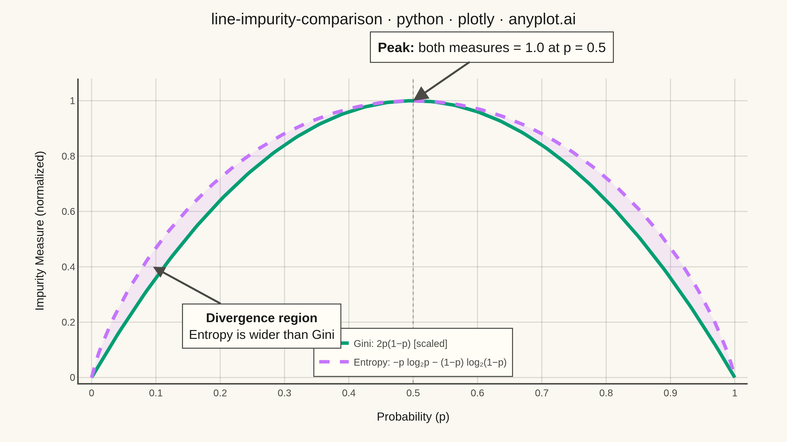
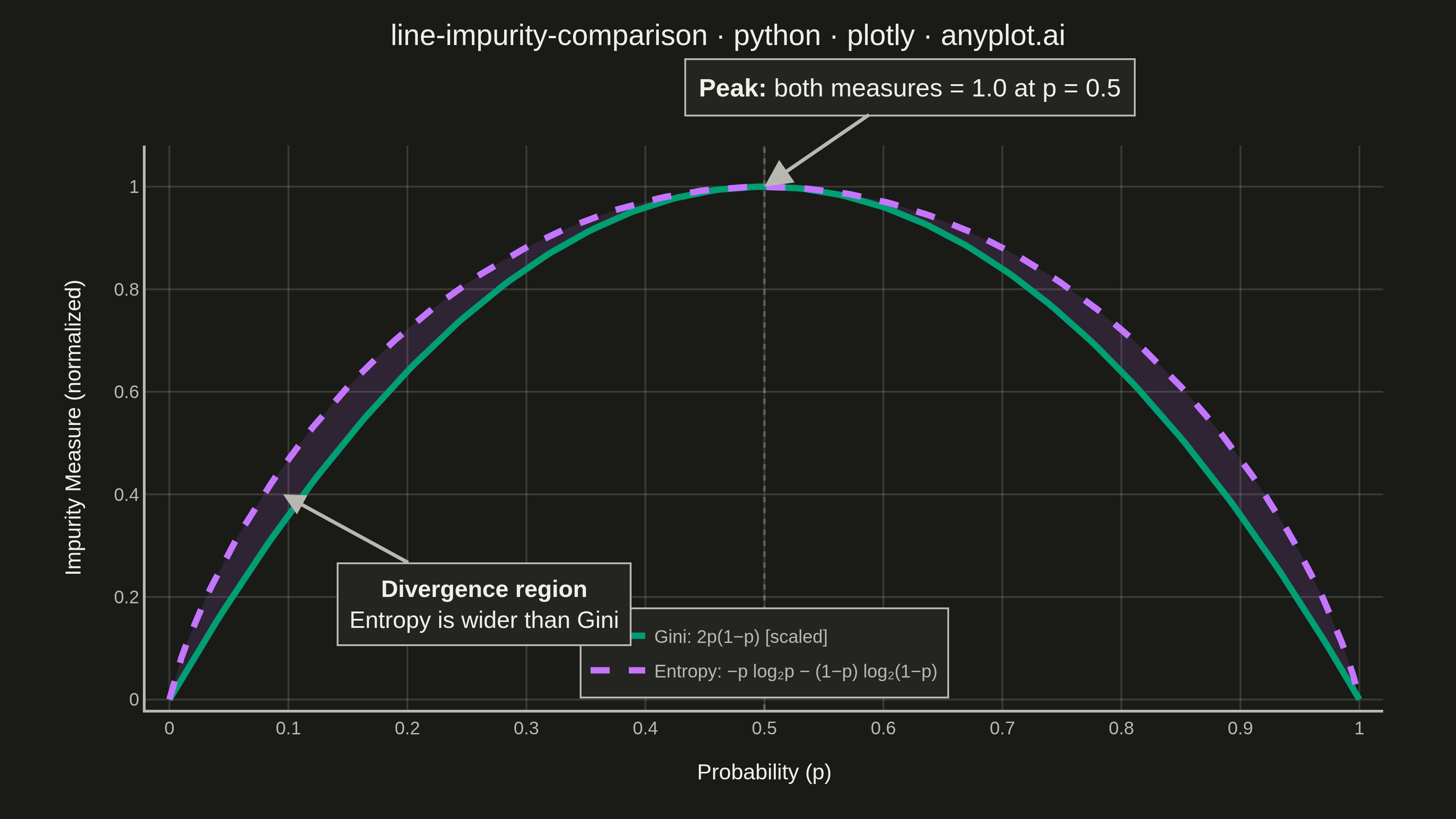
A theoretical comparison plot showing Gini impurity and entropy (information gain) as splitting criteria for decision trees across the probability range [0, 1]. Both curves are displayed on the same axes to illustrate their similar behavior and slight differences. This educational visualization helps understand the mathematical foundation of tree-based algorithms and why both criteria lead to similar tree structures in practice.
""" anyplot.ai
line-impurity-comparison: Gini Impurity vs Entropy Comparison
Library: plotly 6.7.0 | Python 3.13.13
Quality: 93/100 | Updated: 2026-05-29
"""

import os

import numpy as np
import plotly.graph_objects as go


# Theme tokens (Imprint palette + theme-adaptive chrome)
THEME = os.getenv("ANYPLOT_THEME", "light")
PAGE_BG = "#FAF8F1" if THEME == "light" else "#1A1A17"
ELEVATED_BG = "#FFFDF6" if THEME == "light" else "#242420"
INK = "#1A1A17" if THEME == "light" else "#F0EFE8"
INK_SOFT = "#4A4A44" if THEME == "light" else "#B8B7B0"
GRID = "rgba(26,26,23,0.15)" if THEME == "light" else "rgba(240,239,232,0.15)"

# Imprint categorical palette — positions 1 and 2
GINI_COLOR = "#009E73"  # Imprint position 1 — brand green, always first series
ENTROPY_COLOR = "#C475FD"  # Imprint position 2 — lavender

# Data
p = np.linspace(0, 1, 200)

gini_raw = 2 * p * (1 - p)
gini = gini_raw / gini_raw.max()

entropy_raw = np.where((p == 0) | (p == 1), 0.0, -p * np.log2(p) - (1 - p) * np.log2(1 - p))
entropy = entropy_raw / entropy_raw.max()

title = "line-impurity-comparison · python · plotly · anyplot.ai"
title_fontsize = 16  # len=55, under 67 baseline — no scaling needed

# Plot
fig = go.Figure()

# Shaded region between curves to highlight divergence
fig.add_trace(
    go.Scatter(
        x=np.concatenate([p, p[::-1]]),
        y=np.concatenate([entropy, gini[::-1]]),
        fill="toself",
        fillcolor="rgba(196,117,253,0.12)",  # Imprint lavender at low opacity
        line={"width": 0},
        showlegend=False,
        hoverinfo="skip",
    )
)

# Gini curve — Imprint position 1
fig.add_trace(
    go.Scatter(
        x=p,
        y=gini,
        mode="lines",
        name="Gini: 2p(1−p) [scaled]",
        line={"color": GINI_COLOR, "width": 3.5},
        hovertemplate="p = %{x:.2f}<br>Gini = %{y:.3f}<extra></extra>",
    )
)

# Entropy curve — Imprint position 2, dashed for distinction
fig.add_trace(
    go.Scatter(
        x=p,
        y=entropy,
        mode="lines",
        name="Entropy: −p log₂p − (1−p) log₂(1−p)",
        line={"color": ENTROPY_COLOR, "width": 3.5, "dash": "dash"},
        hovertemplate="p = %{x:.2f}<br>Entropy = %{y:.3f}<extra></extra>",
    )
)

# Annotation at p=0.5 maximum
fig.add_annotation(
    x=0.5,
    y=1.0,
    text="<b>Peak:</b> both measures = 1.0 at p = 0.5",
    showarrow=True,
    arrowhead=2,
    arrowsize=1.5,
    arrowwidth=2,
    arrowcolor=INK_SOFT,
    ax=80,
    ay=-55,
    font={"size": 14, "color": INK},
    bgcolor=ELEVATED_BG,
    bordercolor=INK_SOFT,
    borderwidth=1,
    borderpad=7,
)

# Annotation highlighting divergence region
max_diff_idx = int(np.argmax(entropy - gini))
fig.add_annotation(
    x=p[max_diff_idx],
    y=(entropy[max_diff_idx] + gini[max_diff_idx]) / 2,
    text="<b>Divergence region</b><br>Entropy is wider than Gini",
    showarrow=True,
    arrowhead=2,
    arrowsize=1.2,
    arrowwidth=2,
    arrowcolor=INK_SOFT,
    ax=110,
    ay=60,
    font={"size": 13, "color": INK},
    bgcolor=ELEVATED_BG,
    bordercolor=INK_SOFT,
    borderwidth=1,
    borderpad=6,
)

# Vertical reference line at p=0.5
fig.add_vline(x=0.5, line_width=1.5, line_dash="dot", line_color=INK_SOFT, opacity=0.3)

# Style
fig.update_layout(
    autosize=False,
    title={"text": title, "font": {"size": title_fontsize, "color": INK}, "x": 0.5, "xanchor": "center", "y": 0.97},
    xaxis={
        "title": {"text": "Probability (p)", "font": {"size": 12, "color": INK}},
        "tickfont": {"size": 10, "color": INK_SOFT},
        "range": [-0.02, 1.02],
        "dtick": 0.1,
        "showgrid": True,
        "gridcolor": GRID,
        "gridwidth": 1,
        "showline": True,
        "linecolor": INK_SOFT,
        "linewidth": 1.5,
        "zeroline": False,
        "mirror": False,
    },
    yaxis={
        "title": {"text": "Impurity Measure (normalized)", "font": {"size": 12, "color": INK}},
        "tickfont": {"size": 10, "color": INK_SOFT},
        "range": [-0.02, 1.08],
        "dtick": 0.2,
        "showgrid": True,
        "gridcolor": GRID,
        "gridwidth": 1,
        "showline": True,
        "linecolor": INK_SOFT,
        "linewidth": 1.5,
        "zeroline": False,
        "mirror": False,
    },
    paper_bgcolor=PAGE_BG,
    plot_bgcolor=PAGE_BG,
    font={"color": INK},
    template="plotly_white",
    legend={
        "font": {"size": 10, "color": INK_SOFT},
        "x": 0.5,
        "y": 0.02,
        "xanchor": "center",
        "yanchor": "bottom",
        "bgcolor": ELEVATED_BG,
        "bordercolor": INK_SOFT,
        "borderwidth": 1,
    },
    margin={"l": 80, "r": 40, "t": 80, "b": 60},
)

# Save
fig.write_image(f"plot-{THEME}.png", width=800, height=450, scale=4)
fig.write_html(f"plot-{THEME}.html", include_plotlyjs="cdn")
Runnable source as JSON, for any HTTP client: https://api.anyplot.ai/specs/line-impurity-comparison/plotly/code. Any spec id and library id listed in llms-full.txt fit the same URL shape; every URL below is complete and callable.
{
  "spec_id": "line-impurity-comparison",
  "language": "python",
  "library": "plotly",
  "page": "https://anyplot.ai/line-impurity-comparison/python/plotly",
  "hub": "https://anyplot.ai/line-impurity-comparison",
  "code_json": "https://api.anyplot.ai/specs/line-impurity-comparison/plotly/code",
  "spec_json": "https://api.anyplot.ai/specs/line-impurity-comparison",
  "render_light_png": "https://storage.googleapis.com/anyplot-images/plots/line-impurity-comparison/python/plotly/plot-light.png",
  "render_dark_png": "https://storage.googleapis.com/anyplot-images/plots/line-impurity-comparison/python/plotly/plot-dark.png",
  "interactive_light_html": "https://storage.googleapis.com/anyplot-images/plots/line-impurity-comparison/python/plotly/plot-light.html",
  "interactive_dark_html": "https://storage.googleapis.com/anyplot-images/plots/line-impurity-comparison/python/plotly/plot-dark.html",
  "quality_score": 93.0,
  "license": "MIT",
  "guide": "https://anyplot.ai/llms.txt"
}
Part of Gini Impurity vs Entropy Comparison on anyplot.ai.