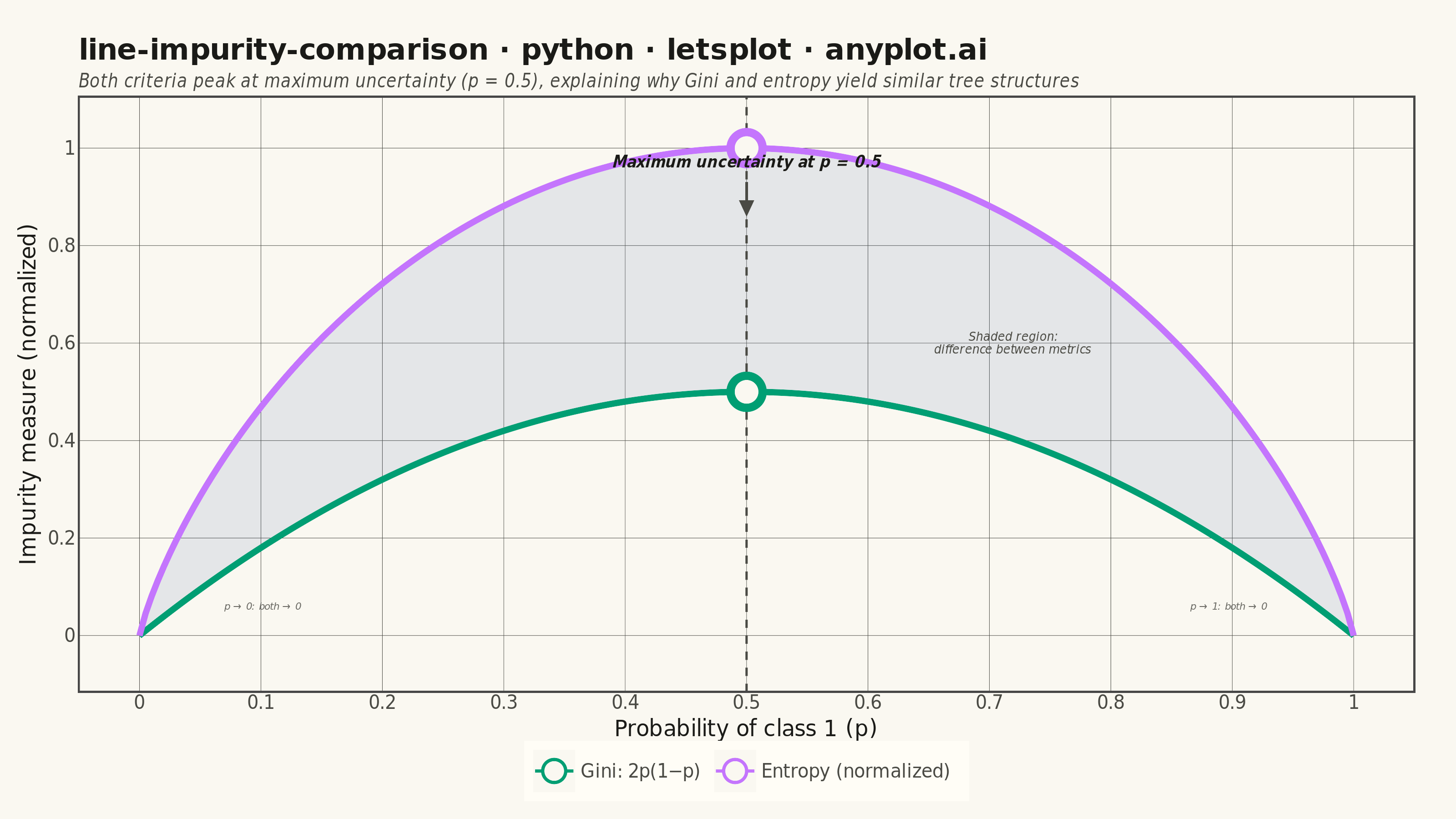
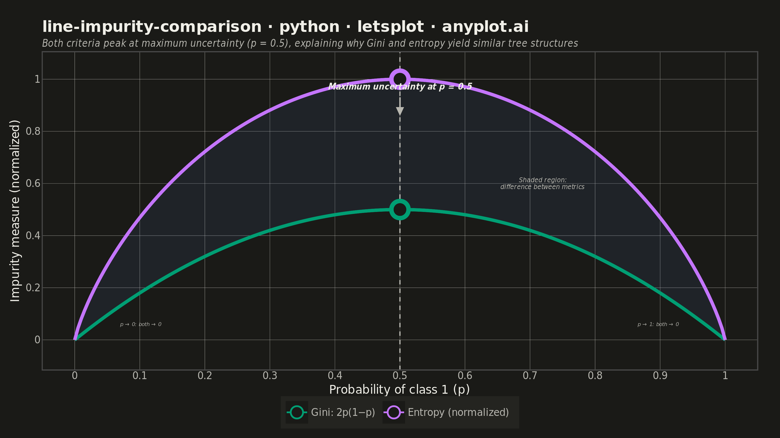
A theoretical comparison plot showing Gini impurity and entropy (information gain) as splitting criteria for decision trees across the probability range [0, 1]. Both curves are displayed on the same axes to illustrate their similar behavior and slight differences. This educational visualization helps understand the mathematical foundation of tree-based algorithms and why both criteria lead to similar tree structures in practice.
""" anyplot.ai
line-impurity-comparison: Gini Impurity vs Entropy Comparison
Library: letsplot 4.10.1 | Python 3.13.13
Quality: 91/100 | Updated: 2026-05-29
"""

import os

import numpy as np
import pandas as pd
from lets_plot import *
from lets_plot.export import ggsave


LetsPlot.setup_html()

# Theme tokens — Imprint palette, theme-adaptive chrome
THEME = os.getenv("ANYPLOT_THEME", "light")
PAGE_BG = "#FAF8F1" if THEME == "light" else "#1A1A17"
ELEVATED_BG = "#FFFDF6" if THEME == "light" else "#242420"
INK = "#1A1A17" if THEME == "light" else "#F0EFE8"
INK_SOFT = "#4A4A44" if THEME == "light" else "#B8B7B0"
INK_MUTED = "#6B6A63" if THEME == "light" else "#A8A79F"

IMPRINT_PALETTE = ["#009E73", "#C475FD", "#4467A3", "#BD8233", "#AE3030", "#2ABCCD", "#954477", "#99B314"]

# Data
p = np.linspace(0, 1, 200)

# Gini impurity: 2p(1 - p)
gini = 2 * p * (1 - p)

# Entropy: -p log2(p) - (1-p) log2(1-p), normalized to [0, 1]
with np.errstate(divide="ignore", invalid="ignore"):
    entropy = -p * np.log2(p) - (1 - p) * np.log2(1 - p)
entropy = np.nan_to_num(entropy, nan=0.0)

# Main curves data — Gini first so it gets Imprint position 1 (#009E73)
df = pd.DataFrame(
    {
        "p": np.tile(p, 2),
        "impurity": np.concatenate([gini, entropy]),
        "metric": ["Gini: 2p(1−p)"] * len(p) + ["Entropy (normalized)"] * len(p),
    }
)

# Shaded region between curves
ribbon_df = pd.DataFrame({"p": p, "gini": gini, "entropy": entropy})

# Open circle markers at maxima (unified, no unused columns)
markers_df = pd.DataFrame(
    {"p": [0.5, 0.5], "impurity": [1.0, 0.5], "metric": ["Entropy (normalized)", "Gini: 2p(1−p)"]}
)

# Arrow pointing to peak area
arrow_df = pd.DataFrame({"x": [0.5], "y": [0.93], "xend": [0.5], "yend": [0.86]})

# Annotations
main_label_df = pd.DataFrame({"p": [0.5], "impurity": [0.97], "label": ["Maximum uncertainty at p = 0.5"]})
region_label_df = pd.DataFrame(
    {"p": [0.72], "impurity": [0.6], "label": ["Shaded region:\ndifference between metrics"]}
)
# Shifted inward (0.07 / 0.93) to avoid left/right edge clipping
boundary_df = pd.DataFrame(
    {"p": [0.07, 0.93], "impurity": [0.06, 0.06], "label": ["p → 0: both → 0", "p → 1: both → 0"], "hjust": [0.0, 1.0]}
)

# Plot
plot = (
    ggplot()
    # Shaded ribbon between curves
    + geom_ribbon(
        data=ribbon_df,
        mapping=aes(x="p", ymin="gini", ymax="entropy"),
        fill=IMPRINT_PALETTE[2],
        alpha=0.12,
        tooltips="none",
    )
    # Main curves with interactive tooltips
    + geom_line(
        data=df,
        mapping=aes(x="p", y="impurity", color="metric"),
        size=1.5,
        tooltips=layer_tooltips()
        .format("@p", ".2f")
        .format("@impurity", ".3f")
        .line("@metric")
        .line("p = @p")
        .line("impurity = @impurity"),
    )
    # Vertical guide at p=0.5
    + geom_vline(xintercept=0.5, color=INK_SOFT, size=0.5, linetype="dashed")
    # Arrow from annotation to entropy maximum
    + geom_segment(
        aes(x="x", y="y", xend="xend", yend="yend"),
        data=arrow_df,
        color=INK_SOFT,
        size=0.6,
        arrow=arrow(angle=25, length=8, type="closed"),
    )
    # Open circle markers at maxima — unified, border color from metric scale
    + geom_point(
        aes(x="p", y="impurity", color="metric"),
        data=markers_df,
        size=6,
        shape=21,
        fill=PAGE_BG,
        stroke=2,
        tooltips="none",
    )
    # Annotation: maximum uncertainty label
    + geom_text(
        data=main_label_df,
        mapping=aes(x="p", y="impurity", label="label"),
        size=4,
        color=INK,
        fontface="bold italic",
    )
    # Annotation: shaded region explanation
    + geom_text(
        data=region_label_df,
        mapping=aes(x="p", y="impurity", label="label"),
        size=3.5,
        color=INK_SOFT,
        fontface="italic",
    )
    # Annotations: boundary behavior at p→0 and p→1
    + geom_text(
        data=boundary_df,
        mapping=aes(x="p", y="impurity", label="label", hjust="hjust"),
        size=3,
        color=INK_MUTED,
        fontface="italic",
    )
    # Scales — Imprint palette canonical order
    + scale_color_manual(values=[IMPRINT_PALETTE[0], IMPRINT_PALETTE[1]])
    + scale_x_continuous(breaks=list(np.arange(0, 1.1, 0.1)), limits=[0, 1])
    + scale_y_continuous(breaks=list(np.arange(0, 1.2, 0.2)), limits=[-0.06, 1.05])
    # Labels
    + labs(
        x="Probability of class 1 (p)",
        y="Impurity measure (normalized)",
        title="line-impurity-comparison · python · letsplot · anyplot.ai",
        subtitle="Both criteria peak at maximum uncertainty (p = 0.5), explaining why Gini and entropy yield similar tree structures",
        color="",
    )
    # Canvas: 800×450 × scale=4 → 3200×1800 px
    + ggsize(800, 450)
    + theme_minimal()
    + theme(
        plot_background=element_rect(fill=PAGE_BG, color=PAGE_BG),
        panel_background=element_rect(fill=PAGE_BG),
        axis_text=element_text(size=10, color=INK_SOFT),
        axis_title=element_text(size=12, color=INK),
        plot_title=element_text(size=16, face="bold", color=INK),
        plot_subtitle=element_text(size=10, color=INK_SOFT, face="italic"),
        legend_text=element_text(size=10, color=INK_SOFT),
        legend_background=element_rect(fill=ELEVATED_BG, color=INK_SOFT),
        legend_position="bottom",
        panel_grid_major=element_line(color=INK_SOFT, size=0.2),
        panel_grid_minor=element_blank(),
        axis_line=element_blank(),
        axis_ticks=element_blank(),
        plot_margin=[20, 20, 10, 10],
    )
)

# Save — PNG + HTML (interactive)
ggsave(plot, f"plot-{THEME}.png", path=".", scale=4)
ggsave(plot, f"plot-{THEME}.html", path=".")
Runnable source as JSON, for any HTTP client: https://api.anyplot.ai/specs/line-impurity-comparison/letsplot/code. Any spec id and library id listed in llms-full.txt fit the same URL shape; every URL below is complete and callable.
{
  "spec_id": "line-impurity-comparison",
  "language": "python",
  "library": "letsplot",
  "page": "https://anyplot.ai/line-impurity-comparison/python/letsplot",
  "hub": "https://anyplot.ai/line-impurity-comparison",
  "code_json": "https://api.anyplot.ai/specs/line-impurity-comparison/letsplot/code",
  "spec_json": "https://api.anyplot.ai/specs/line-impurity-comparison",
  "render_light_png": "https://storage.googleapis.com/anyplot-images/plots/line-impurity-comparison/python/letsplot/plot-light.png",
  "render_dark_png": "https://storage.googleapis.com/anyplot-images/plots/line-impurity-comparison/python/letsplot/plot-dark.png",
  "interactive_light_html": "https://storage.googleapis.com/anyplot-images/plots/line-impurity-comparison/python/letsplot/plot-light.html",
  "interactive_dark_html": "https://storage.googleapis.com/anyplot-images/plots/line-impurity-comparison/python/letsplot/plot-dark.html",
  "quality_score": 91.0,
  "license": "MIT",
  "guide": "https://anyplot.ai/llms.txt"
}
Part of Gini Impurity vs Entropy Comparison on anyplot.ai.