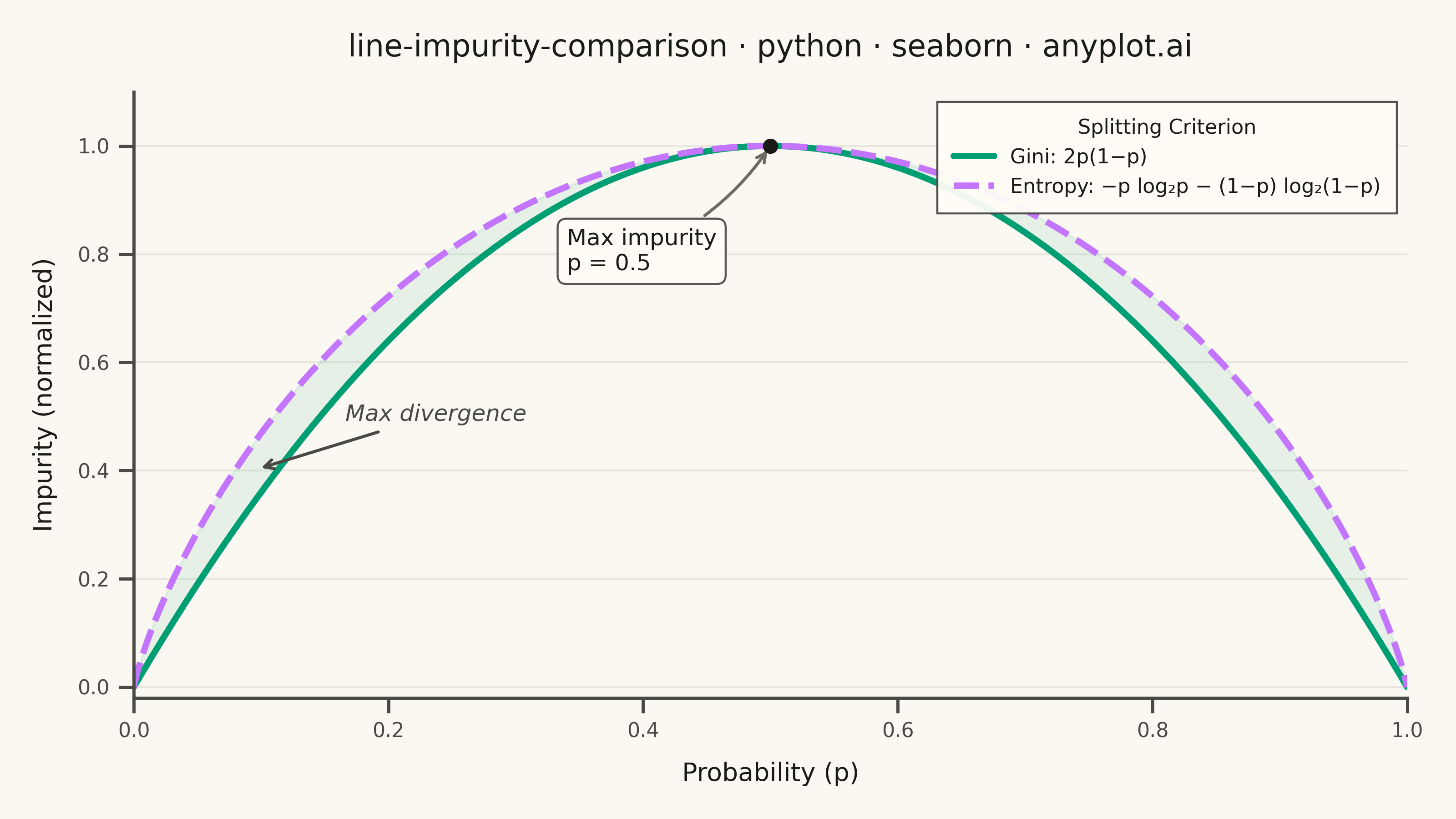
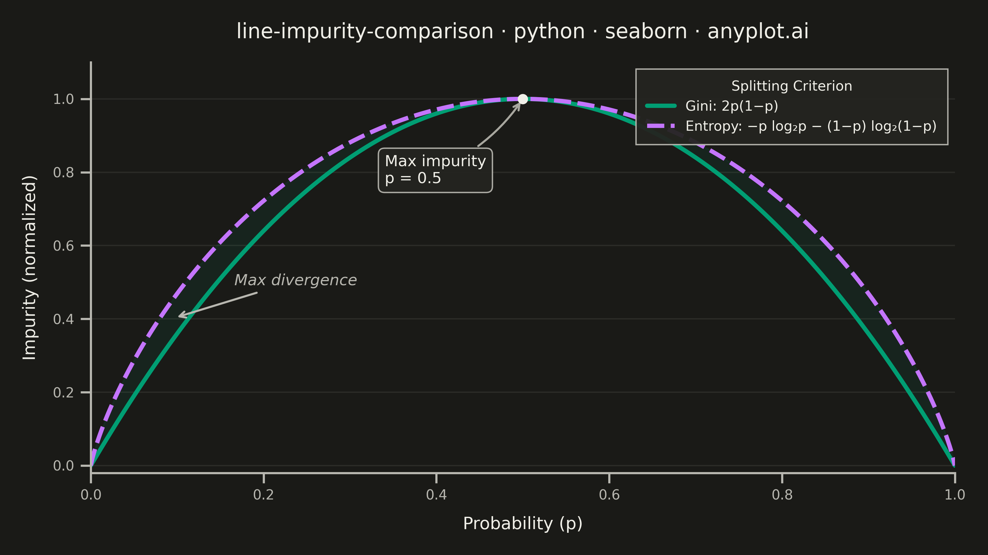
A theoretical comparison plot showing Gini impurity and entropy (information gain) as splitting criteria for decision trees across the probability range [0, 1]. Both curves are displayed on the same axes to illustrate their similar behavior and slight differences. This educational visualization helps understand the mathematical foundation of tree-based algorithms and why both criteria lead to similar tree structures in practice.
""" anyplot.ai
line-impurity-comparison: Gini Impurity vs Entropy Comparison
Library: seaborn 0.13.2 | Python 3.13.13
Quality: 88/100 | Updated: 2026-05-29
"""

import os

import matplotlib.pyplot as plt
import numpy as np
import pandas as pd
import seaborn as sns


# Theme tokens (see prompts/default-style-guide.md "Theme-adaptive Chrome")
THEME = os.getenv("ANYPLOT_THEME", "light")

PAGE_BG = "#FAF8F1" if THEME == "light" else "#1A1A17"
ELEVATED_BG = "#FFFDF6" if THEME == "light" else "#242420"
INK = "#1A1A17" if THEME == "light" else "#F0EFE8"
INK_SOFT = "#4A4A44" if THEME == "light" else "#B8B7B0"
INK_MUTED = "#6B6A63" if THEME == "light" else "#A8A79F"

# Imprint palette — first series always #009E73
IMPRINT_PALETTE = ["#009E73", "#C475FD", "#4467A3", "#BD8233", "#AE3030", "#2ABCCD", "#954477", "#99B314"]

# Data
p = np.linspace(0, 1, 500)

gini = 2 * p * (1 - p)
gini_normalized = gini / gini.max()

# Entropy with edge-case handling (0 * log2(0) → 0 by convention)
entropy = np.zeros_like(p)
mask = (p > 0) & (p < 1)
entropy[mask] = -p[mask] * np.log2(p[mask]) - (1 - p[mask]) * np.log2(1 - p[mask])
entropy_normalized = entropy / entropy.max()

# Long-format DataFrame — enables seaborn's idiomatic hue+style palette mapping
GINI_LABEL = "Gini: 2p(1−p)"
ENTROPY_LABEL = "Entropy: −p log₂p − (1−p) log₂(1−p)"

df = pd.DataFrame(
    {
        "p": np.concatenate([p, p]),
        "Impurity": np.concatenate([gini_normalized, entropy_normalized]),
        "Criterion": [GINI_LABEL] * len(p) + [ENTROPY_LABEL] * len(p),
    }
)

# Canvas: landscape 3200×1800 px (8 × 400 = 3200, 4.5 × 400 = 1800)
# Do NOT pass bbox_inches='tight' to savefig — see prompts/library/seaborn.md "Canvas"
sns.set_theme(
    style="ticks",
    rc={
        "figure.facecolor": PAGE_BG,
        "axes.facecolor": PAGE_BG,
        "axes.edgecolor": INK_SOFT,
        "axes.labelcolor": INK,
        "text.color": INK,
        "xtick.color": INK_SOFT,
        "ytick.color": INK_SOFT,
        "grid.color": INK_MUTED,
        "grid.alpha": 0.12,
        "legend.facecolor": ELEVATED_BG,
        "legend.edgecolor": INK_SOFT,
    },
)

fig, ax = plt.subplots(figsize=(8, 4.5), dpi=400)

color_gini = IMPRINT_PALETTE[0]  # #009E73 — first series (Gini)
color_entropy = IMPRINT_PALETTE[1]  # #C475FD — second series (Entropy)

# Shaded region between the two curves to highlight their divergence
ax.fill_between(p, gini_normalized, entropy_normalized, alpha=0.08, color=color_gini, zorder=1)

# Seaborn hue+style mapping — idiomatic multi-series approach using seaborn's
# palette dispatch and automatic dash-cycle differentiation
sns.lineplot(
    data=df,
    x="p",
    y="Impurity",
    hue="Criterion",
    style="Criterion",
    palette={GINI_LABEL: color_gini, ENTROPY_LABEL: color_entropy},
    linewidth=2.5,
    ax=ax,
)

# Subtle y-axis-only grid for readability (spec recommends a light grid)
ax.yaxis.grid(True, alpha=0.12, linewidth=0.8)

# Annotation: max divergence between the two curves
divergence = np.abs(entropy_normalized - gini_normalized)
max_div_idx = np.argmax(divergence)
mid_y = (gini_normalized[max_div_idx] + entropy_normalized[max_div_idx]) / 2

ax.annotate(
    "Max divergence",
    xy=(p[max_div_idx], mid_y),
    xytext=(p[max_div_idx] + 0.07, mid_y + 0.09),
    fontsize=9,
    fontstyle="italic",
    color=INK_SOFT,
    arrowprops={"arrowstyle": "->", "color": INK_SOFT, "lw": 1.2},
)

# Annotation: both curves peak at p = 0.5
ax.plot(0.5, 1.0, "o", color=INK, markersize=5, zorder=5)
ax.annotate(
    "Max impurity\np = 0.5",
    xy=(0.5, 1.0),
    xytext=(0.34, 0.77),
    fontsize=9,
    color=INK,
    arrowprops={"arrowstyle": "->", "color": INK_MUTED, "lw": 1.2, "connectionstyle": "arc3,rad=0.15"},
    bbox={"boxstyle": "round,pad=0.4", "facecolor": ELEVATED_BG, "edgecolor": INK_SOFT, "alpha": 0.92, "lw": 0.8},
)

# Labels and title
ax.set_xlabel("Probability (p)", fontsize=10, labelpad=8)
ax.set_ylabel("Impurity (normalized)", fontsize=10, labelpad=8)
ax.set_title("line-impurity-comparison · python · seaborn · anyplot.ai", fontsize=12, fontweight="medium", pad=14)
ax.tick_params(axis="both", labelsize=8)
ax.set_xlim(0, 1)
ax.set_ylim(-0.02, 1.1)

sns.despine(ax=ax, top=True, right=True)

# Legend — seaborn auto-generates merged hue+style handles
legend = ax.legend(
    title="Splitting Criterion",
    title_fontsize=8,
    fontsize=8,
    loc="upper right",
    framealpha=0.95,
    fancybox=False,
    borderpad=0.8,
)
legend.get_frame().set_linewidth(0.8)

fig.tight_layout()
plt.savefig(f"plot-{THEME}.png", dpi=400, facecolor=PAGE_BG)
Runnable source as JSON, for any HTTP client: https://api.anyplot.ai/specs/line-impurity-comparison/seaborn/code. Any spec id and library id listed in llms-full.txt fit the same URL shape; every URL below is complete and callable.
{
  "spec_id": "line-impurity-comparison",
  "language": "python",
  "library": "seaborn",
  "page": "https://anyplot.ai/line-impurity-comparison/python/seaborn",
  "hub": "https://anyplot.ai/line-impurity-comparison",
  "code_json": "https://api.anyplot.ai/specs/line-impurity-comparison/seaborn/code",
  "spec_json": "https://api.anyplot.ai/specs/line-impurity-comparison",
  "render_light_png": "https://storage.googleapis.com/anyplot-images/plots/line-impurity-comparison/python/seaborn/plot-light.png",
  "render_dark_png": "https://storage.googleapis.com/anyplot-images/plots/line-impurity-comparison/python/seaborn/plot-dark.png",
  "quality_score": 88.0,
  "license": "MIT",
  "guide": "https://anyplot.ai/llms.txt"
}
Part of Gini Impurity vs Entropy Comparison on anyplot.ai.