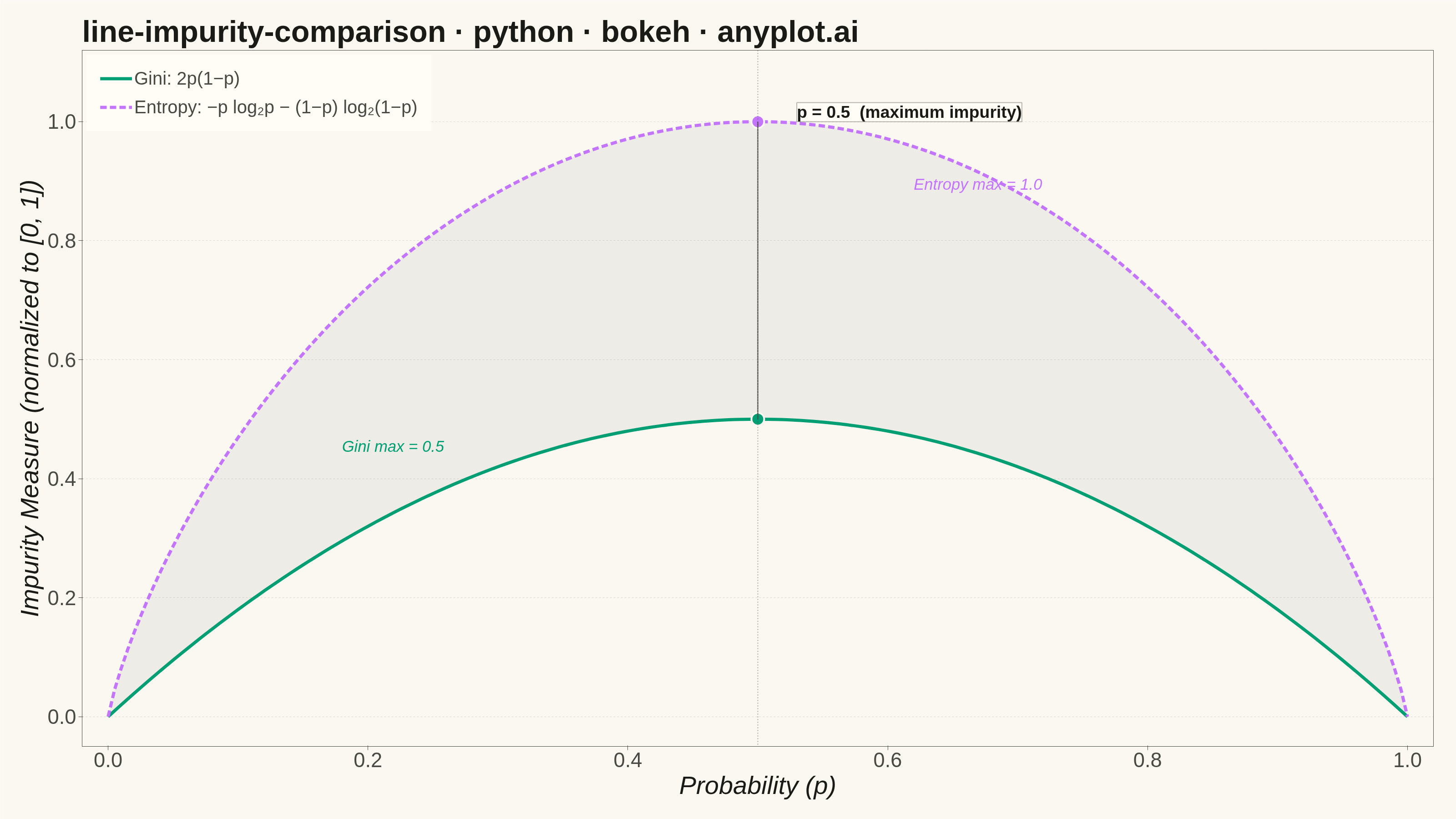
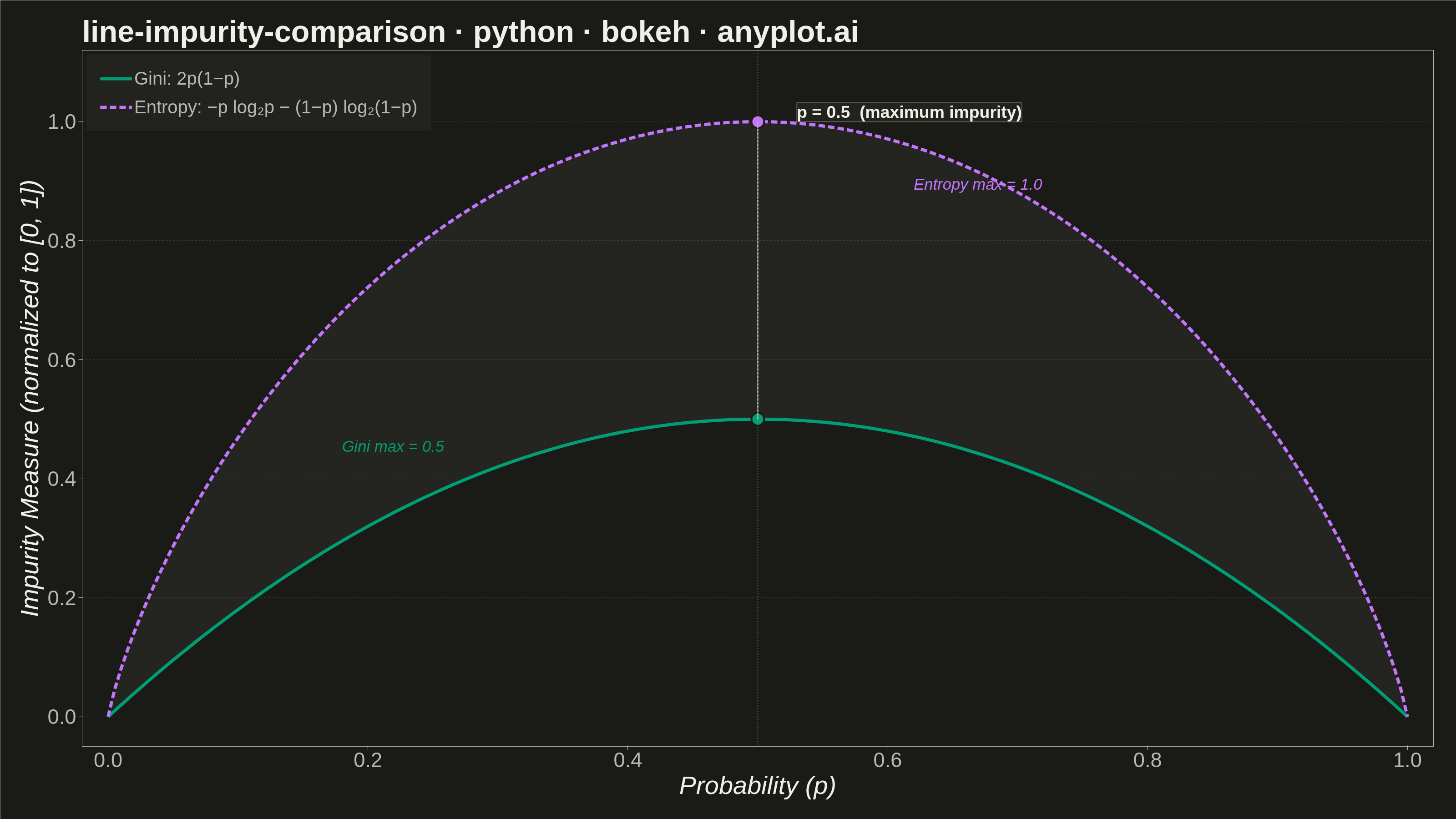
A theoretical comparison plot showing Gini impurity and entropy (information gain) as splitting criteria for decision trees across the probability range [0, 1]. Both curves are displayed on the same axes to illustrate their similar behavior and slight differences. This educational visualization helps understand the mathematical foundation of tree-based algorithms and why both criteria lead to similar tree structures in practice.
""" anyplot.ai
line-impurity-comparison: Gini Impurity vs Entropy Comparison
Library: bokeh 3.9.0 | Python 3.13.13
Quality: 92/100 | Updated: 2026-05-29
"""

import os
import time
from pathlib import Path

import numpy as np
from bokeh.io import output_file, save
from bokeh.models import ColumnDataSource, HoverTool, Label, Legend, NumeralTickFormatter, Span
from bokeh.plotting import figure
from selenium import webdriver
from selenium.webdriver.chrome.options import Options


# Theme tokens
THEME = os.getenv("ANYPLOT_THEME", "light")
PAGE_BG = "#FAF8F1" if THEME == "light" else "#1A1A17"
ELEVATED_BG = "#FFFDF6" if THEME == "light" else "#242420"
INK = "#1A1A17" if THEME == "light" else "#F0EFE8"
INK_SOFT = "#4A4A44" if THEME == "light" else "#B8B7B0"
INK_MUTED = "#6B6A63" if THEME == "light" else "#A8A79F"

# Imprint categorical palette — first series always #009E73
GINI_COLOR = "#009E73"  # Imprint position 1 — brand green
ENTROPY_COLOR = "#C475FD"  # Imprint position 2 — lavender

# Data
p_vals = np.linspace(0, 1, 200)

# Gini impurity: 2 * p * (1 - p), already in [0, 1]
gini = 2 * p_vals * (1 - p_vals)

# Entropy: -p * log2(p) - (1-p) * log2(1-p), normalized to [0, 1]
with np.errstate(divide="ignore", invalid="ignore"):
    entropy = -p_vals * np.log2(p_vals) - (1 - p_vals) * np.log2(1 - p_vals)
entropy = np.nan_to_num(entropy, nan=0.0)

source_gini = ColumnDataSource(data={"p": p_vals, "impurity": gini})
source_entropy = ColumnDataSource(data={"p": p_vals, "impurity": entropy})

# Area between curves to visually emphasize the difference
source_diff = ColumnDataSource(
    data={"p": np.concatenate([p_vals, p_vals[::-1]]), "fill": np.concatenate([entropy, gini[::-1]])}
)

title = "line-impurity-comparison · python · bokeh · anyplot.ai"

# Plot
fig = figure(
    width=3200,
    height=1800,
    title=title,
    x_axis_label="Probability (p)",
    y_axis_label="Impurity Measure (normalized to [0, 1])",
    x_range=(-0.02, 1.02),
    y_range=(-0.05, 1.12),
    toolbar_location=None,
    min_border_bottom=160,
    min_border_left=180,
    min_border_top=110,
    min_border_right=50,
)

# Shaded area between curves — muted fill emphasises the gap without competing
fig.patch(x="p", y="fill", source=source_diff, fill_color=INK_MUTED, fill_alpha=0.08, line_alpha=0)

# Vertical reference line at p=0.5
ref_line = Span(location=0.5, dimension="height", line_color=INK_SOFT, line_width=2, line_dash="dotted", line_alpha=0.5)
fig.add_layout(ref_line)

# Lines
line_gini = fig.line(x="p", y="impurity", source=source_gini, line_width=7, line_color=GINI_COLOR)
line_entropy = fig.line(
    x="p", y="impurity", source=source_entropy, line_width=7, line_color=ENTROPY_COLOR, line_dash=[14, 7]
)

# Markers at maxima (p=0.5): Gini peaks at 0.5, Entropy peaks at 1.0
fig.scatter(
    x=[0.5, 0.5], y=[0.5, 1.0], size=28, fill_color=[GINI_COLOR, ENTROPY_COLOR], line_color=PAGE_BG, line_width=4
)

# Connector segment between the two maxima dots
fig.segment(x0=[0.5], y0=[0.5], x1=[0.5], y1=[1.0], line_color=INK_SOFT, line_width=3, line_dash="dotted")

# Annotation at p=0.5 maximum impurity
max_label = Label(
    x=0.53,
    y=1.00,
    text="p = 0.5  (maximum impurity)",
    text_font_size="28pt",
    text_font_style="bold",
    text_color=INK,
    background_fill_color=ELEVATED_BG,
    background_fill_alpha=0.92,
    border_line_color=INK_SOFT,
    border_line_alpha=0.4,
    border_line_width=2,
)
fig.add_layout(max_label)

# Value labels at each maximum dot
gini_val_label = Label(
    x=0.18, y=0.44, text="Gini max = 0.5", text_font_size="26pt", text_color=GINI_COLOR, text_font_style="italic"
)
fig.add_layout(gini_val_label)

entropy_val_label = Label(
    x=0.62, y=0.88, text="Entropy max = 1.0", text_font_size="26pt", text_color=ENTROPY_COLOR, text_font_style="italic"
)
fig.add_layout(entropy_val_label)

# HoverTool for interactive HTML export
hover = HoverTool(
    renderers=[line_gini, line_entropy], tooltips=[("p", "@p{0.00}"), ("Impurity", "@impurity{0.000}")], mode="vline"
)
fig.add_tools(hover)

# Legend with formulas — click_policy lets viewers isolate each curve in HTML
legend = Legend(
    items=[("Gini: 2p(1−p)", [line_gini]), ("Entropy: −p log₂p − (1−p) log₂(1−p)", [line_entropy])],
    location="top_left",
    label_text_font_size="30pt",
    label_text_color=INK_SOFT,
    glyph_width=70,
    glyph_height=35,
    spacing=18,
    padding=30,
    border_line_alpha=0,
    background_fill_color=ELEVATED_BG,
    background_fill_alpha=0.9,
    click_policy="hide",
)
fig.add_layout(legend)

# Text sizing for 3200×1800 canvas
fig.title.text_font_size = "50pt"
fig.title.text_color = INK
fig.xaxis.axis_label_text_font_size = "42pt"
fig.yaxis.axis_label_text_font_size = "42pt"
fig.xaxis.major_label_text_font_size = "34pt"
fig.yaxis.major_label_text_font_size = "34pt"
fig.xaxis.axis_label_text_color = INK
fig.yaxis.axis_label_text_color = INK
fig.xaxis.major_label_text_color = INK_SOFT
fig.yaxis.major_label_text_color = INK_SOFT

# Tick formatters
fig.xaxis.formatter = NumeralTickFormatter(format="0.0")
fig.yaxis.formatter = NumeralTickFormatter(format="0.0")

# Grid — y-axis only, subtle
fig.xgrid.grid_line_alpha = 0
fig.ygrid.grid_line_color = INK
fig.ygrid.grid_line_alpha = 0.15
fig.ygrid.grid_line_dash = [4, 4]

# Theme-adaptive chrome
fig.background_fill_color = PAGE_BG
fig.border_fill_color = PAGE_BG
fig.outline_line_color = INK_SOFT

fig.xaxis.axis_line_color = INK_SOFT
fig.yaxis.axis_line_color = INK_SOFT
fig.xaxis.major_tick_line_color = INK_SOFT
fig.yaxis.major_tick_line_color = INK_SOFT
fig.axis.minor_tick_line_color = None
fig.axis.major_tick_out = 8

# Save HTML (interactive catalog artifact)
output_file(f"plot-{THEME}.html")
save(fig)

# Screenshot with headless Chrome — Selenium 4 / Selenium Manager.
# Use CDP Emulation.setDeviceMetricsOverride to pin the viewport to exactly
# W×H before navigating; --window-size alone under-delivers by ~139 px.
W, H = 3200, 1800
opts = Options()
for arg in (
    "--headless=new",
    "--no-sandbox",
    "--disable-dev-shm-usage",
    "--disable-gpu",
    f"--window-size={W},{H}",
    "--hide-scrollbars",
):
    opts.add_argument(arg)
driver = webdriver.Chrome(options=opts)
driver.execute_cdp_cmd(
    "Emulation.setDeviceMetricsOverride", {"width": W, "height": H, "deviceScaleFactor": 1, "mobile": False}
)
driver.get(f"file://{Path(f'plot-{THEME}.html').resolve()}")
time.sleep(3)
driver.save_screenshot(f"plot-{THEME}.png")
driver.quit()
Runnable source as JSON, for any HTTP client: https://api.anyplot.ai/specs/line-impurity-comparison/bokeh/code. Any spec id and library id listed in llms-full.txt fit the same URL shape; every URL below is complete and callable.
{
  "spec_id": "line-impurity-comparison",
  "language": "python",
  "library": "bokeh",
  "page": "https://anyplot.ai/line-impurity-comparison/python/bokeh",
  "hub": "https://anyplot.ai/line-impurity-comparison",
  "code_json": "https://api.anyplot.ai/specs/line-impurity-comparison/bokeh/code",
  "spec_json": "https://api.anyplot.ai/specs/line-impurity-comparison",
  "render_light_png": "https://storage.googleapis.com/anyplot-images/plots/line-impurity-comparison/python/bokeh/plot-light.png",
  "render_dark_png": "https://storage.googleapis.com/anyplot-images/plots/line-impurity-comparison/python/bokeh/plot-dark.png",
  "interactive_light_html": "https://storage.googleapis.com/anyplot-images/plots/line-impurity-comparison/python/bokeh/plot-light.html",
  "interactive_dark_html": "https://storage.googleapis.com/anyplot-images/plots/line-impurity-comparison/python/bokeh/plot-dark.html",
  "quality_score": 92.0,
  "license": "MIT",
  "guide": "https://anyplot.ai/llms.txt"
}
Part of Gini Impurity vs Entropy Comparison on anyplot.ai.