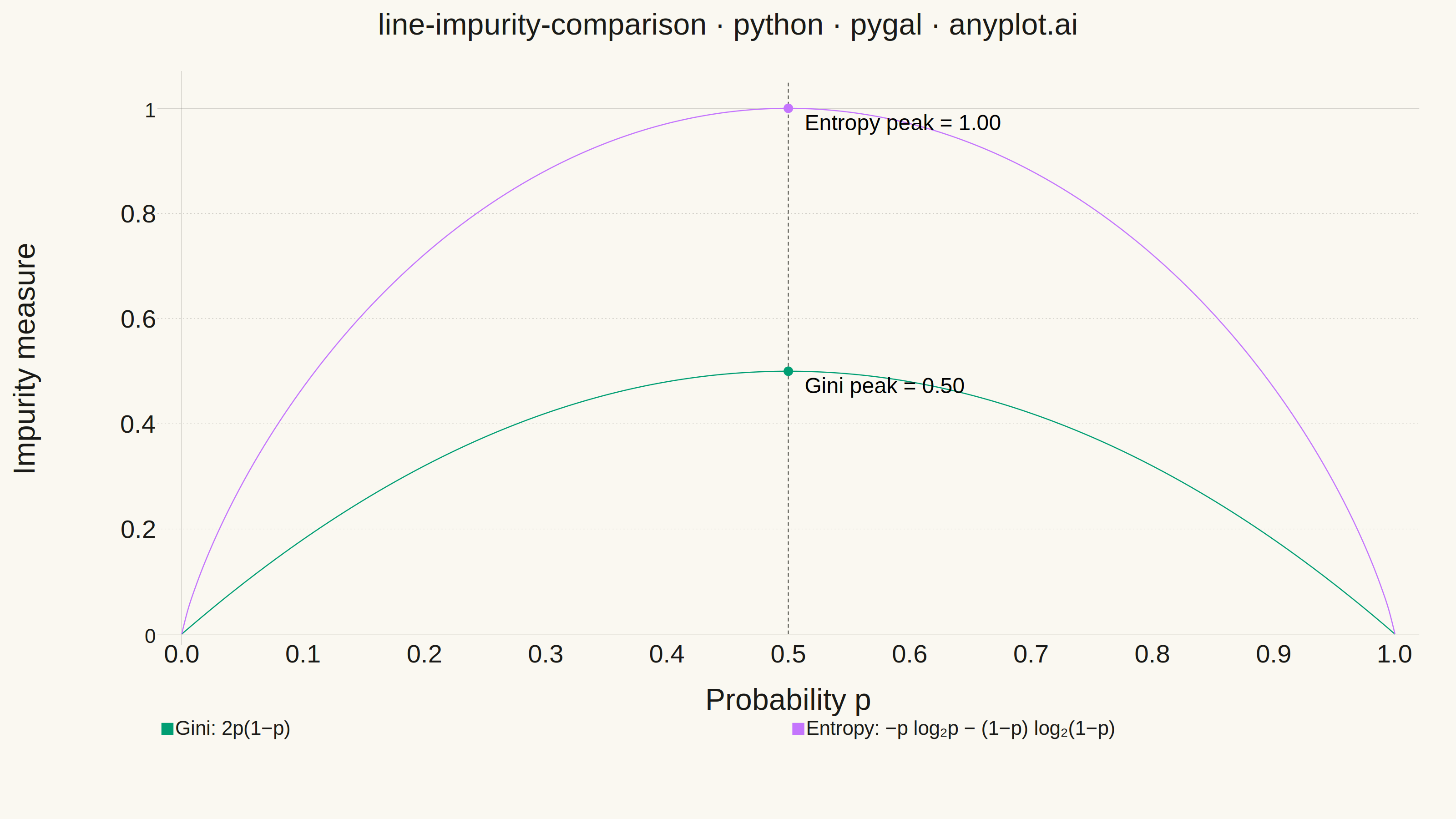
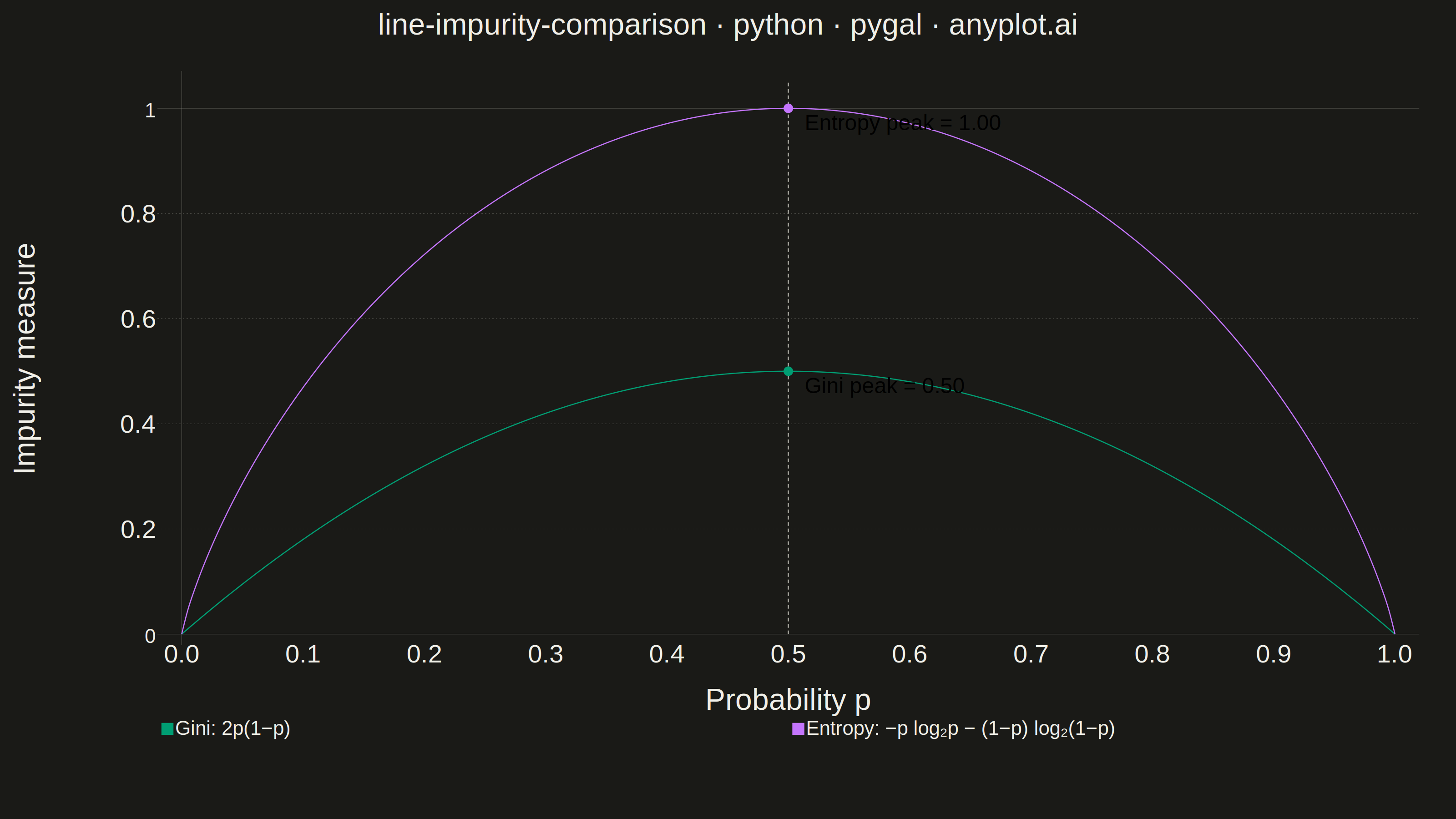
A theoretical comparison plot showing Gini impurity and entropy (information gain) as splitting criteria for decision trees across the probability range [0, 1]. Both curves are displayed on the same axes to illustrate their similar behavior and slight differences. This educational visualization helps understand the mathematical foundation of tree-based algorithms and why both criteria lead to similar tree structures in practice.
""" anyplot.ai
line-impurity-comparison: Gini Impurity vs Entropy Comparison
Library: pygal 3.1.0 | Python 3.13.13
Quality: 87/100 | Updated: 2026-05-29
"""

import os
import re
import sys


# Prevent importing local pygal.py file
sys.path = [p for p in sys.path if not p.endswith("/implementations/python")]

import cairosvg
import numpy as np
import pygal
from pygal.style import Style


THEME = os.getenv("ANYPLOT_THEME", "light")
PAGE_BG = "#FAF8F1" if THEME == "light" else "#1A1A17"
INK = "#1A1A17" if THEME == "light" else "#F0EFE8"
INK_SOFT = "#4A4A44" if THEME == "light" else "#B8B7B0"
INK_MUTED = "#6B6A63" if THEME == "light" else "#A8A79F"

# Data — 200 points for smooth curves across full [0, 1] probability range
p = np.linspace(0, 1, 200)
gini = 2 * p * (1 - p)

with np.errstate(divide="ignore", invalid="ignore"):
    entropy = -p * np.log2(p) - (1 - p) * np.log2(1 - p)
entropy = np.nan_to_num(entropy, nan=0.0)

_font = "Helvetica, Arial, sans-serif"

# Imprint palette — first series is brand green, second is lavender
custom_style = Style(
    background=PAGE_BG,
    plot_background=PAGE_BG,
    foreground=INK,
    foreground_strong=INK,
    foreground_subtle=INK_MUTED,
    colors=(
        "#009E73",  # 1: Gini — Imprint green (first categorical series)
        "#C475FD",  # 2: Entropy — Imprint lavender
        INK_MUTED,  # 3: vertical guide line — muted neutral
        "#009E73",  # 4: Gini peak dot — matches Gini
        "#C475FD",  # 5: Entropy peak dot — matches Entropy
    ),
    opacity="1",
    opacity_hover="1",
    stroke_opacity="1",
    stroke_opacity_hover="1",
    stroke_width=2.5,
    guide_stroke_color=INK_MUTED,
    guide_stroke_dasharray="3, 5",
    major_guide_stroke_color=INK_SOFT,
    major_guide_stroke_dasharray="0",
    title_font_size=66,
    label_font_size=56,
    major_label_font_size=44,
    legend_font_size=44,
    value_font_size=36,
    value_label_font_size=48,
    tooltip_font_size=32,
    font_family=_font,
    label_font_family=_font,
    major_label_font_family=_font,
    legend_font_family=_font,
    title_font_family=_font,
    value_font_family=_font,
    value_label_font_family=_font,
)

chart = pygal.XY(
    width=3200,
    height=1800,
    title="line-impurity-comparison · python · pygal · anyplot.ai",
    x_title="Probability p",
    y_title="Impurity measure",
    style=custom_style,
    show_dots=False,
    fill=False,
    show_y_guides=True,
    show_x_guides=False,
    legend_at_bottom=True,
    legend_at_bottom_columns=2,
    legend_box_size=24,
    truncate_legend=-1,
    xrange=(0, 1),
    range=(0, 1.05),
    y_labels=[0, 0.2, 0.4, 0.6, 0.8, 1.0],
    show_y_labels=True,
    x_label_rotation=0,
    margin=80,
    margin_bottom=120,
    margin_left=160,
    margin_right=80,
    margin_top=80,
    interpolate="cubic",
    print_values=False,
    print_zeroes=False,
    print_labels=True,
    x_value_formatter=lambda x: f"{x:.1f}",
    js=[],
)

# Convert to pygal XY point lists
gini_points = list(zip(p.tolist(), gini.tolist(), strict=True))
entropy_points = list(zip(p.tolist(), entropy.tolist(), strict=True))

# Series 1: Gini impurity — Imprint green, first categorical series
chart.add("Gini: 2p(1−p)", gini_points, stroke_style={"width": 5})

# Series 2: Shannon entropy (normalized to [0,1]) — Imprint lavender
chart.add("Entropy: −p log₂p − (1−p) log₂(1−p)", entropy_points, stroke_style={"width": 5})

# Series 3: Vertical guide at p=0.5 (both maxima occur here)
chart.add(None, [(0.5, 0.0), (0.5, 1.05)], stroke_style={"width": 1.5, "dasharray": "8, 6"})

# Series 4: Gini peak annotation dot at (0.5, 0.5)
chart.add(
    None, [{"value": (0.5, 0.5), "label": "Gini peak = 0.50"}], stroke_style={"width": 0}, show_dots=True, dots_size=10
)

# Series 5: Entropy peak annotation dot at (0.5, 1.0)
chart.add(
    None,
    [{"value": (0.5, 1.0), "label": "Entropy peak = 1.00"}],
    stroke_style={"width": 0},
    show_dots=True,
    dots_size=10,
)


def _render_png(chart, filepath):
    """Render chart to PNG, softening the default hard rectangular axis border."""
    svg_bytes = chart.render()
    svg_str = svg_bytes.decode("utf-8")
    # Extract chart id to scope the injected rule precisely
    m = re.search(r'id="(chart-[^"]+)"', svg_str)
    chart_id = f"#{m.group(1)} " if m else ""
    # Soften the default axis border lines (left/bottom frame) to INK_MUTED at 45% opacity.
    # .axis .line targets the axis spine paths; more-specific .axis .major.line continues
    # to use the theme INK color for the major grid anchors, both at reduced opacity.
    border_css = (
        f"\n      {chart_id}.axis .line {{"
        f" stroke: {INK_MUTED} !important;"
        f" stroke-opacity: 0.45 !important; }}"
        f"\n      {chart_id}.axis .major.line {{"
        f" stroke: {INK_MUTED} !important;"
        f" stroke-opacity: 0.45 !important; }}"
        f"\n    "
    )
    svg_str = svg_str.replace("</style>", border_css + "</style>", 1)
    cairosvg.svg2png(bytestring=svg_str.encode("utf-8"), write_to=filepath, output_width=3200, output_height=1800)


_render_png(chart, f"plot-{THEME}.png")
chart.render_to_file(f"plot-{THEME}.svg")
with open(f"plot-{THEME}.html", "wb") as f:
    f.write(chart.render())
Runnable source as JSON, for any HTTP client: https://api.anyplot.ai/specs/line-impurity-comparison/pygal/code. Any spec id and library id listed in llms-full.txt fit the same URL shape; every URL below is complete and callable.
{
  "spec_id": "line-impurity-comparison",
  "language": "python",
  "library": "pygal",
  "page": "https://anyplot.ai/line-impurity-comparison/python/pygal",
  "hub": "https://anyplot.ai/line-impurity-comparison",
  "code_json": "https://api.anyplot.ai/specs/line-impurity-comparison/pygal/code",
  "spec_json": "https://api.anyplot.ai/specs/line-impurity-comparison",
  "render_light_png": "https://storage.googleapis.com/anyplot-images/plots/line-impurity-comparison/python/pygal/plot-light.png",
  "render_dark_png": "https://storage.googleapis.com/anyplot-images/plots/line-impurity-comparison/python/pygal/plot-dark.png",
  "interactive_light_html": "https://storage.googleapis.com/anyplot-images/plots/line-impurity-comparison/python/pygal/plot-light.html",
  "interactive_dark_html": "https://storage.googleapis.com/anyplot-images/plots/line-impurity-comparison/python/pygal/plot-dark.html",
  "quality_score": 87.0,
  "license": "MIT",
  "guide": "https://anyplot.ai/llms.txt"
}
Part of Gini Impurity vs Entropy Comparison on anyplot.ai.