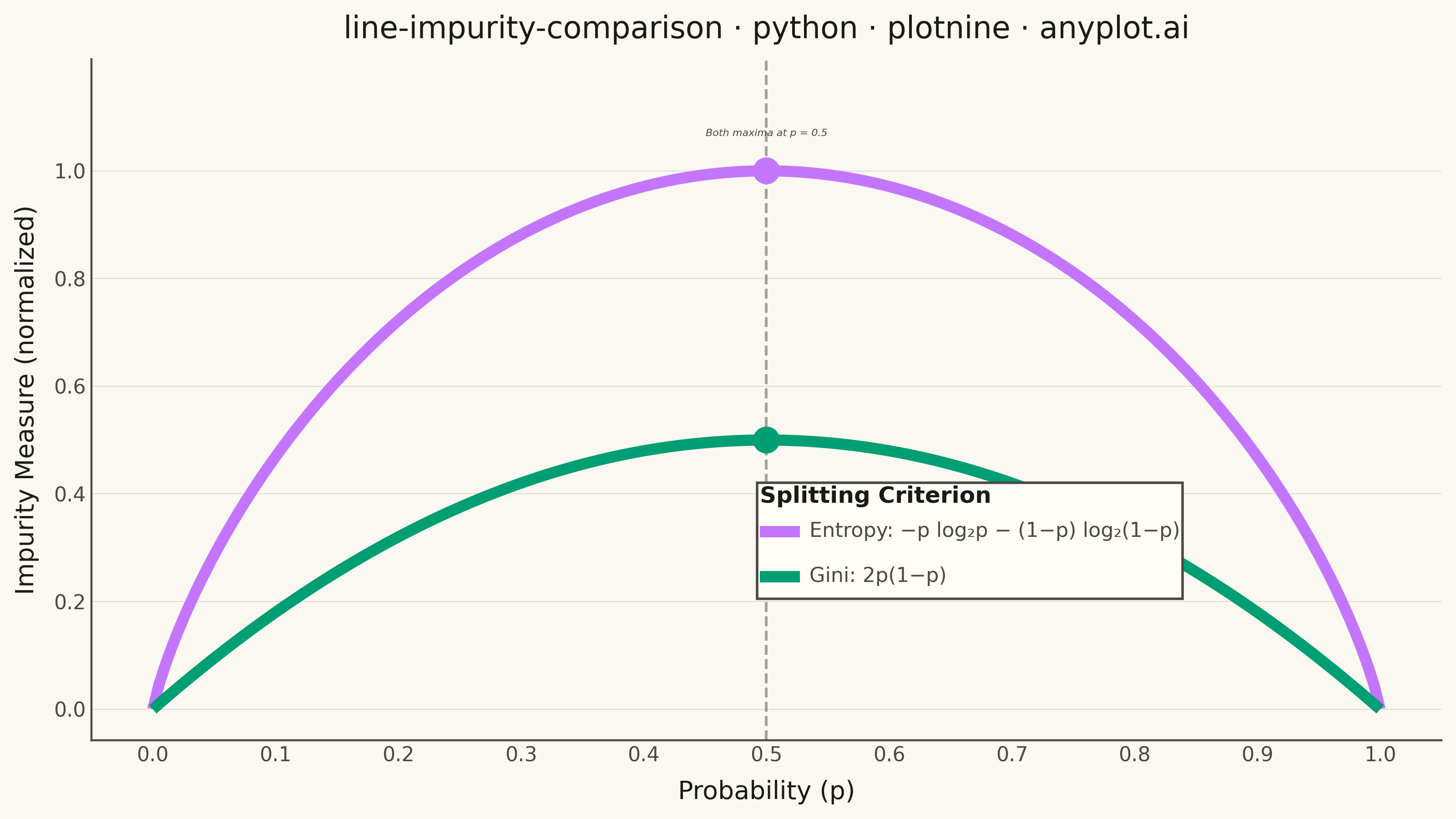
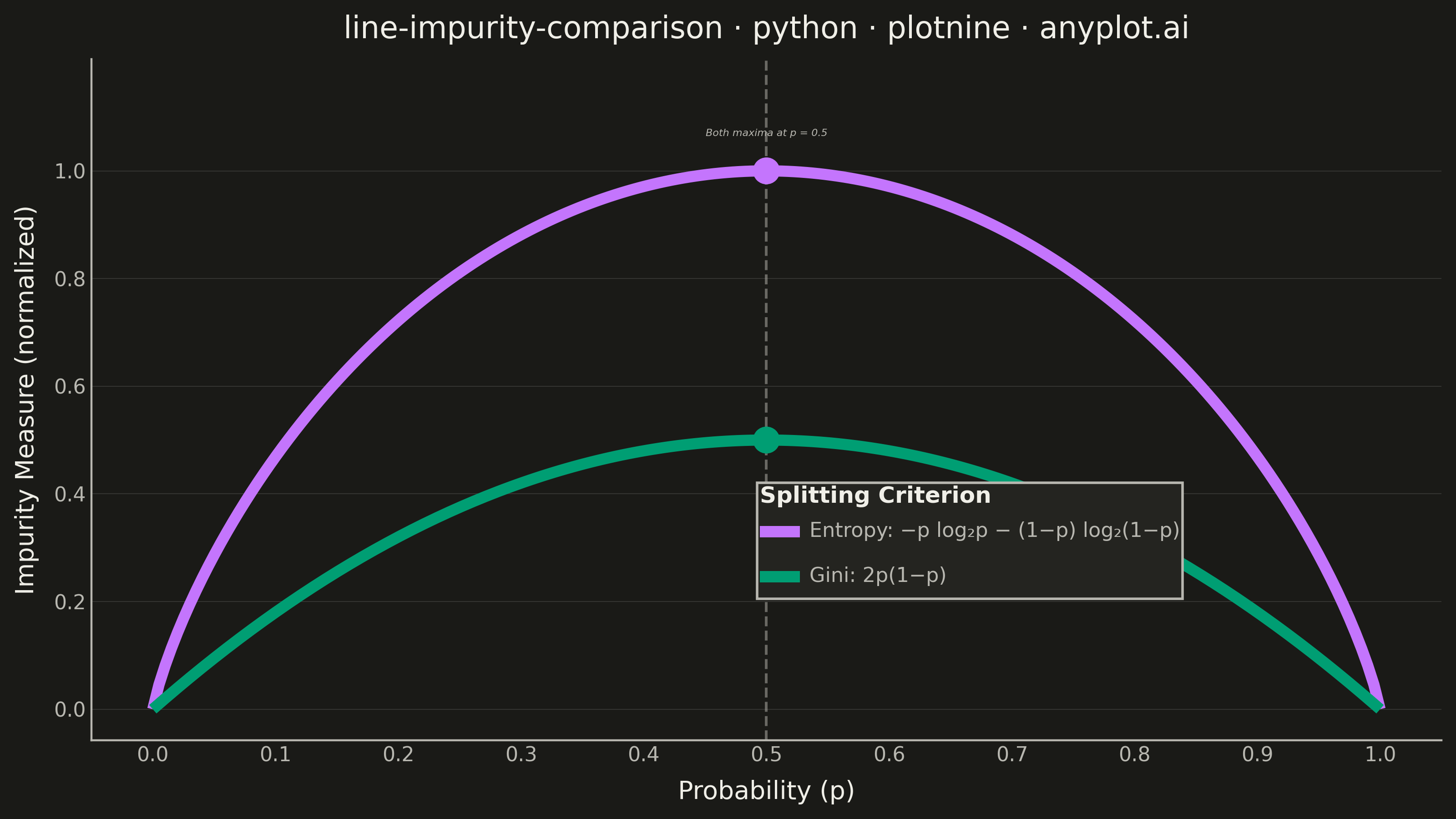
A theoretical comparison plot showing Gini impurity and entropy (information gain) as splitting criteria for decision trees across the probability range [0, 1]. Both curves are displayed on the same axes to illustrate their similar behavior and slight differences. This educational visualization helps understand the mathematical foundation of tree-based algorithms and why both criteria lead to similar tree structures in practice.
""" anyplot.ai
line-impurity-comparison: Gini Impurity vs Entropy Comparison
Library: plotnine 0.15.4 | Python 3.13.13
Quality: 88/100 | Updated: 2026-05-29
"""

import os

import numpy as np
import pandas as pd
from plotnine import (
    aes,
    annotate,
    element_blank,
    element_line,
    element_rect,
    element_text,
    geom_line,
    geom_point,
    geom_vline,
    ggplot,
    labs,
    scale_color_manual,
    scale_linetype_manual,
    scale_x_continuous,
    scale_y_continuous,
    theme,
    theme_minimal,
)


# Theme tokens
THEME = os.getenv("ANYPLOT_THEME", "light")
PAGE_BG = "#FAF8F1" if THEME == "light" else "#1A1A17"
ELEVATED_BG = "#FFFDF6" if THEME == "light" else "#242420"
INK = "#1A1A17" if THEME == "light" else "#F0EFE8"
INK_SOFT = "#4A4A44" if THEME == "light" else "#B8B7B0"

# Imprint palette positions 1 and 2
GINI_COLOR = "#009E73"  # Imprint palette position 1 — brand green, always first series
ENTROPY_COLOR = "#C475FD"  # Imprint palette position 2 — lavender

# Data
p = np.linspace(0, 1, 200)
gini = 2 * p * (1 - p)
entropy = np.where((p > 0) & (p < 1), -p * np.log2(p) - (1 - p) * np.log2(1 - p), 0.0)

GINI_LABEL = "Gini: 2p(1−p)"
ENTROPY_LABEL = "Entropy: −p log₂p − (1−p) log₂(1−p)"

df = pd.DataFrame(
    {
        "p": np.tile(p, 2),
        "impurity": np.concatenate([gini, entropy]),
        "measure": [GINI_LABEL] * len(p) + [ENTROPY_LABEL] * len(p),
    }
)

maxima = pd.DataFrame({"p": [0.5, 0.5], "impurity": [0.5, 1.0], "measure": [GINI_LABEL, ENTROPY_LABEL]})

# Title with length-scaled fontsize (baseline: 67 chars → 12pt)
title = "line-impurity-comparison · python · plotnine · anyplot.ai"
n = len(title)
title_fontsize = max(8, round(12 * (67 / n if n > 67 else 1.0)))

# Plot
plot = (
    ggplot(df, aes(x="p", y="impurity", color="measure", linetype="measure"))
    + geom_vline(xintercept=0.5, color=INK_SOFT, size=0.6, linetype="dashed", alpha=0.5)
    + geom_line(size=2.5)
    + geom_point(data=maxima, size=5, show_legend=False)
    + annotate(
        "text", x=0.5, y=1.07, label="Both maxima at p = 0.5", size=5.5, ha="center", color=INK_SOFT, fontstyle="italic"
    )
    + scale_color_manual(values={GINI_LABEL: GINI_COLOR, ENTROPY_LABEL: ENTROPY_COLOR})
    + scale_linetype_manual(values={GINI_LABEL: "solid", ENTROPY_LABEL: "dashed"})
    + scale_x_continuous(breaks=np.arange(0, 1.1, 0.1))
    + scale_y_continuous(breaks=np.arange(0, 1.1, 0.2), limits=(0, 1.15))
    + labs(
        x="Probability (p)",
        y="Impurity Measure (normalized)",
        title=title,
        color="Splitting Criterion",
        linetype="Splitting Criterion",
    )
    + theme_minimal()
    + theme(
        figure_size=(8, 4.5),
        plot_background=element_rect(fill=PAGE_BG, color=PAGE_BG),
        panel_background=element_rect(fill=PAGE_BG),
        text=element_text(size=7),
        axis_title=element_text(size=10, color=INK),
        axis_text=element_text(size=8, color=INK_SOFT),
        plot_title=element_text(size=title_fontsize, color=INK),
        legend_text=element_text(size=8, color=INK_SOFT),
        legend_title=element_text(size=9, color=INK, weight="bold"),
        legend_position=(0.15, 0.78),
        legend_background=element_rect(fill=ELEVATED_BG, color=INK_SOFT),
        legend_key=element_blank(),
        panel_grid_major_x=element_blank(),
        panel_grid_minor=element_blank(),
        panel_grid_major_y=element_line(color=INK, size=0.3, alpha=0.15),
        axis_line=element_line(color=INK_SOFT, size=0.8),
    )
)

# Save
plot.save(f"plot-{THEME}.png", dpi=400, width=8, height=4.5, units="in", verbose=False)
Runnable source as JSON, for any HTTP client: https://api.anyplot.ai/specs/line-impurity-comparison/plotnine/code. Any spec id and library id listed in llms-full.txt fit the same URL shape; every URL below is complete and callable.
{
  "spec_id": "line-impurity-comparison",
  "language": "python",
  "library": "plotnine",
  "page": "https://anyplot.ai/line-impurity-comparison/python/plotnine",
  "hub": "https://anyplot.ai/line-impurity-comparison",
  "code_json": "https://api.anyplot.ai/specs/line-impurity-comparison/plotnine/code",
  "spec_json": "https://api.anyplot.ai/specs/line-impurity-comparison",
  "render_light_png": "https://storage.googleapis.com/anyplot-images/plots/line-impurity-comparison/python/plotnine/plot-light.png",
  "render_dark_png": "https://storage.googleapis.com/anyplot-images/plots/line-impurity-comparison/python/plotnine/plot-dark.png",
  "quality_score": 88.0,
  "license": "MIT",
  "guide": "https://anyplot.ai/llms.txt"
}
Part of Gini Impurity vs Entropy Comparison on anyplot.ai.