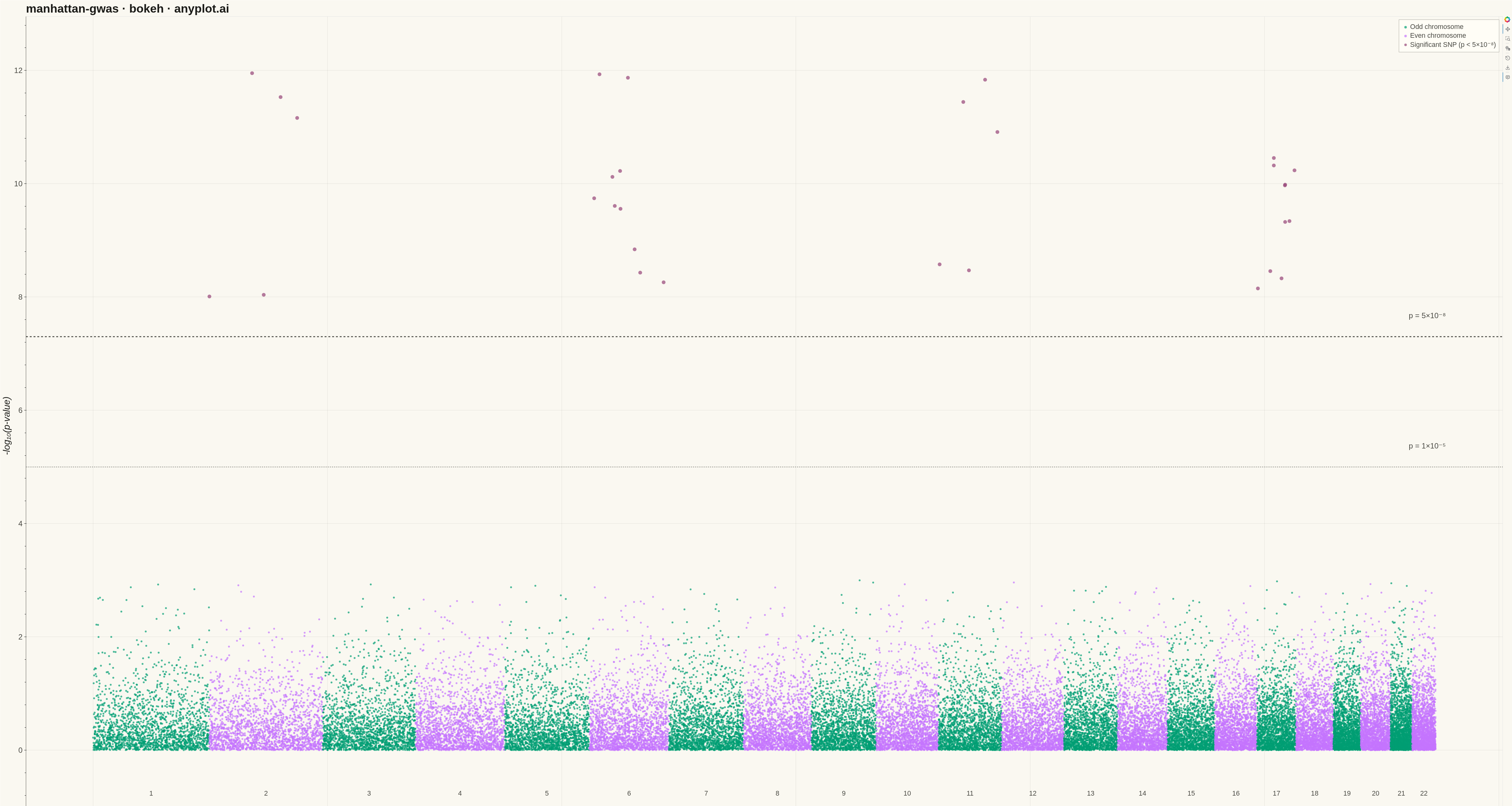
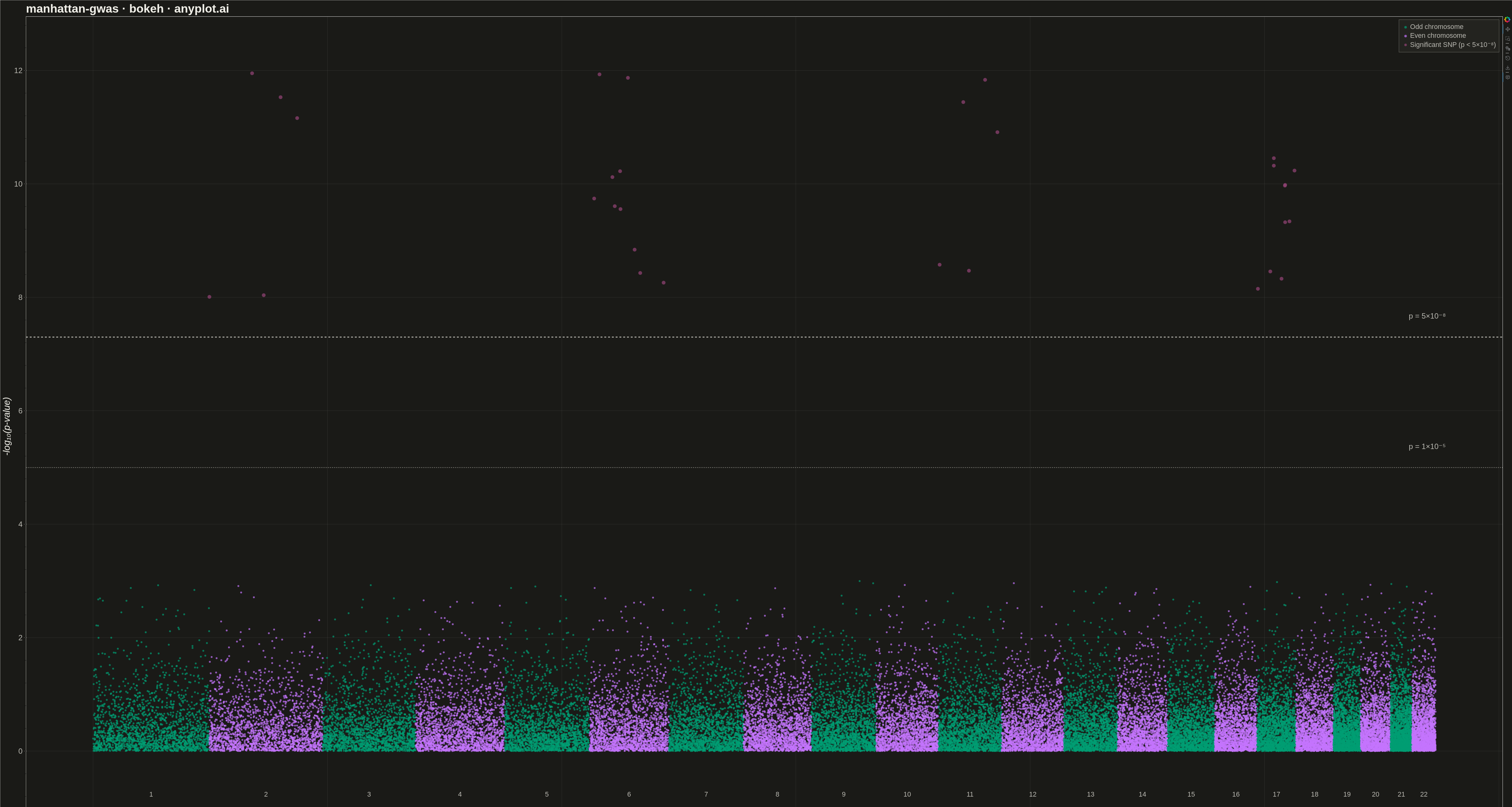
A Manhattan plot visualizes genome-wide association study (GWAS) results by displaying -log10 transformed p-values across chromosomal positions. Points are arranged by genomic position along the x-axis with alternating colors for each chromosome, making it easy to identify significant associations. A horizontal threshold line indicates genome-wide significance (typically p < 5×10⁻⁸). This plot is essential for identifying genetic variants associated with traits or diseases.
""" anyplot.ai
manhattan-gwas: Manhattan Plot for GWAS
Library: bokeh 3.9.0 | Python 3.13.13
Quality: 85/100 | Updated: 2026-05-15
"""

import os
import time
from pathlib import Path

import numpy as np
import pandas as pd
from bokeh.io import output_file, save
from bokeh.models import ColumnDataSource, HoverTool, Label, Span
from bokeh.plotting import figure
from selenium import webdriver
from selenium.webdriver.chrome.options import Options


# Theme tokens
THEME = os.getenv("ANYPLOT_THEME", "light")
PAGE_BG = "#FAF8F1" if THEME == "light" else "#1A1A17"
ELEVATED_BG = "#FFFDF6" if THEME == "light" else "#242420"
INK = "#1A1A17" if THEME == "light" else "#F0EFE8"
INK_SOFT = "#4A4A44" if THEME == "light" else "#B8B7B0"

# Okabe-Ito palette for data colors
CHROM_COLOR_1 = "#009E73"  # Okabe-Ito position 1 (first series)
CHROM_COLOR_2 = "#C475FD"  # Okabe-Ito position 2 (alternating)
SIG_COLOR = "#954477"  # Okabe-Ito position 7 (significant SNPs highlight)

# Data - Simulated GWAS data with significant peaks
np.random.seed(42)

chrom_sizes = {
    "1": 248,
    "2": 242,
    "3": 198,
    "4": 190,
    "5": 181,
    "6": 170,
    "7": 159,
    "8": 145,
    "9": 138,
    "10": 133,
    "11": 135,
    "12": 133,
    "13": 114,
    "14": 107,
    "15": 101,
    "16": 90,
    "17": 83,
    "18": 80,
    "19": 58,
    "20": 64,
    "21": 46,
    "22": 50,
}

# Generate SNP data
n_snps_per_chrom = 2000
data = []
cumulative_pos = 0
chrom_centers = {}

for chrom, size in chrom_sizes.items():
    positions = np.sort(np.random.randint(1, size * 1_000_000, n_snps_per_chrom))
    p_values = np.random.uniform(0.001, 1.0, n_snps_per_chrom)

    if chrom in ["2", "6", "11", "17"]:
        n_significant = np.random.randint(5, 15)
        peak_indices = np.random.choice(n_snps_per_chrom, n_significant, replace=False)
        p_values[peak_indices] = 10 ** np.random.uniform(-12, -8, n_significant)

    cumulative_positions = positions + cumulative_pos
    chrom_centers[chrom] = cumulative_pos + (size * 1_000_000) / 2

    for i in range(n_snps_per_chrom):
        data.append(
            {
                "chromosome": chrom,
                "position": positions[i],
                "cumulative_pos": cumulative_positions[i],
                "p_value": p_values[i],
                "neg_log_p": -np.log10(p_values[i]),
            }
        )

    cumulative_pos += size * 1_000_000

df = pd.DataFrame(data)

# Assign alternating colors based on chromosome parity
chrom_int = df["chromosome"].astype(int)
df["color"] = df["chromosome"].apply(lambda x: CHROM_COLOR_1 if int(x) % 2 == 1 else CHROM_COLOR_2)
df["color_label"] = df["chromosome"].apply(lambda x: "Odd chromosome" if int(x) % 2 == 1 else "Even chromosome")

# Highlight significant SNPs
significance_threshold = -np.log10(5e-8)
significant_mask = df["neg_log_p"] >= significance_threshold
df.loc[significant_mask, "color"] = SIG_COLOR
df.loc[significant_mask, "color_label"] = "Significant SNP (p < 5×10⁻⁸)"

# Adjust point sizes
df["size"] = 6
df.loc[significant_mask, "size"] = 12

# Plot
source = ColumnDataSource(df)

p = figure(
    width=4800,
    height=2700,
    title="manhattan-gwas · bokeh · anyplot.ai",
    x_axis_label="Genomic Position",
    y_axis_label="-log₁₀(p-value)",
    tools="pan,wheel_zoom,box_zoom,reset,save",
)

# Scatter plot with legend
p.scatter(
    x="cumulative_pos",
    y="neg_log_p",
    source=source,
    size="size",
    color="color",
    alpha=0.7,
    line_color=None,
    legend_field="color_label",
)

# Significance threshold line
significance_line = Span(
    location=significance_threshold, dimension="width", line_color=INK_SOFT, line_dash="dashed", line_width=3
)
p.add_layout(significance_line)

# Suggestive threshold line
suggestive_threshold = -np.log10(1e-5)
suggestive_line = Span(
    location=suggestive_threshold, dimension="width", line_color=INK_SOFT, line_dash="dotted", line_width=2
)
p.add_layout(suggestive_line)

# Threshold labels
sig_label = Label(
    x=cumulative_pos * 0.98,
    y=significance_threshold + 0.3,
    text="p = 5×10⁻⁸",
    text_font_size="18pt",
    text_color=INK_SOFT,
)
p.add_layout(sig_label)

sug_label = Label(
    x=cumulative_pos * 0.98, y=suggestive_threshold + 0.3, text="p = 1×10⁻⁵", text_font_size="18pt", text_color=INK_SOFT
)
p.add_layout(sug_label)

# Add chromosome labels
for chrom, center in chrom_centers.items():
    chrom_label = Label(x=center, y=-0.8, text=chrom, text_font_size="16pt", text_align="center", text_color=INK_SOFT)
    p.add_layout(chrom_label)

# Add HoverTool for interactivity
hover = HoverTool(
    tooltips=[
        ("Chromosome", "@chromosome"),
        ("Position", "@{position:0,0}"),
        ("-log₁₀(p)", "@{neg_log_p:.2f}"),
        ("Type", "@color_label"),
    ]
)
p.add_tools(hover)

# Style the plot
p.title.text_font_size = "28pt"
p.title.text_color = INK
p.xaxis.axis_label_text_font_size = "22pt"
p.yaxis.axis_label_text_font_size = "22pt"
p.xaxis.axis_label_text_color = INK
p.yaxis.axis_label_text_color = INK
p.xaxis.major_label_text_font_size = "0pt"
p.yaxis.major_label_text_font_size = "18pt"
p.yaxis.major_label_text_color = INK_SOFT

# Hide x-axis ticks (using chromosome labels instead)
p.xaxis.major_tick_line_color = None
p.xaxis.minor_tick_line_color = None
p.xaxis.axis_line_color = INK_SOFT
p.yaxis.axis_line_color = INK_SOFT
p.yaxis.major_tick_line_color = INK_SOFT

# Grid styling
p.xgrid.grid_line_alpha = 0.10
p.ygrid.grid_line_alpha = 0.10
p.xgrid.grid_line_color = INK
p.ygrid.grid_line_color = INK

# Background and borders
p.background_fill_color = PAGE_BG
p.border_fill_color = PAGE_BG

# Legend styling
if p.legend:
    p.legend.background_fill_color = ELEVATED_BG
    p.legend.border_line_color = INK_SOFT
    p.legend.label_text_color = INK_SOFT
    p.legend.label_text_font_size = "16pt"
    p.legend.location = "top_right"

# Set y-axis range to accommodate chromosome labels
p.y_range.start = -1.5
p.y_range.end = df["neg_log_p"].max() + 1

# Save HTML
output_file(f"plot-{THEME}.html")
save(p)

# Screenshot with headless Chrome via Selenium
W, H = 4800, 2700
opts = Options()
for arg in (
    "--headless=new",
    "--no-sandbox",
    "--disable-dev-shm-usage",
    "--disable-gpu",
    f"--window-size={W},{H}",
    "--hide-scrollbars",
):
    opts.add_argument(arg)

driver = webdriver.Chrome(options=opts)
driver.set_window_size(W, H)
driver.get(f"file://{Path(f'plot-{THEME}.html').resolve()}")
time.sleep(3)
driver.save_screenshot(f"plot-{THEME}.png")
driver.quit()
Runnable source as JSON, for any HTTP client: https://api.anyplot.ai/specs/manhattan-gwas/bokeh/code. Any spec id and library id listed in llms-full.txt fit the same URL shape; every URL below is complete and callable.
{
  "spec_id": "manhattan-gwas",
  "language": "python",
  "library": "bokeh",
  "page": "https://anyplot.ai/manhattan-gwas/python/bokeh",
  "hub": "https://anyplot.ai/manhattan-gwas",
  "code_json": "https://api.anyplot.ai/specs/manhattan-gwas/bokeh/code",
  "spec_json": "https://api.anyplot.ai/specs/manhattan-gwas",
  "render_light_png": "https://storage.googleapis.com/anyplot-images/plots/manhattan-gwas/python/bokeh/plot-light.png",
  "render_dark_png": "https://storage.googleapis.com/anyplot-images/plots/manhattan-gwas/python/bokeh/plot-dark.png",
  "interactive_light_html": "https://storage.googleapis.com/anyplot-images/plots/manhattan-gwas/python/bokeh/plot-light.html",
  "interactive_dark_html": "https://storage.googleapis.com/anyplot-images/plots/manhattan-gwas/python/bokeh/plot-dark.html",
  "quality_score": 85.0,
  "license": "MIT",
  "guide": "https://anyplot.ai/llms.txt"
}
Part of Manhattan Plot for GWAS on anyplot.ai.