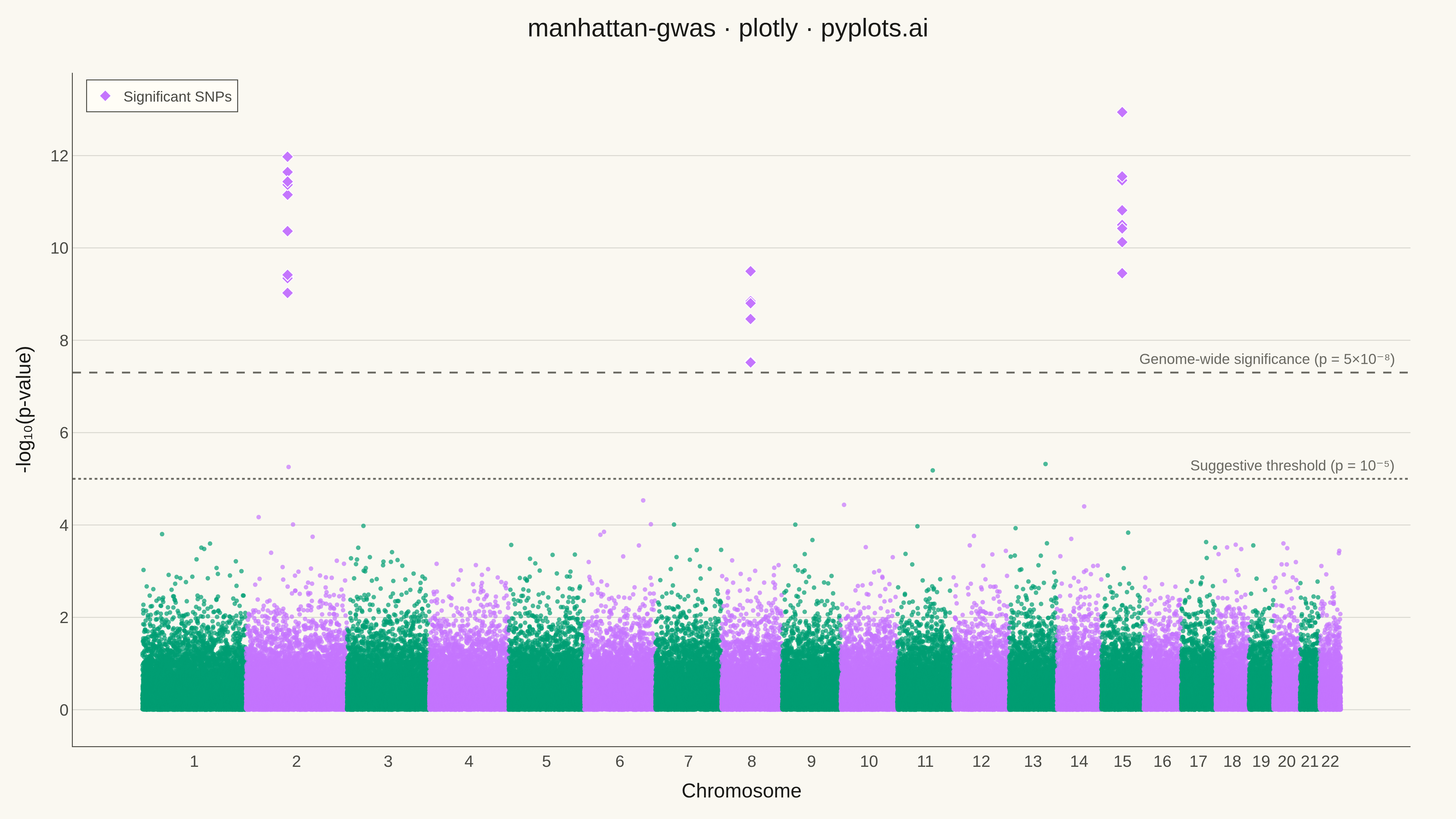
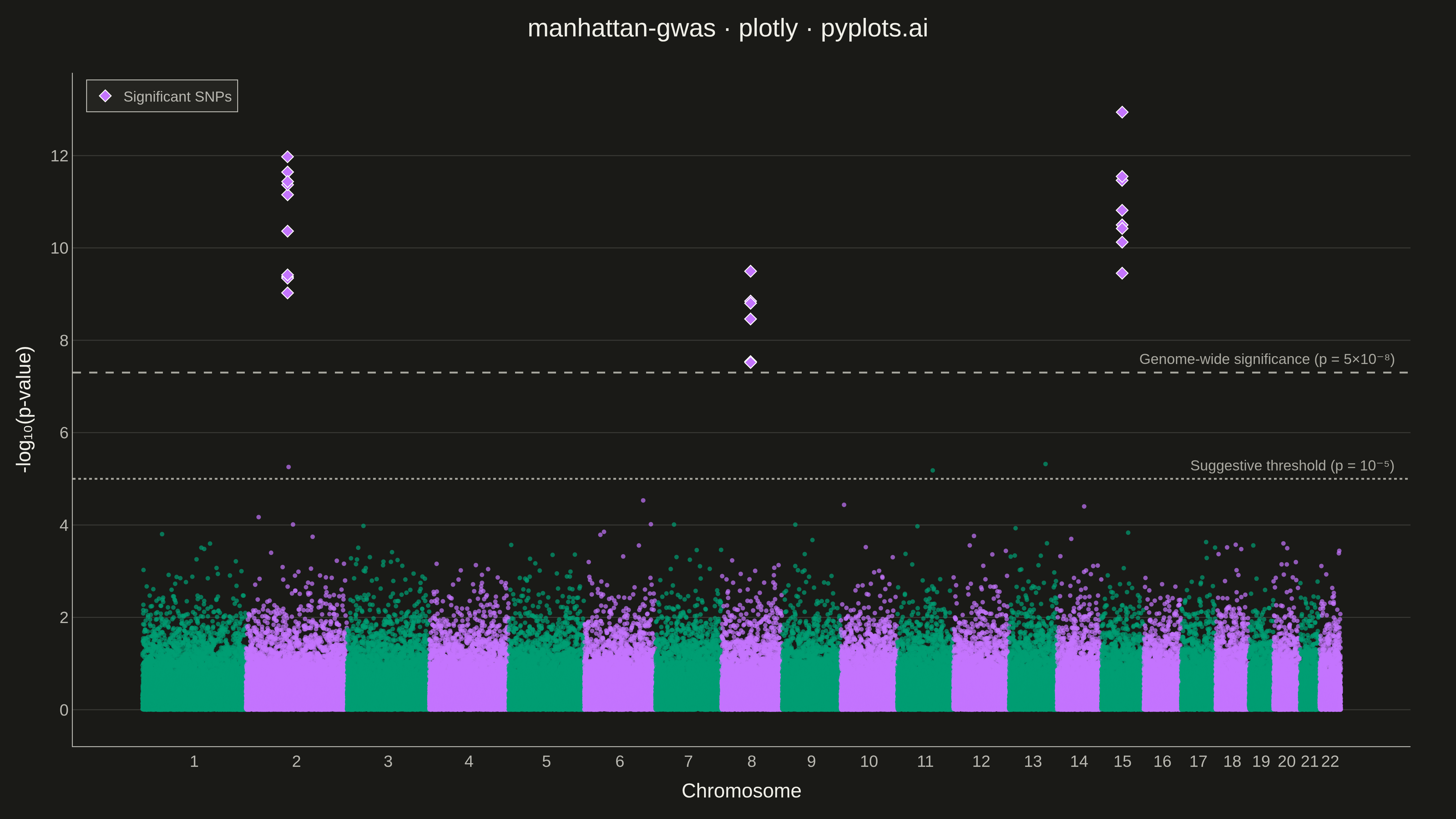
A Manhattan plot visualizes genome-wide association study (GWAS) results by displaying -log10 transformed p-values across chromosomal positions. Points are arranged by genomic position along the x-axis with alternating colors for each chromosome, making it easy to identify significant associations. A horizontal threshold line indicates genome-wide significance (typically p < 5×10⁻⁸). This plot is essential for identifying genetic variants associated with traits or diseases.
""" anyplot.ai
manhattan-gwas: Manhattan Plot for GWAS
Library: plotly 6.7.0 | Python 3.13.13
Quality: 89/100 | Updated: 2026-05-15
"""

import os
import sys

import numpy as np
import pandas as pd


# Remove current directory from path to avoid shadowing plotly package
current_dir = os.path.dirname(os.path.abspath(__file__))
if current_dir in sys.path:
    sys.path.remove(current_dir)

import plotly.graph_objects as go


# Theme configuration
THEME = os.getenv("ANYPLOT_THEME", "light")

PAGE_BG = "#FAF8F1" if THEME == "light" else "#1A1A17"
ELEVATED_BG = "#FFFDF6" if THEME == "light" else "#242420"
INK = "#1A1A17" if THEME == "light" else "#F0EFE8"
INK_SOFT = "#4A4A44" if THEME == "light" else "#B8B7B0"
INK_MUTED = "#6B6A63" if THEME == "light" else "#A8A79F"
GRID = "rgba(26,26,23,0.15)" if THEME == "light" else "rgba(240,239,232,0.15)"

# Okabe-Ito palette
IMPRINT = [
    "#009E73",  # bluish green (brand)
    "#C475FD",  # vermillion
    "#4467A3",  # blue
    "#BD8233",  # reddish purple
    "#AE3030",  # orange
    "#2ABCCD",  # sky blue
    "#954477",  # yellow
]

# Threshold line colors (theme-adaptive)
THRESHOLD_COLOR = INK_MUTED
HIGHLIGHT_COLOR = IMPRINT[1]  # vermillion for significant SNPs

# Data - Simulated GWAS results
np.random.seed(42)

# Chromosome lengths (simplified, in Mb)
chr_lengths = {
    "1": 249,
    "2": 243,
    "3": 198,
    "4": 191,
    "5": 182,
    "6": 171,
    "7": 159,
    "8": 146,
    "9": 141,
    "10": 136,
    "11": 135,
    "12": 134,
    "13": 115,
    "14": 107,
    "15": 102,
    "16": 90,
    "17": 83,
    "18": 80,
    "19": 59,
    "20": 64,
    "21": 47,
    "22": 51,
}

# Generate SNPs for each chromosome
data = []
cumulative_pos = 0
chr_centers = {}

for chrom, length in chr_lengths.items():
    # Number of SNPs proportional to chromosome length
    n_snps = int(length * 40)
    positions = np.sort(np.random.uniform(0, length * 1e6, n_snps))

    # Generate p-values (mostly non-significant, with some peaks)
    pvalues = np.random.uniform(0, 1, n_snps)

    # Add significant peaks on chromosomes 2, 8, and 15
    if chrom == "2":
        peak_idx = np.abs(positions - 100e6).argmin()
        pvalues[peak_idx - 5 : peak_idx + 5] = 10 ** (-np.random.uniform(8, 12, 10))
    elif chrom == "8":
        peak_idx = np.abs(positions - 70e6).argmin()
        pvalues[peak_idx - 3 : peak_idx + 3] = 10 ** (-np.random.uniform(7.5, 10, 6))
    elif chrom == "15":
        peak_idx = np.abs(positions - 50e6).argmin()
        pvalues[peak_idx - 4 : peak_idx + 4] = 10 ** (-np.random.uniform(9, 14, 8))

    # Calculate cumulative position
    cumulative_positions = positions + cumulative_pos
    chr_centers[chrom] = cumulative_pos + (length * 1e6) / 2

    for i in range(n_snps):
        data.append(
            {
                "chromosome": chrom,
                "position": positions[i],
                "cumulative_pos": cumulative_positions[i],
                "p_value": pvalues[i],
                "neg_log_p": -np.log10(pvalues[i]),
            }
        )

    cumulative_pos += length * 1e6

df = pd.DataFrame(data)


# Alternating chromosome colors (Okabe-Ito positions 1 and 2)
def get_chr_color(chrom_num):
    return IMPRINT[0] if int(chrom_num) % 2 == 1 else IMPRINT[1]


# Create figure
fig = go.Figure()

# Add scatter traces for each chromosome
for chrom in chr_lengths.keys():
    chr_data = df[df["chromosome"] == chrom]
    color = get_chr_color(chrom)

    fig.add_trace(
        go.Scatter(
            x=chr_data["cumulative_pos"],
            y=chr_data["neg_log_p"],
            mode="markers",
            marker={"size": 5, "color": color, "opacity": 0.7},
            name=f"Chr {chrom}",
            showlegend=False,
            hovertemplate=(
                f"Chr {chrom}<br>Position: %{{customdata[0]:,.0f}} bp<br>-log₁₀(p): %{{y:.2f}}<extra></extra>"
            ),
            customdata=chr_data[["position"]].values,
        )
    )

# Genome-wide significance threshold (-log10(5e-8) ≈ 7.3)
significance_threshold = -np.log10(5e-8)
fig.add_shape(
    type="line",
    x0=0,
    x1=1,
    xref="paper",
    y0=significance_threshold,
    y1=significance_threshold,
    line={"color": THRESHOLD_COLOR, "width": 2, "dash": "dash"},
)
fig.add_annotation(
    text="Genome-wide significance (p = 5×10⁻⁸)",
    font={"size": 16, "color": THRESHOLD_COLOR},
    xref="paper",
    x=0.99,
    xanchor="right",
    yref="y",
    y=significance_threshold,
    showarrow=False,
    yshift=15,
)

# Suggestive threshold (-log10(1e-5) = 5)
suggestive_threshold = 5
fig.add_shape(
    type="line",
    x0=0,
    x1=1,
    xref="paper",
    y0=suggestive_threshold,
    y1=suggestive_threshold,
    line={"color": INK_MUTED, "width": 2, "dash": "dot"},
)
fig.add_annotation(
    text="Suggestive threshold (p = 10⁻⁵)",
    font={"size": 16, "color": INK_MUTED},
    xref="paper",
    x=0.99,
    xanchor="right",
    yref="y",
    y=suggestive_threshold,
    showarrow=False,
    yshift=15,
)

# Highlight significant SNPs
significant_snps = df[df["neg_log_p"] > significance_threshold]
if len(significant_snps) > 0:
    fig.add_trace(
        go.Scatter(
            x=significant_snps["cumulative_pos"],
            y=significant_snps["neg_log_p"],
            mode="markers",
            marker={"size": 10, "color": HIGHLIGHT_COLOR, "symbol": "diamond", "line": {"color": "white", "width": 1}},
            name="Significant SNPs",
            showlegend=True,
            hovertemplate=(
                "Significant SNP<br>"
                "Chr %{customdata[0]}<br>"
                "Position: %{customdata[1]:,.0f} bp<br>"
                "-log₁₀(p): %{y:.2f}<extra></extra>"
            ),
            customdata=significant_snps[["chromosome", "position"]].values,
        )
    )

# Chromosome tick positions and labels
chr_positions = [chr_centers[chrom] for chrom in chr_lengths.keys()]
chr_labels = list(chr_lengths.keys())

# Layout
fig.update_layout(
    title={"text": "manhattan-gwas · plotly · pyplots.ai", "font": {"size": 28, "color": INK}, "x": 0.5, "xanchor": "center"},
    xaxis={
        "title": {"text": "Chromosome", "font": {"size": 22, "color": INK}},
        "tickfont": {"size": 18, "color": INK_SOFT},
        "tickmode": "array",
        "tickvals": chr_positions,
        "ticktext": chr_labels,
        "showgrid": False,
        "zeroline": False,
        "linecolor": INK_SOFT,
    },
    yaxis={
        "title": {"text": "-log₁₀(p-value)", "font": {"size": 22, "color": INK}},
        "tickfont": {"size": 18, "color": INK_SOFT},
        "gridcolor": GRID,
        "gridwidth": 1,
        "zeroline": False,
        "linecolor": INK_SOFT,
    },
    paper_bgcolor=PAGE_BG,
    plot_bgcolor=PAGE_BG,
    legend={
        "yanchor": "top",
        "y": 0.99,
        "xanchor": "left",
        "x": 0.01,
        "font": {"size": 16, "color": INK_SOFT},
        "bgcolor": ELEVATED_BG,
        "bordercolor": INK_SOFT,
        "borderwidth": 1,
    },
    margin={"l": 80, "r": 50, "t": 80, "b": 80},
    hovermode="closest",
)

# Save outputs with theme suffix
fig.write_image(f"plot-{THEME}.png", width=1600, height=900, scale=3)
fig.write_html(f"plot-{THEME}.html", include_plotlyjs="cdn")
Runnable source as JSON, for any HTTP client: https://api.anyplot.ai/specs/manhattan-gwas/plotly/code. Any spec id and library id listed in llms-full.txt fit the same URL shape; every URL below is complete and callable.
{
  "spec_id": "manhattan-gwas",
  "language": "python",
  "library": "plotly",
  "page": "https://anyplot.ai/manhattan-gwas/python/plotly",
  "hub": "https://anyplot.ai/manhattan-gwas",
  "code_json": "https://api.anyplot.ai/specs/manhattan-gwas/plotly/code",
  "spec_json": "https://api.anyplot.ai/specs/manhattan-gwas",
  "render_light_png": "https://storage.googleapis.com/anyplot-images/plots/manhattan-gwas/python/plotly/plot-light.png",
  "render_dark_png": "https://storage.googleapis.com/anyplot-images/plots/manhattan-gwas/python/plotly/plot-dark.png",
  "interactive_light_html": "https://storage.googleapis.com/anyplot-images/plots/manhattan-gwas/python/plotly/plot-light.html",
  "interactive_dark_html": "https://storage.googleapis.com/anyplot-images/plots/manhattan-gwas/python/plotly/plot-dark.html",
  "quality_score": 89.0,
  "license": "MIT",
  "guide": "https://anyplot.ai/llms.txt"
}
Part of Manhattan Plot for GWAS on anyplot.ai.