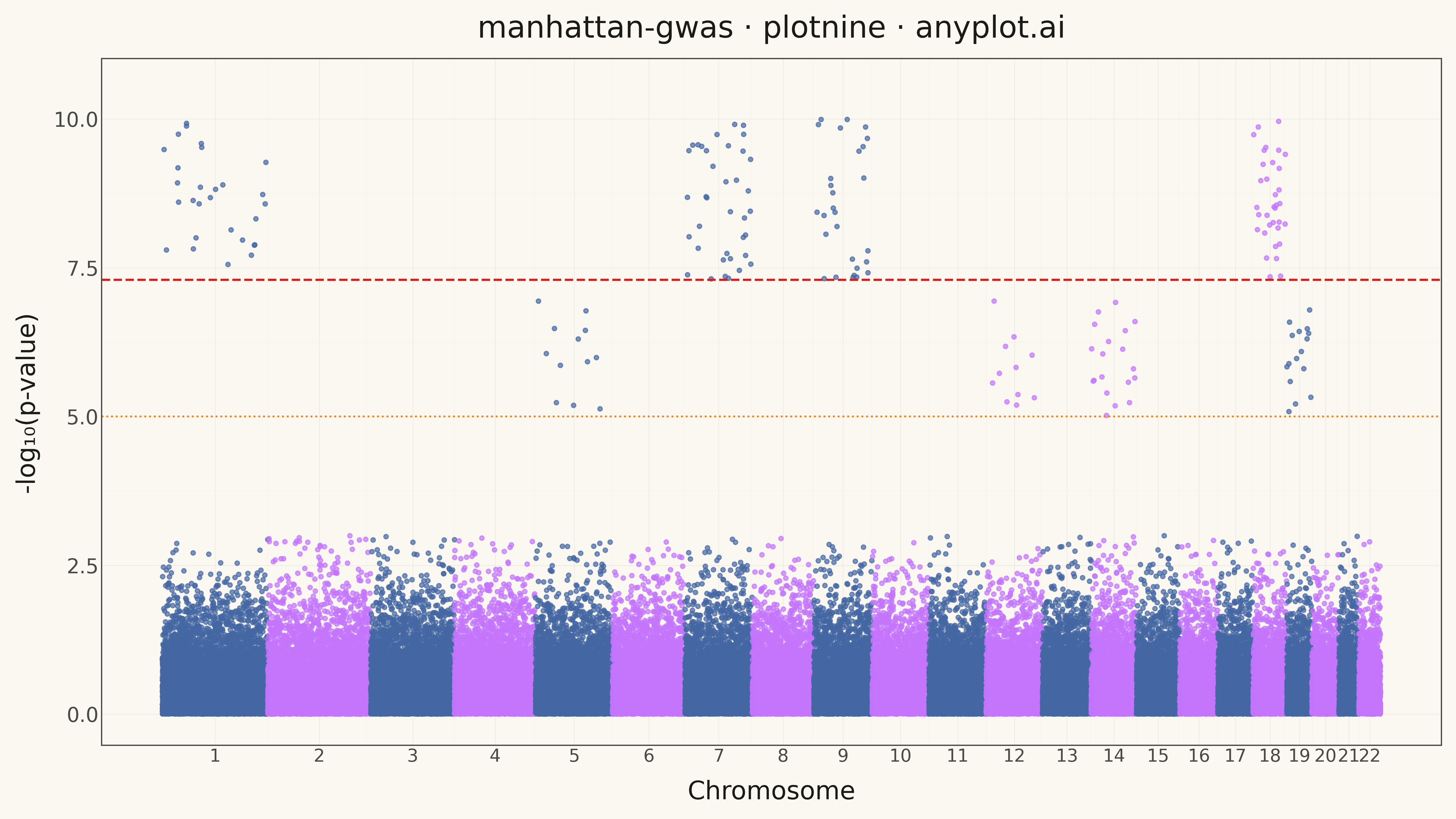
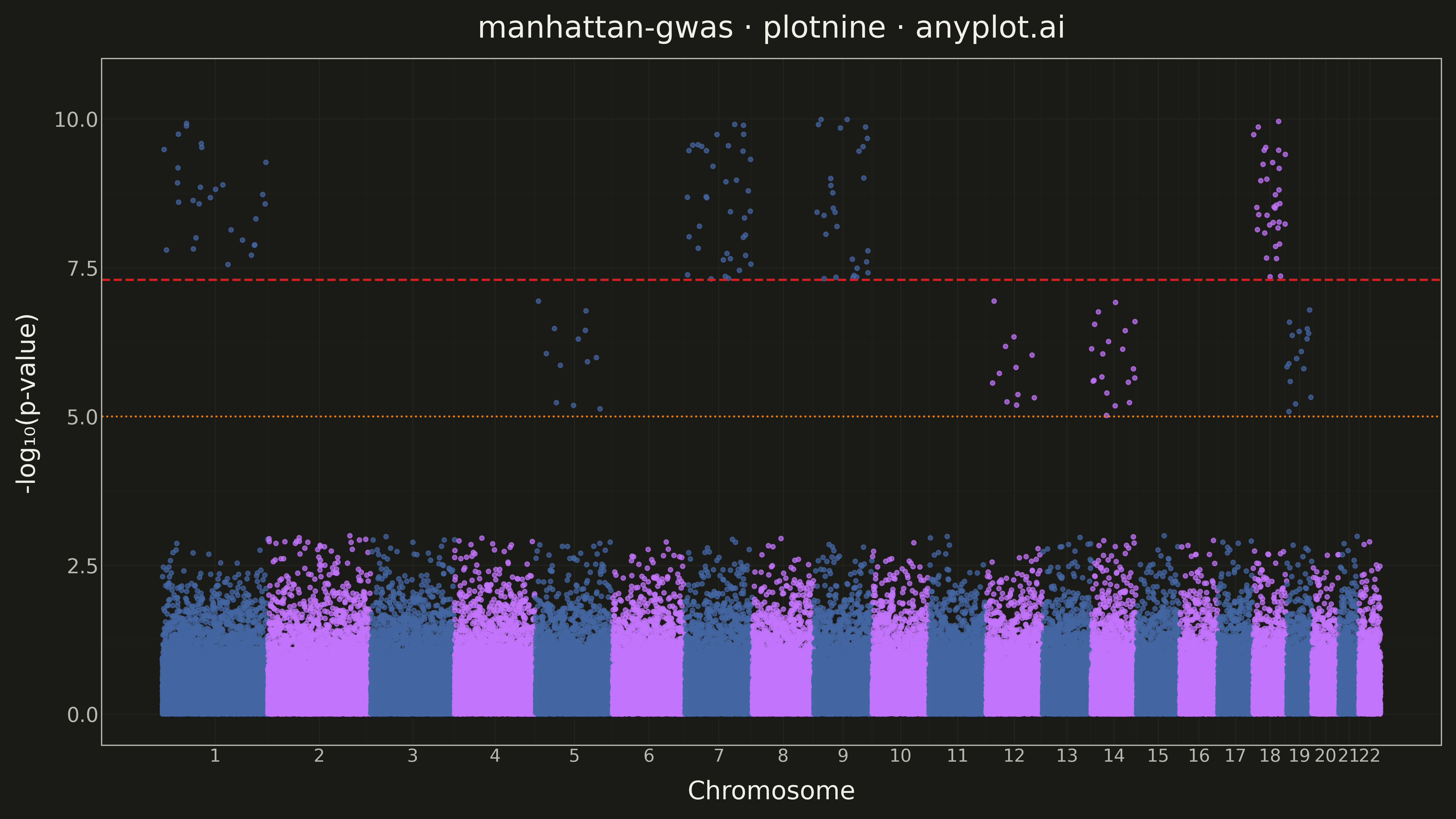
A Manhattan plot visualizes genome-wide association study (GWAS) results by displaying -log10 transformed p-values across chromosomal positions. Points are arranged by genomic position along the x-axis with alternating colors for each chromosome, making it easy to identify significant associations. A horizontal threshold line indicates genome-wide significance (typically p < 5×10⁻⁸). This plot is essential for identifying genetic variants associated with traits or diseases.
""" anyplot.ai
manhattan-gwas: Manhattan Plot for GWAS
Library: plotnine 0.15.4 | Python 3.13.13
Quality: 84/100 | Updated: 2026-05-15
"""

import os

import numpy as np
import pandas as pd
from plotnine import (
    aes,
    element_line,
    element_rect,
    element_text,
    geom_hline,
    geom_point,
    ggplot,
    labs,
    scale_color_manual,
    scale_x_continuous,
    scale_y_continuous,
    theme,
    theme_minimal,
)


# Theme tokens
THEME = os.getenv("ANYPLOT_THEME", "light")
PAGE_BG = "#FAF8F1" if THEME == "light" else "#1A1A17"
ELEVATED_BG = "#FFFDF6" if THEME == "light" else "#242420"
INK = "#1A1A17" if THEME == "light" else "#F0EFE8"
INK_SOFT = "#4A4A44" if THEME == "light" else "#B8B7B0"

# Data - Simulated GWAS results with independent peaks
np.random.seed(123)  # Different seed to produce different peaks

# Chromosome sizes (approximate in Mb)
chr_sizes = {
    "1": 249,
    "2": 243,
    "3": 198,
    "4": 191,
    "5": 182,
    "6": 171,
    "7": 159,
    "8": 145,
    "9": 138,
    "10": 134,
    "11": 135,
    "12": 133,
    "13": 115,
    "14": 107,
    "15": 102,
    "16": 90,
    "17": 83,
    "18": 80,
    "19": 59,
    "20": 64,
    "21": 47,
    "22": 51,
}

# Generate SNPs per chromosome (proportional to size)
chromosomes = list(chr_sizes.keys())
snp_data = []

# Cumulative positions for x-axis
cumulative_offset = 0
chr_offsets = {}
chr_midpoints = {}

for chrom in chromosomes:
    chr_offsets[chrom] = cumulative_offset
    size = chr_sizes[chrom]
    n_snps = int(size * 40)  # ~40 SNPs per Mb = ~8000 total

    # Generate positions
    positions = np.sort(np.random.uniform(0, size * 1e6, n_snps))

    # Generate p-values (mostly non-significant, with some peaks)
    p_values = np.random.uniform(0.001, 1, n_snps)

    # Add significant peaks on specific chromosomes (different from other libraries)
    if chrom in ["1", "7", "9", "18"]:
        # Add 20-40 highly significant SNPs
        n_sig = np.random.randint(20, 40)
        peak_idx = np.random.choice(n_snps, n_sig, replace=False)
        p_values[peak_idx] = 10 ** np.random.uniform(-10, -7.3, n_sig)

    # Add some suggestive signals on other chromosomes
    if chrom in ["5", "12", "14", "19"]:
        n_sug = np.random.randint(10, 20)
        sug_idx = np.random.choice(n_snps, n_sug, replace=False)
        p_values[sug_idx] = 10 ** np.random.uniform(-7, -5, n_sug)

    # Calculate cumulative position
    cumulative_positions = positions + cumulative_offset

    chr_midpoints[chrom] = cumulative_offset + (size * 1e6) / 2

    for i in range(n_snps):
        snp_data.append(
            {
                "chromosome": chrom,
                "position": positions[i],
                "cumulative_pos": cumulative_positions[i],
                "p_value": p_values[i],
            }
        )

    cumulative_offset += size * 1e6

# Create DataFrame
df = pd.DataFrame(snp_data)

# Calculate -log10(p-value)
df["neg_log_p"] = -np.log10(df["p_value"])

# Assign alternating colors based on chromosome
chr_order = {c: i for i, c in enumerate(chromosomes)}
df["chr_num"] = df["chromosome"].map(chr_order)
df["color_group"] = df["chr_num"].apply(lambda x: "odd" if x % 2 == 0 else "even")

# Threshold lines
genome_wide_threshold = -np.log10(5e-8)  # ~7.3
suggestive_threshold = -np.log10(1e-5)  # 5

# Identify top SNPs for potential labeling (above genome-wide significance)
df["significant"] = df["neg_log_p"] > genome_wide_threshold

# Create chromosome tick positions and labels
chr_ticks = [chr_midpoints[c] / 1e6 for c in chromosomes]  # Convert to Mb for display
chr_labels = chromosomes

# Scale positions to Mb for cleaner axis
df["cumulative_pos_mb"] = df["cumulative_pos"] / 1e6

# Plot
anyplot_theme = theme(
    plot_background=element_rect(fill=PAGE_BG, color=PAGE_BG),
    panel_background=element_rect(fill=PAGE_BG),
    panel_grid_major=element_line(color=INK, size=0.3, alpha=0.10),
    panel_grid_minor=element_line(color=INK, size=0.2, alpha=0.05),
    panel_border=element_rect(color=INK_SOFT, fill=None),
    axis_title=element_text(color=INK, size=20),
    axis_text=element_text(color=INK_SOFT, size=16),
    axis_text_x=element_text(size=14),
    axis_line=element_line(color=INK_SOFT, size=0.5),
    plot_title=element_text(color=INK, size=24, hjust=0.5),
    legend_position="none",
)

plot = (
    ggplot(df, aes(x="cumulative_pos_mb", y="neg_log_p", color="color_group"))
    + geom_point(size=1.5, alpha=0.7)
    + geom_hline(yintercept=genome_wide_threshold, linetype="dashed", color="#E31A1C", size=1)
    + geom_hline(yintercept=suggestive_threshold, linetype="dotted", color="#FF7F00", size=0.8)
    + scale_color_manual(values={"odd": "#4467A3", "even": "#C475FD"})
    + scale_x_continuous(breaks=chr_ticks, labels=chr_labels)
    + scale_y_continuous(limits=(0, max(df["neg_log_p"]) * 1.05))
    + labs(x="Chromosome", y="-log₁₀(p-value)", title="manhattan-gwas · plotnine · anyplot.ai")
    + theme_minimal()
    + anyplot_theme
)

# Save
plot.save(f"plot-{THEME}.png", dpi=300, width=16, height=9)
Runnable source as JSON, for any HTTP client: https://api.anyplot.ai/specs/manhattan-gwas/plotnine/code. Any spec id and library id listed in llms-full.txt fit the same URL shape; every URL below is complete and callable.
{
  "spec_id": "manhattan-gwas",
  "language": "python",
  "library": "plotnine",
  "page": "https://anyplot.ai/manhattan-gwas/python/plotnine",
  "hub": "https://anyplot.ai/manhattan-gwas",
  "code_json": "https://api.anyplot.ai/specs/manhattan-gwas/plotnine/code",
  "spec_json": "https://api.anyplot.ai/specs/manhattan-gwas",
  "render_light_png": "https://storage.googleapis.com/anyplot-images/plots/manhattan-gwas/python/plotnine/plot-light.png",
  "render_dark_png": "https://storage.googleapis.com/anyplot-images/plots/manhattan-gwas/python/plotnine/plot-dark.png",
  "quality_score": 84.0,
  "license": "MIT",
  "guide": "https://anyplot.ai/llms.txt"
}
Part of Manhattan Plot for GWAS on anyplot.ai.