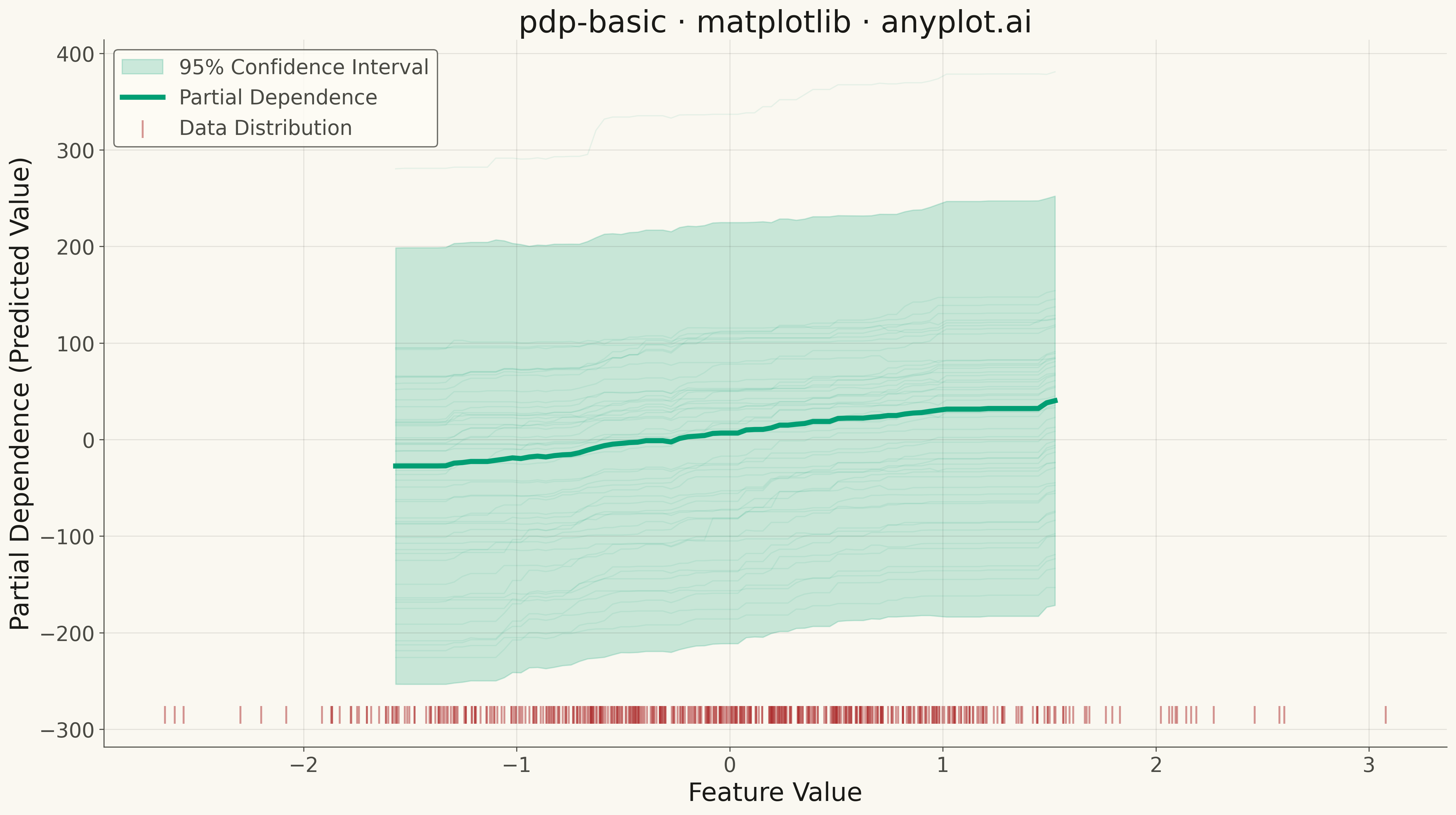
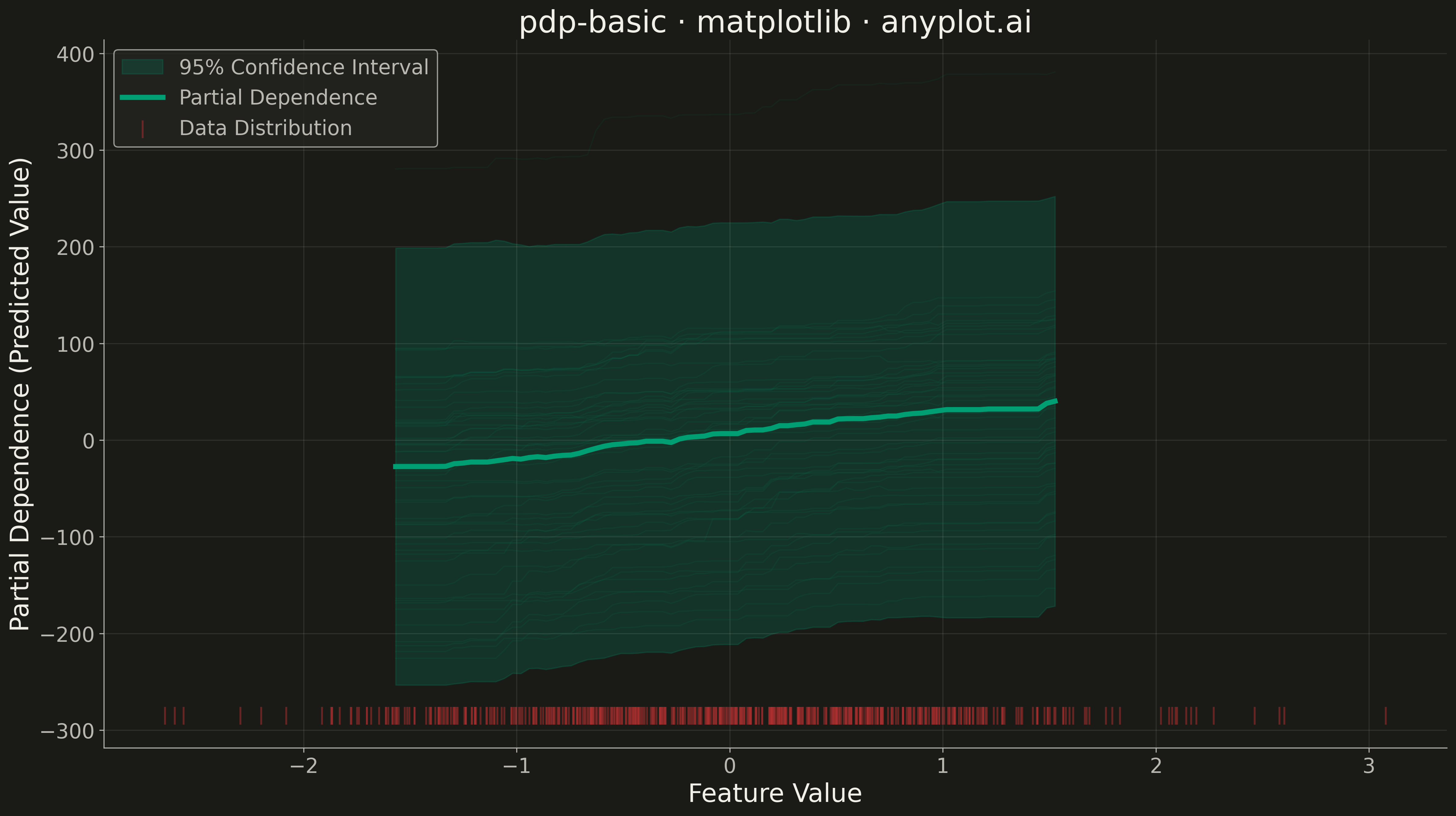
A partial dependence plot (PDP) showing the marginal effect of one feature on the predicted outcome of a machine learning model. The plot displays how predictions change as a feature varies across its range, while averaging over the effects of all other features. This visualization is essential for understanding the relationship between individual features and model predictions in interpretable machine learning.
""" anyplot.ai
pdp-basic: Partial Dependence Plot
Library: matplotlib 3.10.9 | Python 3.13.13
Quality: 94/100 | Updated: 2026-05-15
"""

import os

import matplotlib.pyplot as plt
import numpy as np
from sklearn.datasets import make_regression
from sklearn.ensemble import GradientBoostingRegressor
from sklearn.inspection import partial_dependence


# Theme tokens
THEME = os.getenv("ANYPLOT_THEME", "light")
PAGE_BG = "#FAF8F1" if THEME == "light" else "#1A1A17"
ELEVATED_BG = "#FFFDF6" if THEME == "light" else "#242420"
INK = "#1A1A17" if THEME == "light" else "#F0EFE8"
INK_SOFT = "#4A4A44" if THEME == "light" else "#B8B7B0"
BRAND = "#009E73"  # Okabe-Ito position 1
ACCENT = "#AE3030"  # Okabe-Ito position 5 for rug plot

# Data: Train a gradient boosting model and compute partial dependence
np.random.seed(42)
X, y = make_regression(n_samples=500, n_features=5, noise=15, random_state=42)

# Train model
model = GradientBoostingRegressor(n_estimators=100, max_depth=4, random_state=42)
model.fit(X, y)

# Compute partial dependence for feature 0
feature_idx = 0

# Get partial dependence using sklearn
pd_result = partial_dependence(model, X, features=[feature_idx], kind="both", grid_resolution=80)
pdp_values = pd_result["average"][0]
ice_lines = pd_result["individual"][0]
grid_values = pd_result["grid_values"][0]

# Calculate confidence interval (mean ± std of ICE lines)
ice_mean = pdp_values
ice_std = np.std(ice_lines, axis=0)

# Plot
fig, ax = plt.subplots(figsize=(16, 9), facecolor=PAGE_BG)
ax.set_facecolor(PAGE_BG)

# Plot ICE lines (faint individual lines)
for i in range(0, len(ice_lines), 10):
    ax.plot(grid_values, ice_lines[i], color=BRAND, alpha=0.08, linewidth=1)

# Plot confidence band
ax.fill_between(
    grid_values,
    ice_mean - 1.96 * ice_std,
    ice_mean + 1.96 * ice_std,
    alpha=0.2,
    color=BRAND,
    label="95% Confidence Interval",
)

# Plot main PDP line
ax.plot(grid_values, pdp_values, color=BRAND, linewidth=4, label="Partial Dependence")

# Add rug plot showing data distribution
rug_y = ax.get_ylim()[0]
ax.scatter(
    X[:, feature_idx], np.full(len(X), rug_y), marker="|", color=ACCENT, alpha=0.5, s=200, label="Data Distribution"
)

# Style
ax.set_xlabel("Feature Value", fontsize=20, color=INK)
ax.set_ylabel("Partial Dependence (Predicted Value)", fontsize=20, color=INK)
ax.set_title("pdp-basic · matplotlib · anyplot.ai", fontsize=24, fontweight="medium", color=INK)
ax.tick_params(axis="both", labelsize=16, colors=INK_SOFT)

# Legend with background
leg = ax.legend(fontsize=16, loc="upper left", frameon=True)
leg.get_frame().set_facecolor(ELEVATED_BG)
leg.get_frame().set_edgecolor(INK_SOFT)
leg.get_frame().set_linewidth(1)
for text in leg.get_texts():
    text.set_color(INK_SOFT)

# Grid
ax.grid(True, alpha=0.1, linewidth=0.8, color=INK)
ax.spines["top"].set_visible(False)
ax.spines["right"].set_visible(False)
for s in ("left", "bottom"):
    ax.spines[s].set_color(INK_SOFT)

plt.tight_layout()
plt.savefig(f"plot-{THEME}.png", dpi=300, bbox_inches="tight", facecolor=PAGE_BG)
Runnable source as JSON, for any HTTP client: https://api.anyplot.ai/specs/pdp-basic/matplotlib/code. Any spec id and library id listed in llms-full.txt fit the same URL shape; every URL below is complete and callable.
{
  "spec_id": "pdp-basic",
  "language": "python",
  "library": "matplotlib",
  "page": "https://anyplot.ai/pdp-basic/python/matplotlib",
  "hub": "https://anyplot.ai/pdp-basic",
  "code_json": "https://api.anyplot.ai/specs/pdp-basic/matplotlib/code",
  "spec_json": "https://api.anyplot.ai/specs/pdp-basic",
  "render_light_png": "https://storage.googleapis.com/anyplot-images/plots/pdp-basic/python/matplotlib/plot-light.png",
  "render_dark_png": "https://storage.googleapis.com/anyplot-images/plots/pdp-basic/python/matplotlib/plot-dark.png",
  "quality_score": 94.0,
  "license": "MIT",
  "guide": "https://anyplot.ai/llms.txt"
}
Part of Partial Dependence Plot on anyplot.ai.