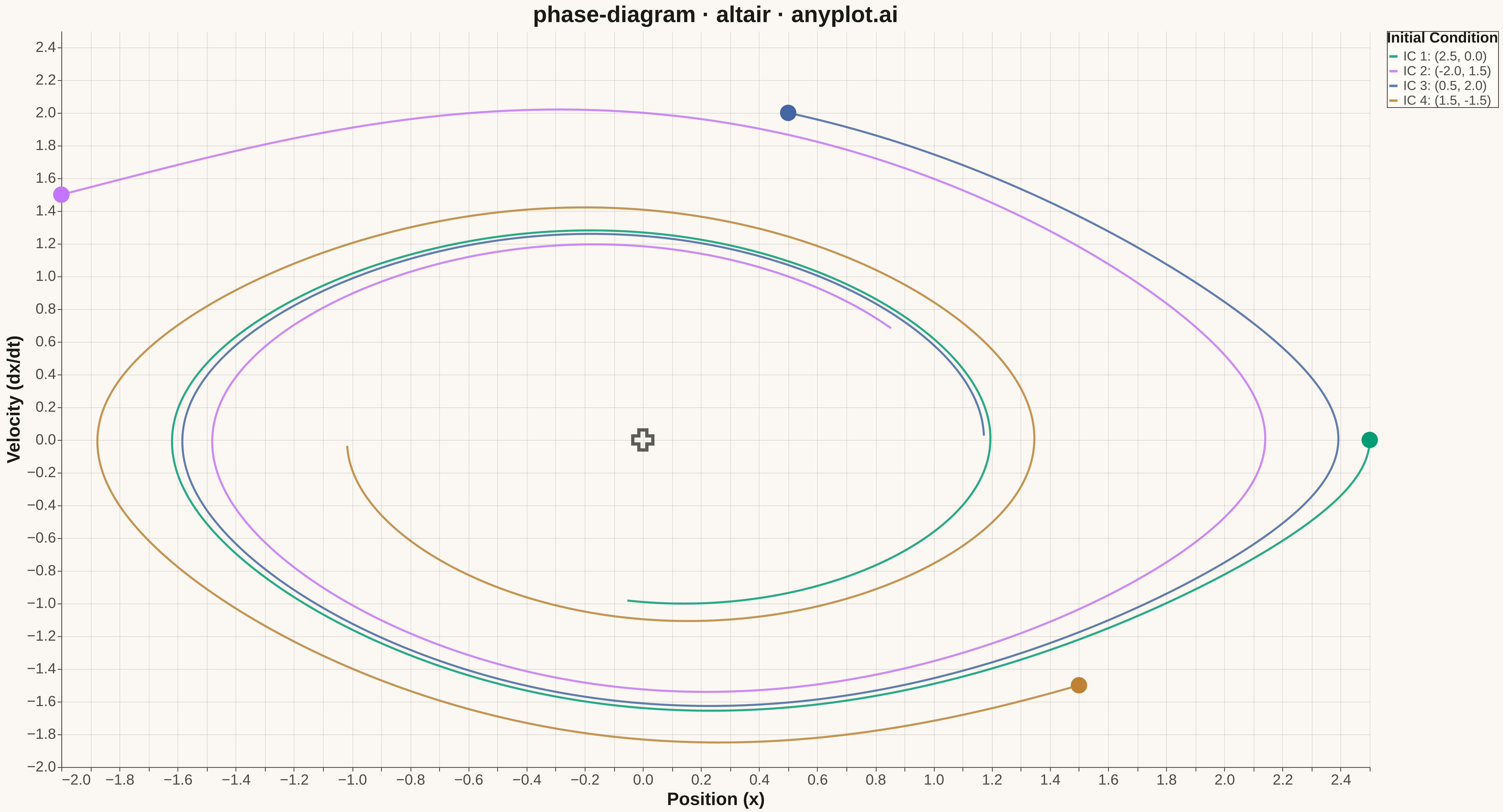
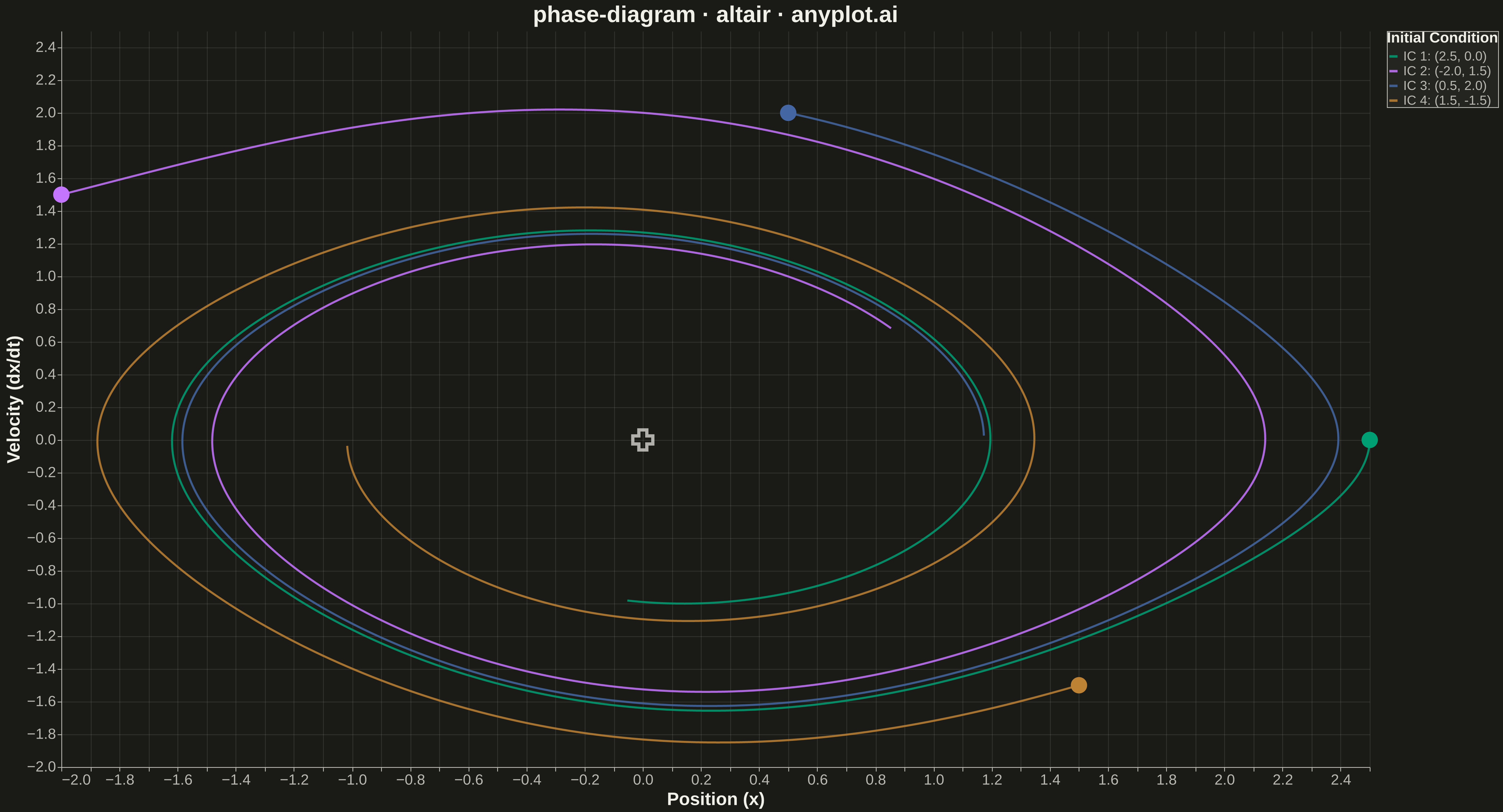
A phase diagram (or state space plot) displays the trajectory of a dynamical system by plotting a variable against its derivative (x vs dx/dt). This visualization reveals the qualitative behavior of systems including fixed points, limit cycles, stability, and oscillation patterns. It is essential for analyzing differential equations without solving them explicitly.
""" anyplot.ai
phase-diagram: Phase Diagram (State Space Plot)
Library: altair 6.1.0 | Python 3.13.13
Quality: 97/100 | Updated: 2026-05-14
"""

import os
import sys


sys.path = [p for p in sys.path if not p.endswith("python")]
import altair as alt
import numpy as np
import pandas as pd


# Theme tokens
THEME = os.getenv("ANYPLOT_THEME", "light")
PAGE_BG = "#FAF8F1" if THEME == "light" else "#1A1A17"
ELEVATED_BG = "#FFFDF6" if THEME == "light" else "#242420"
INK = "#1A1A17" if THEME == "light" else "#F0EFE8"
INK_SOFT = "#4A4A44" if THEME == "light" else "#B8B7B0"

# Okabe-Ito palette (first series is #009E73)
IMPRINT = ["#009E73", "#C475FD", "#4467A3", "#BD8233"]

# Data: Damped pendulum simulation
np.random.seed(42)

dt = 0.02
gamma = 0.15

trajectories = []
initial_conditions = [(2.5, 0.0), (-2.0, 1.5), (0.5, 2.0), (1.5, -1.5)]

for idx, (x0, v0) in enumerate(initial_conditions):
    x, v = x0, v0
    trajectory_x = [x]
    trajectory_v = [v]

    for _ in range(500):
        a = -np.sin(x) - gamma * v
        v = v + a * dt
        x = x + v * dt
        trajectory_x.append(x)
        trajectory_v.append(v)

    for i, (px, pv) in enumerate(zip(trajectory_x, trajectory_v, strict=True)):
        trajectories.append({"x": px, "dx_dt": pv, "trajectory": f"IC {idx + 1}: ({x0:.1f}, {v0:.1f})", "order": i})

df = pd.DataFrame(trajectories)

# Create phase diagram
base = (
    alt.Chart(df)
    .mark_line(strokeWidth=2.5, opacity=0.85)
    .encode(
        x=alt.X("x:Q", title="Position (x)", axis=alt.Axis(titleFontSize=22, labelFontSize=18)),
        y=alt.Y("dx_dt:Q", title="Velocity (dx/dt)", axis=alt.Axis(titleFontSize=22, labelFontSize=18)),
        color=alt.Color(
            "trajectory:N",
            title="Initial Condition",
            scale=alt.Scale(range=IMPRINT),
            legend=alt.Legend(titleFontSize=18, labelFontSize=16, symbolStrokeWidth=3),
        ),
        order=alt.Order("order:Q"),
        detail="trajectory:N",
    )
    .properties(
        width=1600,
        height=900,
        title=alt.Title(text="phase-diagram · altair · anyplot.ai", fontSize=28, anchor="middle"),
    )
)

# Add starting points as markers
start_points = df[df["order"] == 0]
points = (
    alt.Chart(start_points)
    .mark_point(size=400, filled=True, opacity=1.0)
    .encode(x="x:Q", y="dx_dt:Q", color=alt.Color("trajectory:N", scale=alt.Scale(range=IMPRINT), legend=None))
)

# Add equilibrium point marker at origin
equilibrium = pd.DataFrame([{"x": 0, "y": 0}])
eq_point = alt.Chart(equilibrium).mark_point(shape="cross", size=600, strokeWidth=4, color=INK).encode(x="x:Q", y="y:Q")

# Combine layers with theme-aware styling
chart = (
    (base + points + eq_point)
    .properties(background=PAGE_BG)
    .configure_view(fill=PAGE_BG, stroke=INK_SOFT, strokeWidth=0)
    .configure_axis(
        domainColor=INK_SOFT, tickColor=INK_SOFT, gridColor=INK, gridOpacity=0.10, labelColor=INK_SOFT, titleColor=INK
    )
    .configure_title(color=INK)
    .configure_legend(fillColor=ELEVATED_BG, strokeColor=INK_SOFT, labelColor=INK_SOFT, titleColor=INK)
)

# Save with theme suffix
chart.save(f"plot-{THEME}.png", scale_factor=3.0)
chart.interactive().save(f"plot-{THEME}.html")
Runnable source as JSON, for any HTTP client: https://api.anyplot.ai/specs/phase-diagram/altair/code. Any spec id and library id listed in llms-full.txt fit the same URL shape; every URL below is complete and callable.
{
  "spec_id": "phase-diagram",
  "language": "python",
  "library": "altair",
  "page": "https://anyplot.ai/phase-diagram/python/altair",
  "hub": "https://anyplot.ai/phase-diagram",
  "code_json": "https://api.anyplot.ai/specs/phase-diagram/altair/code",
  "spec_json": "https://api.anyplot.ai/specs/phase-diagram",
  "render_light_png": "https://storage.googleapis.com/anyplot-images/plots/phase-diagram/python/altair/plot-light.png",
  "render_dark_png": "https://storage.googleapis.com/anyplot-images/plots/phase-diagram/python/altair/plot-dark.png",
  "interactive_light_html": "https://storage.googleapis.com/anyplot-images/plots/phase-diagram/python/altair/plot-light.html",
  "interactive_dark_html": "https://storage.googleapis.com/anyplot-images/plots/phase-diagram/python/altair/plot-dark.html",
  "quality_score": 97.0,
  "license": "MIT",
  "guide": "https://anyplot.ai/llms.txt"
}
Part of Phase Diagram (State Space Plot) on anyplot.ai.