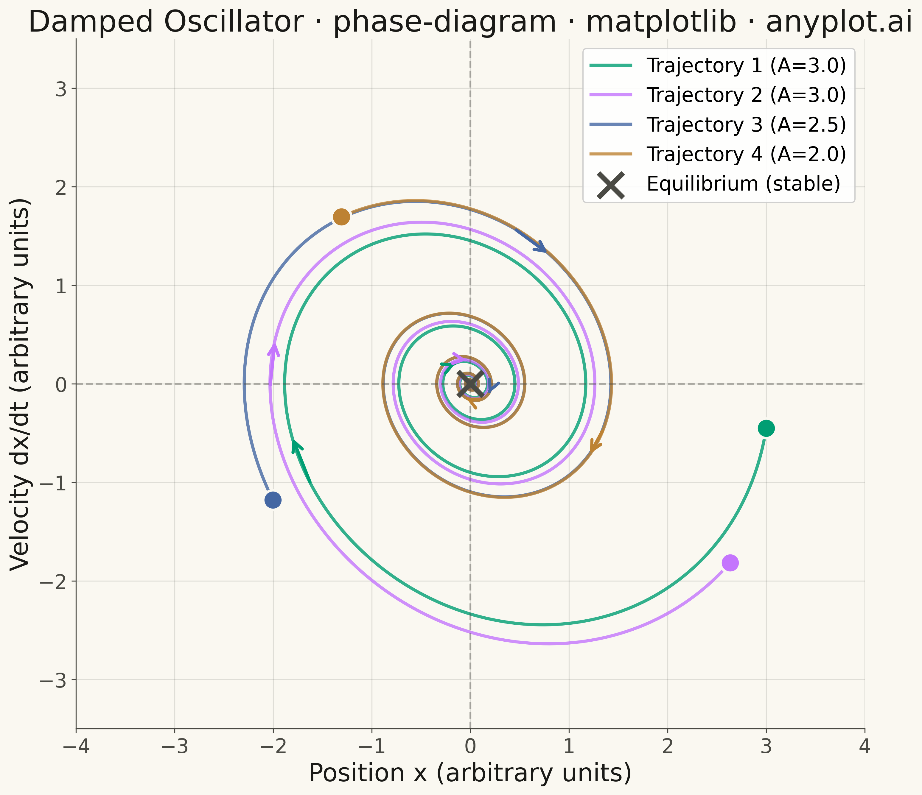
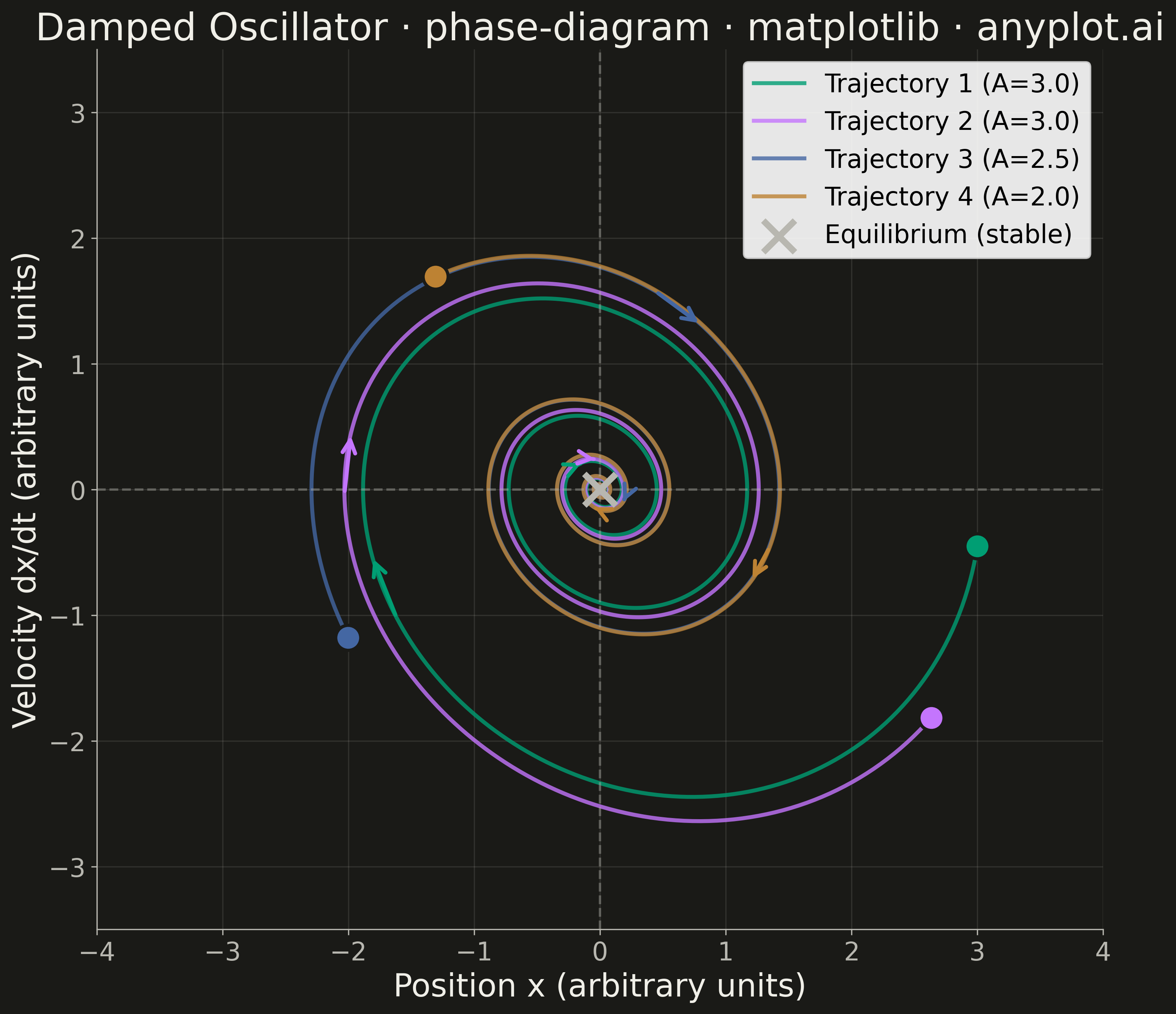
A phase diagram (or state space plot) displays the trajectory of a dynamical system by plotting a variable against its derivative (x vs dx/dt). This visualization reveals the qualitative behavior of systems including fixed points, limit cycles, stability, and oscillation patterns. It is essential for analyzing differential equations without solving them explicitly.
""" anyplot.ai
phase-diagram: Phase Diagram (State Space Plot)
Library: matplotlib 3.10.9 | Python 3.13.13
Quality: 90/100 | Updated: 2026-05-14
"""

import os

import matplotlib.pyplot as plt
import numpy as np


# Theme tokens
THEME = os.getenv("ANYPLOT_THEME", "light")
PAGE_BG = "#FAF8F1" if THEME == "light" else "#1A1A17"
INK = "#1A1A17" if THEME == "light" else "#F0EFE8"
INK_SOFT = "#4A4A44" if THEME == "light" else "#B8B7B0"

# Okabe-Ito palette
BRAND = "#009E73"
IMPRINT = ["#009E73", "#C475FD", "#4467A3", "#BD8233"]

# Damped harmonic oscillator: m*x'' + c*x' + k*x = 0
# Using underdamped solution: x(t) = A*exp(-gamma*t)*cos(omega_d*t + phi)
gamma = 0.15  # Damping coefficient
omega0 = 1.0  # Natural frequency
omega_d = np.sqrt(omega0**2 - gamma**2)  # Damped frequency (underdamped case)

# Time array
t = np.linspace(0, 50, 2000)

# Multiple trajectories from different initial conditions
# Format: (A, phi) - amplitude and phase for analytical solution
initial_params = [(3.0, 0.0), (3.0, 0.5), (2.5, 2.5), (2.0, 4.0)]

# Compute trajectories using analytical solution
# x(t) = A * exp(-gamma*t) * cos(omega_d*t + phi)
# v(t) = dx/dt = A * exp(-gamma*t) * (-gamma*cos(omega_d*t + phi) - omega_d*sin(omega_d*t + phi))
trajectories = []
for A, phi in initial_params:
    exp_decay = A * np.exp(-gamma * t)
    x = exp_decay * np.cos(omega_d * t + phi)
    v = exp_decay * (-gamma * np.cos(omega_d * t + phi) - omega_d * np.sin(omega_d * t + phi))
    trajectories.append((x, v, A, phi))

# Create figure
fig, ax = plt.subplots(figsize=(16, 9), facecolor=PAGE_BG)
ax.set_facecolor(PAGE_BG)

# Plot each trajectory
for i, (x, v, A, _phi) in enumerate(trajectories):
    # Plot trajectory line
    ax.plot(x, v, color=IMPRINT[i], linewidth=2.5, alpha=0.8, label=f"Trajectory {i + 1} (A={A:.1f})")

    # Mark start point with larger marker
    ax.scatter(x[0], v[0], s=250, color=IMPRINT[i], edgecolor=PAGE_BG, linewidth=2, zorder=5, marker="o")

    # Add arrows to show direction along trajectory
    n_points = len(x)
    n_arrows = 4
    arrow_indices = np.linspace(100, n_points - 200, n_arrows, dtype=int)
    for idx in arrow_indices:
        dx = x[idx + 10] - x[idx]
        dv = v[idx + 10] - v[idx]
        length = np.sqrt(dx**2 + dv**2)
        if length > 0.01:
            ax.annotate(
                "",
                xy=(x[idx + 10], v[idx + 10]),
                xytext=(x[idx], v[idx]),
                arrowprops={"arrowstyle": "->", "color": IMPRINT[i], "lw": 2.5, "mutation_scale": 20},
            )

# Mark the equilibrium point (stable fixed point at origin)
ax.scatter(0, 0, s=400, color=INK_SOFT, marker="x", linewidth=4, zorder=10, label="Equilibrium (stable)")

# Add reference lines for axes
ax.axhline(y=0, color=INK_SOFT, linewidth=1.5, linestyle="--", alpha=0.4)
ax.axvline(x=0, color=INK_SOFT, linewidth=1.5, linestyle="--", alpha=0.4)

# Labels and styling
ax.set_xlabel("Position x (arbitrary units)", fontsize=20, color=INK)
ax.set_ylabel("Velocity dx/dt (arbitrary units)", fontsize=20, color=INK)
ax.set_title("Damped Oscillator · phase-diagram · matplotlib · anyplot.ai", fontsize=24, fontweight="medium", color=INK)
ax.tick_params(axis="both", labelsize=16, colors=INK_SOFT, labelcolor=INK_SOFT)
ax.legend(fontsize=16, loc="upper right", framealpha=0.9)
for s in ("left", "bottom"):
    ax.spines[s].set_color(INK_SOFT)
ax.spines["top"].set_visible(False)
ax.spines["right"].set_visible(False)
ax.grid(True, alpha=0.15, linestyle="-", color=INK_SOFT, linewidth=0.8)

# Set equal aspect ratio for proper visualization
ax.set_aspect("equal", adjustable="box")

# Adjust axis limits for better visualization
ax.set_xlim(-4, 4)
ax.set_ylim(-3.5, 3.5)

plt.tight_layout()
plt.savefig(f"plot-{THEME}.png", dpi=300, bbox_inches="tight", facecolor=PAGE_BG)
Runnable source as JSON, for any HTTP client: https://api.anyplot.ai/specs/phase-diagram/matplotlib/code. Any spec id and library id listed in llms-full.txt fit the same URL shape; every URL below is complete and callable.
{
  "spec_id": "phase-diagram",
  "language": "python",
  "library": "matplotlib",
  "page": "https://anyplot.ai/phase-diagram/python/matplotlib",
  "hub": "https://anyplot.ai/phase-diagram",
  "code_json": "https://api.anyplot.ai/specs/phase-diagram/matplotlib/code",
  "spec_json": "https://api.anyplot.ai/specs/phase-diagram",
  "render_light_png": "https://storage.googleapis.com/anyplot-images/plots/phase-diagram/python/matplotlib/plot-light.png",
  "render_dark_png": "https://storage.googleapis.com/anyplot-images/plots/phase-diagram/python/matplotlib/plot-dark.png",
  "quality_score": 90.0,
  "license": "MIT",
  "guide": "https://anyplot.ai/llms.txt"
}
Part of Phase Diagram (State Space Plot) on anyplot.ai.