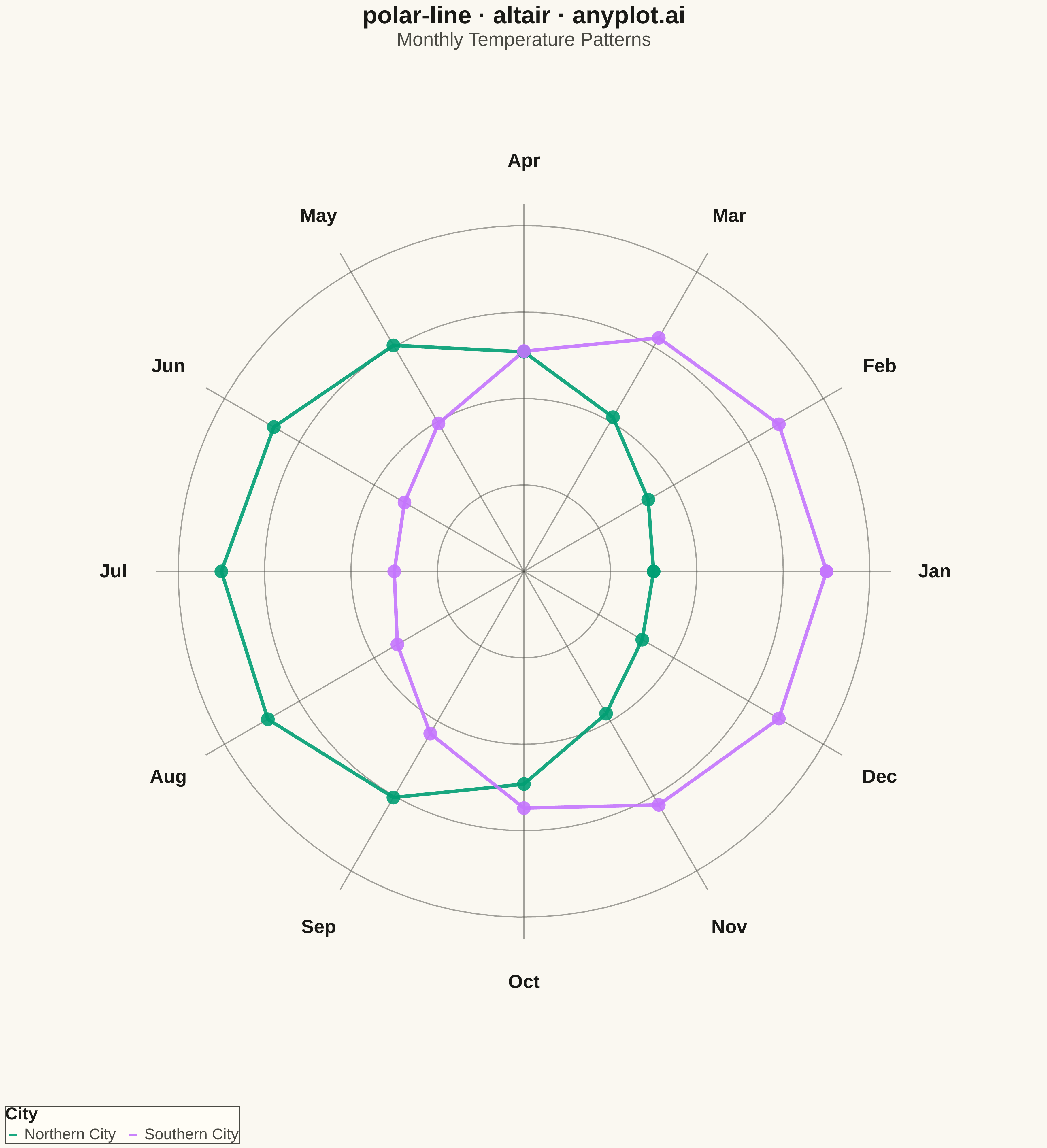
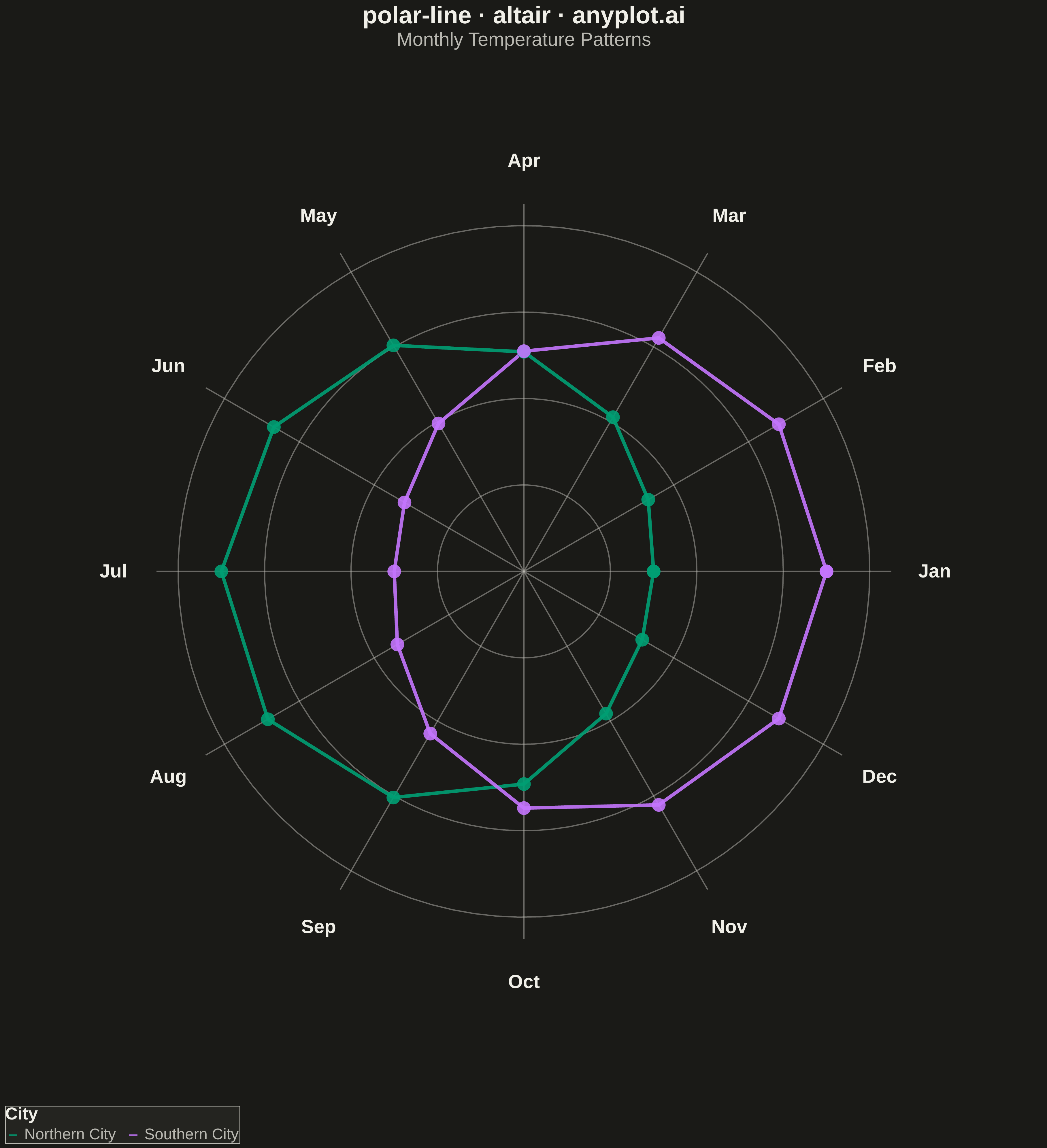
A line plot rendered in polar coordinates, where data points are connected with lines around a circular axis. The angle (theta) typically represents a cyclical variable while the radius shows magnitude.
""" anyplot.ai
polar-line: Polar Line Plot
Library: altair 6.1.0 | Python 3.13.13
Quality: 92/100 | Updated: 2026-05-12
"""

import os
import sys


# Remove current directory from path to avoid importing this file as altair
cwd = os.getcwd()
if cwd in sys.path:
    sys.path.remove(cwd)
script_dir = os.path.dirname(os.path.abspath(__file__))
if script_dir in sys.path:
    sys.path.remove(script_dir)

import altair as alt
import numpy as np
import pandas as pd


# Theme tokens
THEME = os.getenv("ANYPLOT_THEME", "light")
PAGE_BG = "#FAF8F1" if THEME == "light" else "#1A1A17"
ELEVATED_BG = "#FFFDF6" if THEME == "light" else "#242420"
INK = "#1A1A17" if THEME == "light" else "#F0EFE8"
INK_SOFT = "#4A4A44" if THEME == "light" else "#B8B7B0"

# Okabe-Ito palette (positions 1-2 for two series)
IMPRINT = ["#009E73", "#C475FD"]

# Data - Seasonal temperature pattern (cyclical)
np.random.seed(42)
months = np.arange(0, 360, 30)  # 12 months as degrees
month_names = ["Jan", "Feb", "Mar", "Apr", "May", "Jun", "Jul", "Aug", "Sep", "Oct", "Nov", "Dec"]

# Two cities with different seasonal patterns
city_a_temp = np.array([5, 7, 12, 18, 24, 28, 30, 29, 24, 17, 10, 6])
city_b_temp = np.array([28, 27, 24, 18, 12, 8, 7, 9, 14, 20, 24, 27])

# Normalize temperatures to 0-1 range for polar visualization
city_a_norm = (city_a_temp - city_a_temp.min()) / (city_a_temp.max() - city_a_temp.min()) * 0.4 + 0.3
city_b_norm = (city_b_temp - city_b_temp.min()) / (city_b_temp.max() - city_b_temp.min()) * 0.4 + 0.3

# Convert polar to cartesian for Altair
theta_rad_months = np.radians(months)
theta_rad_closed = np.append(theta_rad_months, theta_rad_months[0])

city_a_closed = np.append(city_a_norm, city_a_norm[0])
city_b_closed = np.append(city_b_norm, city_b_norm[0])

x_a = city_a_closed * np.cos(theta_rad_closed)
y_a = city_a_closed * np.sin(theta_rad_closed)
x_b = city_b_closed * np.cos(theta_rad_closed)
y_b = city_b_closed * np.sin(theta_rad_closed)

df = pd.DataFrame(
    {
        "x": np.concatenate([x_a, x_b]),
        "y": np.concatenate([y_a, y_b]),
        "order": list(range(len(x_a))) + list(range(len(x_b))),
        "city": ["Northern City"] * len(x_a) + ["Southern City"] * len(x_b),
    }
)

# Create polar grid - concentric circles
grid_circles = []
for r in [0.2, 0.4, 0.6, 0.8]:
    theta_circle = np.linspace(0, 2 * np.pi, 100)
    x_c = r * np.cos(theta_circle)
    y_c = r * np.sin(theta_circle)
    for i in range(len(x_c)):
        grid_circles.append({"x": x_c[i], "y": y_c[i], "r": str(r), "order": i})
grid_df = pd.DataFrame(grid_circles)

# Create radial lines
radials = []
for angle in months:
    angle_rad = np.radians(angle)
    radials.append({"x": 0, "y": 0, "x2": 0.85 * np.cos(angle_rad), "y2": 0.85 * np.sin(angle_rad)})
radials_df = pd.DataFrame(radials)

# Month labels
labels = []
for angle, name in zip(months, month_names, strict=True):
    angle_rad = np.radians(angle)
    labels.append({"x": 0.95 * np.cos(angle_rad), "y": 0.95 * np.sin(angle_rad), "label": name})
labels_df = pd.DataFrame(labels)

# Concentric grid circles
circles_chart = (
    alt.Chart(grid_df)
    .mark_line(strokeWidth=1.5, opacity=0.5)
    .encode(
        x=alt.X("x:Q", axis=None, scale=alt.Scale(domain=[-1.1, 1.1])),
        y=alt.Y("y:Q", axis=None, scale=alt.Scale(domain=[-1.1, 1.1])),
        detail="r:N",
        order="order:O",
        color=alt.value(INK_SOFT),
    )
)

# Radial grid lines
radials_chart = (
    alt.Chart(radials_df)
    .mark_rule(strokeWidth=1.5, opacity=0.5)
    .encode(x="x:Q", y="y:Q", x2="x2:Q", y2="y2:Q", color=alt.value(INK_SOFT))
)

# Month labels
labels_chart = (
    alt.Chart(labels_df)
    .mark_text(fontSize=22, fontWeight="bold")
    .encode(x="x:Q", y="y:Q", text="label:N", color=alt.value(INK))
)

# Data lines
lines_chart = (
    alt.Chart(df)
    .mark_line(strokeWidth=4, opacity=0.9)
    .encode(
        x="x:Q",
        y="y:Q",
        color=alt.Color(
            "city:N",
            scale=alt.Scale(domain=["Northern City", "Southern City"], range=IMPRINT),
            legend=alt.Legend(
                title="City",
                titleFontSize=20,
                labelFontSize=18,
                orient="bottom",
                direction="horizontal",
                fillColor=ELEVATED_BG,
                strokeColor=INK_SOFT,
                titleColor=INK,
                labelColor=INK_SOFT,
            ),
        ),
        order="order:O",
    )
)

# Data points
points_chart = (
    alt.Chart(df)
    .mark_point(size=250, filled=True, opacity=0.9)
    .encode(
        x="x:Q",
        y="y:Q",
        color=alt.Color(
            "city:N", scale=alt.Scale(domain=["Northern City", "Southern City"], range=IMPRINT), legend=None
        ),
    )
)

# Combine all layers
chart = (
    alt.layer(circles_chart, radials_chart, labels_chart, lines_chart, points_chart)
    .properties(
        width=1200,
        height=1200,
        title=alt.Title(
            text="polar-line · altair · anyplot.ai",
            subtitle="Monthly Temperature Patterns",
            fontSize=28,
            subtitleFontSize=22,
            anchor="middle",
            color=INK,
            subtitleColor=INK_SOFT,
        ),
        background=PAGE_BG,
    )
    .configure_view(strokeWidth=0, fill=PAGE_BG)
)

# Save (1200 * 3 = 3600 for square format)
chart.save(f"plot-{THEME}.png", scale_factor=3.0)
chart.save(f"plot-{THEME}.html")
Runnable source as JSON, for any HTTP client: https://api.anyplot.ai/specs/polar-line/altair/code. Any spec id and library id listed in llms-full.txt fit the same URL shape; every URL below is complete and callable.
{
  "spec_id": "polar-line",
  "language": "python",
  "library": "altair",
  "page": "https://anyplot.ai/polar-line/python/altair",
  "hub": "https://anyplot.ai/polar-line",
  "code_json": "https://api.anyplot.ai/specs/polar-line/altair/code",
  "spec_json": "https://api.anyplot.ai/specs/polar-line",
  "render_light_png": "https://storage.googleapis.com/anyplot-images/plots/polar-line/python/altair/plot-light.png",
  "render_dark_png": "https://storage.googleapis.com/anyplot-images/plots/polar-line/python/altair/plot-dark.png",
  "interactive_light_html": "https://storage.googleapis.com/anyplot-images/plots/polar-line/python/altair/plot-light.html",
  "interactive_dark_html": "https://storage.googleapis.com/anyplot-images/plots/polar-line/python/altair/plot-dark.html",
  "quality_score": 92.0,
  "license": "MIT",
  "guide": "https://anyplot.ai/llms.txt"
}
Part of Polar Line Plot on anyplot.ai.