The same plot in 14 other libraries — Python: Altair, Bokeh, lets-plot, Matplotlib, Plotly, Pygal, Seaborn; R: ggplot2; Julia: Makie.jl; JavaScript: Chart.js, D3.js, Apache ECharts, Highcharts, MUI X Charts. Compare all 15 side by side: Polar Line Plot in Python, R, Julia and JavaScript.
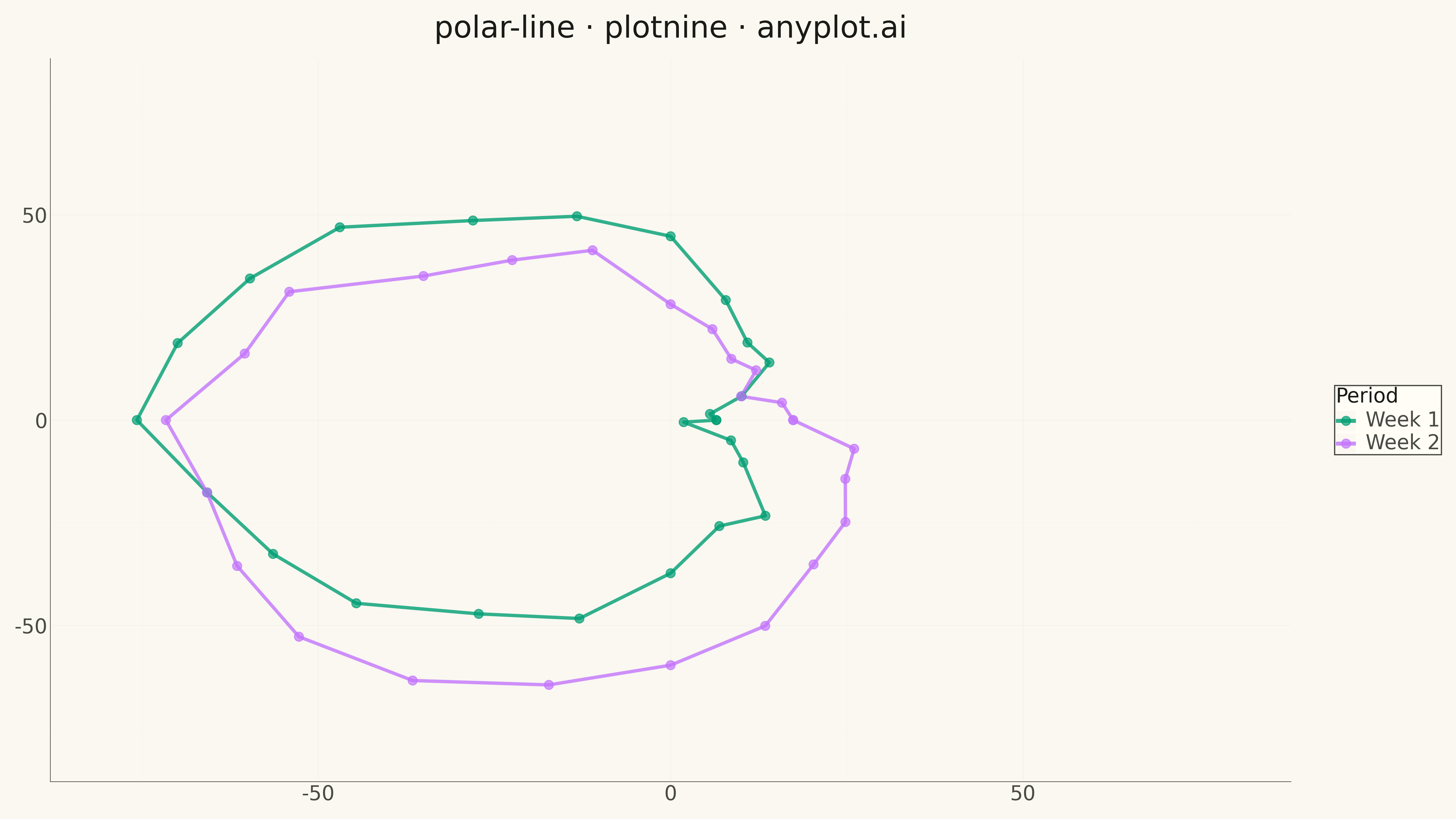
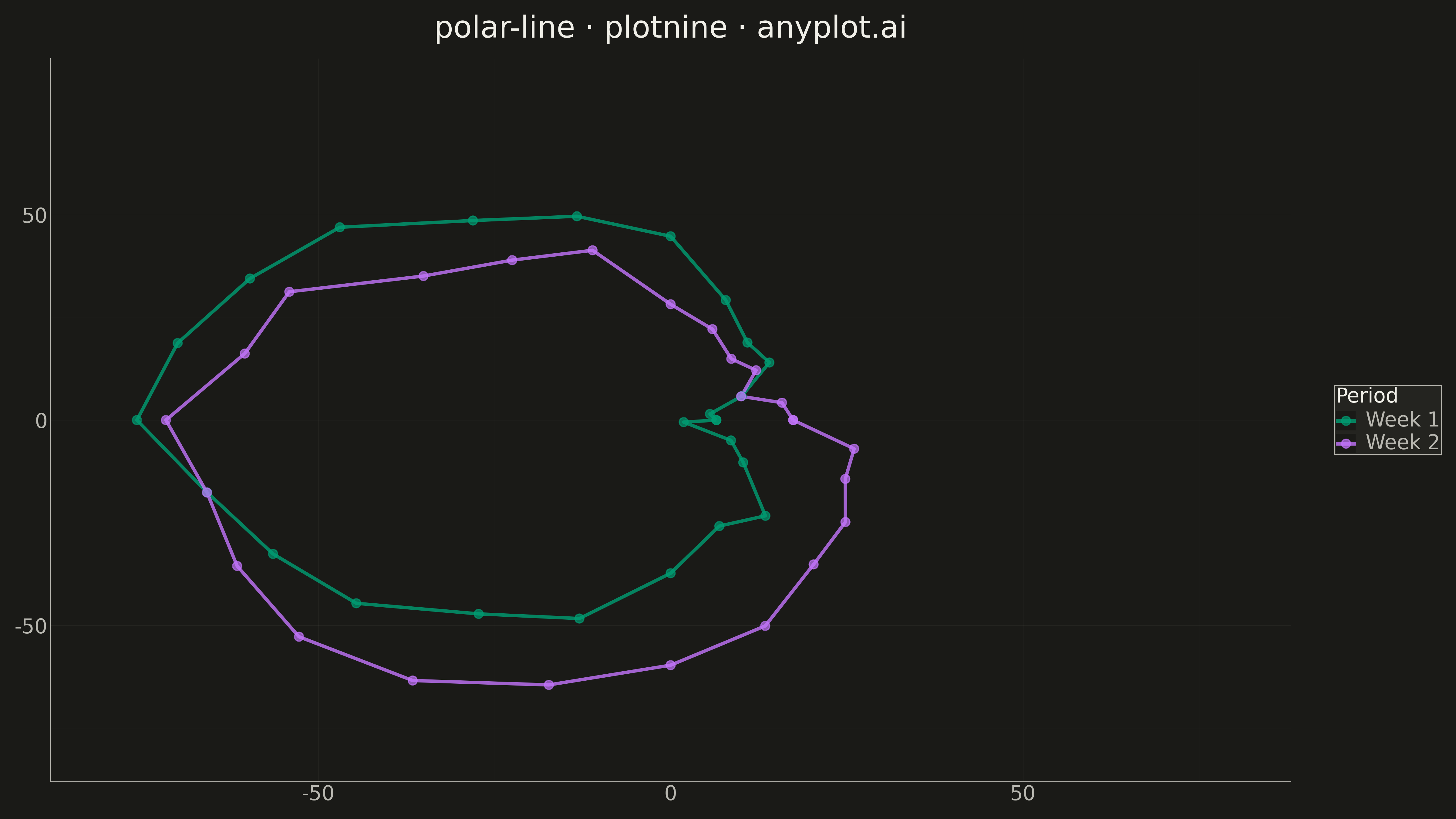
A line plot rendered in polar coordinates, where data points are connected with lines around a circular axis. The angle (theta) typically represents a cyclical variable while the radius shows magnitude.
""" anyplot.ai
polar-line: Polar Line Plot
Library: plotnine 0.15.4 | Python 3.13.13
Quality: 89/100 | Created: 2026-05-12
"""

import os
import sys


# Remove script directory from sys.path to avoid importing local plotnine.py
script_dir = os.path.dirname(os.path.abspath(__file__))
sys.path = [p for p in sys.path if os.path.abspath(p) != script_dir and os.path.abspath(p) != os.getcwd()]

import numpy as np
import pandas as pd
from plotnine import (
    aes,
    element_line,
    element_rect,
    element_text,
    geom_path,
    geom_point,
    ggplot,
    ggsave,
    labs,
    scale_color_manual,
    theme,
    theme_minimal,
    xlim,
    ylim,
)


# Theme tokens
THEME = os.getenv("ANYPLOT_THEME", "light")
PAGE_BG = "#FAF8F1" if THEME == "light" else "#1A1A17"
ELEVATED_BG = "#FFFDF6" if THEME == "light" else "#242420"
INK = "#1A1A17" if THEME == "light" else "#F0EFE8"
INK_SOFT = "#4A4A44" if THEME == "light" else "#B8B7B0"
IMPRINT = ["#009E73", "#C475FD", "#4467A3", "#BD8233", "#AE3030", "#2ABCCD", "#954477"]

# Data: Hourly activity patterns for two weeks
np.random.seed(42)

# Hours as angles (0-360 degrees = 24 hours)
hours = np.arange(0, 24)
hours_deg = hours * 15  # 360 / 24 = 15 degrees per hour

# Week 1: typical activity pattern (higher during day)
week1_activity = 40 + 35 * np.sin(np.radians(hours_deg - 90)) + np.random.randn(24) * 3

# Week 2: shifted pattern (busier mornings)
week2_activity = 45 + 30 * np.sin(np.radians(hours_deg - 120)) + np.random.randn(24) * 3

# Convert polar to Cartesian coordinates
theta_rad_week1 = np.radians(hours_deg)
theta_rad_week2 = np.radians(hours_deg)

# Close the loop
hours_closed = np.append(hours_deg, hours_deg[0])
week1_closed = np.append(week1_activity, week1_activity[0])
week2_closed = np.append(week2_activity, week2_activity[0])
theta_rad_closed = np.append(theta_rad_week1, theta_rad_week1[0])

x_week1 = week1_closed * np.cos(theta_rad_closed)
y_week1 = week1_closed * np.sin(theta_rad_closed)
x_week2 = week2_closed * np.cos(theta_rad_closed)
y_week2 = week2_closed * np.sin(theta_rad_closed)

# Create dataframe
df = pd.DataFrame(
    {
        "x": np.concatenate([x_week1, x_week2]),
        "y": np.concatenate([y_week1, y_week2]),
        "week": ["Week 1"] * len(x_week1) + ["Week 2"] * len(x_week2),
        "order": list(range(len(x_week1))) + list(range(len(x_week2))),
    }
)

# Plot theme
anyplot_theme = theme(
    plot_background=element_rect(fill=PAGE_BG, color=PAGE_BG),
    panel_background=element_rect(fill=PAGE_BG, color=PAGE_BG),
    panel_grid_major=element_line(color=INK, size=0.2, alpha=0.08),
    panel_grid_minor=element_line(color=INK, size=0.1, alpha=0.04),
    axis_title=element_text(size=20, color=INK),
    axis_text=element_text(size=16, color=INK_SOFT),
    axis_line=element_line(color=INK_SOFT, size=0.5),
    plot_title=element_text(size=24, color=INK),
    legend_background=element_rect(fill=ELEVATED_BG, color=INK_SOFT),
    legend_text=element_text(size=16, color=INK_SOFT),
    legend_title=element_text(size=16, color=INK),
    figure_size=(16, 9),
)

# Create plot
plot = (
    ggplot(df, aes(x="x", y="y", color="week", order="order"))
    + geom_path(size=1.5, alpha=0.8)
    + geom_point(size=3.5, alpha=0.7)
    + scale_color_manual(values=IMPRINT[:2])
    + xlim(-80, 80)
    + ylim(-80, 80)
    + labs(title="polar-line · plotnine · anyplot.ai", x="", y="", color="Period")
    + theme_minimal()
    + anyplot_theme
)

# Save
output_path = os.path.join(os.path.dirname(__file__), f"plot-{THEME}.png")
ggsave(plot, filename=output_path, dpi=300, width=16, height=9)
Runnable source as JSON, for any HTTP client: https://api.anyplot.ai/specs/polar-line/plotnine/code. Any spec id and library id listed in llms-full.txt fit the same URL shape; every URL below is complete and callable.
{
  "spec_id": "polar-line",
  "language": "python",
  "library": "plotnine",
  "page": "https://anyplot.ai/polar-line/python/plotnine",
  "hub": "https://anyplot.ai/polar-line",
  "code_json": "https://api.anyplot.ai/specs/polar-line/plotnine/code",
  "spec_json": "https://api.anyplot.ai/specs/polar-line",
  "render_light_png": "https://storage.googleapis.com/anyplot-images/plots/polar-line/python/plotnine/plot-light.png",
  "render_dark_png": "https://storage.googleapis.com/anyplot-images/plots/polar-line/python/plotnine/plot-dark.png",
  "quality_score": 89.0,
  "license": "MIT",
  "guide": "https://anyplot.ai/llms.txt"
}
Part of Polar Line Plot on anyplot.ai.