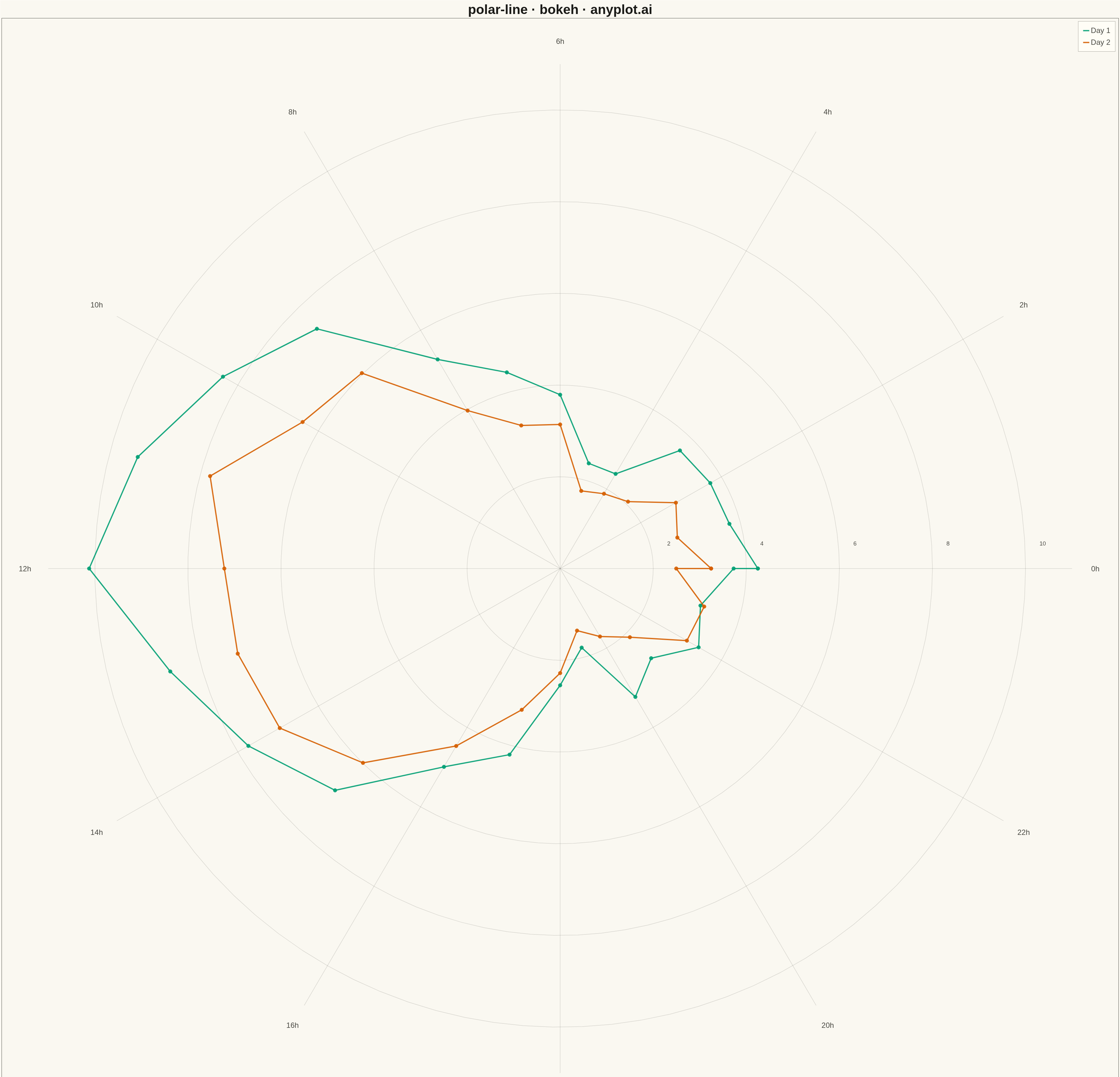
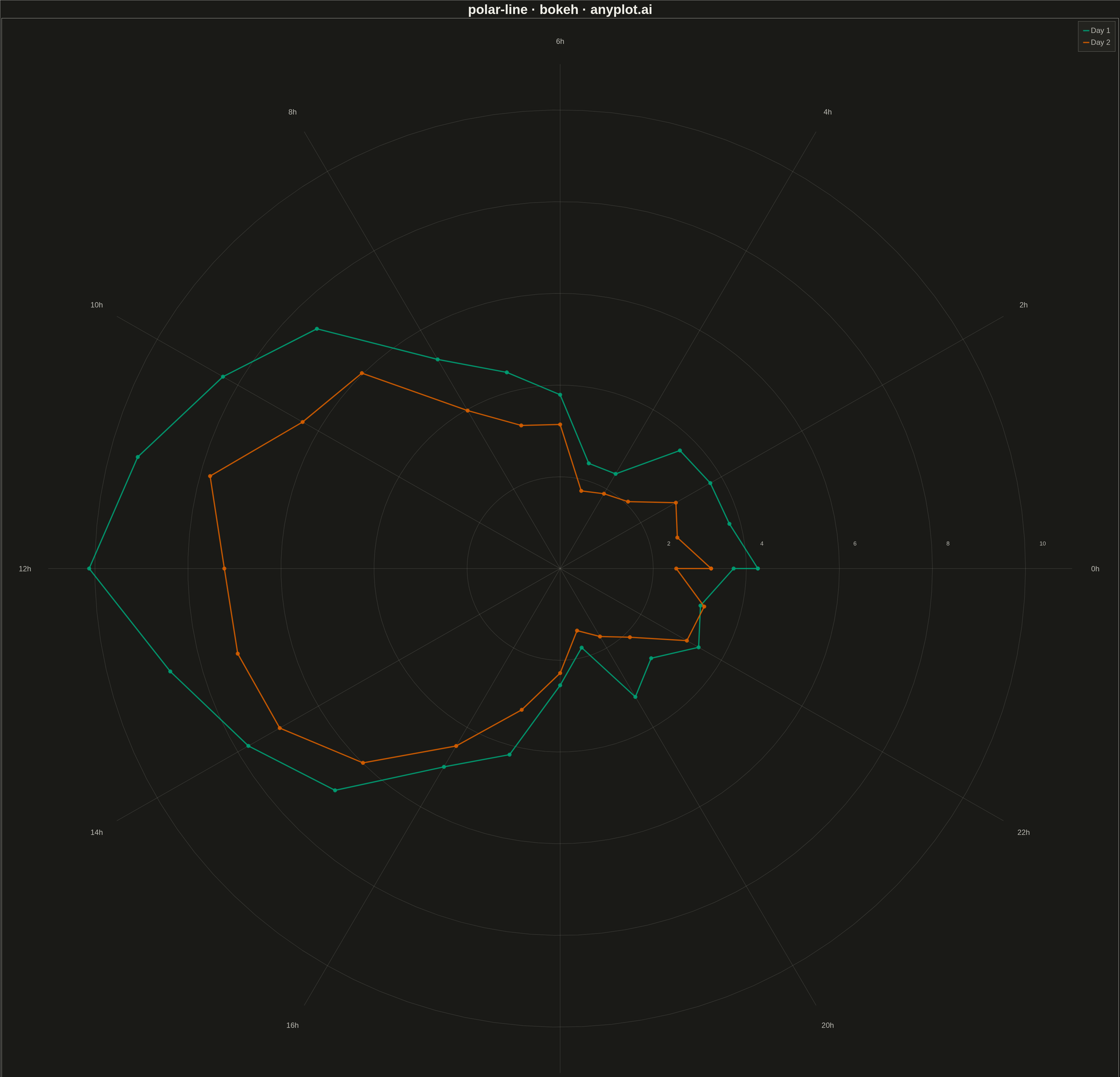
A line plot rendered in polar coordinates, where data points are connected with lines around a circular axis. The angle (theta) typically represents a cyclical variable while the radius shows magnitude.
""" anyplot.ai
polar-line: Polar Line Plot
Library: bokeh 3.9.0 | Python 3.13.13
Quality: 80/100 | Updated: 2026-05-12
"""

import numpy as np
from bokeh.io import export_png
from bokeh.models import ColumnDataSource
from bokeh.plotting import figure, output_file, save


# Data: Wind speed pattern over 24 hours (cyclical)
np.random.seed(42)

# Hours of day (cyclical, 0-24)
hours = np.linspace(0, 24, 25)
theta = hours * (2 * np.pi / 24)  # Convert to radians

# Wind speed pattern: lower at night, higher during afternoon
base_pattern = 5 + 3 * np.sin(theta - np.pi / 2) + 2 * np.cos(2 * theta)
wind_speed_day1 = base_pattern + np.random.normal(0, 0.5, len(theta))
wind_speed_day2 = base_pattern * 0.8 + np.random.normal(0, 0.4, len(theta))

# Ensure positive values
wind_speed_day1 = np.maximum(wind_speed_day1, 0.5)
wind_speed_day2 = np.maximum(wind_speed_day2, 0.5)

# Close the loop by connecting last point to first
theta = np.append(theta, theta[0])
wind_speed_day1 = np.append(wind_speed_day1, wind_speed_day1[0])
wind_speed_day2 = np.append(wind_speed_day2, wind_speed_day2[0])

# Convert polar to Cartesian for Bokeh (which doesn't have native polar support)
x1 = wind_speed_day1 * np.cos(theta)
y1 = wind_speed_day1 * np.sin(theta)
x2 = wind_speed_day2 * np.cos(theta)
y2 = wind_speed_day2 * np.sin(theta)

# Create figure (square for polar plot)
p = figure(
    width=3600,
    height=3600,
    title="polar-line · bokeh · pyplots.ai",
    x_axis_label="Wind Speed (m/s)",
    y_axis_label="Wind Speed (m/s)",
    x_range=(-12, 12),
    y_range=(-12, 12),
    tools="",
    toolbar_location=None,
)

# Draw concentric circles for radial grid
for r in [2, 4, 6, 8, 10]:
    circle_theta = np.linspace(0, 2 * np.pi, 100)
    cx = r * np.cos(circle_theta)
    cy = r * np.sin(circle_theta)
    p.line(cx, cy, line_color="#cccccc", line_width=1.5, line_alpha=0.5)

# Draw radial lines for angular grid (every 30 degrees = 2 hours)
for angle in np.linspace(0, 2 * np.pi, 12, endpoint=False):
    p.line([0, 11 * np.cos(angle)], [0, 11 * np.sin(angle)], line_color="#cccccc", line_width=1.5, line_alpha=0.5)

# Add hour labels around the circle
hour_labels = ["0h", "2h", "4h", "6h", "8h", "10h", "12h", "14h", "16h", "18h", "20h", "22h"]
label_radius = 11.5
for i, label in enumerate(hour_labels):
    angle = i * (2 * np.pi / 12)
    lx = label_radius * np.cos(angle)
    ly = label_radius * np.sin(angle)
    p.text(
        [lx],
        [ly],
        text=[label],
        text_align="center",
        text_baseline="middle",
        text_font_size="18pt",
        text_color="#444444",
    )

# Add radius labels
for r in [2, 4, 6, 8, 10]:
    p.text([r + 0.3], [0.5], text=[f"{r}"], text_font_size="14pt", text_color="#666666")

# Create data sources
source1 = ColumnDataSource(data={"x": x1, "y": y1})
source2 = ColumnDataSource(data={"x": x2, "y": y2})

# Plot the polar lines
p.line("x", "y", source=source1, line_color="#306998", line_width=4, legend_label="Day 1", line_alpha=0.9)
p.scatter("x", "y", source=source1, color="#306998", size=12, alpha=0.9)

p.line("x", "y", source=source2, line_color="#FFD43B", line_width=4, legend_label="Day 2", line_alpha=0.9)
p.scatter("x", "y", source=source2, color="#FFD43B", size=12, alpha=0.9)

# Style the plot
p.title.text_font_size = "32pt"
p.title.align = "center"

p.xaxis.axis_label_text_font_size = "22pt"
p.yaxis.axis_label_text_font_size = "22pt"
p.xaxis.major_label_text_font_size = "18pt"
p.yaxis.major_label_text_font_size = "18pt"

# Hide the default axes for cleaner polar appearance
p.xaxis.visible = False
p.yaxis.visible = False
p.xgrid.visible = False
p.ygrid.visible = False

# Style legend
p.legend.location = "top_right"
p.legend.label_text_font_size = "18pt"
p.legend.background_fill_alpha = 0.8
p.legend.border_line_color = "#cccccc"
p.legend.padding = 15
p.legend.spacing = 10

# Background
p.background_fill_color = "#fafafa"
p.border_fill_color = "#ffffff"
p.outline_line_color = "#dddddd"

# Save PNG and HTML
export_png(p, filename="plot.png")
output_file("plot.html", title="polar-line · bokeh · pyplots.ai")
save(p)
Runnable source as JSON, for any HTTP client: https://api.anyplot.ai/specs/polar-line/bokeh/code. Any spec id and library id listed in llms-full.txt fit the same URL shape; every URL below is complete and callable.
{
  "spec_id": "polar-line",
  "language": "python",
  "library": "bokeh",
  "page": "https://anyplot.ai/polar-line/python/bokeh",
  "hub": "https://anyplot.ai/polar-line",
  "code_json": "https://api.anyplot.ai/specs/polar-line/bokeh/code",
  "spec_json": "https://api.anyplot.ai/specs/polar-line",
  "render_light_png": "https://storage.googleapis.com/anyplot-images/plots/polar-line/python/bokeh/plot-light.png",
  "render_dark_png": "https://storage.googleapis.com/anyplot-images/plots/polar-line/python/bokeh/plot-dark.png",
  "interactive_light_html": "https://storage.googleapis.com/anyplot-images/plots/polar-line/python/bokeh/plot-light.html",
  "interactive_dark_html": "https://storage.googleapis.com/anyplot-images/plots/polar-line/python/bokeh/plot-dark.html",
  "quality_score": 80.0,
  "license": "MIT",
  "guide": "https://anyplot.ai/llms.txt"
}
Part of Polar Line Plot on anyplot.ai.