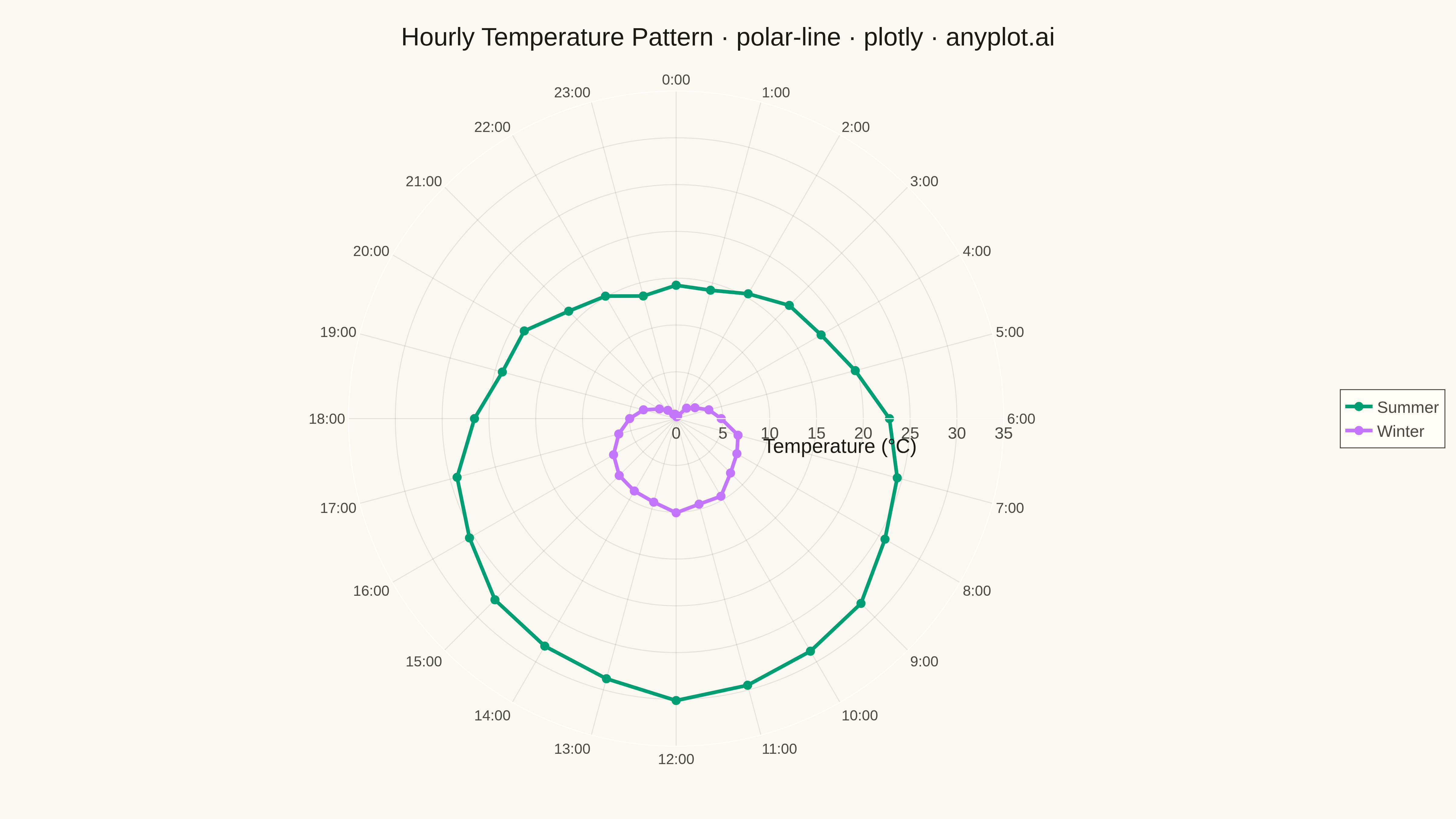
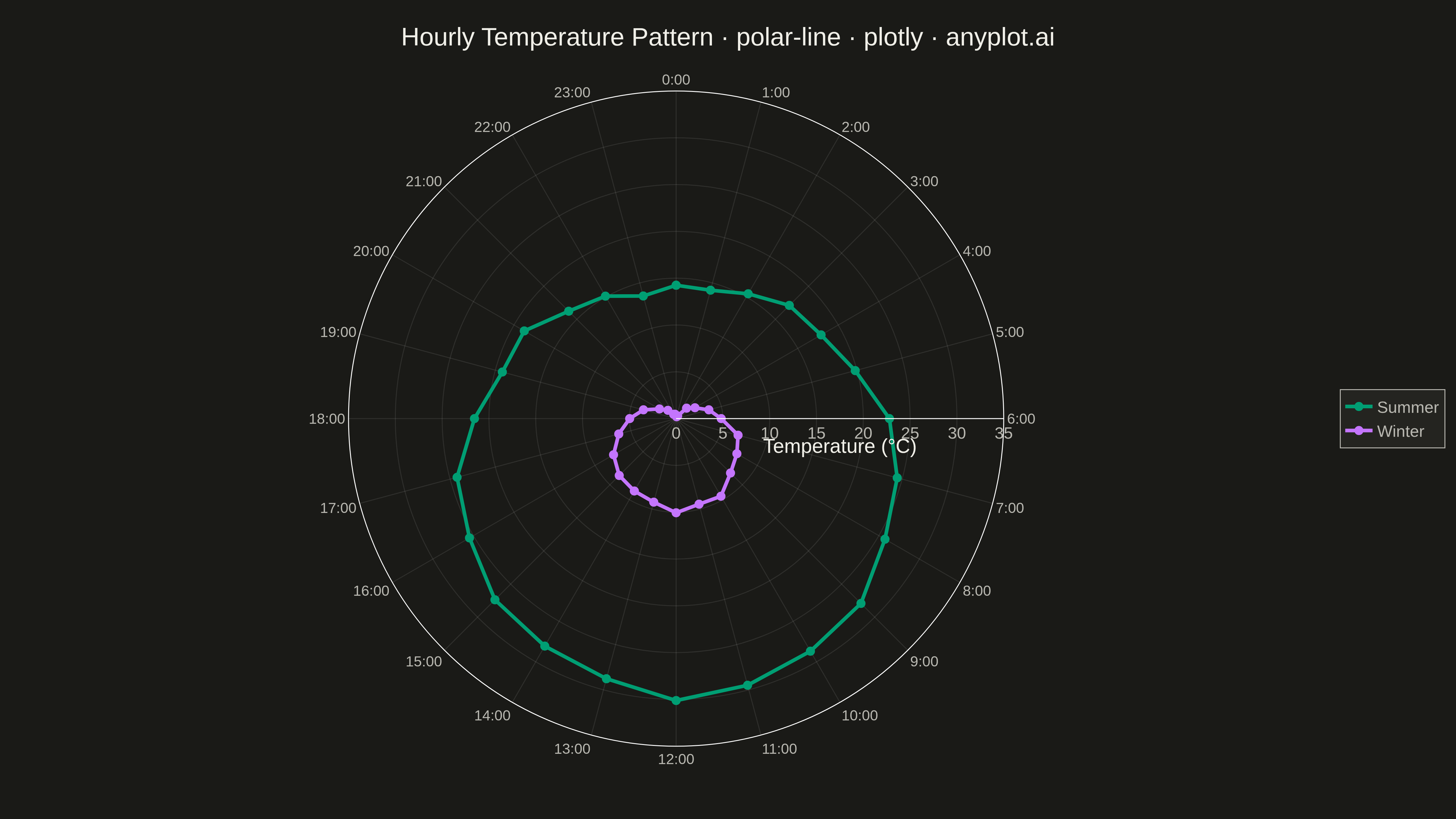
A line plot rendered in polar coordinates, where data points are connected with lines around a circular axis. The angle (theta) typically represents a cyclical variable while the radius shows magnitude.
""" anyplot.ai
polar-line: Polar Line Plot
Library: plotly 6.7.0 | Python 3.13.13
Quality: 93/100 | Updated: 2026-05-12
"""

import os

import numpy as np
import plotly.graph_objects as go


# Theme tokens
THEME = os.getenv("ANYPLOT_THEME", "light")
PAGE_BG = "#FAF8F1" if THEME == "light" else "#1A1A17"
ELEVATED_BG = "#FFFDF6" if THEME == "light" else "#242420"
INK = "#1A1A17" if THEME == "light" else "#F0EFE8"
INK_SOFT = "#4A4A44" if THEME == "light" else "#B8B7B0"
GRID = "rgba(26,26,23,0.10)" if THEME == "light" else "rgba(240,239,232,0.10)"

# Okabe-Ito palette
IMPRINT = ["#009E73", "#C475FD", "#4467A3", "#BD8233", "#AE3030", "#2ABCCD"]

# Data - Average hourly temperature pattern (two seasons)
np.random.seed(42)
hours = np.arange(0, 360, 15)  # 24 hours mapped to 360 degrees (15 deg = 1 hour)
hour_labels = [f"{h}:00" for h in range(24)]

# Summer pattern: warmer during day (12-18h), cooler at night
summer_base = 22 + 8 * np.sin(np.radians(hours - 90))  # Peak at 180 deg (noon)
summer_temp = summer_base + np.random.normal(0, 0.5, len(hours))

# Winter pattern: colder overall, less variation
winter_base = 5 + 5 * np.sin(np.radians(hours - 90))  # Peak at 180 deg (noon)
winter_temp = winter_base + np.random.normal(0, 0.3, len(hours))

# Close the loop by appending the first value
hours_closed = np.append(hours, hours[0])
summer_closed = np.append(summer_temp, summer_temp[0])
winter_closed = np.append(winter_temp, winter_temp[0])

# Create figure
fig = go.Figure()

# Summer line
fig.add_trace(
    go.Scatterpolar(
        r=summer_closed,
        theta=hours_closed,
        mode="lines+markers",
        name="Summer",
        line=dict(color=IMPRINT[0], width=4),
        marker=dict(size=10, color=IMPRINT[0]),
        hovertemplate="Hour: %{theta}°<br>Temp: %{r:.1f}°C<extra>Summer</extra>",
    )
)

# Winter line
fig.add_trace(
    go.Scatterpolar(
        r=winter_closed,
        theta=hours_closed,
        mode="lines+markers",
        name="Winter",
        line=dict(color=IMPRINT[1], width=4),
        marker=dict(size=10, color=IMPRINT[1]),
        hovertemplate="Hour: %{theta}°<br>Temp: %{r:.1f}°C<extra>Winter</extra>",
    )
)

# Layout
fig.update_layout(
    title=dict(
        text="Hourly Temperature Pattern · polar-line · plotly · anyplot.ai",
        font=dict(size=28, color=INK),
        x=0.5,
        xanchor="center",
    ),
    polar=dict(
        radialaxis=dict(
            visible=True,
            range=[0, 35],
            tickfont=dict(size=18, color=INK_SOFT),
            title=dict(text="Temperature (°C)", font=dict(size=22, color=INK)),
            gridcolor=GRID,
        ),
        angularaxis=dict(
            tickfont=dict(size=16, color=INK_SOFT),
            direction="clockwise",
            rotation=90,
            tickmode="array",
            tickvals=list(range(0, 360, 15)),
            ticktext=hour_labels,
            gridcolor=GRID,
        ),
        bgcolor=PAGE_BG,
    ),
    paper_bgcolor=PAGE_BG,
    plot_bgcolor=PAGE_BG,
    legend=dict(
        font=dict(size=18, color=INK_SOFT), x=1.05, y=0.5, bgcolor=ELEVATED_BG, bordercolor=INK_SOFT, borderwidth=1
    ),
    margin=dict(l=80, r=150, t=100, b=80),
)

# Save outputs
script_dir = os.path.dirname(os.path.abspath(__file__))
os.chdir(script_dir)
fig.write_image(f"plot-{THEME}.png", width=1600, height=900, scale=3)
fig.write_html(f"plot-{THEME}.html", include_plotlyjs="cdn")
Runnable source as JSON, for any HTTP client: https://api.anyplot.ai/specs/polar-line/plotly/code. Any spec id and library id listed in llms-full.txt fit the same URL shape; every URL below is complete and callable.
{
  "spec_id": "polar-line",
  "language": "python",
  "library": "plotly",
  "page": "https://anyplot.ai/polar-line/python/plotly",
  "hub": "https://anyplot.ai/polar-line",
  "code_json": "https://api.anyplot.ai/specs/polar-line/plotly/code",
  "spec_json": "https://api.anyplot.ai/specs/polar-line",
  "render_light_png": "https://storage.googleapis.com/anyplot-images/plots/polar-line/python/plotly/plot-light.png",
  "render_dark_png": "https://storage.googleapis.com/anyplot-images/plots/polar-line/python/plotly/plot-dark.png",
  "interactive_light_html": "https://storage.googleapis.com/anyplot-images/plots/polar-line/python/plotly/plot-light.html",
  "interactive_dark_html": "https://storage.googleapis.com/anyplot-images/plots/polar-line/python/plotly/plot-dark.html",
  "quality_score": 93.0,
  "license": "MIT",
  "guide": "https://anyplot.ai/llms.txt"
}
Part of Polar Line Plot on anyplot.ai.