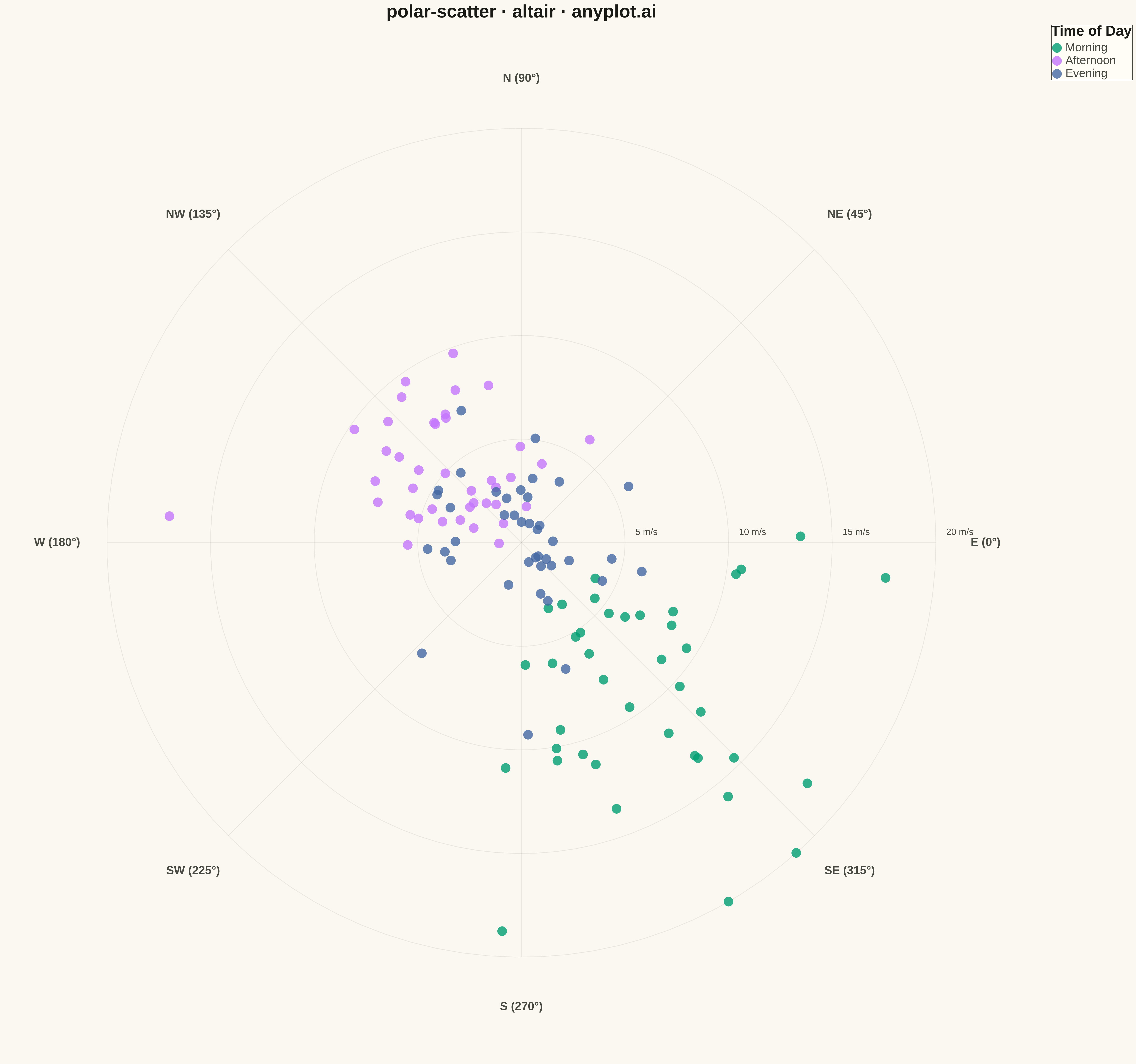
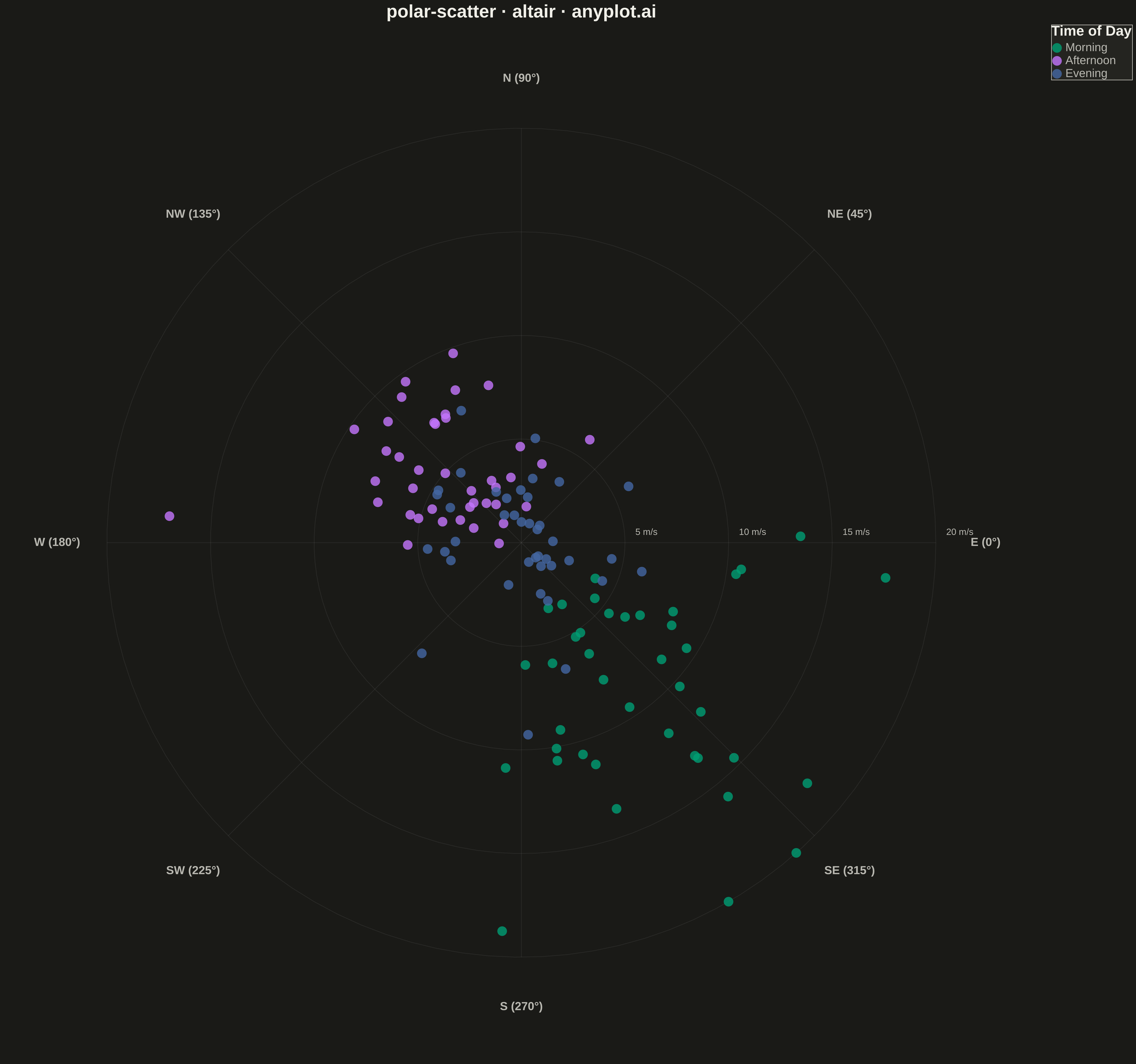
A scatter plot displayed in polar coordinates where data points are positioned using angle (theta) and radius (r) rather than Cartesian x and y coordinates. This visualization is particularly effective for cyclical or directional data where the angular component carries meaningful information.
""" anyplot.ai
polar-scatter: Polar Scatter Plot
Library: altair 6.1.0 | Python 3.13.13
Quality: 92/100 | Updated: 2026-05-09
"""

import os

import altair as alt
import numpy as np
import pandas as pd


# Theme tokens
THEME = os.getenv("ANYPLOT_THEME", "light")
PAGE_BG = "#FAF8F1" if THEME == "light" else "#1A1A17"
ELEVATED_BG = "#FFFDF6" if THEME == "light" else "#242420"
INK = "#1A1A17" if THEME == "light" else "#F0EFE8"
INK_SOFT = "#4A4A44" if THEME == "light" else "#B8B7B0"

# Okabe-Ito palette (positions 1, 2, 3 for three categories)
IMPRINT = ["#009E73", "#C475FD", "#4467A3"]

# Data - Synthetic wind measurements with prevailing directions
np.random.seed(42)
n_points = 120

# Create realistic wind data with prevailing directions (NW and SE)
angles_nw = np.random.normal(315, 25, n_points // 3)  # NW winds
angles_se = np.random.normal(135, 30, n_points // 3)  # SE winds
angles_other = np.random.uniform(0, 360, n_points - 2 * (n_points // 3))  # Other directions
angles_deg = np.concatenate([angles_nw, angles_se, angles_other]) % 360

# Wind speeds (m/s) - higher speeds for prevailing directions
speeds = np.zeros(n_points)
speeds[: n_points // 3] = np.random.gamma(4, 2.5, n_points // 3)  # NW - stronger
speeds[n_points // 3 : 2 * n_points // 3] = np.random.gamma(3, 2, n_points // 3)  # SE - moderate
speeds[2 * n_points // 3 :] = np.random.gamma(2, 1.5, n_points - 2 * (n_points // 3))  # Other - weaker
speeds = np.clip(speeds, 1, 20)

# Time of day categories
time_of_day = np.array(
    ["Morning"] * (n_points // 3) + ["Afternoon"] * (n_points // 3) + ["Evening"] * (n_points - 2 * (n_points // 3))
)

# Convert polar to Cartesian for Altair (doesn't have native polar support)
angles_rad = np.deg2rad(angles_deg)
x = speeds * np.cos(angles_rad)
y = speeds * np.sin(angles_rad)

df = pd.DataFrame({"x": x, "y": y, "speed": speeds, "direction": angles_deg, "time_of_day": time_of_day})

# Create polar gridlines (circles)
max_radius = 20
radii = [5, 10, 15, 20]
circle_points = []
for r in radii:
    theta = np.linspace(0, 2 * np.pi, 100)
    for i, t in enumerate(theta):
        circle_points.append({"x": r * np.cos(t), "y": r * np.sin(t), "radius": r, "order": i})
circles_df = pd.DataFrame(circle_points)

# Create angular gridlines (spokes)
spoke_angles = [0, 45, 90, 135, 180, 225, 270, 315]
spoke_points = []
for angle in spoke_angles:
    rad = np.deg2rad(angle)
    spoke_points.append({"x": 0, "y": 0, "angle": angle, "group": angle, "order": 0})
    spoke_points.append(
        {"x": max_radius * np.cos(rad), "y": max_radius * np.sin(rad), "angle": angle, "group": angle, "order": 1}
    )
spokes_df = pd.DataFrame(spoke_points)

# Create angle labels
label_offset = max_radius * 1.12
angle_labels = []
direction_names = {
    0: "E (0°)",
    45: "NE (45°)",
    90: "N (90°)",
    135: "NW (135°)",
    180: "W (180°)",
    225: "SW (225°)",
    270: "S (270°)",
    315: "SE (315°)",
}
for angle, name in direction_names.items():
    rad = np.deg2rad(angle)
    angle_labels.append({"x": label_offset * np.cos(rad), "y": label_offset * np.sin(rad), "label": name})
labels_df = pd.DataFrame(angle_labels)

# Create radius labels
radius_labels = [{"x": r + 0.5, "y": 0.5, "label": f"{r} m/s"} for r in radii]
radius_labels_df = pd.DataFrame(radius_labels)

# Circular gridlines
grid_circles = (
    alt.Chart(circles_df)
    .mark_line(strokeWidth=1, opacity=0.10)
    .encode(
        x=alt.X("x:Q", axis=None),
        y=alt.Y("y:Q", axis=None),
        detail="radius:N",
        order="order:Q",
        color=alt.value(INK_SOFT),
    )
)

# Radial spokes
grid_spokes = (
    alt.Chart(spokes_df)
    .mark_line(strokeWidth=1, opacity=0.10)
    .encode(
        x=alt.X("x:Q", axis=None),
        y=alt.Y("y:Q", axis=None),
        detail="group:N",
        order="order:Q",
        color=alt.value(INK_SOFT),
    )
)

# Angle labels
angle_text = (
    alt.Chart(labels_df)
    .mark_text(fontSize=18, fontWeight="bold")
    .encode(x=alt.X("x:Q", axis=None), y=alt.Y("y:Q", axis=None), text="label:N", color=alt.value(INK_SOFT))
)

# Radius labels
radius_text = (
    alt.Chart(radius_labels_df)
    .mark_text(fontSize=14, align="left")
    .encode(x=alt.X("x:Q", axis=None), y=alt.Y("y:Q", axis=None), text="label:N", color=alt.value(INK_SOFT))
)

# Data points with Okabe-Ito colors
points = (
    alt.Chart(df)
    .mark_point(size=220, filled=True, opacity=0.8)
    .encode(
        x=alt.X("x:Q", axis=None, scale=alt.Scale(domain=[-25, 25])),
        y=alt.Y("y:Q", axis=None, scale=alt.Scale(domain=[-25, 25])),
        color=alt.Color(
            "time_of_day:N",
            scale=alt.Scale(domain=["Morning", "Afternoon", "Evening"], range=IMPRINT),
            title="Time of Day",
        ),
        tooltip=[
            alt.Tooltip("direction:Q", title="Direction (°)", format=".1f"),
            alt.Tooltip("speed:Q", title="Wind Speed (m/s)", format=".1f"),
            alt.Tooltip("time_of_day:N", title="Time of Day"),
        ],
    )
)

# Combine all layers with theme-adaptive styling
chart = (
    alt.layer(grid_circles, grid_spokes, angle_text, radius_text, points)
    .properties(
        width=1600,
        height=1600,
        background=PAGE_BG,
        title=alt.Title("polar-scatter · altair · anyplot.ai", fontSize=28, anchor="middle", color=INK),
    )
    .configure_view(strokeWidth=0, fill=PAGE_BG)
    .configure_legend(
        titleFontSize=22,
        labelFontSize=18,
        symbolSize=220,
        orient="right",
        fillColor=ELEVATED_BG,
        strokeColor=INK_SOFT,
        titleColor=INK,
        labelColor=INK_SOFT,
    )
    .interactive()
)

# Save as PNG and HTML with theme-suffixed filenames
chart.save(f"plot-{THEME}.png", scale_factor=3.0)
chart.save(f"plot-{THEME}.html")
Runnable source as JSON, for any HTTP client: https://api.anyplot.ai/specs/polar-scatter/altair/code. Any spec id and library id listed in llms-full.txt fit the same URL shape; every URL below is complete and callable.
{
  "spec_id": "polar-scatter",
  "language": "python",
  "library": "altair",
  "page": "https://anyplot.ai/polar-scatter/python/altair",
  "hub": "https://anyplot.ai/polar-scatter",
  "code_json": "https://api.anyplot.ai/specs/polar-scatter/altair/code",
  "spec_json": "https://api.anyplot.ai/specs/polar-scatter",
  "render_light_png": "https://storage.googleapis.com/anyplot-images/plots/polar-scatter/python/altair/plot-light.png",
  "render_dark_png": "https://storage.googleapis.com/anyplot-images/plots/polar-scatter/python/altair/plot-dark.png",
  "interactive_light_html": "https://storage.googleapis.com/anyplot-images/plots/polar-scatter/python/altair/plot-light.html",
  "interactive_dark_html": "https://storage.googleapis.com/anyplot-images/plots/polar-scatter/python/altair/plot-dark.html",
  "quality_score": 92.0,
  "license": "MIT",
  "guide": "https://anyplot.ai/llms.txt"
}
Part of Polar Scatter Plot on anyplot.ai.