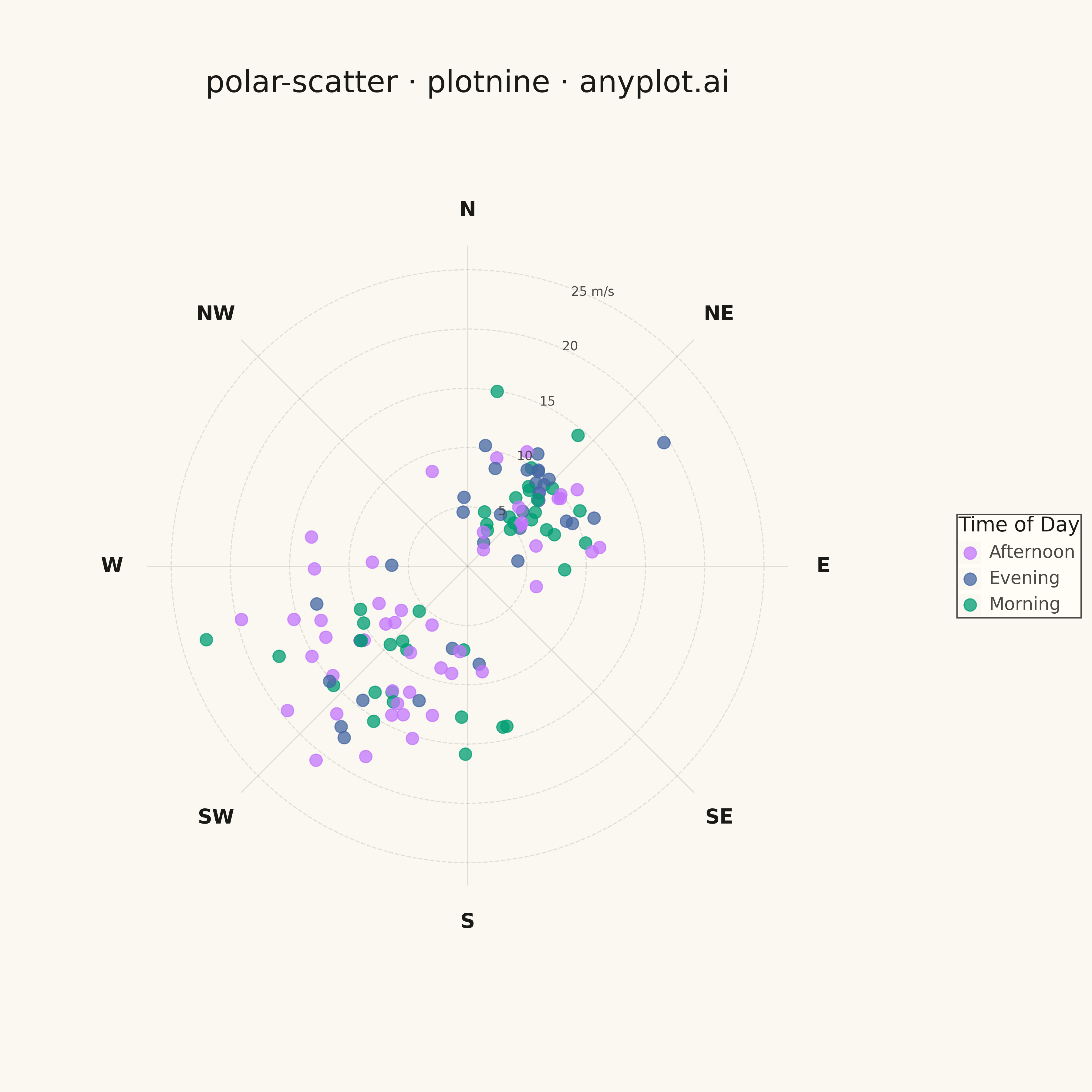
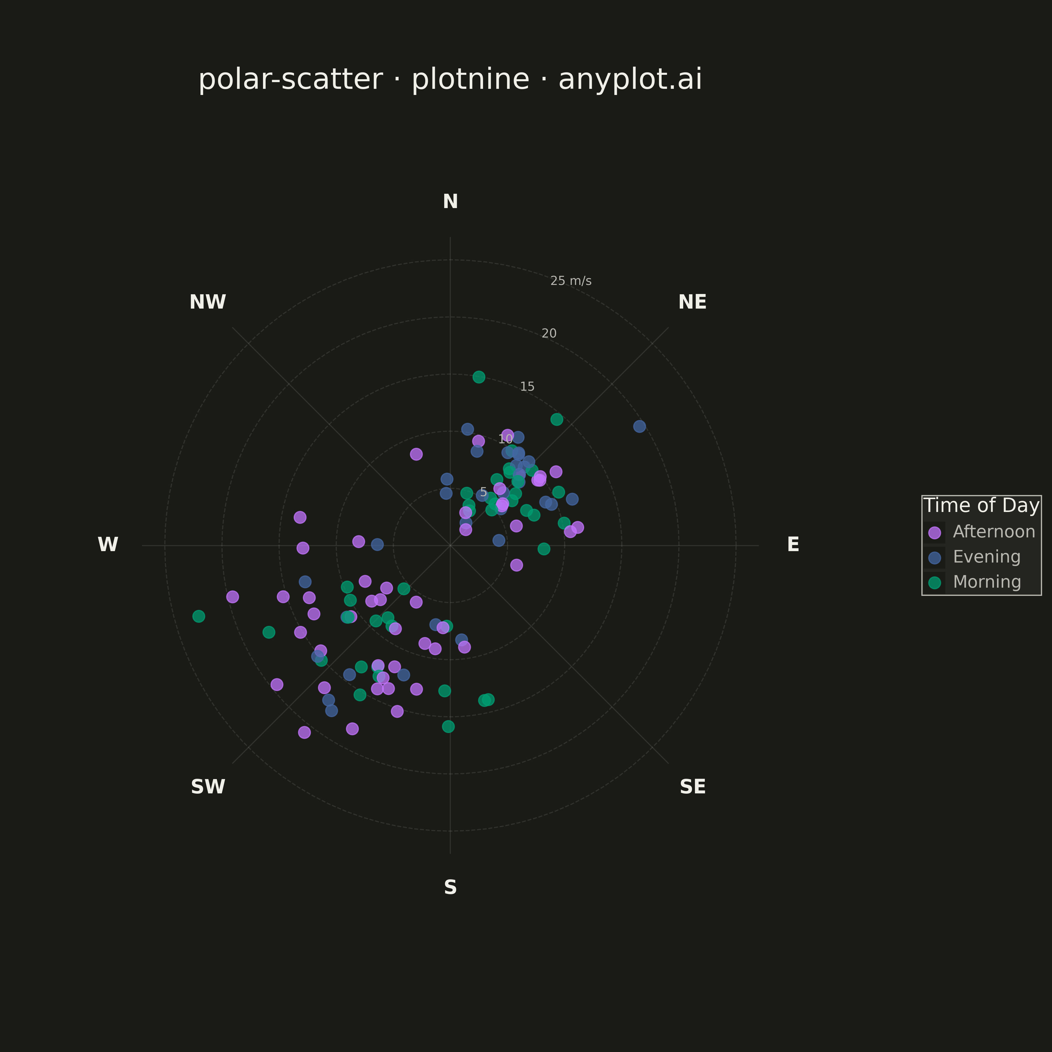
A scatter plot displayed in polar coordinates where data points are positioned using angle (theta) and radius (r) rather than Cartesian x and y coordinates. This visualization is particularly effective for cyclical or directional data where the angular component carries meaningful information.
""" anyplot.ai
polar-scatter: Polar Scatter Plot
Library: plotnine 0.15.4 | Python 3.13.13
Quality: 95/100 | Updated: 2026-05-09
"""

import os
import sys

import numpy as np
import pandas as pd


# Work around naming conflict with plotnine.py script and plotnine package
script_dir = os.path.dirname(os.path.abspath(__file__))
if script_dir in sys.path:
    sys.path.remove(script_dir)
if "" in sys.path:
    sys.path.remove("")
if "." in sys.path:
    sys.path.remove(".")

from plotnine import (
    aes,
    coord_fixed,
    element_blank,
    element_rect,
    element_text,
    geom_path,
    geom_point,
    geom_segment,
    geom_text,
    ggplot,
    labs,
    scale_color_manual,
    scale_x_continuous,
    scale_y_continuous,
    theme,
)


# Theme tokens
THEME = os.getenv("ANYPLOT_THEME", "light")
PAGE_BG = "#FAF8F1" if THEME == "light" else "#1A1A17"
ELEVATED_BG = "#FFFDF6" if THEME == "light" else "#242420"
INK = "#1A1A17" if THEME == "light" else "#F0EFE8"
INK_SOFT = "#4A4A44" if THEME == "light" else "#B8B7B0"

# Okabe-Ito palette
IMPRINT = ["#009E73", "#C475FD", "#4467A3", "#BD8233"]

# Data - Wind measurements with prevailing directions
np.random.seed(42)
n_points = 120

# Wind often has prevailing directions - simulate with mixture
# Prevailing wind from SW (~225°) and secondary from NE (~45°)
angles_sw = np.random.normal(225, 30, n_points // 2)  # Southwest prevailing
angles_ne = np.random.normal(45, 25, n_points // 2)  # Northeast secondary
angles = np.concatenate([angles_sw, angles_ne])
angles = angles % 360  # Wrap to 0-360

# Wind speeds (m/s) - higher speeds tend with prevailing directions
speeds_sw = np.abs(np.random.normal(12, 4, n_points // 2))
speeds_ne = np.abs(np.random.normal(8, 3, n_points // 2))
speeds = np.concatenate([speeds_sw, speeds_ne])
speeds = np.clip(speeds, 1, 25)

# Time of day categories for color encoding
time_categories = np.random.choice(["Morning", "Afternoon", "Evening"], n_points, p=[0.35, 0.40, 0.25])

# Convert polar to Cartesian
# Convention: 0° at top (North), clockwise
theta_rad = np.radians(90 - angles)  # Convert to math convention (0° = East, CCW)
x = speeds * np.cos(theta_rad)
y = speeds * np.sin(theta_rad)

df = pd.DataFrame({"angle": angles, "speed": speeds, "time": time_categories, "x": x, "y": y})

# Create circular gridlines (radial circles at speed intervals)
grid_rows = []
grid_angles = np.linspace(0, 2 * np.pi, 101)
max_radius = 25
for radius in [5, 10, 15, 20, 25]:
    for angle in grid_angles:
        grid_rows.append({"x": radius * np.cos(angle), "y": radius * np.sin(angle), "radius": radius})

grid_df = pd.DataFrame(grid_rows)

# Create radial spokes (compass directions)
spoke_rows = []
compass_dirs = [0, 45, 90, 135, 180, 225, 270, 315]  # N, NE, E, SE, S, SW, W, NW
for deg in compass_dirs:
    angle = np.radians(90 - deg)  # Convert to math convention
    spoke_rows.append(
        {"x1": 0, "y1": 0, "x2": (max_radius + 2) * np.cos(angle), "y2": (max_radius + 2) * np.sin(angle)}
    )

spoke_df = pd.DataFrame(spoke_rows)

# Create compass direction labels
compass_labels = ["N", "NE", "E", "SE", "S", "SW", "W", "NW"]
label_rows = []
label_radius = max_radius + 5
for deg, lbl in zip(compass_dirs, compass_labels, strict=True):
    angle = np.radians(90 - deg)
    label_rows.append({"label": lbl, "x": label_radius * np.cos(angle), "y": label_radius * np.sin(angle)})

label_df = pd.DataFrame(label_rows)

# Create radius labels (wind speed m/s) - positioned along NNE axis for clarity
radius_labels = []
label_angle = np.radians(90 - 22.5)  # NNE direction
for r in [5, 10, 15, 20]:
    radius_labels.append({"label": f"{r}", "x": r * np.cos(label_angle) + 1, "y": r * np.sin(label_angle)})

# Add "m/s" unit at outermost radius
radius_labels.append({"label": "25 m/s", "x": 25 * np.cos(label_angle) + 1, "y": 25 * np.sin(label_angle)})

radius_label_df = pd.DataFrame(radius_labels)

# Color palette for time of day (Okabe-Ito colors)
colors = {
    "Morning": IMPRINT[0],  # #009E73 brand green
    "Afternoon": IMPRINT[1],  # #C475FD vermillion
    "Evening": IMPRINT[2],  # #4467A3 blue
}

# Plot
plot = (
    ggplot()
    # Circular gridlines (speed circles)
    + geom_path(
        aes(x="x", y="y", group="radius"), data=grid_df, color=INK_SOFT, size=0.5, alpha=0.15, linetype="dashed"
    )
    # Radial spokes (direction lines)
    + geom_segment(aes(x="x1", y="y1", xend="x2", yend="y2"), data=spoke_df, color=INK_SOFT, size=0.5, alpha=0.15)
    # Wind data points with color by time of day
    + geom_point(aes(x="x", y="y", color="time"), data=df, size=5, alpha=0.75)
    # Compass direction labels
    + geom_text(aes(x="x", y="y", label="label"), data=label_df, size=16, color=INK, fontweight="bold")
    # Speed labels (m/s)
    + geom_text(aes(x="x", y="y", label="label"), data=radius_label_df, size=10, color=INK_SOFT)
    # Custom colors for time of day
    + scale_color_manual(values=colors, name="Time of Day")
    # Equal coordinate system for proper circles
    + coord_fixed(ratio=1)
    # Axis scaling with padding
    + scale_x_continuous(limits=(-35, 35))
    + scale_y_continuous(limits=(-35, 35))
    # Labels
    + labs(title="polar-scatter · plotnine · anyplot.ai")
    # Theme with proper backgrounds and colors
    + theme(
        figure_size=(12, 12),
        plot_background=element_rect(fill=PAGE_BG, color=PAGE_BG),
        panel_background=element_rect(fill=PAGE_BG, color=PAGE_BG),
        panel_grid_major=element_blank(),
        panel_grid_minor=element_blank(),
        panel_border=element_blank(),
        axis_title=element_blank(),
        axis_text=element_blank(),
        axis_ticks=element_blank(),
        axis_line=element_blank(),
        plot_title=element_text(size=24, ha="center", color=INK),
        legend_title=element_text(size=16, color=INK),
        legend_text=element_text(size=14, color=INK_SOFT),
        legend_background=element_rect(fill=ELEVATED_BG, color=INK_SOFT),
        legend_position="right",
    )
)

# Save
plot.save(f"plot-{THEME}.png", dpi=300, width=12, height=12)
Runnable source as JSON, for any HTTP client: https://api.anyplot.ai/specs/polar-scatter/plotnine/code. Any spec id and library id listed in llms-full.txt fit the same URL shape; every URL below is complete and callable.
{
  "spec_id": "polar-scatter",
  "language": "python",
  "library": "plotnine",
  "page": "https://anyplot.ai/polar-scatter/python/plotnine",
  "hub": "https://anyplot.ai/polar-scatter",
  "code_json": "https://api.anyplot.ai/specs/polar-scatter/plotnine/code",
  "spec_json": "https://api.anyplot.ai/specs/polar-scatter",
  "render_light_png": "https://storage.googleapis.com/anyplot-images/plots/polar-scatter/python/plotnine/plot-light.png",
  "render_dark_png": "https://storage.googleapis.com/anyplot-images/plots/polar-scatter/python/plotnine/plot-dark.png",
  "quality_score": 95.0,
  "license": "MIT",
  "guide": "https://anyplot.ai/llms.txt"
}
Part of Polar Scatter Plot on anyplot.ai.