The same plot in 14 other libraries — JavaScript: D3.js, Apache ECharts, Highcharts, MUI X Charts; Python: Altair, Bokeh, lets-plot, Matplotlib, Plotly, plotnine, Pygal, Seaborn; R: ggplot2; Julia: Makie.jl. Compare all 15 side by side: t-SNE and UMAP Embedding Visualization in Python, R, Julia and JavaScript.
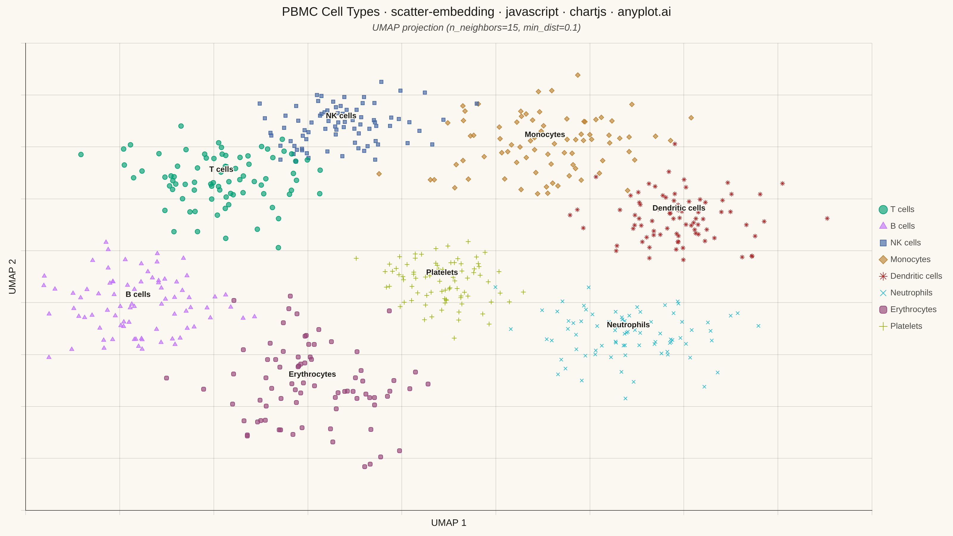
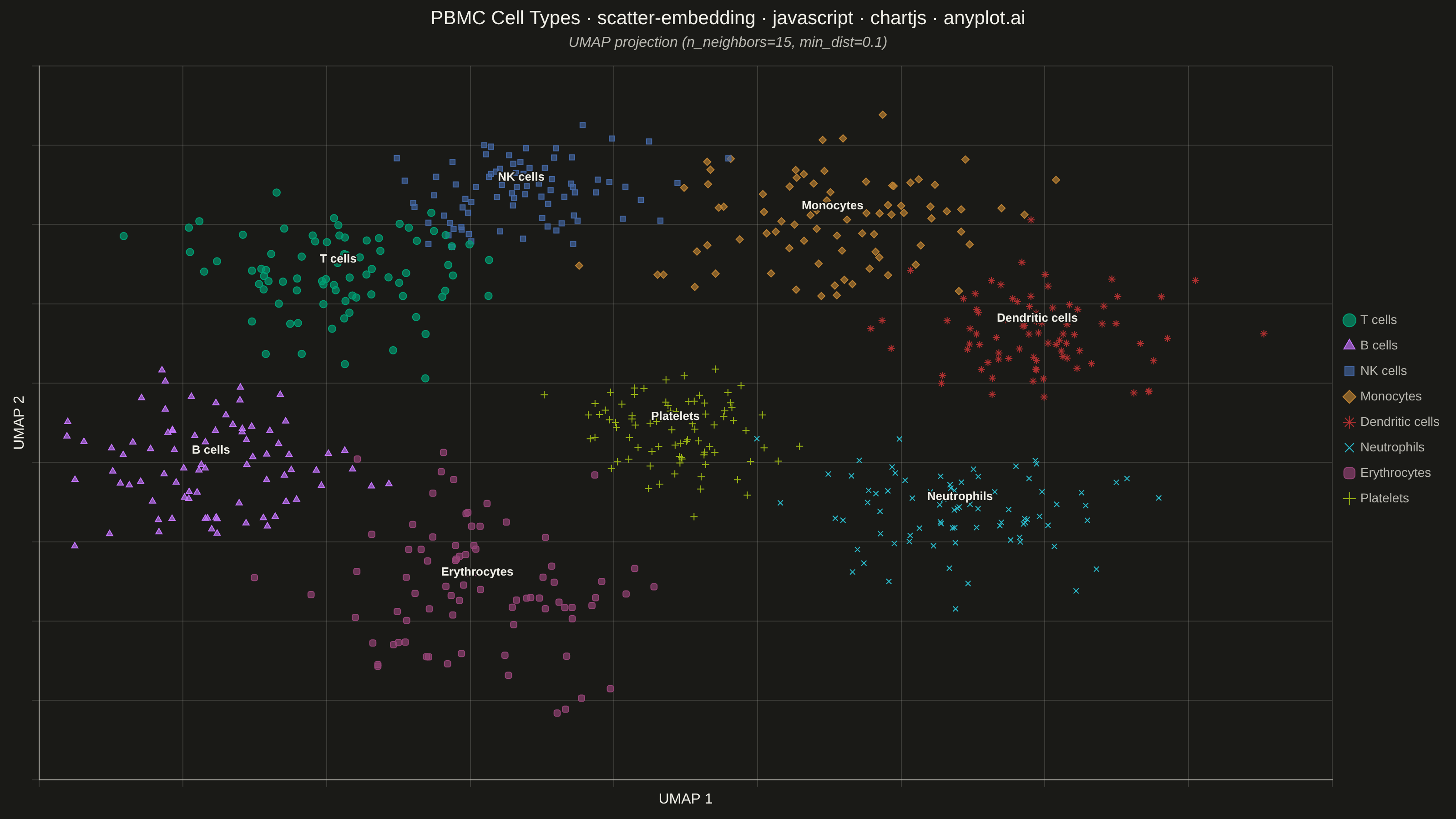
A scatter plot displaying high-dimensional data projected into 2D space using non-linear dimensionality reduction techniques such as t-SNE or UMAP. Points are colored by cluster or class label, revealing groupings and latent structure in the data. This is a standard visualization in machine learning for exploring embeddings, single-cell RNA-seq data, and NLP document clustering, helping practitioners verify that learned representations capture meaningful distinctions.
// anyplot.ai
// scatter-embedding: t-SNE and UMAP Embedding Visualization
// Library: chartjs 4.4.7 | JavaScript 22.23.1
// Quality: 91/100 | Created: 2026-08-11

//# anyplot-orientation: landscape
const t = window.ANYPLOT_TOKENS;

// --- Data (in-memory, deterministic) ----------------------------------------
// Simulated UMAP projection of PBMC (peripheral blood mononuclear cell)
// scRNA-seq profiles: 8 immune cell-type clusters, each an isotropic Gaussian
// blob around a hand-placed 2D centroid (mimics how related cell types sit
// closer together in a real embedding, e.g. lymphocytes on one side).
function makeLcg(seed) {
  let state = seed >>> 0;
  return function () {
    state = (state * 1664525 + 1013904223) >>> 0;
    return state / 4294967296;
  };
}
const rand = makeLcg(42);
function gaussian() {
  const u1 = Math.max(rand(), 1e-9);
  const u2 = rand();
  return Math.sqrt(-2 * Math.log(u1)) * Math.cos(2 * Math.PI * u2);
}
function hexToRgba(hex, alpha) {
  const r = parseInt(hex.slice(1, 3), 16);
  const g = parseInt(hex.slice(3, 5), 16);
  const b = parseInt(hex.slice(5, 7), 16);
  return `rgba(${r}, ${g}, ${b}, ${alpha})`;
}

// Redundant shape encoding (on top of hue) so cluster identity survives
// colorblind confusion at n=8 — each shape maps 1:1 to a cluster/legend entry.
const POINT_STYLES = [
  "circle",
  "triangle",
  "rect",
  "rectRot",
  "star",
  "crossRot",
  "rectRounded",
  "cross",
];

const clusters = [
  { label: "T cells", cx: -20, cy: 14, sx: 6, sy: 5 },
  { label: "B cells", cx: -28, cy: -10, sx: 5, sy: 6 },
  { label: "NK cells", cx: -6, cy: 24, sx: 4, sy: 4 },
  { label: "Monocytes", cx: 16, cy: 20, sx: 7, sy: 6 },
  { label: "Dendritic cells", cx: 30, cy: 6, sx: 5, sy: 5 },
  { label: "Neutrophils", cx: 24, cy: -16, sx: 6, sy: 5 },
  { label: "Erythrocytes", cx: -10, cy: -26, sx: 6, sy: 7 },
  { label: "Platelets", cx: 4, cy: -6, sx: 4, sy: 4 },
];
const pointsPerCluster = 80;

const datasets = clusters.map((cluster, i) => ({
  label: cluster.label,
  data: Array.from({ length: pointsPerCluster }, () => ({
    x: cluster.cx + gaussian() * cluster.sx,
    y: cluster.cy + gaussian() * cluster.sy,
  })),
  backgroundColor: hexToRgba(t.palette[i % t.palette.length], 0.65),
  borderColor: t.palette[i % t.palette.length],
  borderWidth: 1,
  pointStyle: POINT_STYLES[i % POINT_STYLES.length],
  pointRadius: 4,
  pointHoverRadius: 4,
}));

// Cluster centroids (mean of the generated points), used by the custom
// centroid-label plugin below — an explicit per-cluster anchor beyond the
// legend, per the spec's "optionally annotate centroids" guidance.
const centroids = datasets.map((dataset) => {
  const n = dataset.data.length;
  const sumX = dataset.data.reduce((acc, p) => acc + p.x, 0);
  const sumY = dataset.data.reduce((acc, p) => acc + p.y, 0);
  return { label: dataset.label, x: sumX / n, y: sumY / n };
});

// Native Chart.js plugin (not a chartjs-chart-* community plugin) that draws
// a halo-outlined label at each cluster centroid directly on the canvas.
const centroidLabelsPlugin = {
  id: "centroidLabels",
  afterDatasetsDraw(chart) {
    const { ctx, scales } = chart;
    ctx.save();
    ctx.font = "600 13px sans-serif";
    ctx.textAlign = "center";
    ctx.textBaseline = "middle";
    ctx.lineJoin = "round";
    centroids.forEach((c) => {
      const px = scales.x.getPixelForValue(c.x);
      const py = scales.y.getPixelForValue(c.y) - 16;
      ctx.lineWidth = 3;
      ctx.strokeStyle = t.pageBg;
      ctx.strokeText(c.label, px, py);
      ctx.fillStyle = t.ink;
      ctx.fillText(c.label, px, py);
    });
    ctx.restore();
  },
};

// --- Mount -------------------------------------------------------------------
const canvas = document.createElement("canvas");
document.getElementById("container").appendChild(canvas);

// --- Chart ---------------------------------------------------------------------
new Chart(canvas, {
  type: "scatter",
  data: { datasets },
  plugins: [centroidLabelsPlugin],
  options: {
    responsive: true,
    maintainAspectRatio: false,
    animation: false,
    layout: { padding: { top: 8, right: 8, bottom: 8, left: 8 } },
    plugins: {
      title: {
        display: true,
        text: "PBMC Cell Types · scatter-embedding · javascript · chartjs · anyplot.ai",
        color: t.ink,
        font: { size: 21, weight: "500" },
        padding: { bottom: 4 },
      },
      subtitle: {
        display: true,
        text: "UMAP projection (n_neighbors=15, min_dist=0.1)",
        color: t.inkSoft,
        font: { size: 16, style: "italic" },
        padding: { bottom: 16 },
      },
      legend: {
        position: "right",
        labels: {
          color: t.inkSoft,
          font: { size: 14 },
          usePointStyle: true,
          boxWidth: 10,
          boxHeight: 10,
          padding: 14,
        },
      },
    },
    scales: {
      x: {
        title: { display: true, text: "UMAP 1", color: t.ink, font: { size: 16 } },
        ticks: { display: false },
        grid: { color: t.grid },
        border: { color: t.inkSoft },
      },
      y: {
        title: { display: true, text: "UMAP 2", color: t.ink, font: { size: 16 } },
        ticks: { display: false },
        grid: { color: t.grid },
        border: { color: t.inkSoft },
      },
    },
  },
});
Runnable source as JSON, for any HTTP client: https://api.anyplot.ai/specs/scatter-embedding/chartjs/code. Any spec id and library id listed in llms-full.txt fit the same URL shape; every URL below is complete and callable.
{
  "spec_id": "scatter-embedding",
  "language": "javascript",
  "library": "chartjs",
  "page": "https://anyplot.ai/scatter-embedding/javascript/chartjs",
  "hub": "https://anyplot.ai/scatter-embedding",
  "code_json": "https://api.anyplot.ai/specs/scatter-embedding/chartjs/code",
  "spec_json": "https://api.anyplot.ai/specs/scatter-embedding",
  "render_light_png": "https://storage.googleapis.com/anyplot-images/plots/scatter-embedding/javascript/chartjs/plot-light.png",
  "render_dark_png": "https://storage.googleapis.com/anyplot-images/plots/scatter-embedding/javascript/chartjs/plot-dark.png",
  "interactive_light_html": "https://storage.googleapis.com/anyplot-images/plots/scatter-embedding/javascript/chartjs/plot-light.html",
  "interactive_dark_html": "https://storage.googleapis.com/anyplot-images/plots/scatter-embedding/javascript/chartjs/plot-dark.html",
  "quality_score": 91.0,
  "license": "MIT",
  "guide": "https://anyplot.ai/llms.txt"
}
Part of t-SNE and UMAP Embedding Visualization on anyplot.ai.