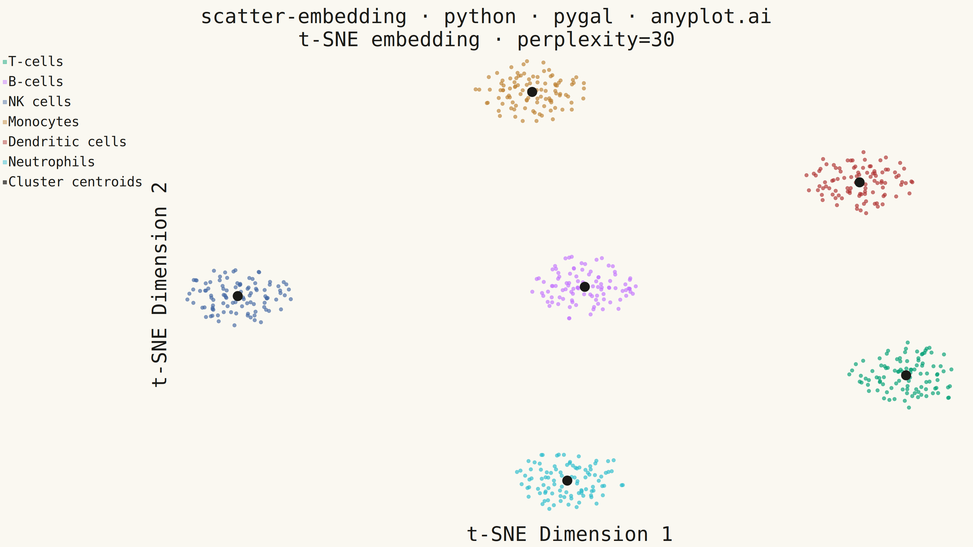
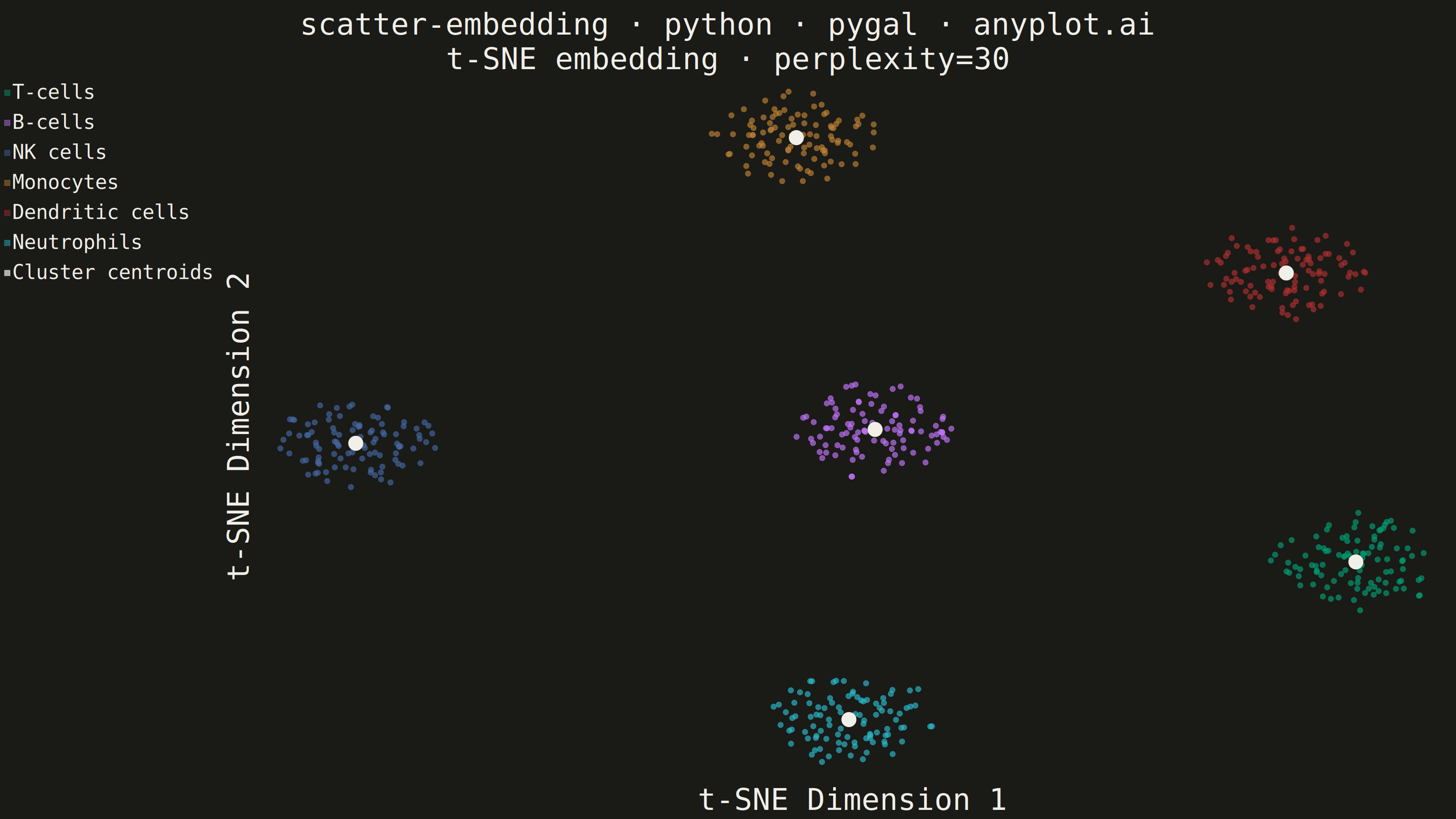
The same plot in 14 other libraries — Python: Altair, Bokeh, lets-plot, Matplotlib, Plotly, plotnine, Seaborn; R: ggplot2; Julia: Makie.jl; JavaScript: Chart.js, D3.js, Apache ECharts, Highcharts, MUI X Charts. Compare all 15 side by side: t-SNE and UMAP Embedding Visualization in Python, R, Julia and JavaScript.
A scatter plot displaying high-dimensional data projected into 2D space using non-linear dimensionality reduction techniques such as t-SNE or UMAP. Points are colored by cluster or class label, revealing groupings and latent structure in the data. This is a standard visualization in machine learning for exploring embeddings, single-cell RNA-seq data, and NLP document clustering, helping practitioners verify that learned representations capture meaningful distinctions.
""" anyplot.ai
scatter-embedding: t-SNE and UMAP Embedding Visualization
Library: pygal 3.1.3 | Python 3.13.14
Quality: 87/100 | Updated: 2026-08-11
"""

import os
import sys


# Work around naming conflict: pygal.py filename shadows pygal package
sys.path.pop(0)

import numpy as np
import pygal
from pygal.formatters import Significant
from pygal.style import Style
from sklearn.datasets import make_blobs
from sklearn.manifold import TSNE


# Theme tokens
THEME = os.getenv("ANYPLOT_THEME", "light")
PAGE_BG = "#FAF8F1" if THEME == "light" else "#1A1A17"
INK = "#1A1A17" if THEME == "light" else "#F0EFE8"
INK_MUTED = "#6B6A63" if THEME == "light" else "#A8A79F"

# Imprint palette positions 1-6 at 65% opacity to handle overlapping points
IMPRINT_ALPHA = (
    "rgba(0,158,115,0.65)",  # #009E73 brand green
    "rgba(196,117,253,0.65)",  # #C475FD lavender
    "rgba(68,103,163,0.65)",  # #4467A3 blue
    "rgba(189,130,51,0.65)",  # #BD8233 ochre
    "rgba(174,48,48,0.65)",  # #AE3030 matte red
    "rgba(42,188,205,0.65)",  # #2ABCCD cyan
)

CELL_TYPES = ["T-cells", "B-cells", "NK cells", "Monocytes", "Dendritic cells", "Neutrophils"]

# Data — 15-D single-cell RNA-seq-style blobs reduced to 2-D with t-SNE
np.random.seed(42)
X_high, labels = make_blobs(n_samples=600, n_features=15, centers=len(CELL_TYPES), cluster_std=2.0, random_state=42)

tsne = TSNE(n_components=2, perplexity=30, max_iter=500, random_state=42)
X_2d = tsne.fit_transform(X_high)

centroids = [X_2d[labels == i].mean(axis=0) for i in range(len(CELL_TYPES))]

# Plot — pygal splits the title on "\n" into stacked lines, giving a native
# subtitle slot for the algorithm + key parameter (pygal has no dedicated
# subtitle field). value_formatter trims hover-tooltip coordinates to 3
# significant digits instead of pygal's noisy float default.
custom_style = Style(
    background=PAGE_BG,
    plot_background=PAGE_BG,
    foreground=INK,
    foreground_strong=INK,
    foreground_subtle=INK_MUTED,
    colors=IMPRINT_ALPHA + (INK,),
    title_font_size=66,
    label_font_size=56,
    major_label_font_size=44,
    legend_font_size=44,
    value_font_size=36,
)

# A thin ink-colored outline on every marker adds a CVD-safety margin for the
# 6-series borderline color range (style-guide "Optional outline pattern"),
# since pygal's XY chart has no per-series marker-shape API to fall back on.
dot_outline_css = f".dot {{ stroke: {INK} !important; stroke-width: 1.5px !important; stroke-opacity: 1 !important; }}"

chart = pygal.XY(
    style=custom_style,
    width=3200,
    height=1800,
    title="scatter-embedding · python · pygal · anyplot.ai\nt-SNE embedding · perplexity=30",
    x_title="t-SNE Dimension 1",
    y_title="t-SNE Dimension 2",
    show_x_labels=False,
    show_y_labels=False,
    stroke=False,
    dots_size=6,
    print_values=False,
    value_formatter=Significant(3),
    truncate_legend=-1,
    css=("file://style.css", "file://graph.css", f"inline:{dot_outline_css}"),
)

for i, name in enumerate(CELL_TYPES):
    points = [(float(x), float(y)) for x, y in X_2d[labels == i]]
    chart.add(name, points)

chart.add("Cluster centroids", [(float(x), float(y)) for x, y in centroids], dots_size=16)

# Save
chart.render_to_png(f"plot-{THEME}.png")
with open(f"plot-{THEME}.html", "wb") as f:
    f.write(chart.render())
Runnable source as JSON, for any HTTP client: https://api.anyplot.ai/specs/scatter-embedding/pygal/code. Any spec id and library id listed in llms-full.txt fit the same URL shape; every URL below is complete and callable.
{
  "spec_id": "scatter-embedding",
  "language": "python",
  "library": "pygal",
  "page": "https://anyplot.ai/scatter-embedding/python/pygal",
  "hub": "https://anyplot.ai/scatter-embedding",
  "code_json": "https://api.anyplot.ai/specs/scatter-embedding/pygal/code",
  "spec_json": "https://api.anyplot.ai/specs/scatter-embedding",
  "render_light_png": "https://storage.googleapis.com/anyplot-images/plots/scatter-embedding/python/pygal/plot-light.png",
  "render_dark_png": "https://storage.googleapis.com/anyplot-images/plots/scatter-embedding/python/pygal/plot-dark.png",
  "interactive_light_html": "https://storage.googleapis.com/anyplot-images/plots/scatter-embedding/python/pygal/plot-light.html",
  "interactive_dark_html": "https://storage.googleapis.com/anyplot-images/plots/scatter-embedding/python/pygal/plot-dark.html",
  "quality_score": 87.0,
  "license": "MIT",
  "guide": "https://anyplot.ai/llms.txt"
}
Part of t-SNE and UMAP Embedding Visualization on anyplot.ai.