The same plot in 14 other libraries — Python: Altair, Bokeh, lets-plot, Matplotlib, Plotly, Pygal, Seaborn; R: ggplot2; Julia: Makie.jl; JavaScript: Chart.js, D3.js, Apache ECharts, Highcharts, MUI X Charts. Compare all 15 side by side: t-SNE and UMAP Embedding Visualization in Python, R, Julia and JavaScript.
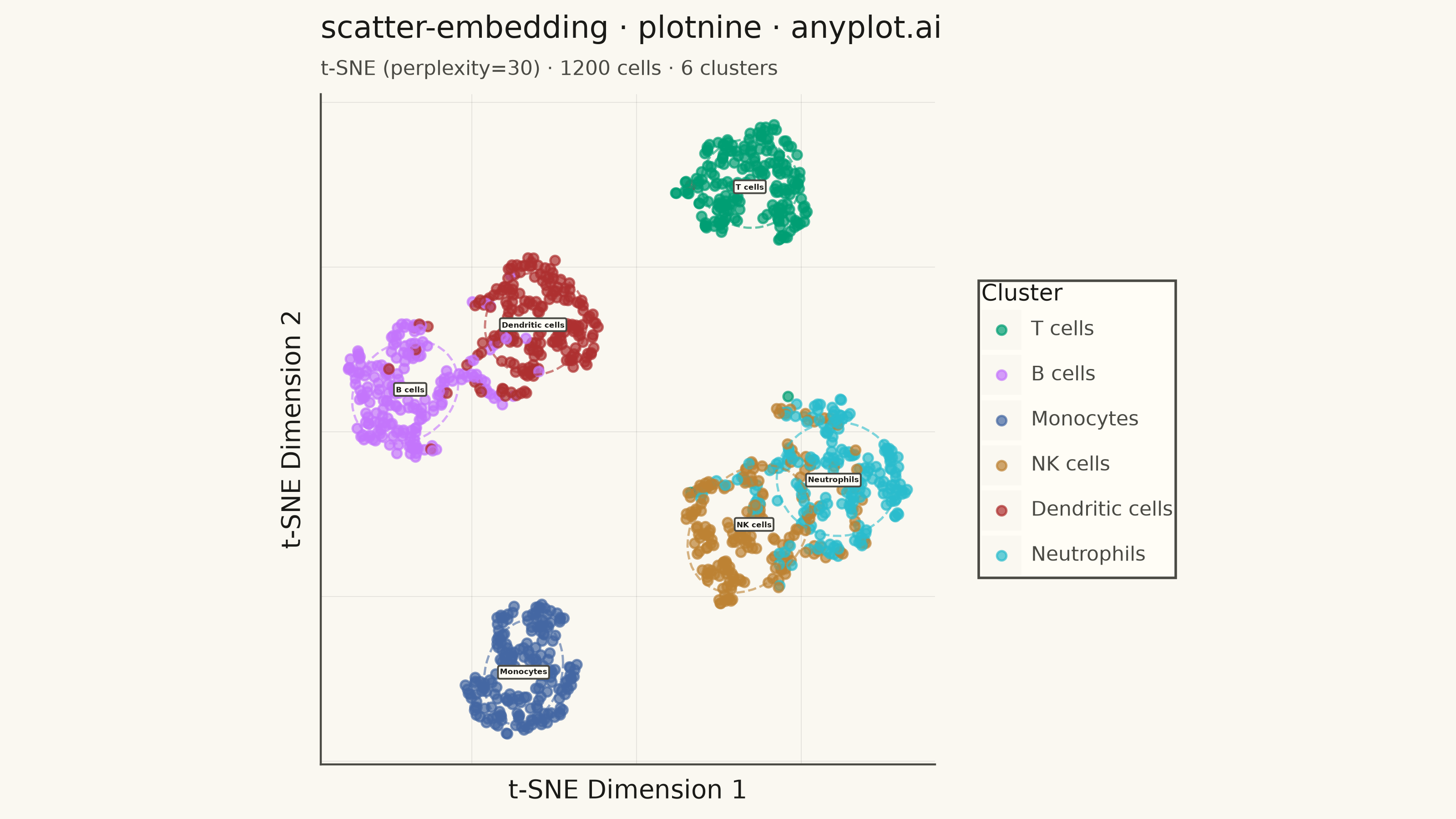
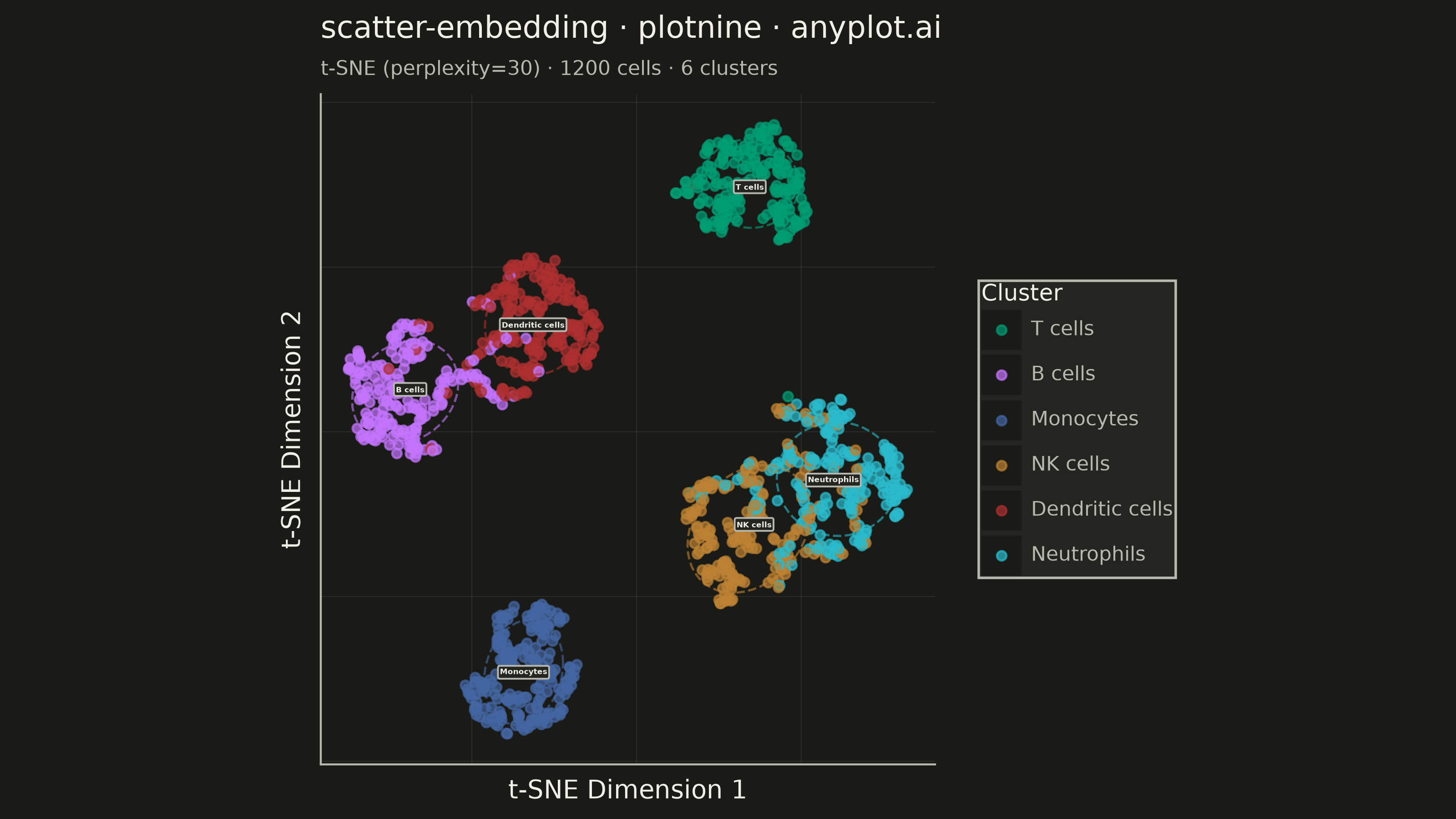
A scatter plot displaying high-dimensional data projected into 2D space using non-linear dimensionality reduction techniques such as t-SNE or UMAP. Points are colored by cluster or class label, revealing groupings and latent structure in the data. This is a standard visualization in machine learning for exploring embeddings, single-cell RNA-seq data, and NLP document clustering, helping practitioners verify that learned representations capture meaningful distinctions.
""" anyplot.ai
scatter-embedding: t-SNE and UMAP Embedding Visualization
Library: plotnine 0.15.7 | Python 3.13.14
Quality: 90/100 | Updated: 2026-08-11
"""

import os

import numpy as np
import pandas as pd
from plotnine import (
    aes,
    coord_fixed,
    element_blank,
    element_line,
    element_rect,
    element_text,
    geom_label,
    geom_point,
    ggplot,
    labs,
    scale_color_manual,
    stat_ellipse,
    theme,
)
from sklearn.datasets import make_blobs
from sklearn.manifold import TSNE


# Theme tokens
THEME = os.getenv("ANYPLOT_THEME", "light")
PAGE_BG = "#FAF8F1" if THEME == "light" else "#1A1A17"
ELEVATED_BG = "#FFFDF6" if THEME == "light" else "#242420"
INK = "#1A1A17" if THEME == "light" else "#F0EFE8"
INK_SOFT = "#4A4A44" if THEME == "light" else "#B8B7B0"

# Imprint palette (canonical order, first series always brand green)
IMPRINT = ["#009E73", "#C475FD", "#4467A3", "#BD8233", "#AE3030", "#2ABCCD"]

# Data: single-cell RNA-seq-style clustering scenario (bioinformatics application)
np.random.seed(42)
cell_types = ["T cells", "B cells", "Monocytes", "NK cells", "Dendritic cells", "Neutrophils"]
n_clusters = len(cell_types)
X, y = make_blobs(n_samples=1200, centers=n_clusters, cluster_std=1.2, random_state=42)

tsne = TSNE(n_components=2, perplexity=30, random_state=42)
embedding = tsne.fit_transform(X)

df = pd.DataFrame(
    {
        "tsne_1": embedding[:, 0],
        "tsne_2": embedding[:, 1],
        "Cluster": pd.Categorical([cell_types[i] for i in y], categories=cell_types),
    }
)

centroids = df.groupby("Cluster", observed=True)[["tsne_1", "tsne_2"]].mean().reset_index()

# Plot
anyplot_theme = theme(
    figure_size=(8, 4.5),
    plot_background=element_rect(fill=PAGE_BG, color=PAGE_BG),
    panel_background=element_rect(fill=PAGE_BG),
    panel_grid_major=element_line(color=INK, size=0.3, alpha=0.10),
    panel_grid_minor=element_blank(),
    panel_border=element_blank(),
    axis_line_x=element_line(color=INK_SOFT, size=0.8),
    axis_line_y=element_line(color=INK_SOFT, size=0.8),
    axis_title=element_text(color=INK, size=10),
    axis_text=element_blank(),
    axis_ticks=element_blank(),
    plot_title=element_text(color=INK, size=12),
    plot_subtitle=element_text(color=INK_SOFT, size=8),
    legend_background=element_rect(fill=ELEVATED_BG, color=INK_SOFT),
    legend_text=element_text(color=INK_SOFT, size=8),
    legend_title=element_text(color=INK, size=9),
    legend_key=element_rect(fill=PAGE_BG),
    legend_margin=10,
)

plot = (
    ggplot(df, aes(x="tsne_1", y="tsne_2", color="Cluster"))
    + geom_point(size=1.6, alpha=0.7)
    + stat_ellipse(level=0.68, type="t", size=0.5, alpha=0.6, linetype="dashed", show_legend=False)
    + geom_label(
        data=centroids,
        mapping=aes(x="tsne_1", y="tsne_2", label="Cluster"),
        inherit_aes=False,
        size=3.0,
        color=INK,
        fill=ELEVATED_BG,
        boxcolor=INK_SOFT,
        fontweight="bold",
        show_legend=False,
    )
    + scale_color_manual(values=IMPRINT)
    + coord_fixed(ratio=1)
    + labs(
        title="scatter-embedding · python · plotnine · anyplot.ai",
        subtitle="t-SNE (perplexity=30) · 1200 cells · 6 clusters",
        x="t-SNE Dimension 1",
        y="t-SNE Dimension 2",
    )
    + anyplot_theme
)

# Save
plot.save(f"plot-{THEME}.png", dpi=400, width=8, height=4.5, units="in")
Runnable source as JSON, for any HTTP client: https://api.anyplot.ai/specs/scatter-embedding/plotnine/code. Any spec id and library id listed in llms-full.txt fit the same URL shape; every URL below is complete and callable.
{
  "spec_id": "scatter-embedding",
  "language": "python",
  "library": "plotnine",
  "page": "https://anyplot.ai/scatter-embedding/python/plotnine",
  "hub": "https://anyplot.ai/scatter-embedding",
  "code_json": "https://api.anyplot.ai/specs/scatter-embedding/plotnine/code",
  "spec_json": "https://api.anyplot.ai/specs/scatter-embedding",
  "render_light_png": "https://storage.googleapis.com/anyplot-images/plots/scatter-embedding/python/plotnine/plot-light.png",
  "render_dark_png": "https://storage.googleapis.com/anyplot-images/plots/scatter-embedding/python/plotnine/plot-dark.png",
  "quality_score": 90.0,
  "license": "MIT",
  "guide": "https://anyplot.ai/llms.txt"
}
Part of t-SNE and UMAP Embedding Visualization on anyplot.ai.