The same plot in 14 other libraries — Python: Altair, Bokeh, lets-plot, Plotly, plotnine, Pygal, Seaborn; R: ggplot2; Julia: Makie.jl; JavaScript: Chart.js, D3.js, Apache ECharts, Highcharts, MUI X Charts. Compare all 15 side by side: t-SNE and UMAP Embedding Visualization in Python, R, Julia and JavaScript.
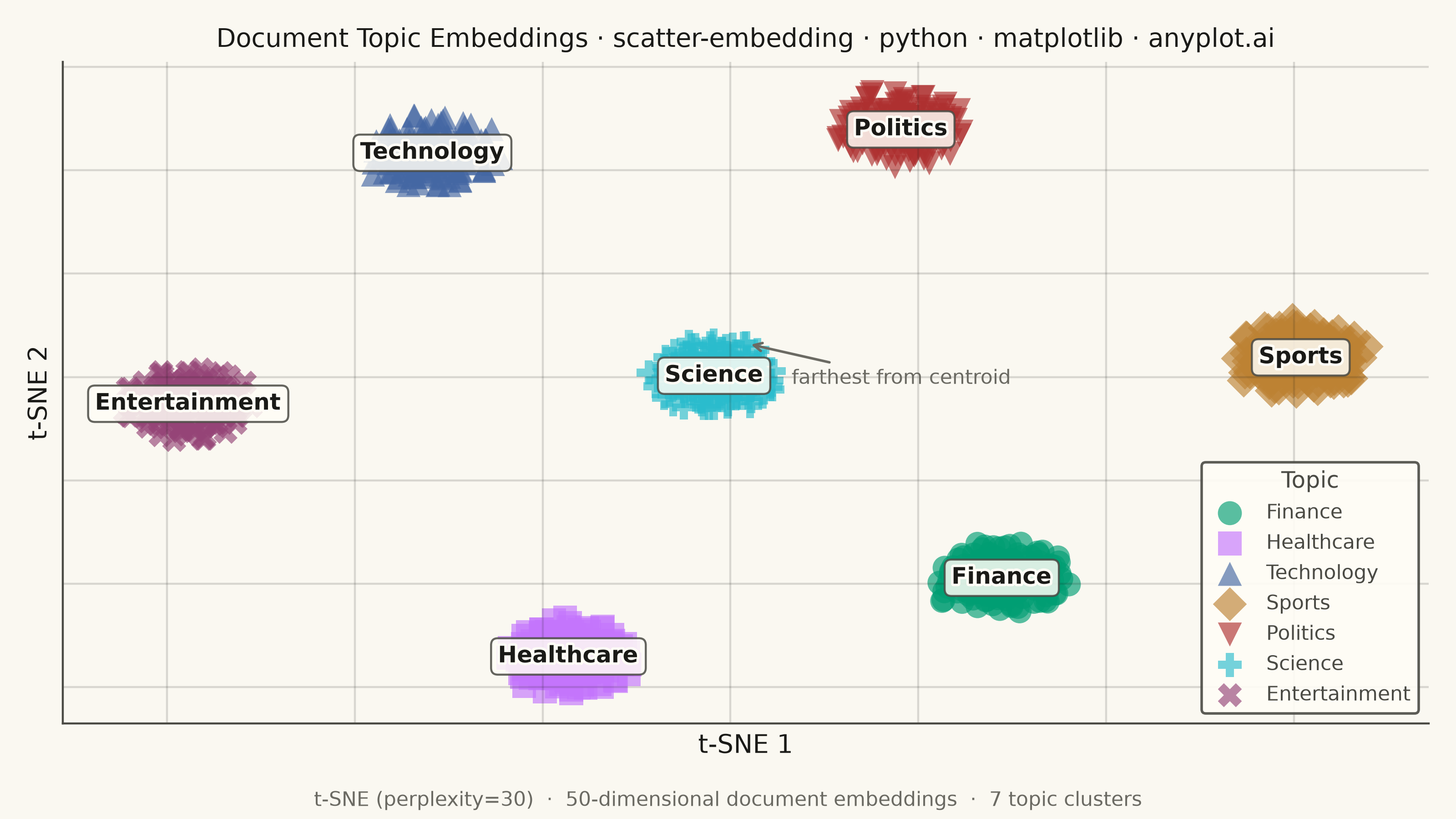
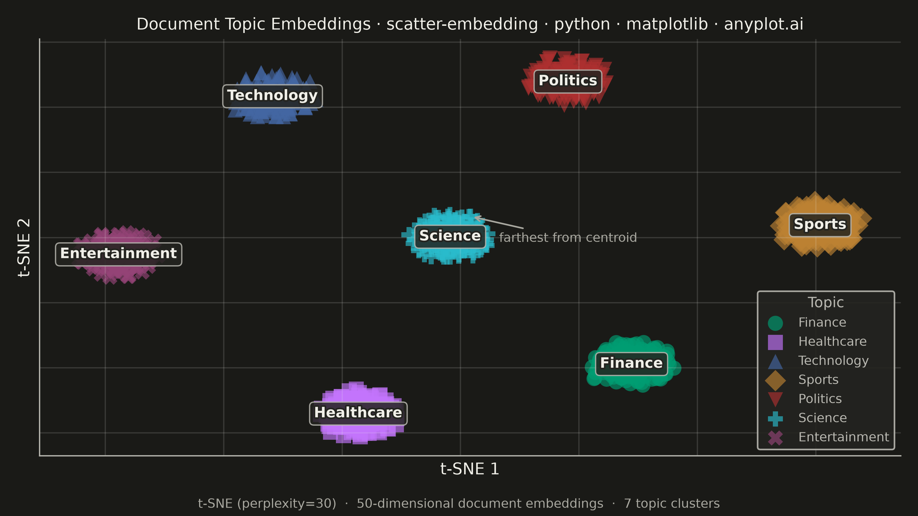
A scatter plot displaying high-dimensional data projected into 2D space using non-linear dimensionality reduction techniques such as t-SNE or UMAP. Points are colored by cluster or class label, revealing groupings and latent structure in the data. This is a standard visualization in machine learning for exploring embeddings, single-cell RNA-seq data, and NLP document clustering, helping practitioners verify that learned representations capture meaningful distinctions.
""" anyplot.ai
scatter-embedding: t-SNE and UMAP Embedding Visualization
Library: matplotlib 3.11.1 | Python 3.13.14
Quality: 93/100 | Updated: 2026-08-11
"""

import os
import sys


sys.path.pop(0)
import matplotlib.patheffects as pe
import matplotlib.pyplot as plt
import numpy as np
from sklearn.datasets import make_blobs
from sklearn.manifold import TSNE


# Theme
THEME = os.getenv("ANYPLOT_THEME", "light")
PAGE_BG = "#FAF8F1" if THEME == "light" else "#1A1A17"
ELEVATED_BG = "#FFFDF6" if THEME == "light" else "#242420"
INK = "#1A1A17" if THEME == "light" else "#F0EFE8"
INK_SOFT = "#4A4A44" if THEME == "light" else "#B8B7B0"
INK_MUTED = "#6B6A63" if THEME == "light" else "#A8A79F"

IMPRINT = ["#009E73", "#C475FD", "#4467A3", "#BD8233", "#AE3030", "#2ABCCD", "#954477"]

CLUSTER_LABELS = ["Finance", "Healthcare", "Technology", "Sports", "Politics", "Science", "Entertainment"]
# 7 series sits at the CVD discrimination floor (Imprint palette) — pair each color
# with a distinct marker shape for redundant encoding, per the style guide's
# color-restraint table.
MARKERS = ["o", "s", "^", "D", "v", "P", "X"]

# Data — 1050 document embeddings (150 per topic) in 50-dimensional space
# cluster_std=3.3 leaves some boundary overlap/noise between neighboring topics,
# matching the real-world embedding-quality-checking use case this spec targets
np.random.seed(42)
X_high, labels = make_blobs(n_samples=1050, n_features=50, centers=7, cluster_std=3.3, random_state=42)
tsne = TSNE(n_components=2, perplexity=30, random_state=42)
X_2d = tsne.fit_transform(X_high)

# Plot
fig, ax = plt.subplots(figsize=(8, 4.5), dpi=400, facecolor=PAGE_BG)
ax.set_facecolor(PAGE_BG)

for i, (label, color, marker) in enumerate(zip(CLUSTER_LABELS, IMPRINT, MARKERS, strict=False)):
    mask = labels == i
    ax.scatter(X_2d[mask, 0], X_2d[mask, 1], c=color, s=90, alpha=0.65, edgecolors="none", marker=marker, label=label)

# Centroid annotations
for i, label in enumerate(CLUSTER_LABELS):
    mask = labels == i
    cx, cy = X_2d[mask, 0].mean(), X_2d[mask, 1].mean()
    txt = ax.text(
        cx,
        cy,
        label,
        fontsize=9,
        fontweight="bold",
        color=INK,
        ha="center",
        va="center",
        bbox={
            "facecolor": ELEVATED_BG,
            "edgecolor": INK_SOFT,
            "alpha": 0.85,
            "boxstyle": "round,pad=0.3",
            "linewidth": 0.8,
        },
    )
    # PathEffects halo keeps the bold label crisp against the box even where
    # dense, overlapping markers sit directly beneath the centroid text
    txt.set_path_effects([pe.withStroke(linewidth=2, foreground=ELEVATED_BG)])

# Outlier callout — surfaces the point furthest from its own cluster centroid,
# the kind of embedding-quality check this plot type exists to support (DE-03)
outlier_mask = labels == 5
outlier_centroid = np.array([X_2d[outlier_mask, 0].mean(), X_2d[outlier_mask, 1].mean()])
outlier_dists = np.linalg.norm(X_2d[outlier_mask] - outlier_centroid, axis=1)
outlier_point = X_2d[outlier_mask][np.argmax(outlier_dists)]
ax.annotate(
    "farthest from centroid",
    xy=(outlier_point[0], outlier_point[1]),
    xytext=(18, -16),
    textcoords="offset points",
    fontsize=8,
    color=INK_MUTED,
    arrowprops={"arrowstyle": "->", "color": INK_MUTED, "linewidth": 1},
)

# Style
ax.set_xlabel("t-SNE 1", fontsize=10, color=INK)
ax.set_ylabel("t-SNE 2", fontsize=10, color=INK)
ax.set_title(
    "Document Topic Embeddings · scatter-embedding · python · matplotlib · anyplot.ai",
    fontsize=10,
    fontweight="medium",
    color=INK,
)
ax.tick_params(axis="both", length=0, colors=INK_SOFT, labelbottom=False, labelleft=False)
ax.grid(True, alpha=0.15, color=INK, linewidth=0.8)

ax.spines["top"].set_visible(False)
ax.spines["right"].set_visible(False)
for s in ("left", "bottom"):
    ax.spines[s].set_color(INK_SOFT)

# Legend
leg = ax.legend(fontsize=8, loc="lower right", framealpha=0.9, title="Topic", title_fontsize=9)
leg.get_frame().set_facecolor(ELEVATED_BG)
leg.get_frame().set_edgecolor(INK_SOFT)
plt.setp(leg.get_texts(), color=INK_SOFT)
leg.get_title().set_color(INK_SOFT)

# Algorithm subtitle
fig.text(
    0.5,
    0.01,
    "t-SNE (perplexity=30)  ·  50-dimensional document embeddings  ·  7 topic clusters",
    ha="center",
    va="bottom",
    fontsize=8,
    color=INK_MUTED,
)

plt.tight_layout(rect=[0, 0.04, 1, 1])
plt.savefig(f"plot-{THEME}.png", dpi=400, facecolor=PAGE_BG)
Runnable source as JSON, for any HTTP client: https://api.anyplot.ai/specs/scatter-embedding/matplotlib/code. Any spec id and library id listed in llms-full.txt fit the same URL shape; every URL below is complete and callable.
{
  "spec_id": "scatter-embedding",
  "language": "python",
  "library": "matplotlib",
  "page": "https://anyplot.ai/scatter-embedding/python/matplotlib",
  "hub": "https://anyplot.ai/scatter-embedding",
  "code_json": "https://api.anyplot.ai/specs/scatter-embedding/matplotlib/code",
  "spec_json": "https://api.anyplot.ai/specs/scatter-embedding",
  "render_light_png": "https://storage.googleapis.com/anyplot-images/plots/scatter-embedding/python/matplotlib/plot-light.png",
  "render_dark_png": "https://storage.googleapis.com/anyplot-images/plots/scatter-embedding/python/matplotlib/plot-dark.png",
  "quality_score": 93.0,
  "license": "MIT",
  "guide": "https://anyplot.ai/llms.txt"
}
Part of t-SNE and UMAP Embedding Visualization on anyplot.ai.