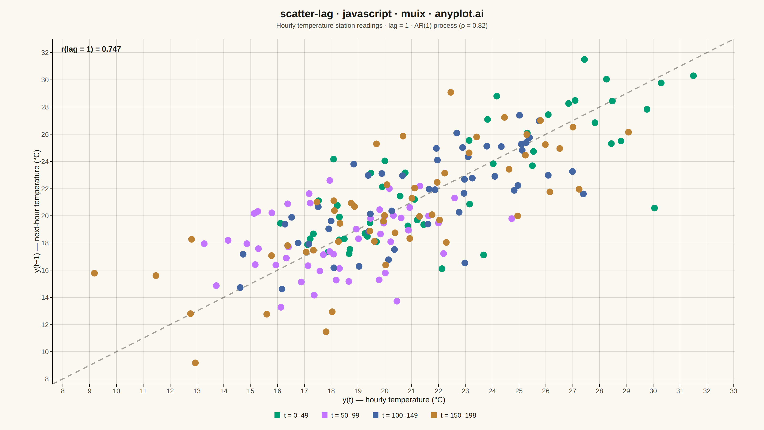
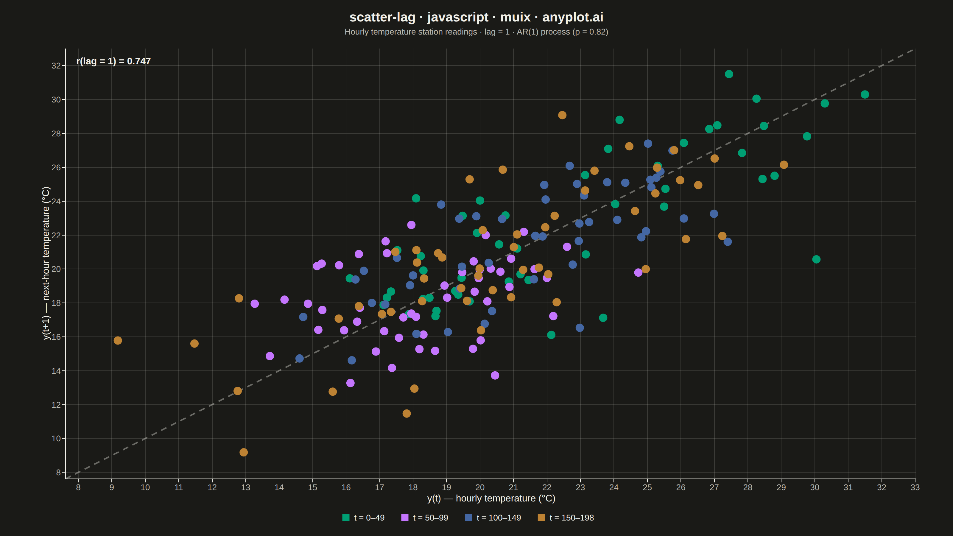
The same plot in 14 other libraries — JavaScript: Chart.js, D3.js, Apache ECharts, Highcharts; Python: Altair, Bokeh, lets-plot, Matplotlib, Plotly, plotnine, Pygal, Seaborn; R: ggplot2; Julia: Makie.jl. Compare all 15 side by side: Lag Plot for Time Series Autocorrelation Diagnosis in Python, R, Julia and JavaScript.
A lag plot is a scatter plot of a time series against a lagged version of itself, plotting y(t) on the x-axis versus y(t+k) on the y-axis for a given lag order k. If the data is purely random, points scatter uniformly with no visible structure; if autocorrelation is present, distinctive patterns emerge — linear clusters for autoregressive processes, elliptical shapes for seasonal data. This provides a quick visual diagnostic for time series dependence, complementing numerical tools like ACF/PACF.
// anyplot.ai
// scatter-lag: Lag Plot for Time Series Autocorrelation Diagnosis
// Library: muix 7.29.1 | JavaScript 22.23.0
// Quality: 90/100 | Created: 2026-06-24
//# anyplot-orientation: landscape
// anyplot.ai
// scatter-lag: Lag Plot for Time Series Autocorrelation Diagnosis
// Library: MUI X Charts | React | Node 22
// License: @mui/x-charts — MIT (community). Pro/Premium are out of scope.
// Quality: pending | Created: 2026-06-24

import { ChartContainer } from "@mui/x-charts/ChartContainer";
import { ScatterPlot } from "@mui/x-charts/ScatterChart";
import { ChartsXAxis } from "@mui/x-charts/ChartsXAxis";
import { ChartsYAxis } from "@mui/x-charts/ChartsYAxis";
import { ChartsGrid } from "@mui/x-charts/ChartsGrid";
import { ChartsLegend } from "@mui/x-charts/ChartsLegend";
import { useXScale, useYScale } from "@mui/x-charts/hooks";

const t = window.ANYPLOT_TOKENS;
const { width, height } = window.ANYPLOT_SIZE;

// Deterministic LCG (seed 42) — no Math.random() in browser harness
let _seed = 42;
function lcg() {
  _seed = (1664525 * _seed + 1013904223) >>> 0;
  return _seed / 4294967296;
}
function randn() {
  const u = lcg(), v = lcg();
  return Math.sqrt(-2 * Math.log(u + 1e-15)) * Math.cos(2 * Math.PI * v);
}

// AR(1) hourly temperature process: ρ=0.82, μ=20°C, σ≈5°C
// Strong positive autocorrelation → tight ellipse along diagonal in lag plot
const N = 200;
const RHO = 0.82;
const rawAR = [0.0];
for (let i = 1; i < N; i++) {
  rawAR.push(RHO * rawAR[i - 1] + Math.sqrt(1 - RHO * RHO) * randn());
}
const temps = rawAR.map(v => +(20 + v * 5).toFixed(2));

// Lag-1 pairs: (temp(t), temp(t+1))
const lagPairs = temps.slice(0, N - 1).map((v, i) => ({ x: v, y: temps[i + 1] }));

// Symmetric axis range with padding
const gMin = Math.min(...temps);
const gMax = Math.max(...temps);
const axPad = (gMax - gMin) * 0.07;
const axMin = gMin - axPad;
const axMax = gMax + axPad;

// Pearson r(lag=1)
const nPairs = lagPairs.length;
const xMean = lagPairs.reduce((s, p) => s + p.x, 0) / nPairs;
const yMean = lagPairs.reduce((s, p) => s + p.y, 0) / nPairs;
const cov = lagPairs.reduce((s, p) => s + (p.x - xMean) * (p.y - yMean), 0);
const sX = Math.sqrt(lagPairs.reduce((s, p) => s + (p.x - xMean) ** 2, 0));
const sY = Math.sqrt(lagPairs.reduce((s, p) => s + (p.y - yMean) ** 2, 0));
const pearsonR = (cov / (sX * sY)).toFixed(3);

// 4 time-quartile series — color encodes temporal order (earliest → latest)
const QN = Math.floor(nPairs / 4);
const QLABELS = ["t = 0–49", "t = 50–99", "t = 100–149", "t = 150–198"];
const series = [0, 1, 2, 3].map(q => ({
  type: "scatter",
  id: `q${q}`,
  label: QLABELS[q],
  color: t.palette[q],
  markerSize: 7,
  data: lagPairs
    .slice(q * QN, q < 3 ? (q + 1) * QN : nPairs)
    .map((p, i) => ({ x: p.x, y: p.y, id: `q${q}-${i}` })),
}));

// Diagonal reference line y=x — rendered via MUI X axis scale hooks
function DiagonalLine() {
  const xScale = useXScale();
  const yScale = useYScale();
  if (!xScale || !yScale) return null;
  return (
    <line
      x1={xScale(axMin)} y1={yScale(axMin)}
      x2={xScale(axMax)} y2={yScale(axMax)}
      stroke={t.inkSoft}
      strokeWidth={2.5}
      strokeDasharray="10,8"
      opacity={0.5}
    />
  );
}

const TITLE = "scatter-lag · javascript · muix · anyplot.ai";
const MARGIN = { top: 80, right: 60, bottom: 96, left: 110 };

export default function Chart() {
  return (
    <ChartContainer
      width={width}
      height={height}
      margin={MARGIN}
      series={series}
      xAxis={[{
        scaleType: "linear",
        min: axMin,
        max: axMax,
        label: "y(t)  — hourly temperature (°C)",
        tickLabelStyle: { fontSize: 14, fill: t.inkSoft },
        labelStyle: { fontSize: 16, fill: t.ink },
      }]}
      yAxis={[{
        scaleType: "linear",
        min: axMin,
        max: axMax,
        label: "y(t+1)  — next-hour temperature (°C)",
        tickLabelStyle: { fontSize: 14, fill: t.inkSoft },
        labelStyle: { fontSize: 16, fill: t.ink },
      }]}
    >
      <ChartsGrid horizontal vertical />
      <DiagonalLine />
      <ScatterPlot skipAnimation />
      <ChartsXAxis />
      <ChartsYAxis />
      <ChartsLegend
        direction="row"
        position={{ vertical: "bottom", horizontal: "middle" }}
        slotProps={{
          legend: {
            itemMarkWidth: 12,
            itemMarkHeight: 12,
            markGap: 8,
            itemGap: 28,
            labelStyle: { fontSize: 14, fill: t.ink },
          },
        }}
      />
      {/* L-frame: mask top and right spines with background color */}
      <line
        x1={MARGIN.left - 1} y1={MARGIN.top}
        x2={width - MARGIN.right + 1} y2={MARGIN.top}
        stroke={t.pageBg}
        strokeWidth={3}
      />
      <line
        x1={width - MARGIN.right} y1={MARGIN.top - 1}
        x2={width - MARGIN.right} y2={height - MARGIN.bottom + 1}
        stroke={t.pageBg}
        strokeWidth={3}
      />
      {/* Title */}
      <text
        x={width / 2}
        y={36}
        textAnchor="middle"
        fontSize={22}
        fontWeight={600}
        fill={t.ink}
      >
        {TITLE}
      </text>
      {/* Subtitle */}
      <text
        x={width / 2}
        y={58}
        textAnchor="middle"
        fontSize={14}
        fill={t.inkSoft}
      >
        Hourly temperature station readings · lag = 1 · AR(1) process (ρ = 0.82)
      </text>
      {/* Pearson r annotation — top-left corner (sparse for positive autocorrelation) */}
      <text
        x={MARGIN.left + 18}
        y={MARGIN.top + 28}
        textAnchor="start"
        fontSize={16}
        fontWeight={600}
        fill={t.ink}
      >
        {`r(lag = 1) = ${pearsonR}`}
      </text>
    </ChartContainer>
  );
}
Runnable source as JSON, for any HTTP client: https://api.anyplot.ai/specs/scatter-lag/muix/code. Any spec id and library id listed in llms-full.txt fit the same URL shape; every URL below is complete and callable.
{
  "spec_id": "scatter-lag",
  "language": "javascript",
  "library": "muix",
  "page": "https://anyplot.ai/scatter-lag/javascript/muix",
  "hub": "https://anyplot.ai/scatter-lag",
  "code_json": "https://api.anyplot.ai/specs/scatter-lag/muix/code",
  "spec_json": "https://api.anyplot.ai/specs/scatter-lag",
  "render_light_png": "https://storage.googleapis.com/anyplot-images/plots/scatter-lag/javascript/muix/plot-light.png",
  "render_dark_png": "https://storage.googleapis.com/anyplot-images/plots/scatter-lag/javascript/muix/plot-dark.png",
  "interactive_light_html": "https://storage.googleapis.com/anyplot-images/plots/scatter-lag/javascript/muix/plot-light.html",
  "interactive_dark_html": "https://storage.googleapis.com/anyplot-images/plots/scatter-lag/javascript/muix/plot-dark.html",
  "quality_score": 90.0,
  "license": "MIT",
  "guide": "https://anyplot.ai/llms.txt"
}
Part of Lag Plot for Time Series Autocorrelation Diagnosis on anyplot.ai.