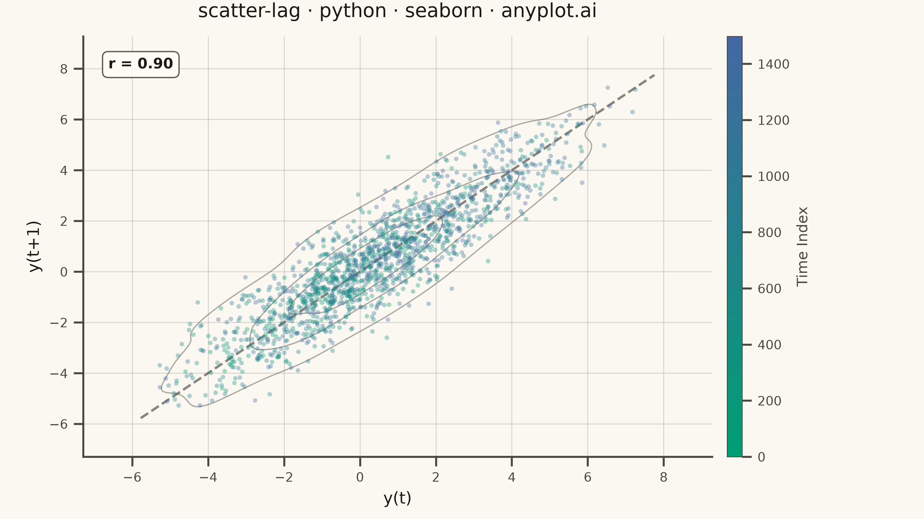
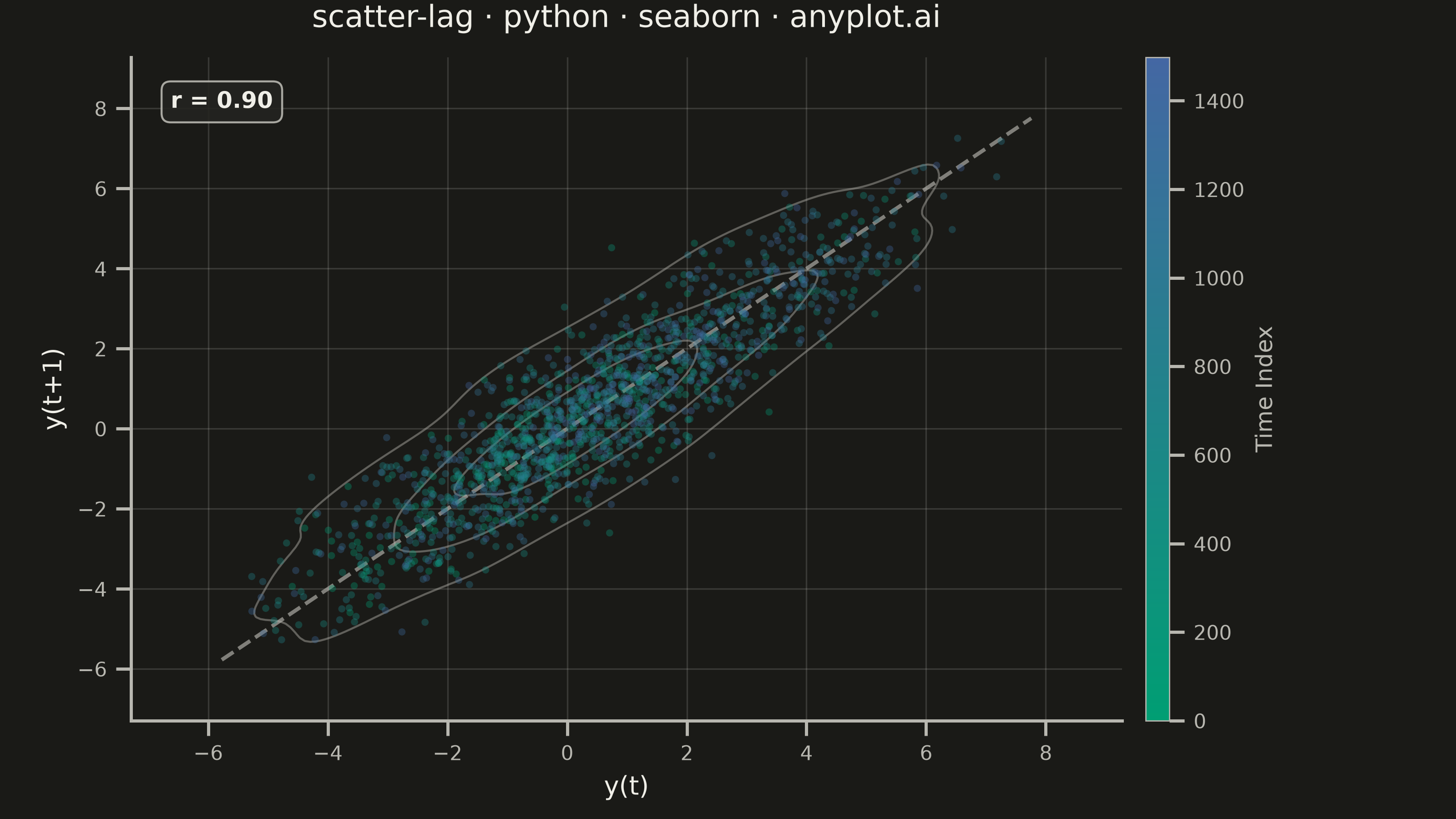
A lag plot is a scatter plot of a time series against a lagged version of itself, plotting y(t) on the x-axis versus y(t+k) on the y-axis for a given lag order k. If the data is purely random, points scatter uniformly with no visible structure; if autocorrelation is present, distinctive patterns emerge — linear clusters for autoregressive processes, elliptical shapes for seasonal data. This provides a quick visual diagnostic for time series dependence, complementing numerical tools like ACF/PACF.
""" anyplot.ai
scatter-lag: Lag Plot for Time Series Autocorrelation Diagnosis
Library: seaborn 0.13.2 | Python 3.13.14
Quality: 87/100 | Updated: 2026-06-24
"""

import os

import matplotlib.pyplot as plt
import numpy as np
import pandas as pd
import seaborn as sns
from matplotlib.colors import LinearSegmentedColormap


THEME = os.getenv("ANYPLOT_THEME", "light")

PAGE_BG = "#FAF8F1" if THEME == "light" else "#1A1A17"
ELEVATED_BG = "#FFFDF6" if THEME == "light" else "#242420"
INK = "#1A1A17" if THEME == "light" else "#F0EFE8"
INK_SOFT = "#4A4A44" if THEME == "light" else "#B8B7B0"

# Imprint sequential cmap for temporal index (single-polarity continuous)
imprint_seq = LinearSegmentedColormap.from_list("imprint_seq", ["#009E73", "#4467A3"])

# Data — AR(1) with extreme positive autocorrelation (phi=0.9, n=1500)
np.random.seed(42)
n = 1500
phi = 0.9
noise = np.random.normal(0, 1, n)
values = np.zeros(n)
values[0] = noise[0]
for t in range(1, n):
    values[t] = phi * values[t - 1] + noise[t]

lag = 1
y_t = values[:-lag]
y_t_lag = values[lag:]
time_index = np.arange(len(y_t))

df = pd.DataFrame({"y(t)": y_t, "y(t+1)": y_t_lag, "Time Index": time_index})
r = np.corrcoef(y_t, y_t_lag)[0, 1]

# Theme-adaptive chrome
sns.set_theme(
    style="ticks",
    rc={
        "figure.facecolor": PAGE_BG,
        "axes.facecolor": PAGE_BG,
        "axes.edgecolor": INK_SOFT,
        "axes.labelcolor": INK,
        "text.color": INK,
        "xtick.color": INK_SOFT,
        "ytick.color": INK_SOFT,
        "grid.color": INK,
        "grid.alpha": 0.15,
        "legend.facecolor": ELEVATED_BG,
        "legend.edgecolor": INK_SOFT,
    },
)

fig, ax = plt.subplots(figsize=(8, 4.5), dpi=400)
fig.patch.set_facecolor(PAGE_BG)
ax.set_facecolor(PAGE_BG)

# Density contours via sns.kdeplot — visual depth separating dense cluster from sparse outer points
sns.kdeplot(data=df, x="y(t)", y="y(t+1)", levels=4, color=INK_SOFT, linewidths=0.8, alpha=0.45, ax=ax, zorder=1)

# Diagonal reference line (y = x) using theme-adaptive neutral
data_min = min(y_t.min(), y_t_lag.min())
data_max = max(y_t.max(), y_t_lag.max())
margin = (data_max - data_min) * 0.04
ax.plot(
    [data_min - margin, data_max + margin],
    [data_min - margin, data_max + margin],
    color=INK_SOFT,
    linewidth=1.5,
    linestyle="--",
    alpha=0.65,
    zorder=2,
)

# Temporal scatter via sns.scatterplot with continuous hue — seaborn-idiomatic coloring
norm = plt.Normalize(df["Time Index"].min(), df["Time Index"].max())
sm = plt.cm.ScalarMappable(cmap=imprint_seq, norm=norm)
sm.set_array([])

sns.scatterplot(
    data=df,
    x="y(t)",
    y="y(t+1)",
    hue="Time Index",
    palette=imprint_seq,
    hue_norm=norm,
    s=8,
    alpha=0.35,
    edgecolor="none",
    legend=False,
    ax=ax,
    zorder=3,
)

# Colorbar for temporal structure
cbar = plt.colorbar(sm, ax=ax, pad=0.02, aspect=28)
cbar.set_label("Time Index", fontsize=9, color=INK_SOFT)
cbar.ax.tick_params(labelsize=8, colors=INK_SOFT)
cbar.outline.set_edgecolor(INK_SOFT)
cbar.outline.set_linewidth(0.5)

# Correlation coefficient annotation
ax.annotate(
    f"r = {r:.2f}",
    xy=(0.04, 0.95),
    xycoords="axes fraction",
    fontsize=9,
    fontweight="bold",
    color=INK,
    ha="left",
    va="top",
    bbox={"boxstyle": "round,pad=0.4", "facecolor": ELEVATED_BG, "edgecolor": INK_SOFT, "alpha": 0.9, "linewidth": 0.8},
)

ax.set_title("scatter-lag · python · seaborn · anyplot.ai", fontsize=12, fontweight="medium", color=INK, pad=12)
ax.set_xlabel("y(t)", fontsize=10, color=INK)
ax.set_ylabel("y(t+1)", fontsize=10, color=INK)
ax.tick_params(axis="both", labelsize=8, colors=INK_SOFT)
ax.grid(True, alpha=0.15, linewidth=0.6, color=INK)
sns.despine(ax=ax)

fig.subplots_adjust(left=0.09, right=0.91, top=0.93, bottom=0.12)
plt.savefig(f"plot-{THEME}.png", dpi=400, facecolor=PAGE_BG)
plt.close()
Runnable source as JSON, for any HTTP client: https://api.anyplot.ai/specs/scatter-lag/seaborn/code. Any spec id and library id listed in llms-full.txt fit the same URL shape; every URL below is complete and callable.
{
  "spec_id": "scatter-lag",
  "language": "python",
  "library": "seaborn",
  "page": "https://anyplot.ai/scatter-lag/python/seaborn",
  "hub": "https://anyplot.ai/scatter-lag",
  "code_json": "https://api.anyplot.ai/specs/scatter-lag/seaborn/code",
  "spec_json": "https://api.anyplot.ai/specs/scatter-lag",
  "render_light_png": "https://storage.googleapis.com/anyplot-images/plots/scatter-lag/python/seaborn/plot-light.png",
  "render_dark_png": "https://storage.googleapis.com/anyplot-images/plots/scatter-lag/python/seaborn/plot-dark.png",
  "quality_score": 87.0,
  "license": "MIT",
  "guide": "https://anyplot.ai/llms.txt"
}
Part of Lag Plot for Time Series Autocorrelation Diagnosis on anyplot.ai.