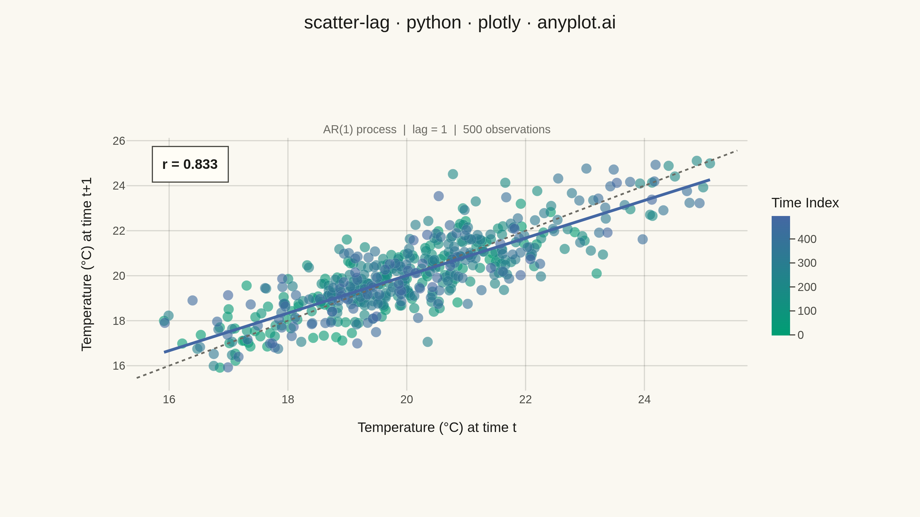
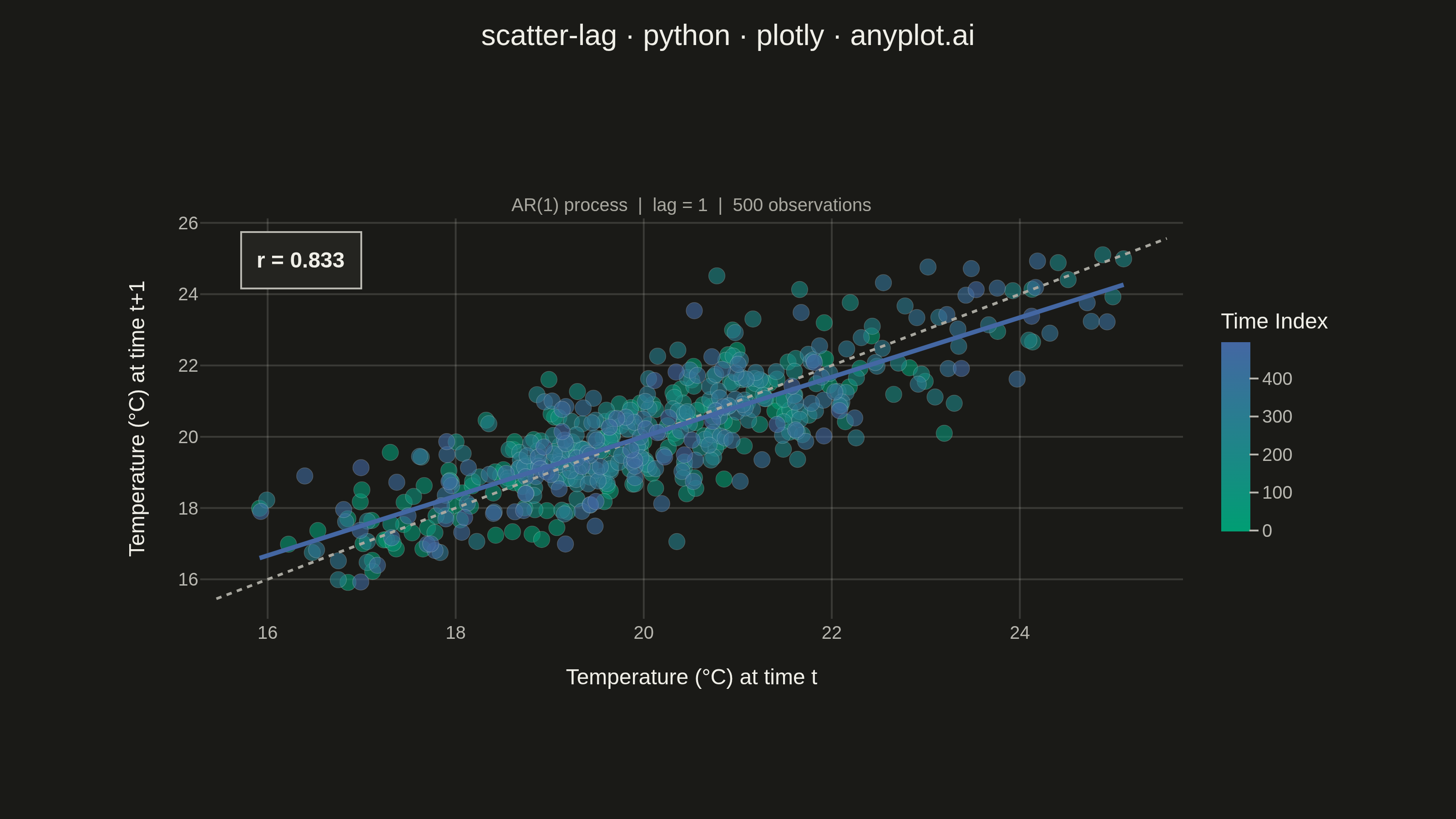
A lag plot is a scatter plot of a time series against a lagged version of itself, plotting y(t) on the x-axis versus y(t+k) on the y-axis for a given lag order k. If the data is purely random, points scatter uniformly with no visible structure; if autocorrelation is present, distinctive patterns emerge — linear clusters for autoregressive processes, elliptical shapes for seasonal data. This provides a quick visual diagnostic for time series dependence, complementing numerical tools like ACF/PACF.
""" anyplot.ai
scatter-lag: Lag Plot for Time Series Autocorrelation Diagnosis
Library: plotly 6.8.0 | Python 3.13.14
Quality: 89/100 | Updated: 2026-06-24
"""

import os
import sys


# Remove the script's own directory from sys.path to prevent shadowing the installed
# plotly package (Python inserts the script dir as sys.path[0] when running a .py file).
_script_dir = os.path.dirname(os.path.abspath(__file__))
if sys.path and sys.path[0] == _script_dir:
    sys.path.pop(0)

import numpy as np
import plotly.graph_objects as go


# Theme-adaptive chrome — Imprint palette tokens
THEME = os.getenv("ANYPLOT_THEME", "light")
PAGE_BG = "#FAF8F1" if THEME == "light" else "#1A1A17"
ELEVATED_BG = "#FFFDF6" if THEME == "light" else "#242420"
INK = "#1A1A17" if THEME == "light" else "#F0EFE8"
INK_SOFT = "#4A4A44" if THEME == "light" else "#B8B7B0"
INK_MUTED = "#6B6A63" if THEME == "light" else "#A8A79F"
RULE = "rgba(26,26,23,0.15)" if THEME == "light" else "rgba(240,239,232,0.15)"

# Imprint sequential colormap (brand green → blue) for continuous time index
imprint_seq = [[0.0, "#009E73"], [1.0, "#4467A3"]]

# Data — synthetic AR(1) temperature process with strong autocorrelation
np.random.seed(42)
n_points = 500
phi = 0.85
noise = np.random.normal(0, 1, n_points)
temperature = np.zeros(n_points)
temperature[0] = 20.0
for i in range(1, n_points):
    temperature[i] = phi * temperature[i - 1] + (1 - phi) * 20.0 + noise[i]

lag = 1
y_t = temperature[:-lag]
y_t_lag = temperature[lag:]
time_index = np.arange(len(y_t))

# Correlation coefficient
correlation = np.corrcoef(y_t, y_t_lag)[0, 1]

# Regression line through the data
slope, intercept = np.polyfit(y_t, y_t_lag, 1)
x_fit = np.array([y_t.min(), y_t.max()])
y_fit = slope * x_fit + intercept

# Diagonal reference line bounds
data_min = min(y_t.min(), y_t_lag.min())
data_max = max(y_t.max(), y_t_lag.max())
padding = (data_max - data_min) * 0.05
line_min = data_min - padding
line_max = data_max + padding

# Plot
fig = go.Figure()

# Scatter points colored by time index using Imprint sequential colormap
fig.add_trace(
    go.Scatter(
        x=y_t,
        y=y_t_lag,
        mode="markers",
        marker={
            "size": 9,
            "color": time_index,
            "colorscale": imprint_seq,
            "colorbar": {
                "title": {"text": "Time Index", "font": {"size": 12, "color": INK}},
                "tickfont": {"size": 10, "color": INK_SOFT},
                "thickness": 16,
                "len": 0.65,
                "outlinewidth": 0,
                "y": 0.5,
                "bgcolor": PAGE_BG,
                "tickcolor": INK_SOFT,
            },
            "opacity": 0.6,
            "line": {"width": 0.3, "color": "rgba(255,255,255,0.4)"},
        },
        hovertemplate=(
            "<b>Time %{customdata}</b><br>Temp at t: %{x:.1f} °C<br>Temp at t+1: %{y:.1f} °C<extra></extra>"
        ),
        customdata=time_index,
    )
)

# Diagonal reference line (y = x)
fig.add_trace(
    go.Scatter(
        x=[line_min, line_max],
        y=[line_min, line_max],
        mode="lines",
        line={"color": INK_MUTED, "width": 1.5, "dash": "dot"},
        showlegend=False,
        hoverinfo="skip",
        name="y = x",
    )
)

# Regression trend line — Imprint blue (position 3)
fig.add_trace(
    go.Scatter(
        x=x_fit,
        y=y_fit,
        mode="lines",
        line={"color": "#4467A3", "width": 2.5},
        showlegend=False,
        hoverinfo="skip",
        name="trend",
    )
)

fig.update_layout(
    autosize=False,
    title={
        "text": "scatter-lag · python · plotly · anyplot.ai",
        "font": {"size": 16, "color": INK},
        "x": 0.5,
        "xanchor": "center",
        "y": 0.97,
    },
    xaxis={
        "title": {"text": "Temperature (°C) at time t", "font": {"size": 12, "color": INK}},
        "tickfont": {"size": 10, "color": INK_SOFT},
        "showgrid": True,
        "gridcolor": RULE,
        "gridwidth": 1,
        "zeroline": False,
        "showline": False,
        "ticks": "",
        "linecolor": INK_SOFT,
    },
    yaxis={
        "title": {"text": f"Temperature (°C) at time t+{lag}", "font": {"size": 12, "color": INK}},
        "tickfont": {"size": 10, "color": INK_SOFT},
        "showgrid": True,
        "gridcolor": RULE,
        "gridwidth": 1,
        "zeroline": False,
        "showline": False,
        "ticks": "",
        "linecolor": INK_SOFT,
    },
    paper_bgcolor=PAGE_BG,
    plot_bgcolor=PAGE_BG,
    font={"color": INK},
    showlegend=False,
    margin={"l": 110, "r": 150, "t": 120, "b": 110},
)

# Subtitle annotation
fig.add_annotation(
    text="AR(1) process  |  lag = 1  |  500 observations",
    xref="paper",
    yref="paper",
    x=0.5,
    y=1.07,
    showarrow=False,
    font={"size": 10, "color": INK_MUTED},
    xanchor="center",
)

# Correlation coefficient annotation
fig.add_annotation(
    text=f"<b>r = {correlation:.3f}</b>",
    xref="paper",
    yref="paper",
    x=0.04,
    y=0.97,
    showarrow=False,
    font={"size": 12, "color": INK},
    bgcolor=ELEVATED_BG,
    bordercolor=INK_SOFT,
    borderwidth=1,
    borderpad=8,
)

# Save — landscape 3200×1800 (width=800 height=450 scale=4)
fig.write_image(f"plot-{THEME}.png", width=800, height=450, scale=4)
fig.write_html(f"plot-{THEME}.html", include_plotlyjs="cdn")
Runnable source as JSON, for any HTTP client: https://api.anyplot.ai/specs/scatter-lag/plotly/code. Any spec id and library id listed in llms-full.txt fit the same URL shape; every URL below is complete and callable.
{
  "spec_id": "scatter-lag",
  "language": "python",
  "library": "plotly",
  "page": "https://anyplot.ai/scatter-lag/python/plotly",
  "hub": "https://anyplot.ai/scatter-lag",
  "code_json": "https://api.anyplot.ai/specs/scatter-lag/plotly/code",
  "spec_json": "https://api.anyplot.ai/specs/scatter-lag",
  "render_light_png": "https://storage.googleapis.com/anyplot-images/plots/scatter-lag/python/plotly/plot-light.png",
  "render_dark_png": "https://storage.googleapis.com/anyplot-images/plots/scatter-lag/python/plotly/plot-dark.png",
  "interactive_light_html": "https://storage.googleapis.com/anyplot-images/plots/scatter-lag/python/plotly/plot-light.html",
  "interactive_dark_html": "https://storage.googleapis.com/anyplot-images/plots/scatter-lag/python/plotly/plot-dark.html",
  "quality_score": 89.0,
  "license": "MIT",
  "guide": "https://anyplot.ai/llms.txt"
}
Part of Lag Plot for Time Series Autocorrelation Diagnosis on anyplot.ai.