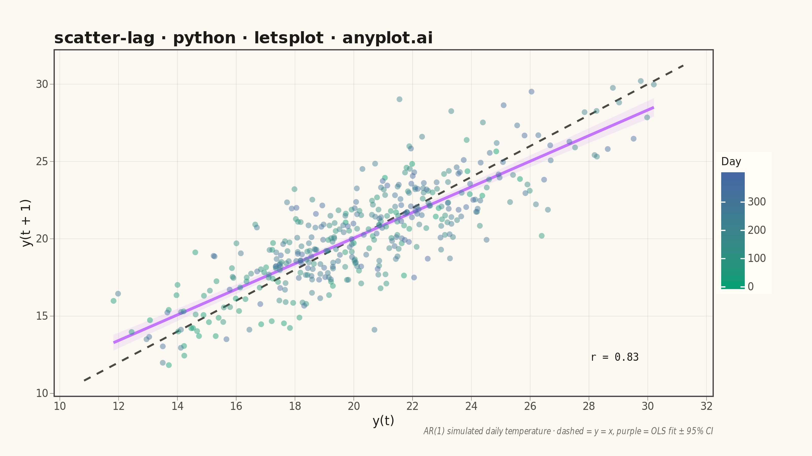
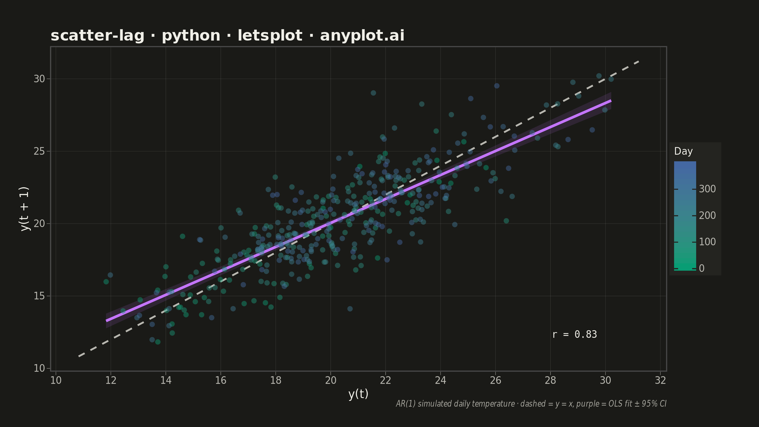
A lag plot is a scatter plot of a time series against a lagged version of itself, plotting y(t) on the x-axis versus y(t+k) on the y-axis for a given lag order k. If the data is purely random, points scatter uniformly with no visible structure; if autocorrelation is present, distinctive patterns emerge — linear clusters for autoregressive processes, elliptical shapes for seasonal data. This provides a quick visual diagnostic for time series dependence, complementing numerical tools like ACF/PACF.
""" anyplot.ai
scatter-lag: Lag Plot for Time Series Autocorrelation Diagnosis
Library: letsplot 4.10.1 | Python 3.13.14
Quality: 89/100 | Updated: 2026-06-24
"""

import os

import numpy as np
import pandas as pd
from lets_plot import *


LetsPlot.setup_html()

# Theme-adaptive chrome — Imprint palette
THEME = os.getenv("ANYPLOT_THEME", "light")
PAGE_BG = "#FAF8F1" if THEME == "light" else "#1A1A17"
ELEVATED_BG = "#FFFDF6" if THEME == "light" else "#242420"
INK = "#1A1A17" if THEME == "light" else "#F0EFE8"
INK_SOFT = "#4A4A44" if THEME == "light" else "#B8B7B0"
INK_MUTED = "#6B6A63" if THEME == "light" else "#A8A79F"
GRID = "rgba(26,26,23,0.15)" if THEME == "light" else "rgba(240,239,232,0.15)"

# Imprint sequential colormap: brand-green → blue (single-polarity continuous)
SEQ_LOW = "#009E73"  # position 1
SEQ_HIGH = "#4467A3"  # position 3

# Data: AR(1) temperature process, phi=0.85 → strong positive autocorrelation
np.random.seed(42)
n = 400
lag = 1
phi = 0.85
innovations = np.random.randn(n) * 2.0

temperature = np.zeros(n)
temperature[0] = 20.0
for i in range(1, n):
    temperature[i] = phi * temperature[i - 1] + (1 - phi) * 20.0 + innovations[i]

# Lag plot data: y(t) vs y(t+lag)
value_t = temperature[:-lag]
value_t_lag = temperature[lag:]
time_index = np.arange(len(value_t))
df = pd.DataFrame({"value_t": value_t, "value_t_lag": value_t_lag, "day": time_index})

# Autocorrelation at lag 1
r = np.corrcoef(value_t, value_t_lag)[0, 1]

# Diagonal reference line (y = x)
ref_min = min(value_t.min(), value_t_lag.min()) - 1
ref_max = max(value_t.max(), value_t_lag.max()) + 1
ref_df = pd.DataFrame({"x": [ref_min, ref_max], "y": [ref_min, ref_max]})

# Correlation annotation: placed at bottom-right where point density is low
anno_df = pd.DataFrame({"x": [ref_max - 1.5], "y": [ref_min + 1.5], "label": [f"r = {r:.2f}"]})

plot = (
    ggplot(df, aes(x="value_t", y="value_t_lag", color="day"))
    # Reference diagonal: y = x (perfect lag-1 autocorrelation)
    + geom_line(
        aes(x="x", y="y"),
        data=ref_df,
        color=INK_SOFT,
        size=0.8,
        linetype="dashed",
        inherit_aes=False,
    )
    # OLS regression line — letsplot-native geom_smooth with confidence band
    + geom_smooth(
        aes(x="value_t", y="value_t_lag"),
        data=df,
        method="lm",
        color="#C475FD",
        fill="#C475FD",
        size=1.2,
        alpha=0.12,
        inherit_aes=False,
    )
    # Data points colored by temporal order (Imprint sequential: green → blue)
    + geom_point(
        size=2.5,
        alpha=0.45,
        shape=16,
        tooltips=layer_tooltips()
        .line("Day|@day")
        .line("y(t)|@{value_t}{.2f}")
        .line("y(t+1)|@{value_t_lag}{.2f}"),
    )
    # Correlation coefficient annotation
    + geom_text(
        aes(x="x", y="y", label="label"),
        data=anno_df,
        size=5,
        color=INK,
        family="monospace",
        hjust=1.0,
        inherit_aes=False,
    )
    + scale_color_gradient(
        low=SEQ_LOW, high=SEQ_HIGH, name="Day"
    )
    + labs(
        x="y(t)",
        y=f"y(t + {lag})",
        title="scatter-lag · python · letsplot · anyplot.ai",
        caption="AR(1) simulated daily temperature · dashed = y = x, purple = OLS fit ± 95% CI",
    )
    + ggsize(800, 450)
    + theme_minimal()
    + theme(
        plot_background=element_rect(fill=PAGE_BG, color=PAGE_BG),
        panel_background=element_rect(fill=PAGE_BG),
        panel_grid_major=element_line(color=GRID, size=0.3),
        panel_grid_minor=element_blank(),
        axis_text=element_text(size=10, color=INK_SOFT),
        axis_title=element_text(size=12, color=INK),
        axis_line=element_line(color=INK_SOFT),
        axis_ticks=element_line(color=INK_SOFT, size=0.3),
        plot_title=element_text(size=16, color=INK, face="bold"),
        plot_caption=element_text(size=8, color=INK_MUTED, face="italic"),
        legend_background=element_rect(fill=ELEVATED_BG, color=INK_SOFT),
        legend_title=element_text(size=10, color=INK),
        legend_text=element_text(size=10, color=INK_SOFT),
        plot_margin=[30, 40, 20, 20],
    )
)

# Save PNG (3200×1800) and interactive HTML
ggsave(plot, f"plot-{THEME}.png", path=".", scale=4)
ggsave(plot, f"plot-{THEME}.html", path=".")
Runnable source as JSON, for any HTTP client: https://api.anyplot.ai/specs/scatter-lag/letsplot/code. Any spec id and library id listed in llms-full.txt fit the same URL shape; every URL below is complete and callable.
{
  "spec_id": "scatter-lag",
  "language": "python",
  "library": "letsplot",
  "page": "https://anyplot.ai/scatter-lag/python/letsplot",
  "hub": "https://anyplot.ai/scatter-lag",
  "code_json": "https://api.anyplot.ai/specs/scatter-lag/letsplot/code",
  "spec_json": "https://api.anyplot.ai/specs/scatter-lag",
  "render_light_png": "https://storage.googleapis.com/anyplot-images/plots/scatter-lag/python/letsplot/plot-light.png",
  "render_dark_png": "https://storage.googleapis.com/anyplot-images/plots/scatter-lag/python/letsplot/plot-dark.png",
  "interactive_light_html": "https://storage.googleapis.com/anyplot-images/plots/scatter-lag/python/letsplot/plot-light.html",
  "interactive_dark_html": "https://storage.googleapis.com/anyplot-images/plots/scatter-lag/python/letsplot/plot-dark.html",
  "quality_score": 89.0,
  "license": "MIT",
  "guide": "https://anyplot.ai/llms.txt"
}
Part of Lag Plot for Time Series Autocorrelation Diagnosis on anyplot.ai.