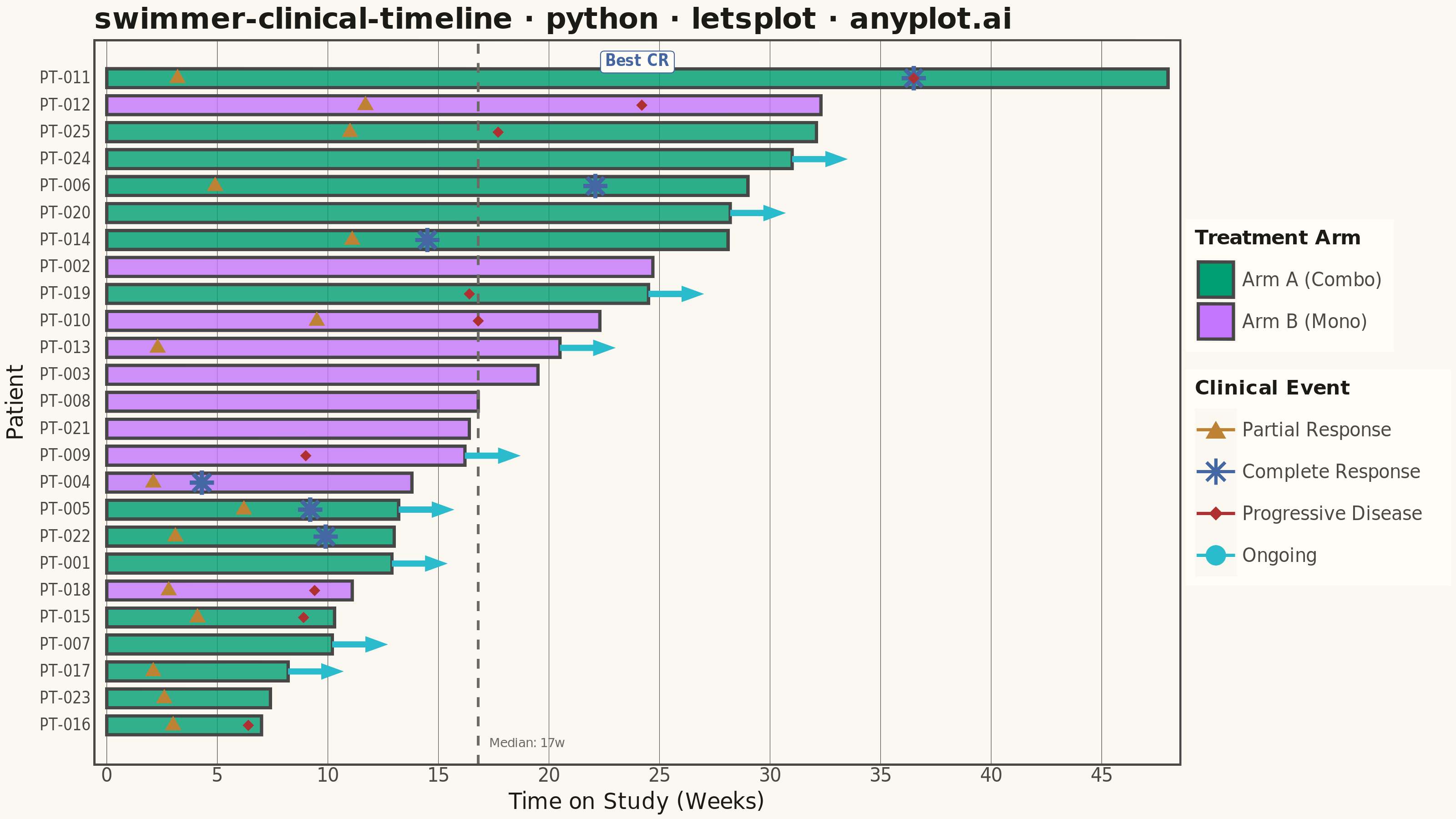
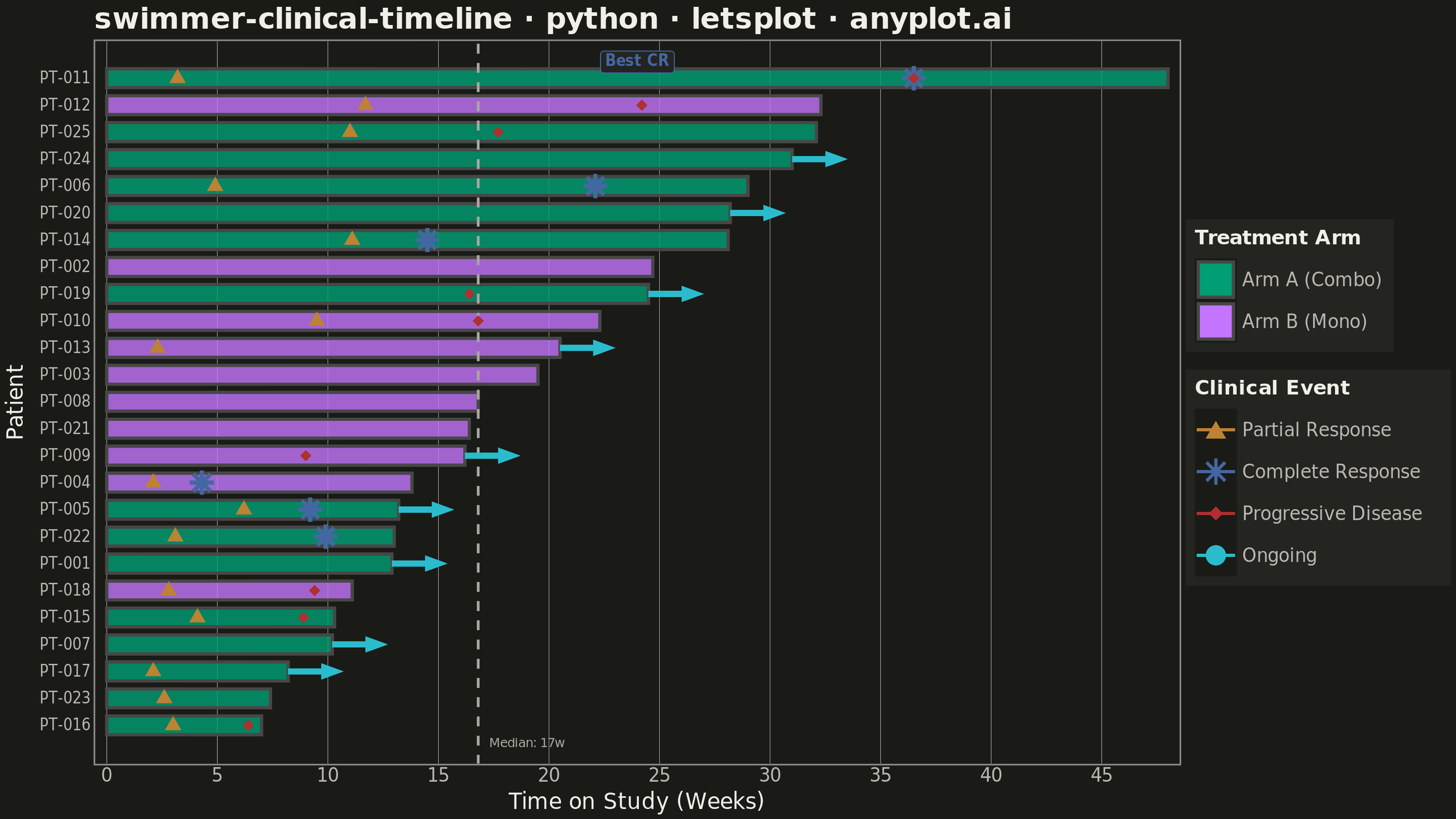
A swimmer plot displays individual patient timelines as horizontal bars, commonly used in clinical oncology to visualize treatment duration, response events, and disease progression across a study cohort. Each bar represents one patient, typically sorted by treatment duration, with symbols or color changes marking key clinical events such as partial response, complete response, or progressive disease. This plot is standard in clinical trial publications and regulatory submissions for conveying patient-level longitudinal outcomes at a glance.
""" anyplot.ai
swimmer-clinical-timeline: Swimmer Plot for Clinical Trial Timelines
Library: letsplot 4.10.1 | Python 3.13.13
Quality: 88/100 | Updated: 2026-06-08
"""

import os

import numpy as np
import pandas as pd
from lets_plot import *


LetsPlot.setup_html()

# Theme tokens — see prompts/default-style-guide.md
THEME = os.getenv("ANYPLOT_THEME", "light")
PAGE_BG = "#FAF8F1" if THEME == "light" else "#1A1A17"
ELEVATED_BG = "#FFFDF6" if THEME == "light" else "#242420"
INK = "#1A1A17" if THEME == "light" else "#F0EFE8"
INK_SOFT = "#4A4A44" if THEME == "light" else "#B8B7B0"
INK_MUTED = "#6B6A63" if THEME == "light" else "#A8A79F"

# Imprint palette — hybrid-v3 sort order
IMPRINT_PALETTE = [
    "#009E73",  # 1 brand green
    "#C475FD",  # 2 lavender
    "#4467A3",  # 3 blue
    "#BD8233",  # 4 ochre
    "#AE3030",  # 5 matte red (semantic: bad/loss/progression)
    "#2ABCCD",  # 6 cyan
    "#954477",  # 7 rose
    "#99B314",  # 8 lime
]

# Data — Simulated Phase II Oncology Trial (25 patients, 2 treatment arms)
np.random.seed(42)

n_patients = 25
patient_ids = [f"PT-{i + 1:03d}" for i in range(n_patients)]
arms = np.random.choice(["Arm A (Combo)", "Arm B (Mono)"], n_patients, p=[0.52, 0.48])
durations = np.round(np.random.gamma(shape=4, scale=5, size=n_patients), 1)
durations = np.clip(durations, 3, 48)

events_list = []
for i in range(n_patients):
    pid = patient_ids[i]
    dur = durations[i]

    if np.random.rand() < 0.65:
        t = np.round(np.random.uniform(2, min(dur * 0.5, 12)), 1)
        events_list.append({"patient_id": pid, "time": t, "event_type": "Partial Response"})

        cr_upper = min(dur * 0.8, dur - 1)
        if np.random.rand() < 0.35 and cr_upper > t + 2:
            t_cr = np.round(np.random.uniform(t + 2, cr_upper), 1)
            events_list.append({"patient_id": pid, "time": t_cr, "event_type": "Complete Response"})

    if np.random.rand() < 0.4:
        t_pd = np.round(np.random.uniform(dur * 0.5, dur), 1)
        events_list.append({"patient_id": pid, "time": t_pd, "event_type": "Progressive Disease"})

    if np.random.rand() < 0.3:
        events_list.append({"patient_id": pid, "time": dur, "event_type": "Ongoing"})

events_df = pd.DataFrame(events_list)

# Sort patients by duration (shortest at bottom, longest at top)
bar_df = pd.DataFrame({"patient_id": patient_ids, "duration": durations, "arm": arms})
bar_df = bar_df.sort_values("duration", ascending=True).reset_index(drop=True)
bar_df["y_pos"] = range(len(bar_df))

# Map y positions to events
y_map = dict(zip(bar_df["patient_id"], bar_df["y_pos"]))
events_df["y_pos"] = events_df["patient_id"].map(y_map)

# Median reference line
median_duration = float(np.median(durations))

# Bar geometry helpers
bar_df["y_min"] = bar_df["y_pos"] - 0.35
bar_df["y_max"] = bar_df["y_pos"] + 0.35
bar_df["x_min"] = 0.0

# Complete responders — for highlight bands and best-CR annotation
cr_patients = set(events_df[events_df["event_type"] == "Complete Response"]["patient_id"])
bar_df["has_cr"] = bar_df["patient_id"].isin(cr_patients)
cr_bar = bar_df[bar_df["has_cr"]].sort_values("duration", ascending=False)
best_responder = cr_bar.iloc[0] if len(cr_bar) > 0 else None

# Ongoing patients — separate arrow segments (spec: arrow = still on study)
ongoing_pids = set(events_df[events_df["event_type"] == "Ongoing"]["patient_id"])
ongoing_df = bar_df[bar_df["patient_id"].isin(ongoing_pids)][["y_pos", "duration"]].copy()
ongoing_df["x_end"] = ongoing_df["duration"] + 2.5
ongoing_df["event_type"] = "Ongoing"

# Non-ongoing events for point markers
point_events_df = events_df[events_df["event_type"] != "Ongoing"].copy()

# Median annotation
median_label_df = pd.DataFrame(
    {"x": [median_duration + 0.5], "y": [-0.65], "label": [f"Median: {median_duration:.0f}w"]}
)

title = "swimmer-clinical-timeline · python · letsplot · anyplot.ai"

# Plot
plot = (
    ggplot()
    # Subtle CR highlight bands using Imprint green at low alpha
    + geom_rect(
        aes(xmin="x_min", xmax="duration", ymin="y_min", ymax="y_max"),
        data=bar_df[bar_df["has_cr"]],
        fill=IMPRINT_PALETTE[0],
        alpha=0.12,
    )
    # Treatment duration bars — fill by arm with interactive tooltips (lets-plot feature)
    + geom_rect(
        aes(xmin="x_min", xmax="duration", ymin="y_min", ymax="y_max", fill="arm"),
        data=bar_df,
        alpha=0.8,
        tooltips=layer_tooltips().line("@patient_id").line("Arm: @arm").line("Duration: @duration wks"),
    )
    # Median reference line
    + geom_vline(xintercept=median_duration, color=INK_MUTED, linetype="dashed", size=0.6)
    # Clinical event markers with interactive tooltips (lets-plot feature)
    + geom_point(
        aes(x="time", y="y_pos", color="event_type", shape="event_type"),
        data=point_events_df,
        size=4,
        stroke=1.0,
        tooltips=layer_tooltips().line("@patient_id").line("@event_type").line("Week @time"),
    )
    # Median label annotation
    + geom_text(aes(x="x", y="y", label="label"), data=median_label_df, size=3.5, hjust=0, color=INK_MUTED)
    # Arm fill scale — Imprint positions 1 & 2 (first series always #009E73)
    + scale_fill_manual(
        name="Treatment Arm", values={"Arm A (Combo)": IMPRINT_PALETTE[0], "Arm B (Mono)": IMPRINT_PALETTE[1]}
    )
    # Event color scale — semantic mapping: red for progression (bad outcome), cyan for ongoing
    + scale_color_manual(
        name="Clinical Event",
        values={
            "Partial Response": IMPRINT_PALETTE[3],
            "Complete Response": IMPRINT_PALETTE[2],
            "Progressive Disease": IMPRINT_PALETTE[4],
            "Ongoing": IMPRINT_PALETTE[5],
        },
    )
    + scale_shape_manual(
        name="Clinical Event", values={"Partial Response": 17, "Complete Response": 8, "Progressive Disease": 18}
    )
    + scale_y_continuous(breaks=list(bar_df["y_pos"]), labels=list(bar_df["patient_id"]), expand=[0.03, 0.05])
    + scale_x_continuous(name="Time on Study (Weeks)", expand=[0.01, 0.08])
    + labs(title=title, y="Patient")
    + theme_minimal()
    + theme(
        plot_background=element_rect(fill=PAGE_BG, color=PAGE_BG),
        panel_background=element_rect(fill=PAGE_BG),
        plot_title=element_text(size=16, face="bold", color=INK),
        axis_title=element_text(size=12, color=INK),
        axis_text_x=element_text(size=10, color=INK_SOFT),
        axis_text_y=element_text(size=8, color=INK_SOFT),
        legend_title=element_text(size=11, face="bold", color=INK),
        legend_text=element_text(size=10, color=INK_SOFT),
        legend_background=element_rect(fill=ELEVATED_BG, color=INK_SOFT),
        legend_position="right",
        panel_grid_major_x=element_line(color=INK_SOFT, size=0.25),
        panel_grid_major_y=element_blank(),
        panel_grid_minor=element_blank(),
        axis_line=element_line(color=INK_SOFT),
        panel_border=element_rect(color=INK_SOFT, size=0.4),
    )
    + ggsize(800, 450)
)

# Ongoing patient arrows — mapped via color="event_type" so "Ongoing" appears in the legend
if len(ongoing_df) > 0:
    plot = plot + geom_segment(
        aes(x="duration", xend="x_end", y="y_pos", yend="y_pos", color="event_type"),
        data=ongoing_df,
        size=1.5,
        arrow=arrow(type="closed", angle=20, length=6),
    )

# Best CR annotation — geom_label gives a boxed callout for visual prominence
if best_responder is not None:
    plot = plot + geom_label(
        aes(x="x", y="y", label="label"),
        data=pd.DataFrame(
            {
                "x": [float(best_responder["duration"]) * 0.5],
                "y": [float(best_responder["y_pos"]) + 0.6],
                "label": ["Best CR"],
            }
        ),
        size=4,
        hjust=0.5,
        color=IMPRINT_PALETTE[2],
        fill=ELEVATED_BG,
        fontface="bold",
        label_size=0.5,
    )

# Save — theme-suffixed as required by pipeline; path="." writes to current dir
ggsave(plot, f"plot-{THEME}.png", scale=4, path=".")
ggsave(plot, f"plot-{THEME}.html", path=".")

if os.path.exists("lets-plot-images"):
    import shutil

    shutil.rmtree("lets-plot-images")
Runnable source as JSON, for any HTTP client: https://api.anyplot.ai/specs/swimmer-clinical-timeline/letsplot/code. Any spec id and library id listed in llms-full.txt fit the same URL shape; every URL below is complete and callable.
{
  "spec_id": "swimmer-clinical-timeline",
  "language": "python",
  "library": "letsplot",
  "page": "https://anyplot.ai/swimmer-clinical-timeline/python/letsplot",
  "hub": "https://anyplot.ai/swimmer-clinical-timeline",
  "code_json": "https://api.anyplot.ai/specs/swimmer-clinical-timeline/letsplot/code",
  "spec_json": "https://api.anyplot.ai/specs/swimmer-clinical-timeline",
  "render_light_png": "https://storage.googleapis.com/anyplot-images/plots/swimmer-clinical-timeline/python/letsplot/plot-light.png",
  "render_dark_png": "https://storage.googleapis.com/anyplot-images/plots/swimmer-clinical-timeline/python/letsplot/plot-dark.png",
  "interactive_light_html": "https://storage.googleapis.com/anyplot-images/plots/swimmer-clinical-timeline/python/letsplot/plot-light.html",
  "interactive_dark_html": "https://storage.googleapis.com/anyplot-images/plots/swimmer-clinical-timeline/python/letsplot/plot-dark.html",
  "quality_score": 88.0,
  "license": "MIT",
  "guide": "https://anyplot.ai/llms.txt"
}
Part of Swimmer Plot for Clinical Trial Timelines on anyplot.ai.