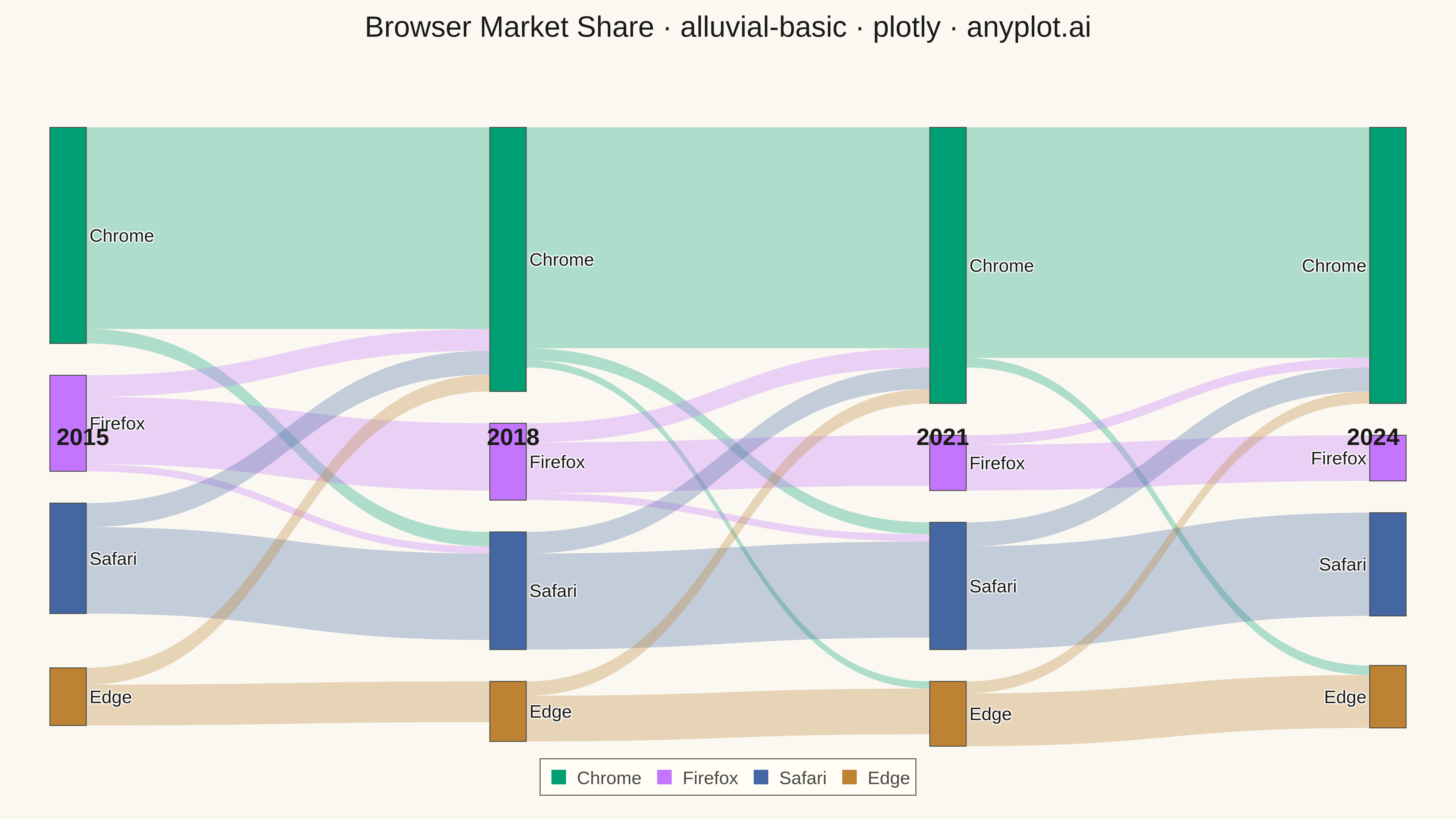
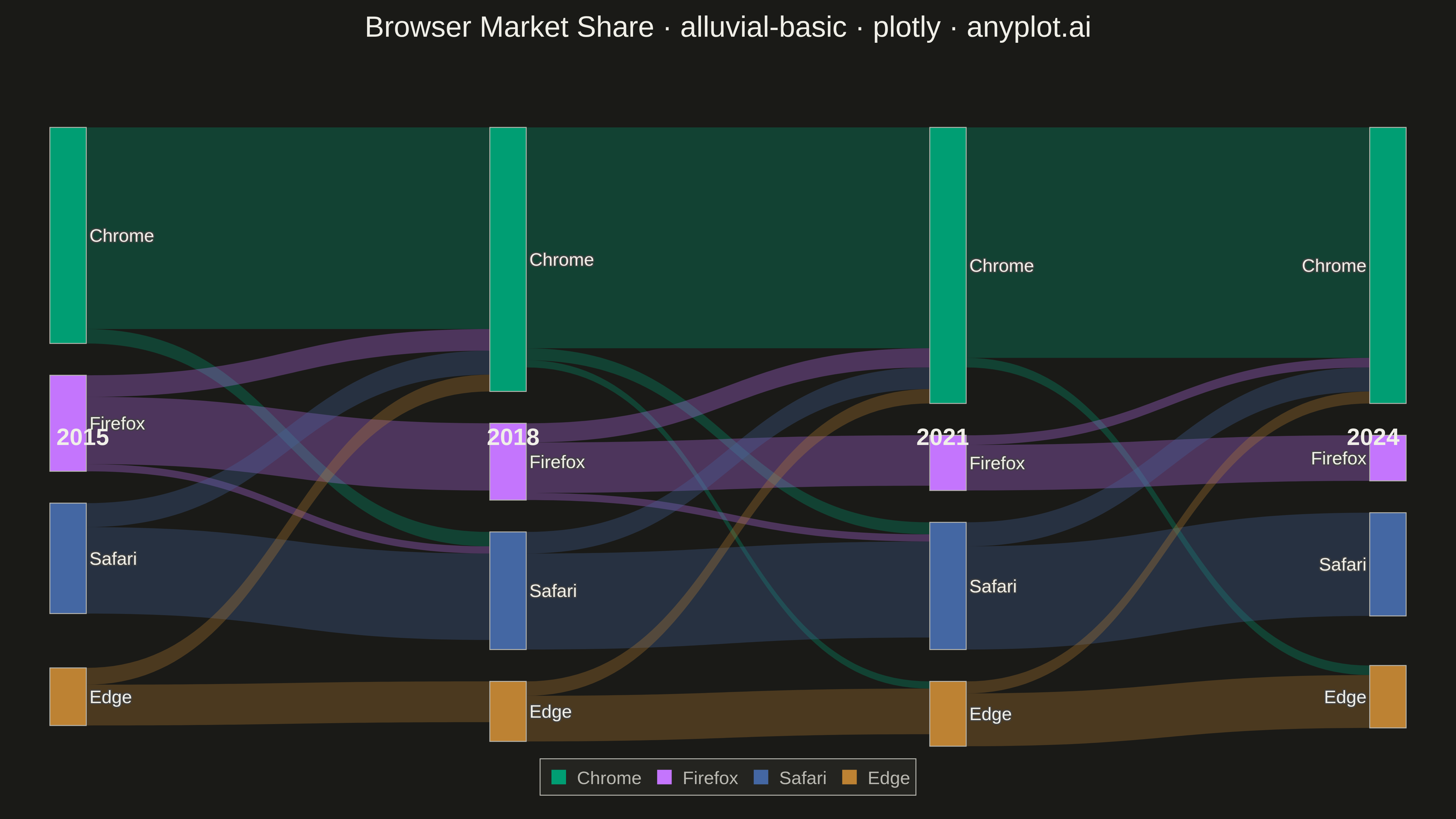
An alluvial diagram visualizes how entities flow or transition between discrete categories across multiple time points or ordered stages. Unlike general Sankey diagrams, alluvial diagrams enforce strict vertical ordering where each column represents a specific time step or category dimension. Bands connect related segments to show how proportions shift over time, making it ideal for tracking structural changes, migrations, and transitions in categorical data.
""" anyplot.ai
alluvial-basic: Basic Alluvial Diagram
Library: plotly 6.7.0 | Python 3.13.13
Quality: 93/100 | Updated: 2026-05-09
"""

import os

import plotly.graph_objects as go


# Theme tokens
THEME = os.getenv("ANYPLOT_THEME", "light")
PAGE_BG = "#FAF8F1" if THEME == "light" else "#1A1A17"
ELEVATED_BG = "#FFFDF6" if THEME == "light" else "#242420"
INK = "#1A1A17" if THEME == "light" else "#F0EFE8"
INK_SOFT = "#4A4A44" if THEME == "light" else "#B8B7B0"
GRID = "rgba(26,26,23,0.10)" if THEME == "light" else "rgba(240,239,232,0.10)"

# Okabe-Ito palette
IMPRINT = ["#009E73", "#C475FD", "#4467A3", "#BD8233"]

# Data: Browser market share evolution 2015-2024
# Shows how different browsers have gained/lost market share over time
time_points = ["2015", "2018", "2021", "2024"]
categories = ["Chrome", "Firefox", "Safari", "Edge"]

# Node labels and colors
node_labels = categories * 4
category_colors = {cat: IMPRINT[i] for i, cat in enumerate(categories)}
node_colors = [category_colors[cat] for cat in node_labels]

# X positions: 4 time points evenly spaced
x_positions = []
for t in range(4):
    x_positions.extend([0.01 + (t / 3) * 0.98] * 4)

# Y positions: 4 categories evenly spaced vertically
y_positions = [0.15, 0.42, 0.68, 0.92] * 4

# Define flows: realistic browser market share transitions
flows_data = [
    # 2015 -> 2018: Chrome growth, Firefox decline
    (0, 0, 1, 0, 420),  # Chrome stays Chrome
    (0, 0, 1, 2, 30),  # Chrome to Safari
    (0, 1, 1, 1, 140),  # Firefox stays Firefox
    (0, 1, 1, 0, 45),  # Firefox to Chrome
    (0, 1, 1, 2, 15),  # Firefox to Safari
    (0, 2, 1, 2, 180),  # Safari stays Safari
    (0, 2, 1, 0, 50),  # Safari to Chrome
    (0, 3, 1, 3, 85),  # Edge stays Edge
    (0, 3, 1, 0, 35),  # Edge to Chrome
    # 2018 -> 2021: Chrome dominance, Firefox further decline
    (1, 0, 2, 0, 460),  # Chrome stays Chrome
    (1, 0, 2, 2, 25),  # Chrome to Safari
    (1, 0, 2, 3, 15),  # Chrome to Edge
    (1, 1, 2, 1, 105),  # Firefox stays Firefox
    (1, 1, 2, 0, 40),  # Firefox to Chrome
    (1, 1, 2, 2, 15),  # Firefox to Safari
    (1, 2, 2, 2, 200),  # Safari stays Safari
    (1, 2, 2, 0, 45),  # Safari to Chrome
    (1, 3, 2, 3, 95),  # Edge stays Edge
    (1, 3, 2, 0, 30),  # Edge to Chrome
    # 2021 -> 2024: Consolidation, Chrome dominance continues
    (2, 0, 3, 0, 480),  # Chrome stays Chrome
    (2, 0, 3, 3, 20),  # Chrome to Edge
    (2, 1, 3, 1, 95),  # Firefox stays Firefox
    (2, 1, 3, 0, 20),  # Firefox to Chrome
    (2, 2, 3, 2, 215),  # Safari stays Safari
    (2, 2, 3, 0, 50),  # Safari to Chrome
    (2, 3, 3, 3, 110),  # Edge stays Edge
    (2, 3, 3, 0, 25),  # Edge to Chrome
]

# Convert to source/target indices
sources = []
targets = []
values = []
link_colors = []

for src_time, src_cat, tgt_time, tgt_cat, value in flows_data:
    src_idx = src_time * 4 + src_cat
    tgt_idx = tgt_time * 4 + tgt_cat
    sources.append(src_idx)
    targets.append(tgt_idx)
    values.append(value)
    # Use source category color with transparency
    base_color = IMPRINT[src_cat]
    r = int(base_color[1:3], 16)
    g = int(base_color[3:5], 16)
    b = int(base_color[5:7], 16)
    link_colors.append(f"rgba({r},{g},{b},0.3)")

# Create Sankey diagram
fig = go.Figure(
    data=[
        go.Sankey(
            arrangement="snap",
            node=dict(
                pad=35,
                thickness=40,
                line=dict(color=INK_SOFT, width=1),
                label=node_labels,
                color=node_colors,
                x=x_positions,
                y=y_positions,
                hovertemplate="<b>%{label}</b><br>Market Share: %{value:,}%<extra></extra>",
            ),
            link=dict(
                source=sources,
                target=targets,
                value=values,
                color=link_colors,
                hovertemplate="<b>%{source.label}</b> (%{source.customdata})<br>"
                + "→ <b>%{target.label}</b><br>"
                + "Share: <b>%{value}%</b><extra></extra>",
            ),
        )
    ]
)

# Add time point labels
for i, year in enumerate(time_points):
    fig.add_annotation(
        x=i / 3, y=1.12, text=f"<b>{year}</b>", showarrow=False, font=dict(size=26, color=INK), xanchor="center"
    )

# Add legend
for cat, color in category_colors.items():
    fig.add_trace(
        go.Scatter(
            x=[None],
            y=[None],
            mode="markers",
            marker=dict(size=18, color=color, symbol="square"),
            name=cat,
            showlegend=True,
        )
    )

# Update layout with theme-adaptive colors
fig.update_layout(
    title=dict(
        text="Browser Market Share · alluvial-basic · plotly · anyplot.ai",
        font=dict(size=32, color=INK),
        x=0.5,
        xanchor="center",
        y=0.98,
    ),
    font=dict(size=20, color=INK),
    paper_bgcolor=PAGE_BG,
    plot_bgcolor=PAGE_BG,
    margin=dict(l=60, r=60, t=140, b=80),
    legend=dict(
        orientation="h",
        yanchor="bottom",
        y=-0.08,
        xanchor="center",
        x=0.5,
        font=dict(size=20, color=INK_SOFT),
        bgcolor=ELEVATED_BG,
        bordercolor=INK_SOFT,
        borderwidth=1,
    ),
    xaxis=dict(visible=False),
    yaxis=dict(visible=False),
)

# Save outputs
fig.write_image(f"plot-{THEME}.png", width=1600, height=900, scale=3)
fig.write_html(f"plot-{THEME}.html", include_plotlyjs="cdn")
Runnable source as JSON, for any HTTP client: https://api.anyplot.ai/specs/alluvial-basic/plotly/code. Any spec id and library id listed in llms-full.txt fit the same URL shape; every URL below is complete and callable.
{
  "spec_id": "alluvial-basic",
  "language": "python",
  "library": "plotly",
  "page": "https://anyplot.ai/alluvial-basic/python/plotly",
  "hub": "https://anyplot.ai/alluvial-basic",
  "code_json": "https://api.anyplot.ai/specs/alluvial-basic/plotly/code",
  "spec_json": "https://api.anyplot.ai/specs/alluvial-basic",
  "render_light_png": "https://storage.googleapis.com/anyplot-images/plots/alluvial-basic/python/plotly/plot-light.png",
  "render_dark_png": "https://storage.googleapis.com/anyplot-images/plots/alluvial-basic/python/plotly/plot-dark.png",
  "interactive_light_html": "https://storage.googleapis.com/anyplot-images/plots/alluvial-basic/python/plotly/plot-light.html",
  "interactive_dark_html": "https://storage.googleapis.com/anyplot-images/plots/alluvial-basic/python/plotly/plot-dark.html",
  "quality_score": 93.0,
  "license": "MIT",
  "guide": "https://anyplot.ai/llms.txt"
}
Part of Basic Alluvial Diagram on anyplot.ai.