The same plot in 14 other libraries — Python: Altair, Bokeh, lets-plot, Matplotlib, Plotly, plotnine, Pygal, Seaborn; Julia: Makie.jl; JavaScript: Chart.js, D3.js, Apache ECharts, Highcharts, MUI X Charts. Compare all 15 side by side: Cumulative Flow Diagram for Workflow Analytics in Python, R, Julia and JavaScript.
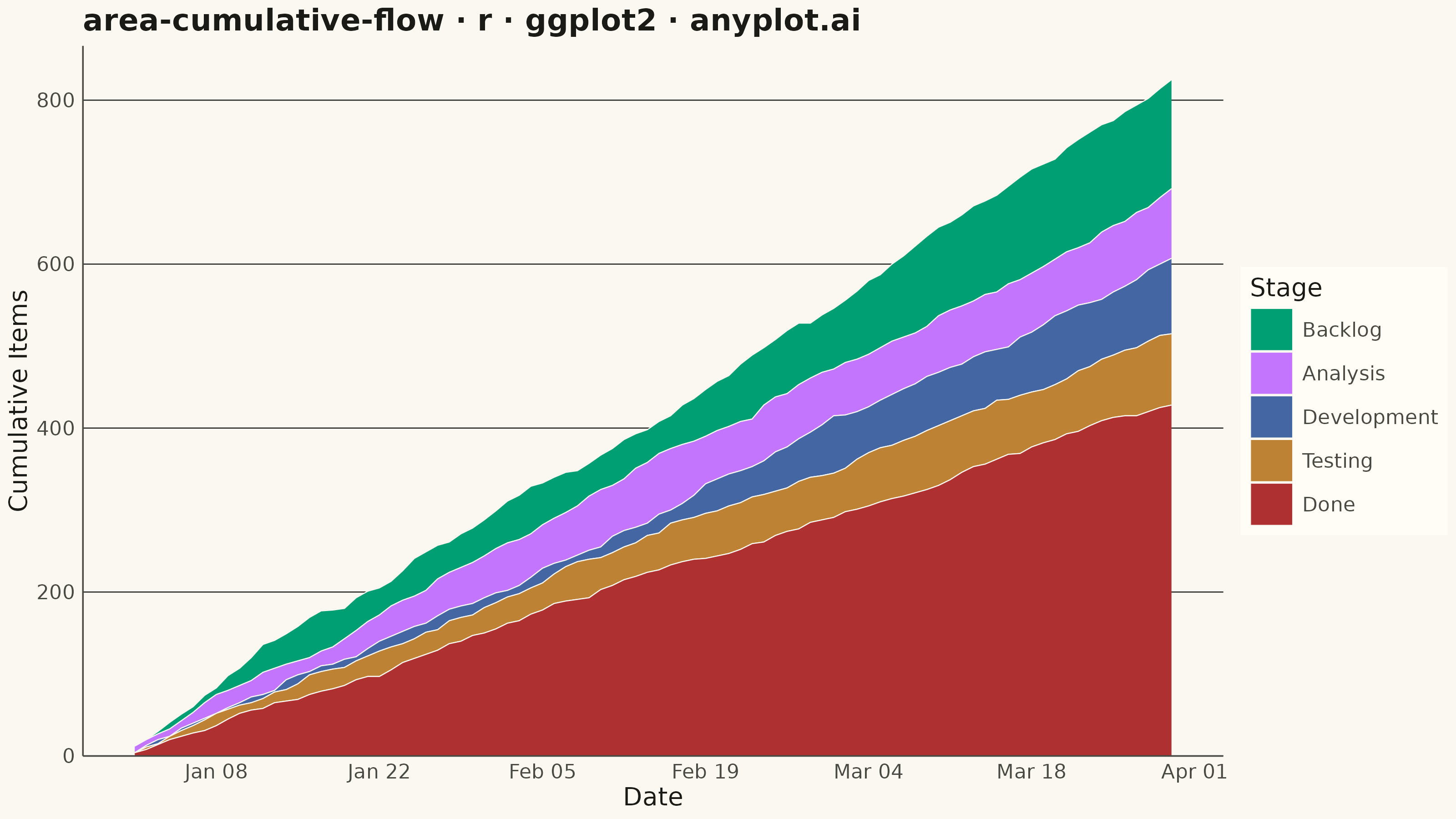
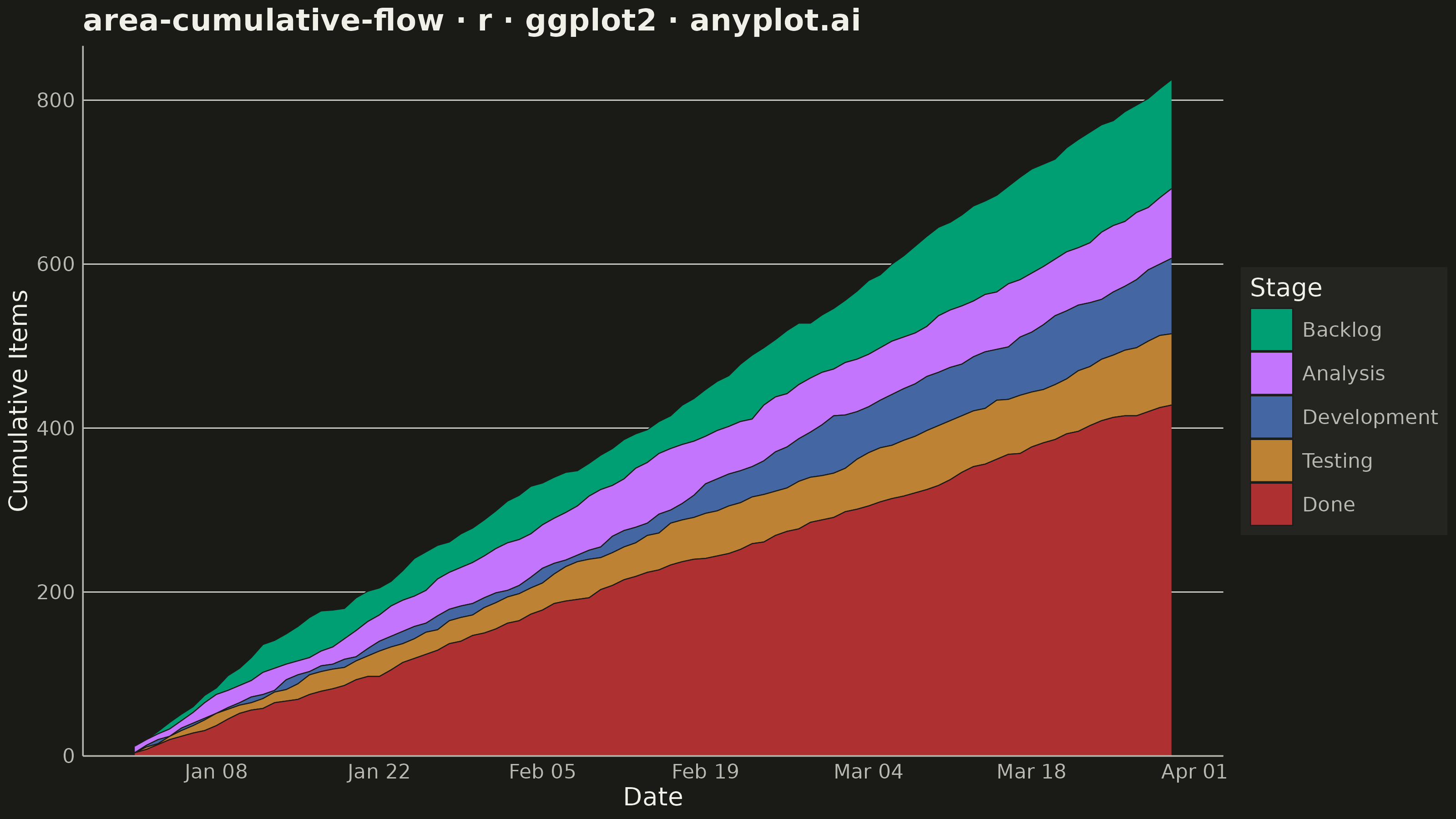
A cumulative flow diagram (CFD) displays the cumulative count of items in each workflow stage as stacked areas over time. Each band represents a stage (e.g., Backlog, In Progress, Done), and the vertical distance between two adjacent band boundaries shows the number of items currently in that stage (work-in-progress). This is a key visualization in Lean and Agile project management for identifying bottlenecks, monitoring throughput, and assessing flow efficiency across a delivery pipeline.
#' anyplot.ai
#' area-cumulative-flow: Cumulative Flow Diagram for Workflow Analytics
#' Library: ggplot2 3.5.1 | R 4.4.1
#' Quality: 90/100 | Created: 2026-08-18

library(ggplot2)
library(dplyr)
library(tidyr)
library(scales)
library(ragg)

set.seed(42)

# --- Theme tokens -------------------------------------------------------------
THEME       <- Sys.getenv("ANYPLOT_THEME", "light")
PAGE_BG     <- if (THEME == "light") "#FAF8F1" else "#1A1A17"
ELEVATED_BG <- if (THEME == "light") "#FFFDF6" else "#242420"
INK         <- if (THEME == "light") "#1A1A17" else "#F0EFE8"
INK_SOFT    <- if (THEME == "light") "#4A4A44" else "#B8B7B0"

IMPRINT_PALETTE <- c(
  "#009E73", # 1 - Backlog (brand green, always first series)
  "#C475FD", # 2 - Analysis
  "#4467A3", # 3 - Development
  "#BD8233", # 4 - Testing
  "#AE3030"  # 5 - Done
)

# --- Data: 90-day Kanban board cumulative flow ---------------------------------
stages   <- c("Backlog", "Analysis", "Development", "Testing", "Done")
n_stages <- length(stages)
n_days   <- 90
dates    <- seq(as.Date("2024-01-01"), by = "day", length.out = n_days)

# Daily items entering the pipeline
arrivals <- pmax(0, round(rnorm(n_days, mean = 9, sd = 3)))

cum_matrix <- matrix(0, nrow = n_days, ncol = n_stages)
cum_matrix[, 1] <- cumsum(arrivals)

# Each downstream stage absorbs a capped number of items per day from the
# stage upstream of it. Capacity tightens down the pipeline (8/7/6/5), so
# every stage's queue grows over the series — demand consistently outpaces
# throughput, the classic CFD signature of a pipeline running behind.
throughput_lambda <- c(8, 7, 6, 5)
for (i in 2:n_stages) {
  capacity <- rpois(n_days, lambda = throughput_lambda[i - 1])
  cur <- 0
  for (t in seq_len(n_days)) {
    cur <- min(cum_matrix[t, i - 1], cur + capacity[t])
    cum_matrix[t, i] <- cur
  }
}

df <- as.data.frame(cum_matrix)
colnames(df) <- stages
df$date <- dates
df <- as_tibble(df)

df_long <- df %>%
  pivot_longer(cols = all_of(stages), names_to = "stage", values_to = "cum_count") %>%
  mutate(stage = factor(stage, levels = stages))

# WIP per stage is the vertical gap between its cumulative curve and the next
# stage's cumulative curve (items that entered this stage but haven't left it).
df_bands <- df_long %>%
  arrange(date, stage) %>%
  group_by(date) %>%
  mutate(ymax = cum_count, ymin = lead(cum_count, default = 0)) %>%
  ungroup()

# --- Plot -----------------------------------------------------------------------
anyplot_theme <- theme_minimal(base_size = 7) +
  theme(
    plot.background   = element_rect(fill = PAGE_BG, color = PAGE_BG),
    panel.background  = element_rect(fill = PAGE_BG, color = NA),
    panel.grid.major.x = element_blank(),
    panel.grid.minor  = element_blank(),
    panel.grid.major.y = element_line(color = INK, linewidth = 0.2),
    axis.line.x       = element_line(color = INK_SOFT, linewidth = 0.3),
    axis.line.y       = element_line(color = INK_SOFT, linewidth = 0.3),
    axis.ticks        = element_blank(),
    axis.title        = element_text(color = INK, size = 10),
    axis.text         = element_text(color = INK_SOFT, size = 8),
    plot.title        = element_text(color = INK, size = 12, face = "bold"),
    legend.background = element_rect(fill = ELEVATED_BG, color = NA),
    legend.text       = element_text(color = INK_SOFT, size = 8),
    legend.title      = element_text(color = INK, size = 10),
    legend.position   = "right"
  )

p <- ggplot(df_bands, aes(x = date, ymin = ymin, ymax = ymax, fill = stage)) +
  geom_ribbon(color = PAGE_BG, linewidth = 0.2) +
  scale_fill_manual(values = IMPRINT_PALETTE, name = "Stage") +
  scale_x_date(date_breaks = "2 weeks", date_labels = "%b %d") +
  scale_y_continuous(labels = scales::comma, expand = expansion(mult = c(0, 0.05))) +
  labs(
    title = "area-cumulative-flow · r · ggplot2 · anyplot.ai",
    x     = "Date",
    y     = "Cumulative Items"
  ) +
  anyplot_theme

# --- Save -------------------------------------------------------------------
ggsave(
  filename = sprintf("plot-%s.png", THEME),
  plot     = p,
  device   = ragg::agg_png,
  width    = 8,
  height   = 4.5,
  units    = "in",
  dpi      = 400
)
Runnable source as JSON, for any HTTP client: https://api.anyplot.ai/specs/area-cumulative-flow/ggplot2/code. Any spec id and library id listed in llms-full.txt fit the same URL shape; every URL below is complete and callable.
{
  "spec_id": "area-cumulative-flow",
  "language": "r",
  "library": "ggplot2",
  "page": "https://anyplot.ai/area-cumulative-flow/r/ggplot2",
  "hub": "https://anyplot.ai/area-cumulative-flow",
  "code_json": "https://api.anyplot.ai/specs/area-cumulative-flow/ggplot2/code",
  "spec_json": "https://api.anyplot.ai/specs/area-cumulative-flow",
  "render_light_png": "https://storage.googleapis.com/anyplot-images/plots/area-cumulative-flow/r/ggplot2/plot-light.png",
  "render_dark_png": "https://storage.googleapis.com/anyplot-images/plots/area-cumulative-flow/r/ggplot2/plot-dark.png",
  "quality_score": 90.0,
  "license": "MIT",
  "guide": "https://anyplot.ai/llms.txt"
}
Part of Cumulative Flow Diagram for Workflow Analytics on anyplot.ai.