The same plot in 14 other libraries — Python: Altair, Bokeh, lets-plot, Matplotlib, plotnine, Pygal, Seaborn; R: ggplot2; Julia: Makie.jl; JavaScript: Chart.js, D3.js, Apache ECharts, Highcharts, MUI X Charts. Compare all 15 side by side: Cumulative Flow Diagram for Workflow Analytics in Python, R, Julia and JavaScript.
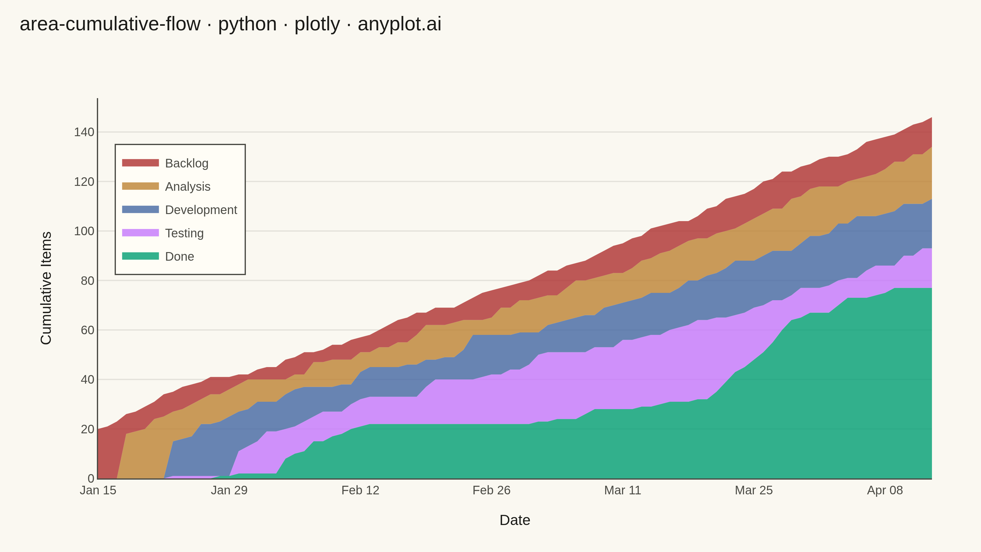
A cumulative flow diagram (CFD) displays the cumulative count of items in each workflow stage as stacked areas over time. Each band represents a stage (e.g., Backlog, In Progress, Done), and the vertical distance between two adjacent band boundaries shows the number of items currently in that stage (work-in-progress). This is a key visualization in Lean and Agile project management for identifying bottlenecks, monitoring throughput, and assessing flow efficiency across a delivery pipeline.
""" anyplot.ai
area-cumulative-flow: Cumulative Flow Diagram for Workflow Analytics
Library: plotly 6.9.0 | Python 3.13.15
Quality: 94/100 | Updated: 2026-08-18
"""

import os

import numpy as np
import pandas as pd
import plotly.graph_objects as go


# Theme tokens
THEME = os.getenv("ANYPLOT_THEME", "light")
PAGE_BG = "#FAF8F1" if THEME == "light" else "#1A1A17"
ELEVATED_BG = "#FFFDF6" if THEME == "light" else "#242420"
INK = "#1A1A17" if THEME == "light" else "#F0EFE8"
INK_SOFT = "#4A4A44" if THEME == "light" else "#B8B7B0"
GRID = "rgba(26, 26, 23, 0.10)" if THEME == "light" else "rgba(240, 239, 232, 0.10)"

# Imprint palette — first series is always #009E73
FILL_COLORS = [
    "rgba(0, 158, 115, 0.80)",  # #009E73 Done
    "rgba(196, 117, 253, 0.80)",  # #C475FD Testing
    "rgba(68, 103, 163, 0.80)",  # #4467A3 Development
    "rgba(189, 130, 51, 0.80)",  # #BD8233 Analysis
    "rgba(174, 48, 48, 0.80)",  # #AE3030 Backlog
]
LINE_COLORS = ["#009E73", "#C475FD", "#4467A3", "#BD8233", "#AE3030"]

# Data — Kanban board for a software team over 90 days
np.random.seed(42)
n_days = 90
dates = pd.date_range("2024-01-15", periods=n_days, freq="D")
t = np.arange(n_days)

# Cumulative counts per stage (monotonically non-decreasing)
# Backlog: total items entered the system (~1.5 new items/day)
backlog = np.maximum.accumulate((20 + 1.5 * t + np.cumsum(np.random.normal(0, 0.8, n_days))).astype(int))

# Each downstream stage lags the prior stage and has a slightly lower count
backlog_s = pd.Series(backlog.astype(float))
analysis_noise = np.random.normal(0, 0.9, n_days)
analysis = np.minimum(
    np.maximum.accumulate((backlog_s.shift(3, fill_value=0) * 0.94 + analysis_noise).astype(int).values), backlog
)

dev_noise = np.random.normal(0, 0.8, n_days)
analysis_s = pd.Series(analysis.astype(float))
development = np.minimum(
    np.maximum.accumulate((analysis_s.shift(5, fill_value=0) * 0.91 + dev_noise).astype(int).values), analysis
)

test_noise = np.random.normal(0, 0.7, n_days)
dev_s = pd.Series(development.astype(float))
testing = np.minimum(
    np.maximum.accumulate((dev_s.shift(7, fill_value=0) * 0.88 + test_noise).astype(int).values), development
)

# QA/release capacity constrained mid-project (ramps down into days 35-64): completion
# rate drops, widening the Testing WIP band. A ramped, above-baseline catch-up burst
# (days 65-84) then drains the backlog and narrows the band again — the bottleneck
# dynamic a CFD exists to reveal.
done_rate = np.full(n_days, 0.85)
done_rate[30:35] = np.linspace(0.85, 0.55, 5)
done_rate[35:65] = 0.55
done_rate[65:75] = np.linspace(0.55, 0.95, 10)
done_rate[75:85] = 0.95
done_rate[85:90] = np.linspace(0.95, 0.85, 5)

done_noise = np.random.normal(0, 0.6, n_days)
test_s = pd.Series(testing.astype(float))
done = np.minimum(
    np.maximum.accumulate((test_s.shift(5, fill_value=0) * done_rate + done_noise).astype(int).values), testing
)

# WIP per stage = difference between adjacent cumulative bounds
# Stack order: Done (bottom) → Testing → Development → Analysis → Backlog (top)
stage_names = ["Done", "Testing", "Development", "Analysis", "Backlog"]
stage_wip = [
    np.maximum(done, 0),
    np.maximum(testing - done, 0),
    np.maximum(development - testing, 0),
    np.maximum(analysis - development, 0),
    np.maximum(backlog - analysis, 0),
]

# Plot
fig = go.Figure()

for name, wip, fill, line_color in zip(stage_names, stage_wip, FILL_COLORS, LINE_COLORS, strict=False):
    fig.add_trace(
        go.Scatter(
            x=dates,
            y=wip,
            name=name,
            stackgroup="one",
            mode="none",
            fillcolor=fill,
            line={"width": 1.5, "color": line_color},
            hovertemplate=f"<b>{name}</b><br>%{{x|%b %d, %Y}}<br>WIP: %{{y:,.0f}} items<extra></extra>",
        )
    )

# Bi-weekly tick marks
tick_dates = pd.date_range("2024-01-15", "2024-04-13", freq="14D")

fig.update_layout(
    autosize=False,
    title={
        "text": "area-cumulative-flow · python · plotly · anyplot.ai",
        "font": {"size": 16, "color": INK},
        "x": 0.02,
        "xanchor": "left",
        "y": 0.97,
        "yanchor": "top",
    },
    xaxis={
        "title": {"text": "Date", "font": {"size": 12, "color": INK}},
        "tickfont": {"size": 10, "color": INK_SOFT},
        "linecolor": INK_SOFT,
        "showgrid": False,
        "tickvals": tick_dates,
        "ticktext": [d.strftime("%b %d") for d in tick_dates],
        "tickangle": 0,
    },
    yaxis={
        "title": {"text": "Cumulative Items", "font": {"size": 12, "color": INK}},
        "tickfont": {"size": 10, "color": INK_SOFT},
        "gridcolor": GRID,
        "linecolor": INK_SOFT,
        "showgrid": True,
        "zeroline": False,
    },
    legend={
        "bgcolor": ELEVATED_BG,
        "bordercolor": INK_SOFT,
        "borderwidth": 1,
        "font": {"size": 10, "color": INK_SOFT},
        "traceorder": "reversed",
        "x": 0.02,
        "y": 0.88,
        "xanchor": "left",
        "yanchor": "top",
    },
    paper_bgcolor=PAGE_BG,
    plot_bgcolor=PAGE_BG,
    font={"color": INK},
    hovermode="x unified",
    margin={"l": 80, "r": 40, "t": 80, "b": 60},
)

# Save
fig.write_image(f"plot-{THEME}.png", width=800, height=450, scale=4)
fig.write_html(f"plot-{THEME}.html", include_plotlyjs="cdn")
Runnable source as JSON, for any HTTP client: https://api.anyplot.ai/specs/area-cumulative-flow/plotly/code. Any spec id and library id listed in llms-full.txt fit the same URL shape; every URL below is complete and callable.
{
  "spec_id": "area-cumulative-flow",
  "language": "python",
  "library": "plotly",
  "page": "https://anyplot.ai/area-cumulative-flow/python/plotly",
  "hub": "https://anyplot.ai/area-cumulative-flow",
  "code_json": "https://api.anyplot.ai/specs/area-cumulative-flow/plotly/code",
  "spec_json": "https://api.anyplot.ai/specs/area-cumulative-flow",
  "render_light_png": "https://storage.googleapis.com/anyplot-images/plots/area-cumulative-flow/python/plotly/plot-light.png",
  "render_dark_png": "https://storage.googleapis.com/anyplot-images/plots/area-cumulative-flow/python/plotly/plot-dark.png",
  "interactive_light_html": "https://storage.googleapis.com/anyplot-images/plots/area-cumulative-flow/python/plotly/plot-light.html",
  "interactive_dark_html": "https://storage.googleapis.com/anyplot-images/plots/area-cumulative-flow/python/plotly/plot-dark.html",
  "quality_score": 94.0,
  "license": "MIT",
  "guide": "https://anyplot.ai/llms.txt"
}
Part of Cumulative Flow Diagram for Workflow Analytics on anyplot.ai.