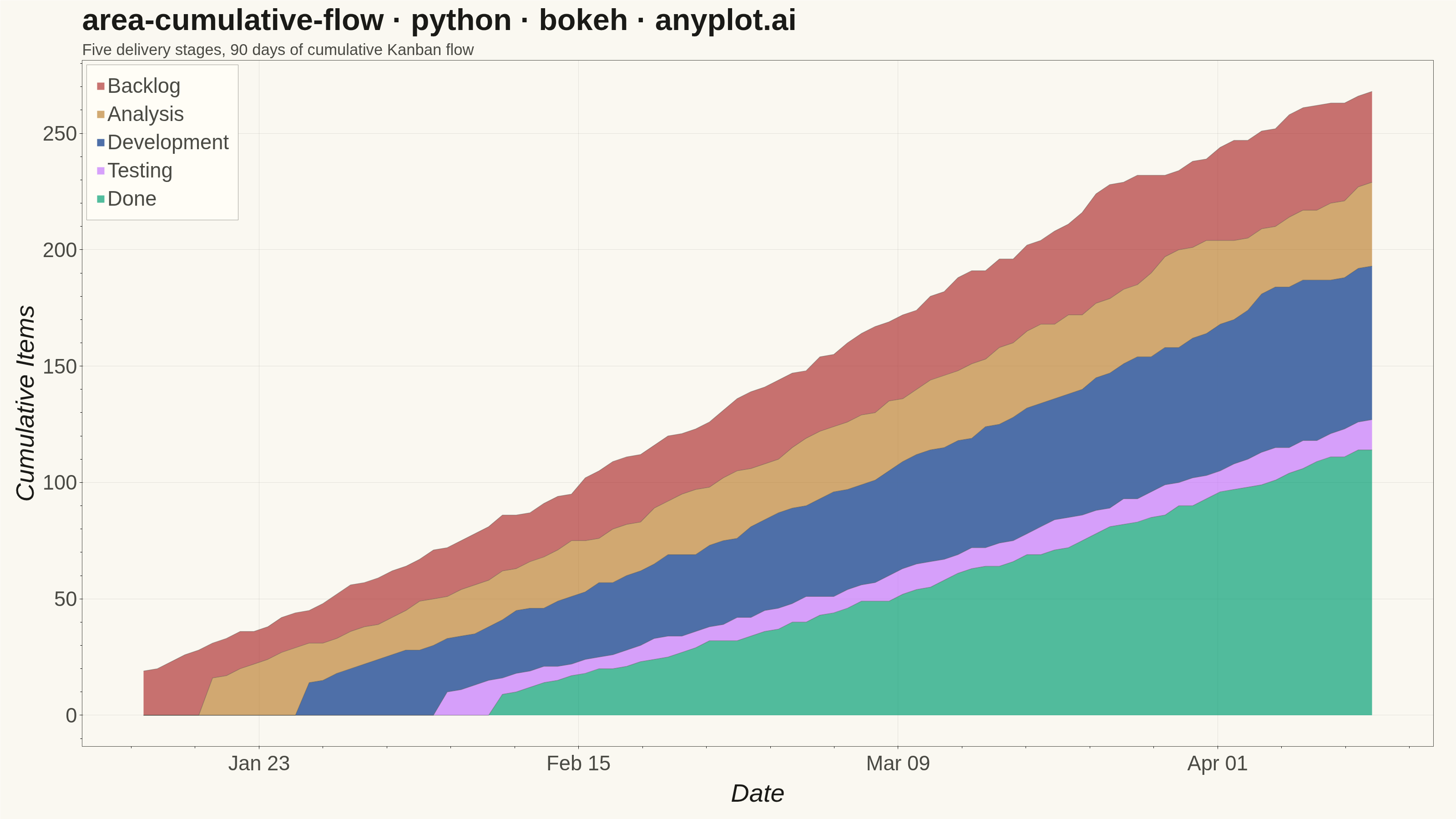
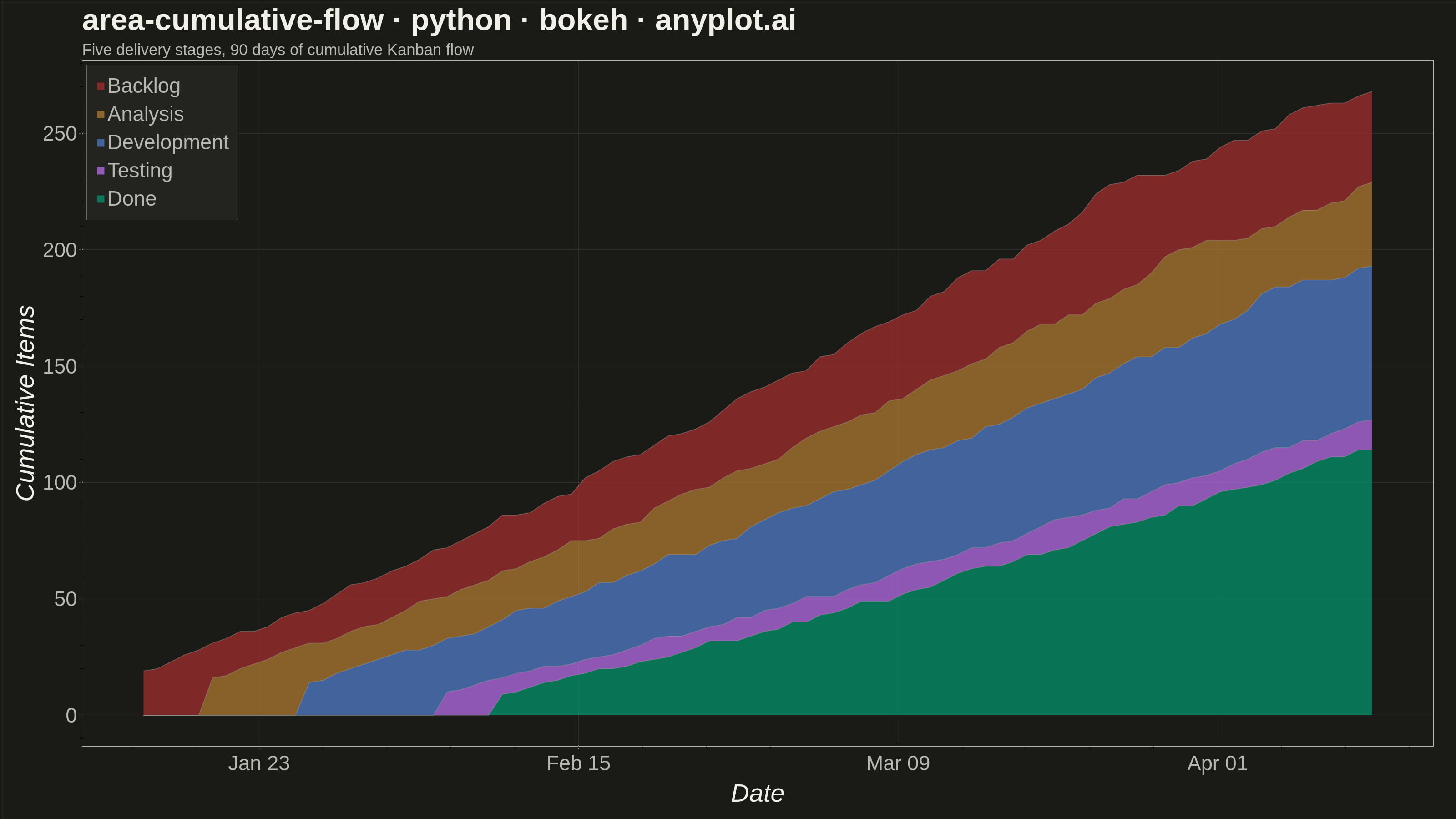
The same plot in 14 other libraries — Python: Altair, lets-plot, Matplotlib, Plotly, plotnine, Pygal, Seaborn; R: ggplot2; Julia: Makie.jl; JavaScript: Chart.js, D3.js, Apache ECharts, Highcharts, MUI X Charts. Compare all 15 side by side: Cumulative Flow Diagram for Workflow Analytics in Python, R, Julia and JavaScript.
A cumulative flow diagram (CFD) displays the cumulative count of items in each workflow stage as stacked areas over time. Each band represents a stage (e.g., Backlog, In Progress, Done), and the vertical distance between two adjacent band boundaries shows the number of items currently in that stage (work-in-progress). This is a key visualization in Lean and Agile project management for identifying bottlenecks, monitoring throughput, and assessing flow efficiency across a delivery pipeline.
""" anyplot.ai
area-cumulative-flow: Cumulative Flow Diagram for Workflow Analytics
Library: bokeh 3.9.2 | Python 3.13.15
Quality: 94/100 | Updated: 2026-08-18
"""

import os
import sys
import time
from pathlib import Path


# Remove the script's own directory from sys.path so "bokeh" resolves to the
# installed package, not this file.
_this_dir = str(Path(__file__).parent.resolve())
sys.path = [p for p in sys.path if os.path.abspath(p) != _this_dir and p != ""]

import numpy as np
import pandas as pd
from bokeh.io import output_file, save
from bokeh.models import ColumnDataSource, DatetimeTickFormatter, Legend, LegendItem, Title
from bokeh.plotting import figure
from selenium import webdriver
from selenium.webdriver.chrome.options import Options


# Theme tokens
THEME = os.getenv("ANYPLOT_THEME", "light")
PAGE_BG = "#FAF8F1" if THEME == "light" else "#1A1A17"
ELEVATED_BG = "#FFFDF6" if THEME == "light" else "#242420"
INK = "#1A1A17" if THEME == "light" else "#F0EFE8"
INK_SOFT = "#4A4A44" if THEME == "light" else "#B8B7B0"

# Imprint palette — first series always #009E73
IMPRINT = ["#009E73", "#C475FD", "#4467A3", "#BD8233", "#AE3030"]

# Data — 90-day Kanban board for a software delivery team
np.random.seed(42)
days = 90
dates = pd.date_range("2024-01-15", periods=days, freq="D")

# Items enter the backlog at a Poisson rate (~3/day) starting from 15 committed items
daily_intake = np.random.poisson(3, days)
backlog_cum = np.maximum.accumulate(np.cumsum(daily_intake) + 15)

# Each downstream stage lags the upstream by a delay and has a throughput rate.
# Development is deliberately throttled (lower rate, longer lag into Testing) so
# the diagram tells a genuine bottleneck story through the data itself.
analysis_cum = np.zeros(days, dtype=int)
analysis_cum[5:] = (backlog_cum[:-5] * 0.88).astype(int)
analysis_cum = np.maximum.accumulate(analysis_cum)

dev_cum = np.zeros(days, dtype=int)
dev_cum[7:] = (analysis_cum[:-7] * 0.92).astype(int)
dev_cum = np.maximum.accumulate(dev_cum)

testing_cum = np.zeros(days, dtype=int)
testing_cum[10:] = (dev_cum[:-10] * 0.75).astype(int)
testing_cum = np.maximum.accumulate(testing_cum)

done_cum = np.zeros(days, dtype=int)
done_cum[4:] = (testing_cum[:-4] * 0.97).astype(int)
done_cum = np.maximum.accumulate(done_cum)

# Band heights = WIP in each stage (differences between consecutive cumulative boundaries)
source = ColumnDataSource(
    data={
        "date": dates,
        "done": done_cum.astype(float),
        "testing": np.maximum(0, testing_cum - done_cum).astype(float),
        "development": np.maximum(0, dev_cum - testing_cum).astype(float),
        "analysis": np.maximum(0, analysis_cum - dev_cum).astype(float),
        "backlog": np.maximum(0, backlog_cum - analysis_cum).astype(float),
    }
)

stages = ["done", "testing", "development", "analysis", "backlog"]
labels = ["Done", "Testing", "Development", "Analysis", "Backlog"]

# Plot — `width`/`height` are the total canvas; min_border_* reserve room for
# the native-pixel tick + axis-label stack at this size.
p = figure(
    width=3200,
    height=1800,
    tools="",
    toolbar_location=None,
    min_border_bottom=160,
    min_border_left=180,
    min_border_top=110,
    min_border_right=50,
)

# Stacked areas — each color corresponds to the matching stacker
renderers = p.varea_stack(stackers=stages, x="date", color=IMPRINT, alpha=0.70, source=source)

# Development is the throttled stage (see data comment above) — render it near-opaque
# while the other bands stay dimmer, so the bottleneck reads as a focal point at a glance.
for stage, renderer in zip(stages, renderers, strict=True):
    renderer.glyph.fill_alpha = 0.95 if stage == "development" else 0.68

# Subtle boundary lines at each stage transition
cum_vals = np.zeros(days)
for stage in stages:
    cum_vals = cum_vals + source.data[stage]
    p.line(x=dates, y=cum_vals, line_width=1.5, line_color=INK_SOFT, line_alpha=0.40)

# Legend — top to bottom: Backlog → Done (matches visual band order)
legend_items = [LegendItem(label=labels[i], renderers=[renderers[i]]) for i in range(len(stages) - 1, -1, -1)]
legend = Legend(
    items=legend_items,
    location="top_left",
    background_fill_color=ELEVATED_BG,
    border_line_color=INK_SOFT,
    label_text_color=INK_SOFT,
    label_text_font_size="34pt",
    padding=20,
    spacing=10,
)
p.add_layout(legend)

# Title + subtitle — typographic hierarchy via a bold headline over a lighter,
# smaller descriptive line (no data annotations — this is a "basic" spec variant).
p.add_layout(
    Title(
        text="Five delivery stages, 90 days of cumulative Kanban flow",
        text_font_size="26pt",
        text_font_style="normal",
        text_color=INK_SOFT,
    ),
    "above",
)
p.add_layout(
    Title(
        text="area-cumulative-flow · python · bokeh · anyplot.ai",
        text_font_size="50pt",
        text_font_style="bold",
        text_color=INK,
    ),
    "above",
)

# Theme-adaptive chrome
p.background_fill_color = PAGE_BG
p.border_fill_color = PAGE_BG
p.outline_line_color = INK_SOFT

p.xaxis.axis_label = "Date"
p.yaxis.axis_label = "Cumulative Items"
p.xaxis.axis_label_text_color = INK
p.yaxis.axis_label_text_color = INK
p.xaxis.axis_label_text_font_size = "42pt"
p.yaxis.axis_label_text_font_size = "42pt"
p.xaxis.major_label_text_color = INK_SOFT
p.yaxis.major_label_text_color = INK_SOFT
p.xaxis.major_label_text_font_size = "34pt"
p.yaxis.major_label_text_font_size = "34pt"
p.xaxis.axis_line_color = INK_SOFT
p.yaxis.axis_line_color = INK_SOFT
p.xaxis.major_tick_line_color = INK_SOFT
p.yaxis.major_tick_line_color = INK_SOFT

p.xgrid.grid_line_color = INK
p.ygrid.grid_line_color = INK
p.xgrid.grid_line_alpha = 0.10
p.ygrid.grid_line_alpha = 0.10

p.xaxis.formatter = DatetimeTickFormatter(days="%b %d", months="%b %Y")

# Save HTML then screenshot with headless Chrome
output_file(f"plot-{THEME}.html")
save(p)

W, H = 3200, 1800
opts = Options()
for arg in (
    "--headless=new",
    "--no-sandbox",
    "--disable-dev-shm-usage",
    "--disable-gpu",
    f"--window-size={W},{H}",
    "--hide-scrollbars",
):
    opts.add_argument(arg)
driver = webdriver.Chrome(options=opts)
driver.set_window_size(W, H)
driver.get(f"file://{Path(f'plot-{THEME}.html').resolve()}")
# Headless Chrome's --window-size sets the OUTER window, which still reserves a
# phantom title-bar height even headless — pin the viewport exactly via CDP.
driver.execute_cdp_cmd(
    "Emulation.setDeviceMetricsOverride", {"width": W, "height": H, "deviceScaleFactor": 1, "mobile": False}
)
time.sleep(3)
driver.save_screenshot(f"plot-{THEME}.png")
driver.quit()
Runnable source as JSON, for any HTTP client: https://api.anyplot.ai/specs/area-cumulative-flow/bokeh/code. Any spec id and library id listed in llms-full.txt fit the same URL shape; every URL below is complete and callable.
{
  "spec_id": "area-cumulative-flow",
  "language": "python",
  "library": "bokeh",
  "page": "https://anyplot.ai/area-cumulative-flow/python/bokeh",
  "hub": "https://anyplot.ai/area-cumulative-flow",
  "code_json": "https://api.anyplot.ai/specs/area-cumulative-flow/bokeh/code",
  "spec_json": "https://api.anyplot.ai/specs/area-cumulative-flow",
  "render_light_png": "https://storage.googleapis.com/anyplot-images/plots/area-cumulative-flow/python/bokeh/plot-light.png",
  "render_dark_png": "https://storage.googleapis.com/anyplot-images/plots/area-cumulative-flow/python/bokeh/plot-dark.png",
  "interactive_light_html": "https://storage.googleapis.com/anyplot-images/plots/area-cumulative-flow/python/bokeh/plot-light.html",
  "interactive_dark_html": "https://storage.googleapis.com/anyplot-images/plots/area-cumulative-flow/python/bokeh/plot-dark.html",
  "quality_score": 94.0,
  "license": "MIT",
  "guide": "https://anyplot.ai/llms.txt"
}
Part of Cumulative Flow Diagram for Workflow Analytics on anyplot.ai.