The same plot in 14 other libraries — Python: Altair, Bokeh, lets-plot, Matplotlib, Plotly, plotnine, Seaborn; R: ggplot2; Julia: Makie.jl; JavaScript: Chart.js, D3.js, Apache ECharts, Highcharts, MUI X Charts. Compare all 15 side by side: Cumulative Flow Diagram for Workflow Analytics in Python, R, Julia and JavaScript.
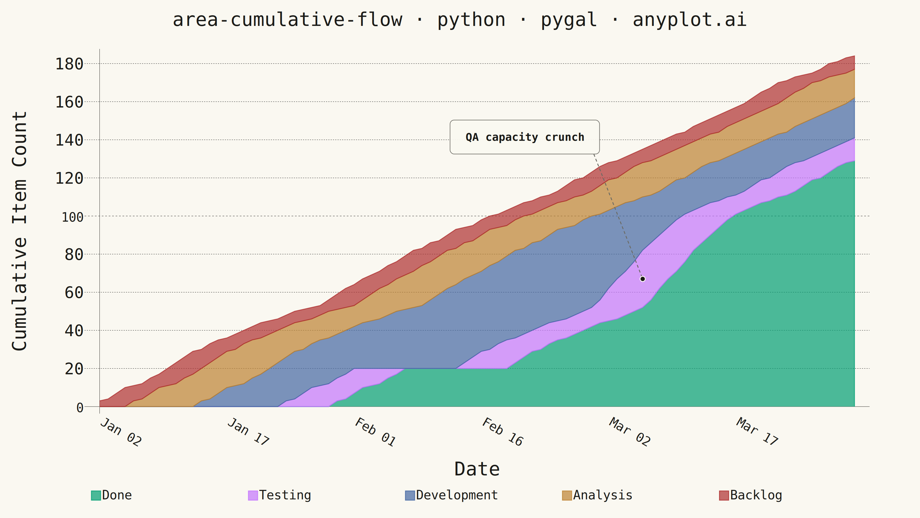
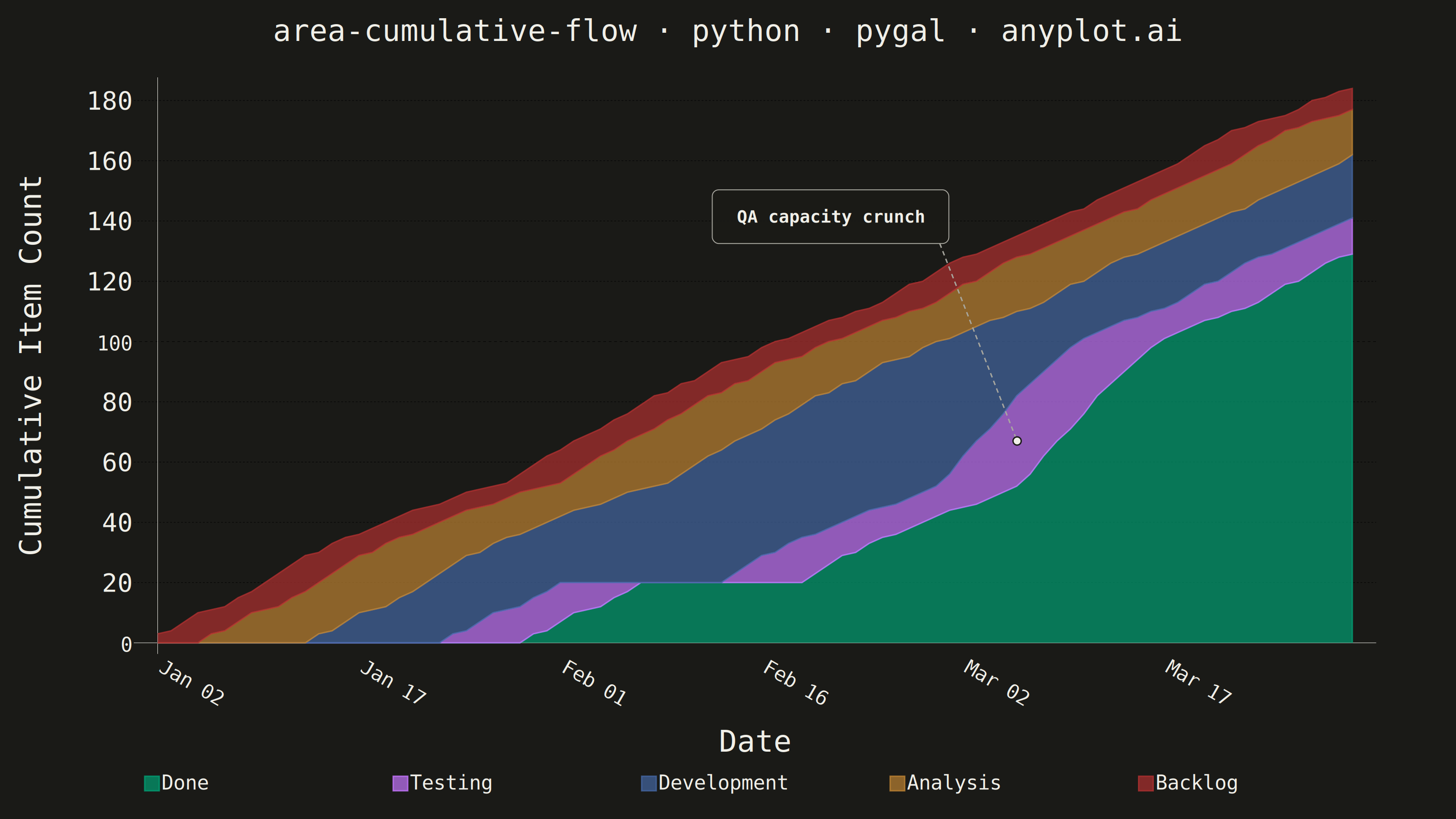
A cumulative flow diagram (CFD) displays the cumulative count of items in each workflow stage as stacked areas over time. Each band represents a stage (e.g., Backlog, In Progress, Done), and the vertical distance between two adjacent band boundaries shows the number of items currently in that stage (work-in-progress). This is a key visualization in Lean and Agile project management for identifying bottlenecks, monitoring throughput, and assessing flow efficiency across a delivery pipeline.
""" anyplot.ai
area-cumulative-flow: Cumulative Flow Diagram for Workflow Analytics
Library: pygal 3.1.3 | Python 3.13.15
Quality: 93/100 | Updated: 2026-08-18
"""

import os

import cairosvg
import numpy as np
import pandas as pd
import pygal
from pygal.style import Style


# pygal drops its internal layout state after render() unless this is set —
# the QA-crunch annotation below needs chart.view/chart.margin_box afterwards
# to place the callout at the exact pixel position of the widened Testing band.
os.environ["PYGAL_KEEP_STATE"] = "1"

# Theme tokens
THEME = os.getenv("ANYPLOT_THEME", "light")
PAGE_BG = "#FAF8F1" if THEME == "light" else "#1A1A17"
INK = "#1A1A17" if THEME == "light" else "#F0EFE8"
INK_MUTED = "#6B6A63" if THEME == "light" else "#A8A79F"

IMPRINT = ("#009E73", "#C475FD", "#4467A3", "#BD8233", "#AE3030")

# Data: 90-day Kanban board for a software delivery team
np.random.seed(42)
n_days = 90
dates = pd.date_range("2024-01-02", periods=n_days, freq="D")

# Daily new items entering the backlog (1–3 per day)
daily_new = np.random.randint(1, 4, n_days)
backlog_entered = np.cumsum(daily_new).astype(float)

# Each stage has a lag from the previous stage boundary. Testing capacity
# tightens during a mid-period bottleneck (QA understaffed vs. dev throughput),
# so items linger longer in Development before Testing can absorb them. The
# lag ramps by at most 1 day/day so the cumulative counts stay non-decreasing.
analysis_lag = 4  # days after entering backlog before analysis starts
dev_lag = 8  # days in analysis before development starts
testing_lag_normal = 10  # days in development before testing starts (baseline)
testing_lag_bottleneck = 22  # days during the QA capacity crunch (peak)
done_lag = 6  # days in testing before done

ramp = np.arange(testing_lag_normal, testing_lag_bottleneck + 1)
testing_lag_schedule = np.concatenate(
    [
        np.full(30, testing_lag_normal),  # normal flow
        ramp,  # QA backlog builds up
        np.full(14, testing_lag_bottleneck),  # crunch plateau
        ramp[::-1],  # extra QA capacity drains the backlog
    ]
)
testing_lag_schedule = np.concatenate(
    [testing_lag_schedule, np.full(n_days - len(testing_lag_schedule), testing_lag_normal)]
)

analysis_entered = np.zeros(n_days)
dev_entered = np.zeros(n_days)
testing_entered = np.zeros(n_days)
done = np.zeros(n_days)

for d in range(n_days):
    if d - analysis_lag >= 0:
        analysis_entered[d] = backlog_entered[d - analysis_lag]
    if d - dev_lag >= 0:
        dev_entered[d] = analysis_entered[d - dev_lag]
    lag = testing_lag_schedule[d]
    if d - lag >= 0:
        testing_entered[d] = dev_entered[d - lag]
    if d - done_lag >= 0:
        done[d] = testing_entered[d - done_lag]

# Band widths (WIP per stage) — stacked bottom-to-top: Done → Backlog
done_band = done
testing_band = testing_entered - done
dev_band = dev_entered - testing_entered
analysis_band = analysis_entered - dev_entered
backlog_band = backlog_entered - analysis_entered

# X-axis labels — show every 15th day
all_labels = [d.strftime("%b %d") for d in dates]
major_labels = [d.strftime("%b %d") for d in dates[::15]]

# Style
custom_style = Style(
    background=PAGE_BG,
    plot_background=PAGE_BG,
    foreground=INK,
    foreground_strong=INK,
    foreground_subtle=INK_MUTED,
    colors=IMPRINT,
    title_font_size=66,
    label_font_size=56,
    major_label_font_size=44,
    legend_font_size=44,
    value_font_size=36,
    stroke_width=3,
)

# Chart
chart = pygal.StackedLine(
    style=custom_style,
    fill=True,
    width=3200,
    height=1800,
    title="area-cumulative-flow · python · pygal · anyplot.ai",
    x_title="Date",
    y_title="Cumulative Item Count",
    show_minor_x_labels=False,
    x_label_rotation=30,
    margin=80,
    show_dots=False,
    legend_at_bottom=True,
    legend_at_bottom_columns=5,
    legend_box_size=32,
    spacing=24,
)

chart.x_labels = all_labels
chart.x_labels_major = major_labels

# Add series from bottom (Done) to top (Backlog) — workflow order reversed.
# Testing (the QA-bottleneck stage) gets a bolder boundary stroke than the
# other bands: an intentional visual hierarchy that draws the eye straight
# to the widening band instead of leaving every stage equally weighted.
chart.add("Done", done_band.tolist())
chart.add("Testing", testing_band.tolist(), stroke_style={"width": 6})
chart.add("Development", dev_band.tolist())
chart.add("Analysis", analysis_band.tolist())
chart.add("Backlog", backlog_band.tolist())

# Render once, keeping pygal's internal view/margin state (see
# PYGAL_KEEP_STATE above) so the QA-crunch callout below can be placed at
# the exact pixel position of the Testing band's widest point.
svg = chart.render()
svg_text = svg.decode("utf-8") if isinstance(svg, bytes) else svg

# Annotate the QA-capacity crunch: the day the Testing band is widest.
peak_day = int(np.argmax(testing_band))
anchor_value = (done[peak_day] + testing_entered[peak_day]) / 2
anchor_xf = peak_day / (n_days - 1)
anchor_x = chart.margin_box.left + chart.view.x(anchor_xf)
anchor_y = chart.margin_box.top + chart.view.y(anchor_value)

# Callout box sits in the empty canvas above the pre-crunch ramp-up (offsets
# tuned for this fixed-seed dataset so the box and its leader line never
# cross into the filled bands).
box_w, box_h = 520, 118
box_right = anchor_x - 150
box_left = box_right - box_w
box_bottom = anchor_y - 434
box_top = box_bottom - box_h
text_x = (box_left + box_right) / 2
text_y = box_top + box_h / 2 + 13

annotation = f"""
<g class="qa-crunch-annotation">
  <line x1="{box_right - 20:.1f}" y1="{box_bottom:.1f}" x2="{anchor_x:.1f}" y2="{anchor_y:.1f}"
        stroke="{INK_MUTED}" stroke-width="3" stroke-dasharray="10,8" />
  <circle cx="{anchor_x:.1f}" cy="{anchor_y:.1f}" r="9" fill="{INK}" stroke="{PAGE_BG}" stroke-width="3" />
  <rect x="{box_left:.1f}" y="{box_top:.1f}" width="{box_w}" height="{box_h}" rx="14"
        fill="{PAGE_BG}" fill-opacity="0.94" stroke="{INK_MUTED}" stroke-width="2" />
  <text x="{text_x:.1f}" y="{text_y:.1f}" text-anchor="middle" font-weight="bold" font-size="38"
        font-family='Consolas, "Liberation Mono", Menlo, Courier, monospace' fill="{INK}">QA capacity crunch</text>
</g>
"""
svg_text = svg_text.replace("</svg>", annotation + "</svg>", 1)

# Save
with open(f"plot-{THEME}.html", "wb") as f:
    f.write(svg_text.encode("utf-8"))
cairosvg.svg2png(bytestring=svg_text.encode("utf-8"), write_to=f"plot-{THEME}.png", dpi=72)
Runnable source as JSON, for any HTTP client: https://api.anyplot.ai/specs/area-cumulative-flow/pygal/code. Any spec id and library id listed in llms-full.txt fit the same URL shape; every URL below is complete and callable.
{
  "spec_id": "area-cumulative-flow",
  "language": "python",
  "library": "pygal",
  "page": "https://anyplot.ai/area-cumulative-flow/python/pygal",
  "hub": "https://anyplot.ai/area-cumulative-flow",
  "code_json": "https://api.anyplot.ai/specs/area-cumulative-flow/pygal/code",
  "spec_json": "https://api.anyplot.ai/specs/area-cumulative-flow",
  "render_light_png": "https://storage.googleapis.com/anyplot-images/plots/area-cumulative-flow/python/pygal/plot-light.png",
  "render_dark_png": "https://storage.googleapis.com/anyplot-images/plots/area-cumulative-flow/python/pygal/plot-dark.png",
  "interactive_light_html": "https://storage.googleapis.com/anyplot-images/plots/area-cumulative-flow/python/pygal/plot-light.html",
  "interactive_dark_html": "https://storage.googleapis.com/anyplot-images/plots/area-cumulative-flow/python/pygal/plot-dark.html",
  "quality_score": 93.0,
  "license": "MIT",
  "guide": "https://anyplot.ai/llms.txt"
}
Part of Cumulative Flow Diagram for Workflow Analytics on anyplot.ai.