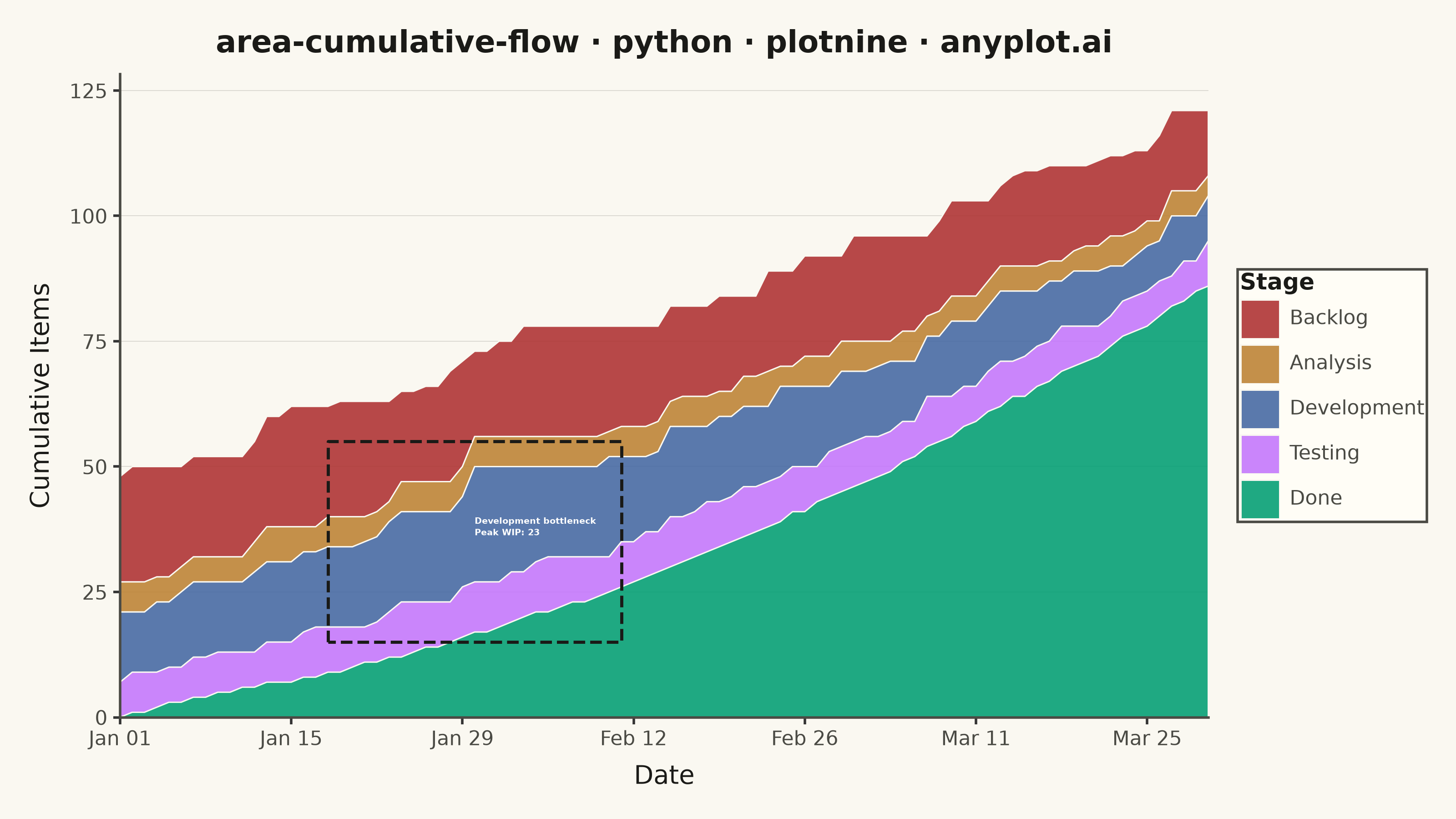
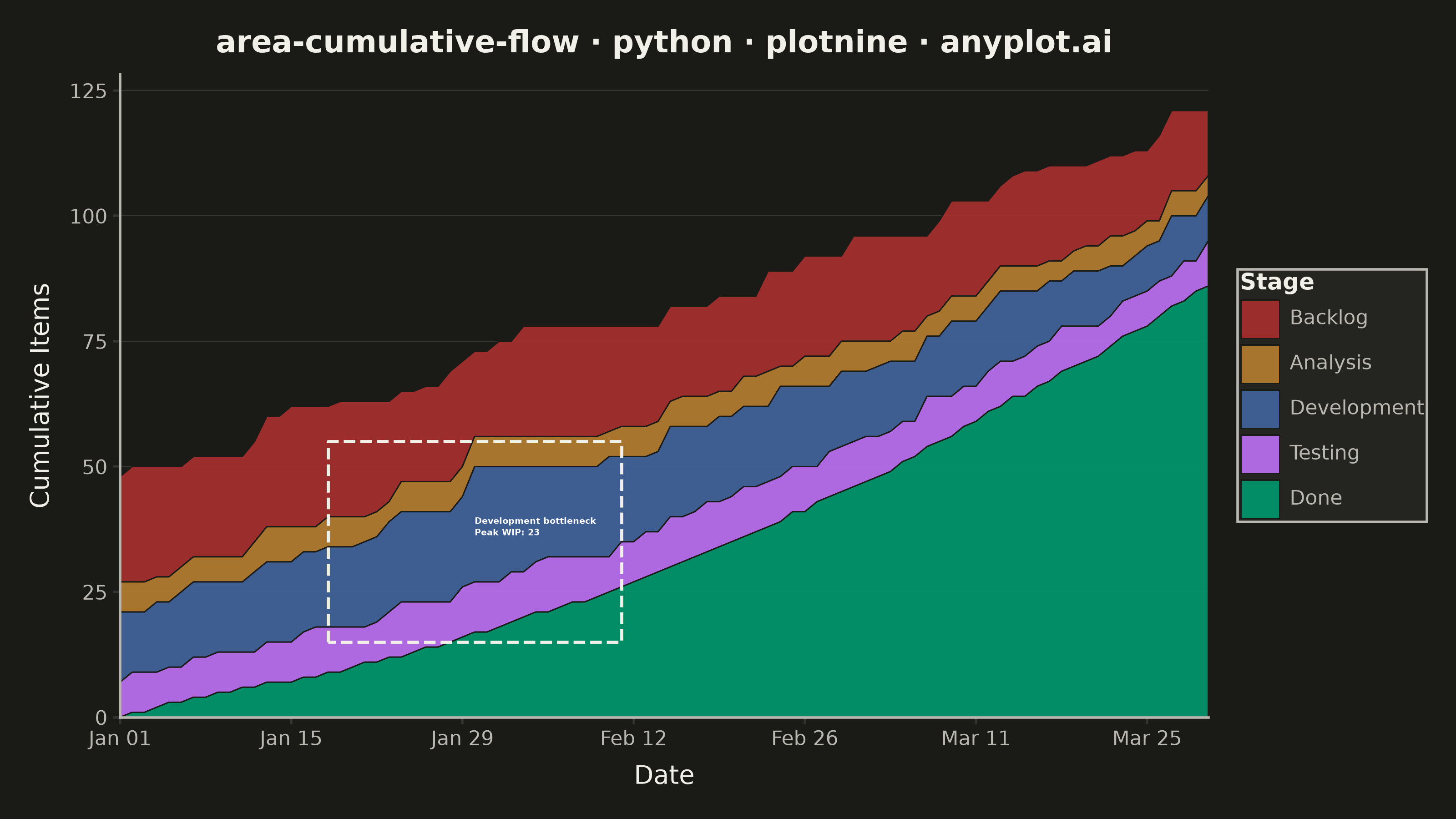
The same plot in 14 other libraries — Python: Altair, Bokeh, lets-plot, Matplotlib, Plotly, Pygal, Seaborn; R: ggplot2; Julia: Makie.jl; JavaScript: Chart.js, D3.js, Apache ECharts, Highcharts, MUI X Charts. Compare all 15 side by side: Cumulative Flow Diagram for Workflow Analytics in Python, R, Julia and JavaScript.
A cumulative flow diagram (CFD) displays the cumulative count of items in each workflow stage as stacked areas over time. Each band represents a stage (e.g., Backlog, In Progress, Done), and the vertical distance between two adjacent band boundaries shows the number of items currently in that stage (work-in-progress). This is a key visualization in Lean and Agile project management for identifying bottlenecks, monitoring throughput, and assessing flow efficiency across a delivery pipeline.
""" anyplot.ai
area-cumulative-flow: Cumulative Flow Diagram for Workflow Analytics
Library: plotnine 0.15.8 | Python 3.13.15
Quality: 93/100 | Updated: 2026-08-18
"""

import os
import sys


# Remove current directory from sys.path to avoid shadowing the plotnine package
_here = os.path.dirname(os.path.abspath(__file__))
_cleaned = [p for p in sys.path if os.path.abspath(p) != _here]
sys.path.clear()
sys.path.extend(_cleaned)

import numpy as np
import pandas as pd
from plotnine import (
    aes,
    annotate,
    element_blank,
    element_line,
    element_rect,
    element_text,
    geom_area,
    ggplot,
    labs,
    scale_fill_manual,
    scale_x_datetime,
    scale_y_continuous,
    theme,
)
from plotnine.coords import coord_cartesian


# Theme tokens
THEME = os.getenv("ANYPLOT_THEME", "light")
PAGE_BG = "#FAF8F1" if THEME == "light" else "#1A1A17"
ELEVATED_BG = "#FFFDF6" if THEME == "light" else "#242420"
INK = "#1A1A17" if THEME == "light" else "#F0EFE8"
INK_SOFT = "#4A4A44" if THEME == "light" else "#B8B7B0"

IMPRINT = ["#009E73", "#C475FD", "#4467A3", "#BD8233", "#AE3030"]

# Data
np.random.seed(42)
n_days = 90
dates = pd.date_range("2024-01-01", periods=n_days)
t = np.arange(n_days)

# Throughput ramps as the team finds its rhythm (~90 items completed over 90 days)
throughput = (0.4 + 0.013 * t + np.random.randn(n_days) * 0.2).clip(0.1)
cum_done = np.round(np.cumsum(throughput)).astype(int)
cum_done = np.maximum.accumulate(cum_done)

# WIP per stage — Development is the bottleneck (widest band)
testing_wip = (7 + 2 * np.sin(t / 25) + np.random.randn(n_days) * 1.0).clip(3).round().astype(int)
dev_wip = (13 + 4 * np.sin(t / 20) + np.random.randn(n_days) * 1.5).clip(6).round().astype(int)
analysis_wip = (5 + np.random.randn(n_days) * 1.0).clip(2).round().astype(int)
backlog_wip = (20 - 0.05 * t + np.random.randn(n_days) * 2.0).clip(8).round().astype(int)

# Cumulative boundary lines (monotonically non-decreasing)
cum_testing = np.maximum.accumulate(cum_done + testing_wip)
cum_dev = np.maximum.accumulate(cum_testing + dev_wip)
cum_analysis = np.maximum.accumulate(cum_dev + analysis_wip)
cum_backlog = np.maximum.accumulate(cum_analysis + backlog_wip)

# Band heights: WIP in each stage (difference between adjacent boundary lines).
# plotnine stacks geom_area with the LAST factor level at the bottom.
# Spec: earliest stage (Backlog) on top, latest stage (Done) on bottom.
# Factor order → Done last so it renders at the bottom of the chart.
stage_order = ["Backlog", "Analysis", "Development", "Testing", "Done"]
bands = [
    cum_backlog - cum_analysis,  # Backlog WIP   → visual top
    cum_analysis - cum_dev,  # Analysis WIP
    cum_dev - cum_testing,  # Development WIP (bottleneck)
    cum_testing - cum_done,  # Testing WIP
    cum_done,  # Done (cumulative completed) → visual bottom
]

df = pd.concat(
    [pd.DataFrame({"date": dates, "stage": stage, "wip": wip}) for stage, wip in zip(stage_order, bands, strict=True)],
    ignore_index=True,
)
df["stage"] = pd.Categorical(df["stage"], categories=stage_order, ordered=True)

# Colors assigned to visual layers (bottom → top): Done, Testing, Development, Analysis, Backlog
visual_order = ["Done", "Testing", "Development", "Analysis", "Backlog"]
stage_colors = dict(zip(visual_order, IMPRINT, strict=True))

# Bottleneck callout: locate the widest Development window around its WIP peak,
# not just a single day, so the highlight box below hugs the whole widening span.
peak_idx = int(np.argmax(dev_wip))
window = 12
win_lo = max(0, peak_idx - window)
win_hi = min(n_days - 1, peak_idx + window)
box_pad = 3
box_xmin, box_xmax = dates[win_lo], dates[win_hi]
box_ymin = max(0.0, float(np.min(cum_testing[win_lo : win_hi + 1])) - box_pad)
box_ymax = float(np.max(cum_dev[win_lo : win_hi + 1])) + box_pad
peak_wip = int(dev_wip[peak_idx])
x_annot = dates[peak_idx]
y_annot = int((cum_testing[peak_idx] + cum_dev[peak_idx]) / 2)

# Explicit y-limit for coord_cartesian below: a touch of headroom above the
# stack top, computed once instead of relying on scale expansion alone.
y_top = float(cum_backlog.max()) * 1.06

# Title — canonical format, well under the 67-char baseline so no fontsize scaling needed
title = "area-cumulative-flow · python · plotnine · anyplot.ai"

# Plot
anyplot_theme = theme(
    figure_size=(8, 4.5),
    plot_background=element_rect(fill=PAGE_BG, color=PAGE_BG),
    panel_background=element_rect(fill=PAGE_BG),
    panel_grid_major_x=element_blank(),
    panel_grid_major_y=element_line(color=INK_SOFT, size=0.3, alpha=0.20),
    panel_grid_minor=element_blank(),
    panel_border=element_blank(),
    axis_title=element_text(color=INK, size=10),
    axis_text=element_text(color=INK_SOFT, size=8),
    # L-shaped frame: bottom x-axis line and left y-axis line only
    axis_line_x=element_line(color=INK_SOFT),
    axis_line_y=element_line(color=INK_SOFT),
    plot_title=element_text(color=INK, size=12, face="bold"),
    legend_background=element_rect(fill=ELEVATED_BG, color=INK_SOFT),
    legend_text=element_text(color=INK_SOFT, size=8),
    # Slightly larger legend title for visual hierarchy within the legend
    legend_title=element_text(color=INK, size=9, face="bold"),
    legend_position="right",
    # Tight breathing room between plot area and legend — avoids the excess
    # right-side whitespace flagged in the previous review
    legend_box_spacing=0.02,
    plot_margin=0.02,
)

plot = (
    ggplot(df, aes(x="date", y="wip", fill="stage"))
    # outline_type="full" closes each band's own polygon border (not just the
    # upper edge), a deliberate refinement over the geom_area default
    + geom_area(position="stack", alpha=0.88, color=PAGE_BG, size=0.3, outline_type="full")
    + scale_fill_manual(values=stage_colors)
    # date axis hugs the data range — no leading/trailing padding
    + scale_x_datetime(date_labels="%b %d", date_breaks="2 weeks", expand=(0, 0))
    + scale_y_continuous(expand=(0, 0))
    # Fine-tuned view window (vs. relying on scale expansion alone) so the
    # bottleneck highlight box below always has clean headroom above it
    + coord_cartesian(ylim=(0, y_top), expand=False)
    + labs(x="Date", y="Cumulative Items", fill="Stage", title=title)
    # Dashed callout box makes the widening Development band unmissable at a
    # glance, instead of relying solely on the text label to carry the insight
    + annotate(
        "rect",
        xmin=box_xmin,
        xmax=box_xmax,
        ymin=box_ymin,
        ymax=box_ymax,
        fill=None,
        color=INK,
        linetype="dashed",
        size=0.7,
        alpha=0.85,
    )
    + annotate(
        "text",
        x=x_annot,
        y=y_annot,
        label=f"Development bottleneck\nPeak WIP: {peak_wip}",
        color="#FFFFFF",
        size=3.5,
        ha="left",
        va="center",
        fontweight="bold",
    )
    + anyplot_theme
)

# Save
plot.save(f"plot-{THEME}.png", dpi=400, width=8, height=4.5, units="in", verbose=False)
Runnable source as JSON, for any HTTP client: https://api.anyplot.ai/specs/area-cumulative-flow/plotnine/code. Any spec id and library id listed in llms-full.txt fit the same URL shape; every URL below is complete and callable.
{
  "spec_id": "area-cumulative-flow",
  "language": "python",
  "library": "plotnine",
  "page": "https://anyplot.ai/area-cumulative-flow/python/plotnine",
  "hub": "https://anyplot.ai/area-cumulative-flow",
  "code_json": "https://api.anyplot.ai/specs/area-cumulative-flow/plotnine/code",
  "spec_json": "https://api.anyplot.ai/specs/area-cumulative-flow",
  "render_light_png": "https://storage.googleapis.com/anyplot-images/plots/area-cumulative-flow/python/plotnine/plot-light.png",
  "render_dark_png": "https://storage.googleapis.com/anyplot-images/plots/area-cumulative-flow/python/plotnine/plot-dark.png",
  "quality_score": 93.0,
  "license": "MIT",
  "guide": "https://anyplot.ai/llms.txt"
}
Part of Cumulative Flow Diagram for Workflow Analytics on anyplot.ai.